Category Archives: quantitative research

Wilcoxon Signed Rank Test in R

The Wilcoxon Signed Rank Test is the non-parametric equivalent of the t-test. If you have questions whether or not your data is normally distributed the Wilcoxon Signed Rank Test can still indicate to you if there is a difference between the means of your sample.

Th Wilcoxon Test compares the medians of two samples instead of their means. The differences between the median and each individual value for each sample is calculated. Values that come to zero are removed. Any remaining values are ranked from lowest to highest. Lastly, the ranks are summed. If the rank sum is different between the two samples it indicates statistical difference between samples.

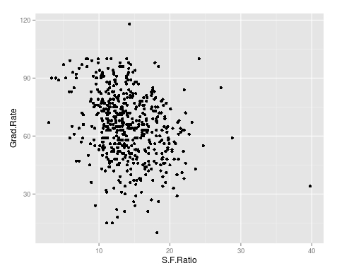
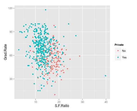
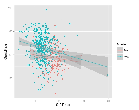
We will now do an example using r. We want to see if there is a difference in enrollment between private and public universities. Below is the code

We will begin by loading the ISLR package. Then we will load the ‘College’ data and take a look at the variables in the “College” dataset by using the ‘str’ function.

library(ISLR)
data=College
str(College)
## 'data.frame':    777 obs. of  18 variables:
##  $ Private    : Factor w/ 2 levels "No","Yes": 2 2 2 2 2 2 2 2 2 2 ...
##  $ Apps       : num  1660 2186 1428 417 193 ...
##  $ Accept     : num  1232 1924 1097 349 146 ...
##  $ Enroll     : num  721 512 336 137 55 158 103 489 227 172 ...
##  $ Top10perc  : num  23 16 22 60 16 38 17 37 30 21 ...
##  $ Top25perc  : num  52 29 50 89 44 62 45 68 63 44 ...
##  $ F.Undergrad: num  2885 2683 1036 510 249 ...
##  $ P.Undergrad: num  537 1227 99 63 869 ...
##  $ Outstate   : num  7440 12280 11250 12960 7560 ...
##  $ Room.Board : num  3300 6450 3750 5450 4120 ...
##  $ Books      : num  450 750 400 450 800 500 500 450 300 660 ...
##  $ Personal   : num  2200 1500 1165 875 1500 ...
##  $ PhD        : num  70 29 53 92 76 67 90 89 79 40 ...
##  $ Terminal   : num  78 30 66 97 72 73 93 100 84 41 ...
##  $ S.F.Ratio  : num  18.1 12.2 12.9 7.7 11.9 9.4 11.5 13.7 11.3 11.5 ...
##  $ perc.alumni: num  12 16 30 37 2 11 26 37 23 15 ...
##  $ Expend     : num  7041 10527 8735 19016 10922 ...
##  $ Grad.Rate  : num  60 56 54 59 15 55 63 73 80 52 ...

We will now look at the Enroll variable and see if it is normally distributed

hist(College$Enroll)

download.png

This variable is highly skewed to the right. This may mean that it is not normally distributed. Therefore, we may not be able to use a regular t-test to compare private and public universities and the Wilcoxon Test is more appropriate. We will now use the Wilcoxon Test. Below are the results

wilcox.test(College$Enroll~College$Private)
## 
##  Wilcoxon rank sum test with continuity correction
## 
## data:  College$Enroll by College$Private
## W = 104090, p-value < 2.2e-16
## alternative hypothesis: true location shift is not equal to 0

The results indicate a difference we will now calculate the medians of the two groups using the ‘aggregate’ function. This function allows us to compare our two groups based on the median. Below is the code with the results.

aggregate(College$Enroll~College$Private, FUN=median)
##   College$Private College$Enroll
## 1              No       1337.5
## 2             Yes        328.0

As you can see, there is a large difference in enrollment in private and public colleges. We can then make the conclusion that there is a difference in the medians of private and public colleges with public colleges have a much higher enrollment.

Conclusion

The Wilcoxon Test is used for a non-parametric analysis of data. This test is useful whenever there are concerns with the normality of the data.

Big Data & Data Mining

Dealing with large amounts of data has been a problem throughout most of human history. Ancient civilizations had to keep large amounts of clay tablets, papyrus, steles, parchments, scrolls etc. to keep track of all the details of an empire.

However, whenever it seemed as though there would be no way to hold any more information a new technology would be developed to alleviate the problem. When people could not handle keeping records on stone paper scrolls were invented. When scrolls were no longer practical books were developed. When hand-copying books were too much the printing press came along.

By the mid 20th century there were concerns that we would not be able to have libraries large enough to keep all of the books that were being developed. With this problem came the solution of the computer. One computer could hold the information of several dozen if not hundreds of libraries.

Now even a single computer can no longer cope with all of the information that is constantly being developed for just a single subject. This has lead to computers working together in networks to share the task of storing information. With data spread across several computers, it makes analyzing data much more challenging. It was now necessary to mine for useful information in a way that people used to mine for gold in the 19th century.

Big data is data that is too large to fit within the memory of a single computer. Analyzing data that is spread across a network of databases takes skills different from traditional statistical analysis. This post will explain some of the characteristics of big data as well as data mining.

Big Data Traits

The three main traits of big data are volume, velocity, and variety. Volume describes the size of big data, which means data to big to be on only one computer. Velocity is about how fast the data can be processed. Lastly, variety different types of data. common sources of big data includes the following

  • Metadata from visual sources such as cameras
  • Data from sensors such as in medical equipment
  • Social media data such as information from google, youtube or facebook

Data Mining

Data mining is the process of discovering a model in a big dataset. Through the development of an algorithm, we can find specific information that helps us to answer our questions. Generally, there are two ways to mine data and these are extraction and summarization.

Extraction is the process of pulling specific information from a big dataset. For example, if we want all the addresses of people who bought a specific book from Amazon the result would be an extraction from a big data set.

Summarization is reducing a dataset to describe it. We might do a cluster analysis in which similar data is combined on a characteristic. For example, if we analyze all the books people ordered through Amazon last year we might notice that one cluster of groups buys mostly religious books while another buys investment books.

Conclusion

Big data will only continue to get bigger. Currently, the response has been to just use more computers and servers. As such, there is now a need for finding information on many computers and servers. This is the purpose of data mining, which is to find pertinent information that answers stakeholders questions.

Type I and Type II Error

Hypothesis testing in statistics involves deciding whether to reject or not reject a null hypothesis. There are problems that can occur when making decisions about a null hypothesis. A researcher can reject a null when they should not reject it, which is called a type I error. The other mistake is not rejecting a null when they should have, which is a type II error. Both of these mistakes represent can seriously damage the interpretation of data.

An Example

The classic example that explains type I and type II errors is a courtroom. In a trial, the defendant is considered innocent until proven guilty. The defendant can be compared to the null hypothesis being true. The prosecutor job is to present evidence that the defendant is guilty. This is the same as providing statistical evidence to reject the null hypothesis which indicates that the null is not true and needs to be rejected.

There are four possible outcomes of our trial and our statistical test…

  1. The defendant can be declared guilty when they are really guilty. That’s a correct decision.This is the same as rejecting the null hypothesis.
  2. The defendant could be judged not guilty when they really are innocent. That’s a correct and is the same as not rejecting the null hypothesis.
  3. The defendant is convicted when they are actually innocent, which is wrong. This is the same as rejecting the null hypothesis when you should not and is know as a type I error
  4. The defendant is guilty but declared innocent, which is also incorrect. This is the same as not rejecting the null hypothesis when you should have. This is known as a type II error.

Important Notes

The probability of committing a type I error is the same as the alpha or significance level of a statistical test. Common values associated with alpha are o.1, 0.05, and 0.01. This means that the likelihood of committing a type I error depends on the level of the significance that the researcher picks.

The probability of committing a type II error is known as beta. Calculating beta is complicated as you need specific values in your null and alternative hypothesis. It is not always possible to supply this. As such, researcher often do not focus on type II error avoidance as they do with type I.

Another concern is that decrease the risk of committing one type of error increases the risk of committing the other. This means that if you reduce the risk of type I error you increase the risk of committing a type II error.

Conclusion

The risk of error or incorrect judgment of a null hypothesis is a risk in statistical analysis. As such, researchers need to be aware of these problems as they study data.

Decision Trees in R

Decision trees are useful for splitting data based into smaller distinct groups based on criteria you establish. This post will attempt to explain how to develop decision trees in R.

We are going to use the ‘College’ dataset found in the “ISLR” package. Once you load the package you need to split the data into a training and testing set as shown in the code below. We want to divide the data based on education level, age, and income

library(ISLR); library(ggplot2); library(caret)
data("College")
inTrain<-createDataPartition(y=College$education, 
 p=0.7, list=FALSE)
trainingset <- College[inTrain, ]
testingset <- College[-inTrain, ]

Visualize the Data

We will now make a plot of the data based on education as the groups and age and wage as the x and y variable. Below is the code followed by the plot. Please note that education is divided into 5 groups as indicated in the chart.

qplot(age, wage, colour=education, data=trainingset)
Rplot10
Create the Model

We are now going to develop the model for the decision tree. We will use age and wage to predict education as shown in the code below.

TreeModel<-train(education~age+income, method='rpart', data=trainingset)

Create Visual of the Model

We now need to create a visual of the model. This involves installing the package called ‘rattle’. You can install ‘rattle’ separately yourself. After doing this below is the code for the tree model followed by the diagram.

fancyRpartPlot(TreeModel$finalModel)

Rplot02

Here is what the chart means

  1. At the top is node 1 which is called ‘HS Grad” the decimals underneath is the percentage of the data that falls within the “HS Grad” category. As the highest node, everything is classified as “HS grad” until we begin to apply our criteria.
  2. Underneath nod 1 is a decision about wage. If a person makes less than 112 you go to the left if they make more you go to the right.
  3. Nod 2 indicates the percentage of the sample that was classified as HS grade regardless of education. 14% of those with less than a HS diploma were classified as a HS Grade based on wage. 43% of those with a HS diploma were classified as a HS grade based on income. The percentage underneath the decimals indicates the total amount of the sample placed in the HS grad category. Which was 57%.
  4. This process is repeated for each node until the data is divided as much as possible.

Predict

You can predict individual values in the dataset by using the ‘predict’ function with the test data as shown in the code below.

predict(TreeModel, newdata = testingset)

Conclusion

Prediction Trees are a unique feature in data analysis for determining how well data can be divided into subsets. It also provides a visual of how to move through data sequentially based on characteristics in the data.

Z-Scores

A z-score indicates how closely related one given score is to mean of the sample. Extremely high or low z-scores indicates that the given data point is unusually above or below the mean of the sample.

In order to understand z-scores you need to be familiar with distribution. In general, data is distributed in a bell shape curve. With the mean being the exact middle of the graph as shown in the picture below.

download

The Greek letter μ is the mean. In this post, we will go through an example that will try to demonstrate how to use and interpret the z-score. Notice that a z-score + 1 takes of 68% of the potential values a z-score + 2 takes of 95%, a z-score + 3 takes of 99%.

Imagine you know the average test score of students on a quiz. The average is 75%. with a standard deviation of 6.4%. Below is the equation for calculating the z-score.

Standard_Score_Calc

Let’s say that one student scored 52% on the quiz. We can calculate the likelihood for this data point by using the formula above.

(52 – 75) / 6.4 = -3.59

Our value is negative which indicates that the score is below the mean of the sample. Our score is very exceptionally low from the mean. This makes sense given that the mean is 75% and the standard deviation is 6.4%. To get a 52% on the quiz was really bad performance.

We can convert the z-score to a percentage to indicate the probability of getting such a value. To do this you would need to find a z-score conversion table on the internet. A quick glance at the table will show you that the probability of getting a score of 52 on the quiz is less than 1%.

Off course, this is based on the average score of 75% with a standard deviation of 6.4%. A different average and standard deviation would change the probability of getting a 52%.

Standardization 

Z-scores are also used to standardize a variable. If you look at our example, the original values were in percentages. By using the z-score formula we converted these numbers into a different value. Specifically, the values of a z-score represent standard deviations from the mean.

In our example, we calculated a z-score of -3.59. In other words, the person who scored 52% on the quiz had a score 3.59 standard deviations below the mean. When attempting to interpret data the z-score is a foundational piece of information that is used extensively in statistics.

Multiple Regression Prediction in R

In this post, we will learn how to predict using multiple regression in R. In a previous post, we learn how to predict with simple regression. This post will be a large repeat of this other post with the addition of using more than one predictor variable. We will use the “College” dataset and we will try to predict Graduation rate with the following variables

  • Student to faculty ratio
  • Percentage of faculty with PhD
  • Expenditures per student

Preparing the Data

First we need to load several packages and divide the dataset int training and testing sets. This is not new for this blog. Below is the code for this.

library(ISLR); library(ggplot2); library(caret)
data("College")
inTrain<-createDataPartition(y=College$Grad.Rate, 
 p=0.7, list=FALSE)
trainingset <- College[inTrain, ]
testingset <- College[-inTrain, ]
dim(trainingset); dim(testingset)

Visualizing the Data

We now need to get a visual idea of the data. Since we are using several variables the code for this is slightly different so we can look at several charts at the same time. Below is the code followed by the plots

> featurePlot(x=trainingset[,c("S.F.Ratio","PhD","Expend")],y=trainingset$Grad.Rate, plot="pairs")
Rplot10

To make these plots we did the following

  1. We used the ‘featureplot’ function told R to use the ‘trainingset’ data set and subsetted the data to use the three independent variables.
  2. Next, we told R what the y= variable was and told R to plot the data in pairs

Developing the Model

We will now develop the model. Below is the code for creating the model. How to interpret this information is in another post.

> TrainingModel <-lm(Grad.Rate ~ S.F.Ratio+PhD+Expend, data=trainingset) > summary(TrainingModel)

As you look at the summary, you can see that all of our variables are significant and that the current model explains 18% of the variance of graduation rate.

Visualizing the Multiple Regression Model

We cannot use a regular plot because are model involves more than two dimensions.  To get around this problem to see are modeling, we will graph fitted values against the residual values. Fitted values are the predict values while residual values are the acutal values from the data. Below is the code followed by the plot.

> CheckModel<-train(Grad.Rate~S.F.Ratio+PhD+Expend, method="lm", data=trainingset)
> DoubleCheckModel<-CheckModel$finalModel
> plot(DoubleCheckModel, 1, pch=19, cex=0.5)
Rplot01

Here is what happened

  1. We created the variable ‘CheckModel’.  In this variable, we used the ‘train’ function to create a linear model with all of our variables
  2. We then created the variable ‘DoubleCheckModel’ which includes the information from ‘CheckModel’ plus the new column of ‘finalModel’
  3. Lastly, we plot ‘DoubleCheckModel’

The regression line was automatically added for us. As you can see, the model does not predict much but shows some linearity.

Predict with Model

We will now do one prediction. We want to know the graduation rate when we have the following information

  • Student-to-faculty ratio = 33
  • Phd percent = 76
  • Expenditures per Student = 11000

Here is the code with the answer

> newdata<-data.frame(S.F.Ratio=33, PhD=76, Expend=11000)
> predict(TrainingModel, newdata)
       1 
57.04367

To put it simply, if the student-to-faculty ratio is 33, the percentage of PhD faculty is 76%, and the expenditures per student is 11,000, we can expect 57% of the students to graduate.

Testing

We will now test our model with the testing dataset. We will calculate the RMSE. Below is the code for creating the testing model followed by the codes for calculating each RMSE.

> TestingModel<-lm(Grad.Rate~S.F.Ratio+PhD+Expend, data=testingset)
> sqrt(sum((TrainingModel$fitted-trainingset$Grad.Rate)^2))
[1] 369.4451
> sqrt(sum((TestingModel$fitted-testingset$Grad.Rate)^2))
[1] 219.4796

Here is what happened

  1. We created the ‘TestingModel’ by using the same model as before but using the ‘testingset’ instead of the ‘trainingset’.
  2. The next two lines of codes should look familiar.
  3. From this output the performance of the model improvement on the testing set since the RMSE is lower than compared to the training results.

Conclusion

This post attempted to explain how to predict and assess models with multiple variables. Although complex for some, prediction is a valuable statistical tool in many situations.

Using Regression for Prediction in R

In the last post about R, we looked at plotting information to make predictions. We will now look at an example of making predictions using regression.

We will use the same data as last time with the help of the ‘caret’ package as well. The code below sets up the seed and the training and testing set we need.

> library(caret); library(ISLR); library(ggplot2)
> data("College");set.seed(1)
> PracticeSet<-createDataPartition(y=College$Grad.Rate,  +                                  p=0.5, list=FALSE) > TrainingSet<-College[PracticeSet, ]; TestingSet<- +         College[-PracticeSet, ] > head(TrainingSet)

The code above should look familiar from the previous post.

Make the Scatterplot

We will now create the scatterplot showing the relationship between “S.F. Ratio” and “Grad.Rate” with the code below and the scatterplot.

> plot(TrainingSet$S.F.Ratio, TrainingSet$Grad.Rate, pch=5, col="green", 
xlab="Student Faculty Ratio", ylab="Graduation Rate")

Rplot10

Here is what we did

  1. We used the ‘plot’ function to make this scatterplot. The x variable was ‘S.F.Ratio’ of the ‘TrainingSet’ the y variable was ‘Grad.Rate’.
  2. We picked the type of dot to use using the ‘pch’ argument and choosing ’19’
  3. Next, we chose a color and labeled each axis

Fitting the Model

We will now develop the linear model. This model will help us to predict future models. Furthermore, we will compare the model of the Training Set with the Test Set. Below is the code for developing the model.

> TrainingModel<-lm(Grad.Rate~S.F.Ratio, data=TrainingSet)
> summary(TrainingModel)

How to interpret this information was presented in a previous post. However, to summarize, we can say that when the student to faculty ratio increases one the graduation rate decreases 1.29. In other words, an increase in the student to faculty ratio leads to decrease in the graduation rate.

Adding the Regression Line to the Plot

Below is the code for adding the regression line followed by the scatterplot

> plot(TrainingSet$S.F.Ratio, TrainingSet$Grad.Rate, pch=19, col="green", xlab="Student Faculty Ratio", ylab="Graduation Rate")
> lines(TrainingSet$S.F.Ratio, TrainingModel$fitted, lwd=3)

Rplot01

Predicting New Values

With our model complete we can now predict values. For our example, we will only predict one value. We want to know what the graduation rate would be if we have a student to faculty ratio of 33. Below is the code for this with the answer

> newdata<-data.frame(S.F.Ratio=33)
> predict(TrainingModel, newdata)
      1 
40.6811

Here is what we did

  1. We made a variable called ‘newdata’ and stored a data frame in it with a variable called ‘S.F.Ratio’ with a value of 33. This is x value
  2. Next, we used the ‘predict’ function from the ‘caret’ package to determine what the graduation rate would be if the student to faculty ratio is 33. To do this we told caret to use the ‘TrainingModel’ we developed using regression and to run this model with the information in the ‘newdata’ dataframe
  3. The answer was 40.68. This means that if the student to faculty ratio is 33 at a university then the graduation rate would be about 41%.

Testing the Model

We will now test the model we made with the training set with the testing set. First, we will make a visual of both models by using the “plot” function. Below is the code follow by the plots.

par(mfrow=c(1,2))
plot(TrainingSet$S.F.Ratio,
TrainingSet$Grad.Rate, pch=19, col=’green’,  xlab=”Student Faculty Ratio”, ylab=’Graduation Rate’)
lines(TrainingSet$S.F.Ratio,  predict(TrainingModel), lwd=3)
plot(TestingSet$S.F.Ratio,  TestingSet$Grad.Rate, pch=19, col=’purple’,
xlab=”Student Faculty Ratio”, ylab=’Graduation Rate’)
lines(TestingSet$S.F.Ratio,  predict(TrainingModel, newdata = TestingSet),lwd=3)

Rplot02.jpeg

In the code, all that is new is the “par” function which allows us to see to plots at the same time. We also used the ‘predict’ function to set the plots. As you can see, the two plots are somewhat differ based on a visual inspection. To determine how much so, we need to calculate the error. This is done through computing the root mean square error as shown below.

> sqrt(sum((TrainingModel$fitted-TrainingSet$Grad.Rate)^2))
[1] 328.9992
> sqrt(sum((predict(TrainingModel, newdata=TestingSet)-TestingSet$Grad.Rate)^2))
[1] 315.0409

The main take away from this complicated calculation is the number 328.9992 and 315.0409. These numbers tell you the amount of error in the training model and testing model. The lower the number the better the model. Since the error number in the testing set is lower than the training set we know that our model actually improves when using the testing set. This means that our model is beneficial in assessing graduation rates. If there were problems we may consider using other variables in the model.

Conclusion

This post shared ways to develop a regression model for the purpose of prediction and for model testing.

Using Plots for Prediction in R

It is common in machine learning to look at the training set of your data visually. This helps you to decide what to do as you begin to build your model.  In this post, we will make several different visual representations of data using datasets available in several R packages.

We are going to explore data in the “College” dataset in the “ISLR” package. If you have not done so already, you need to download the “ISLR” package along with “ggplot2” and the “caret” package.

Once these packages are installed in R you want to look at a summary of the variables use the summary function as shown below.

summary(College)

You should get a printout of information about 18 different variables. Based on this printout, we want to explore the relationship between graduation rate “Grad.Rate” and student to faculty ratio “S.F.Ratio”. This is the objective of this post.

Next, we need to create a training and testing dataset below is the code to do this.

> library(ISLR);library(ggplot2);library(caret)
> data("College")
> PracticeSet<-createDataPartition(y=College$Enroll, p=0.7, +                                  list=FALSE) > trainingSet<-College[PracticeSet,] > testSet<-College[-PracticeSet,] > dim(trainingSet); dim(testSet)
[1] 545  18
[1] 232  18

The explanation behind this code was covered in predicting with caret so we will not explain it again. You just need to know that the dataset you will use for the rest of this post is called “trainingSet”.

Developing a Plot

We now want to explore the relationship between graduation rates and student to faculty ratio. We will be used the ‘ggpolt2’  package to do this. Below is the code for this followed by the plot.

qplot(S.F.Ratio, Grad.Rate, data=trainingSet)
Rplot10
As you can see, there appears to be a negative relationship between student faculty ratio and grad rate. In other words, as the ration of student to faculty increases there is a decrease in the graduation rate.

Next, we will color the plots on the graph based on whether they are a public or private university to get a better understanding of the data. Below is the code for this followed by the plot.

> qplot(S.F.Ratio, Grad.Rate, colour = Private, data=trainingSet)
Rplot.jpeg
It appears that private colleges usually have lower student to faculty ratios and also higher graduation rates than public colleges

Add Regression Line

We will now plot the same data but will add a regression line. This will provide us with a visual of the slope. Below is the code followed by the plot.

> collegeplot<-qplot(S.F.Ratio, Grad.Rate, colour = Private, data=trainingSet) > collegeplot+geom_smooth(method = ‘lm’,formula=y~x)
Rplot01.jpeg
Most of this code should be familiar to you. We saved the plot as the variable ‘collegeplot’. In the second line of code, we add specific coding for ‘ggplot2’ to add the regression line. ‘lm’ means linear model and formula is for creating the regression.

Cutting the Data

We will now divide the data based on the student-faculty ratio into three equal size groups to look for additional trends. To do this you need the “Hmisc” packaged. Below is the code followed by the table

> library(Hmisc)
> divide_College<-cut2(trainingSet$S.F.Ratio, g=3)
> table(divide_College)
divide_College
[ 2.9,12.3) [12.3,15.2) [15.2,39.8] 
        185         179         181

Our data is now divided into three equal sizes.

Box Plots

Lastly, we will make a box plot with our three equal size groups based on student-faculty ratio. Below is the code followed by the box plot

CollegeBP<-qplot(divide_College, Grad.Rate, data=trainingSet, fill=divide_College, geom=c(“boxplot”)) > CollegeBP
Rplot02
As you can see, the negative relationship continues even when student-faculty is divided into three equally size groups. However, our information about private and public college is missing. To fix this we need to make a table as shown in the code below.

> CollegeTable<-table(divide_College, trainingSet$Private)
> CollegeTable
              
divide_College  No Yes
   [ 2.9,12.3)  14 171
   [12.3,15.2)  27 152
   [15.2,39.8] 106  75

This table tells you how many public and private colleges there based on the division of the student-faculty ratio into three groups. We can also get proportions by using the following

> prop.table(CollegeTable, 1)
              
divide_College         No        Yes
   [ 2.9,12.3) 0.07567568 0.92432432
   [12.3,15.2) 0.15083799 0.84916201
   [15.2,39.8] 0.58563536 0.41436464

In this post, we found that there is a negative relationship between student-faculty ratio and graduation rate. We also found that private colleges have a lower student-faculty ratio and a higher graduation rate than public colleges. In other words, the status of a university as public or private moderates the relationship between student-faculty ratio and graduation rate.

You can probably tell by now that R can be a lot of fun with some basic knowledge of coding.

Predicting with Caret

In this post, we will explore the use of the caret package for developing algorithms for use in machine learning. The caret package is particularly useful for processing data before the actual analysis of the algorithm.

When developing algorithms is common practice to divide the data into a training a testing subsamples. The training subsample is what is used to develop the algorithm while the testing sample is used to assess the predictive power of the algorithm. There are many different ways to divide a sample into a testing and training set and one of the main benefits of the “caret” package is in dividing the sample.

In the example we will use, we will return to the “kearnlab” example and this develop an algorithm after sub-setting the sample to have a training data set and a testing data set.

First, you need to download the ‘caret’ and ‘kearnlab’ package if you have not done so. After that below is the code for subsetting the ‘spam’ data from the ‘kearnlab’ package.

inTrain<- createDataPartition(y=spam$type, p=0.75, 
list=FALSE)
training<-spam[inTrain,]
testing<-spam[-inTrain,] 
dim(training)

Here is what we did

  1. We created the variable ‘inTrain’
  2. In the variable ‘inTrain’ we told R to make a partition in the data use the ‘createDataPartition’ function. I the parenthesis we told r to look at the dataset ‘spam’ and to examine the variable ‘type’. Then we told are to pull 75% of the data in ‘type’ and copy it to the ‘inTrain’ variable we created. List = False tells R not to make a list. If you look closely, you will see that the variable ‘type’ is being set as the y variable in the ‘inTrain’ data set. This means that all the other variables in the data set will be used as predictors. Also, remember that the ‘type’ variable has two outcomes “spam” or “nonspam”
  3. Next, we created the variable ‘training’ which is the dataset we will use for developing our algorithm. To make this we take the original ‘spam’ data and subset the ‘inTrain’ partition. Now all the data that is in the ‘inTrain’ partition is now in the ‘training’ variable.
  4. Finally, we create the ‘testing’ variable which will be used for testing the algorithm. To make this variable, we tell R to take everything that was not assigned to the ‘inTrain’ variable and put it into the ‘testing’ variable. This is done through the use of a negative sign
  5. The ‘dim’ function just tells us how many rows and columns we have as shown below.
[1] 3451   58

As you can see, we have 3451 rows and 58 columns. Rows are for different observations and columns are for the variables in the data set.

Now to make the model. We are going to bootstrap our sample. Bootstrapping involves random sampling from the sample with replacement in order to assess the stability of the results. Below is the code for the bootstrap and model development followed by an explanation.

set.seed(32343)
SpamModel<-train(type ~., data=training, method="glm")
SpamModel

Here is what we did,

  1. Whenever you bootstrap, it is wise to set the seed. This allows you to reproduce the same results each time. For us, we set the seed to 32343
  2. Next, we developed the actual model. We gave the model the name “SpamModel” we used the ‘train’ function. Inside the parenthesis, we tell r to set “type” as the y variable and then use ~. which is a shorthand for using all other variables in the model as predictor variables. Then we set the data to the ‘training’ data set and indicate that the method is ‘glm’ which means generalized linear model.
  3. The output for the analysis is available at the link SpamModel

There is a lot of information but the most important information for us is the accuracy of the model which is 91.3%. The kappa stat tells us what the expected accuracy of the model is which is 81.7%. This means that our model is a little bit better than the expected accuracy.

For our final trick, we will develop a confusion matrix to assess the accuracy of our model using the ‘testing’ sample we made earlier. Below is the code

SpamPredict<-predict(SpamModel, newdata=testing)
confusionMatrix(SpamPredict, testing$type)

Here is what we did,

  1. We made a variable called ‘SpamPredict’. We use the function ‘predict’ using the ‘SpamModel’ with the new data called ‘testing’.
  2. Next, we make matrix using the ‘confusionMatrix’ function using the new model ‘SpamPredict’ based on the ‘testing’ data on the ‘type’ variable. Below is the output

Reference

  1. Prediction nonspam spam
       nonspam     657   35
       spam         40  418
                                              
                   Accuracy : 0.9348          
                     95% CI : (0.9189, 0.9484)
        No Information Rate : 0.6061          
        P-Value [Acc > NIR] : <2e-16          
                                              
                      Kappa : 0.8637          
     Mcnemar's Test P-Value : 0.6442          
                                              
                Sensitivity : 0.9426          
                Specificity : 0.9227          
             Pos Pred Value : 0.9494          
             Neg Pred Value : 0.9127          
                 Prevalence : 0.6061          
             Detection Rate : 0.5713          
       Detection Prevalence : 0.6017          
          Balanced Accuracy : 0.9327          
                                              
           'Positive' Class : nonspam

    The accuracy of the model actually improved to 93% on the test data. The other values such as sensitivity and specificity have to do with such things as looking at correct classifications divided by false negatives and other technical matters. As you can see, machine learning is a somewhat complex experience

Simple Prediction

Prediction is one of the key concepts of machine learning. Machine learning is a field of study that is focused on the development of algorithms that can be used to make predictions.

Anyone who has shopped online at has experienced machine learning. When you make a purchase at an online store, the website will recommend additional purchases for you to make. Often these recommendations are based on whatever you have purchased or whatever you click on while at the site.

There are two common forms of machine learning, unsupervised and supervised learning. Unsupervised learning involves using data that is not cleaned and labeled and attempts are made to find patterns within the data. Since the data is not labeled, there is no indication of what is right or wrong

Supervised machine learning is using cleaned and properly labeled data. Since the data is labeled there is some form of indication whether the model that is developed is accurate or not. If the is incorrect then you need to make adjustments to it. In other words, the model learns based on its ability to accurately predict results. However, it is up to the human to make adjustments to the model in order to improve the accuracy of it.

In this post, we will look at using R for supervised machine learning. The definition presented so far will make more sense with an example.

The Example

We are going to make a simple prediction about whether emails are spam or not using data from kern lab.

The first thing that you need to do is to install and load the “kernlab” package using the following code

install.packages("kernlab")
library(kernlab)

If you use the “View” function to examine the data you will see that there are several columns. Each column tells you the frequency of a word that kernlab found in a collection of emails. We are going to use the word/variable “money” to predict whether an email is spam or not. First, we need to plot the density of the use of the word “money” when the email was not coded as spam. Below is the code for this.

plot(density(spam$money[spam$type=="nonspam"]),
 col='blue',main="", xlab="Frequency of 'money'")

This is an advance R post so I am assuming you can read the code. The plot should look like the following.

Rplot10

As you can see, money is not used to frequently in emails that are not spam in this dataset. However, you really cannot say this unless you compare the times ‘money’ is labeled nonspam to the times that it is labeled spam. To learn this we need to add a second line that explains to us when the word ‘money’ is used and classified as spam. The code for this is below with the prior code included.

plot(density(spam$money[spam$type=="nonspam"]),
 col='blue',main="", xlab="Frequency of 'money'")
lines(density(spam$money[spam$type=="spam"]), col="red")

Your new plot should look like the following

Rplot10

If you look closely at the plot doing a visual inspection, where there is a separation between the blue line for nonspam and the red line for spam is the cutoff point for whether an email is spam or not. In other words, everything inside the arc is labeled correctly while the information outside the arc is not.

The next code and graph show that this cutoff point is around 0.1. This means that any email that has on average more than 0.1 frequency of the word ‘money’ is spam. Below is the code and the graph with the cutoff point indicated by a black line.

plot(density(spam$money[spam$type=="nonspam"]),
 col='blue',main="", xlab="Frequency of 'money'")
lines(density(spam$money[spam$type=="spam"]), col="red")
abline(v=0.1, col="black", lw= 3)

Rplot10.jpeg Now we need to calculate the accuracy of the use of the word ‘money’ to predict spam. For our current example, we will simply use in “ifelse” function. If the frequency is greater than 0.1.

We then need to make a table to see the results. The code for the “ifelse” function and the table are below followed by the table.

predict<-ifelse(spam$money > 0.1, "spam","nonspam")
table(predict, spam$type)/length(spam$type)
predict       nonspam        spam
  nonspam 0.596392089 0.266898500
  spam    0.009563138 0.127146273

Based on the table that I am assuming you can read, our model accurately calculates that an email is spam about 71% (0.59 + 0.12) of the time based on the frequency of the word ‘money’ being greater than 0.1.

Of course, for this to be true machine learning we would repeat this process by trying to improve the accuracy of the prediction. However, this is an adequate introduction to this topic.

Survey Design

Survey design is used to describe the opinions, beliefs, behaviors, and or characteristics of a population based on the results of a sample. This design involves the use of surveys that include questions, statements, and or other ways of soliciting information from the sample. This design is used for descriptive purpose primarily but can be combined with other designs (correlational, experimental) at times as well. In this post, we will look at the following.

  • Types of Survey Design
  • Characteristics of Survey Design

Types of Survey Design

There are two common forms of survey design which are cross-sectional and longitudinal.   A cross-sectional survey design is the collection of data at one specific point in time. Data is only collected once in a cross-sectional design.

A cross-sectional design can be used to measure opinions/beliefs, compare two or more groups, evaluate a program, and or measure the needs of a specific group. The main goal is to analyze the data from a sample at a given moment in time.

A longitudinal design is similar to a cross-sectional design with the difference being that longitudinal designs require collection over time.Longitudinal studies involve cohorts and panels in which data is collected over days, months, years and even decades. Through doing this, a longitudinal study is able to expose trends over time in a sample.

Characteristics of Survey Design

There are certain traits that are associated with survey design. Questionnaires and interviews are a common component of survey design. The questionnaires can happen by mail, phone, internet, and in person. Interviews can happen by phone, in focus groups, or one-on-one.

The design of a survey instrument often includes personal, behavioral and attitudinal questions and open/closed questions.

Another important characteristic of survey design is monitoring the response rate. The response rate is the percentage of participants in the study compared to the number of surveys that were distributed. The response rate varies depending on how the data was collected. Normally, personal interviews have the highest rate while email request has the lowest.

It is sometimes necessary to report the response rate when trying to publish. As such, you should at the very least be aware of what the rate is for a study you are conducting.

Conclusion

Surveys are used to collect data at one point in time or over time. The purpose of this approach is to develop insights into the population in order to describe what is happening or to be used to make decisions and inform practice.

Correlational Designs

Correlational research is focused on examining the relationships among two or more variables. This information can be used either to explain a phenomenon or to make predictions. This post will explain the two forms of correlational design as well as the characteristics of correlational design in general.

Explanatory Design

An explanatory design seeks to determine to what extent two or more variables co-vary. Co-vary simply means the strength of the relationship of one variable to another. In general, two or more variables can have a strong, weak, or no relationship. This is determined by the product moment correlation coefficient, which is usually referred to as r. The r is measured on a scale of -1 to 1. The higher the absolute value the stronger the relationship.

For example, let’s say we do a study to determine the strength of the relationship between exercise and health. Exercise is the explanatory variable and health is the response variable. This means that we are hoping the exercise will explain health or you can say we are hoping that health responds to exercise. In this example, let’s say that there is a strong relationship between exercise and health with an r of 0.7. This literally means that when exercise goes up one unit, that health improves by 0.7 units or that the more exercise a person gets the healthier they are. In other words, when one increases the other increase as well.

Exercise is able to explain a certain amount of the variance (amount of change) in health. This is done by squaring the r to get the r-squared. The higher the r-squared to more appropriate the model is in explaining the relationship between the explanatory and response variable. This is where regression comes from.

This also holds true for a negative relationship but in negative relationships when the explanatory variables increase the response variable decreases. For example, let’s say we do a study that examines the relationship between exercise and age and we calculate an r of -0.85. This means that when exercise increases one unit age decreases 0.85. In other words, more exercises mean that the person is probably younger. In this example, the relationship is strong but indicates that the variables move in opposite directions.

Prediction Design

Prediction design has most of the same functions as explanatory design with a few minor changes. In prediction design, we normally do not use the term explanatory and response variable. Rather we have predictor and outcome variable as terms. This is because we are trying to predict and not explain. In research, there are many terms for independent and dependent variable and this is because different designs often use different terms.

Another difference is the prediction designs are focused on determining future results or forecasting. For example, if we are using exercise to predict age we can develop an equation that allows us to determine a person’s age based on how much they exercise or vice versa. Off course, no model is 100% accurate but a good model can be useful even if it is wrong at times.

What both designs have in common is the use of r and r square and the analysis of the strength of the relationship among the variables.

Conclusion

In research, explanatory and prediction correlational designs have a place in understanding data. Which to use depends on the goals of the research and or the research questions. Both designs have

Simple Regression in R

In this post, we will look at how to perform a simple regression using R. We will use a built-in dataset in R called ‘mtcars.’ There are several variables in this dataset but we will only use ‘wt’ which stands for the weight of the cars and ‘mpg’ which stands for miles per gallon.

Developing the Model

We want to know the association or relationship between the weight of a car and miles per gallon. We want to see how much of the variance of ‘mpg’ is explained by ‘wt’. Below is the code for this.

> Carmodel <- lm(mpg ~ wt, data = mtcars)

Here is what we did

  1. We created the variable ‘Carmodel’ to store are information
  2. Inside this variable, we used the ‘lm’ function to tell R to make a linear model.
  3. Inside the function, we put ‘mpg ~ wt’ the ‘~’ sign means ’tilda’ in English and is used to indicate that ‘mpg’ is a function of ‘wt’. This section is the actual notation for the regression model.
  4. After the comma, we see ‘data = mtcars’ this is telling R to use the ‘mtcar’ dataset.

Seeing the Results

Once you pressed enter you probably noticed nothing happens. The model ‘Carmodel’ was created but the results have not been displayed. Below is various information you can extract from your model.

The ‘summary’ function is useful for pulling most of the critical information. Below is the code for the output.

> summary(Carmodel)

Call:
lm(formula = mpg ~ wt, data = mtcars)

Residuals:
    Min      1Q  Median      3Q     Max 
-4.5432 -2.3647 -0.1252  1.4096  6.8727 

Coefficients:
            Estimate Std. Error t value Pr(>|t|)    
(Intercept)  37.2851     1.8776  19.858  < 2e-16 ***
wt           -5.3445     0.5591  -9.559 1.29e-10 ***
---
Signif. codes:  0 ‘***’ 0.001 ‘**’ 0.01 ‘*’ 0.05 ‘.’ 0.1 ‘ ’ 1

Residual standard error: 3.046 on 30 degrees of freedom
Multiple R-squared:  0.7528,	Adjusted R-squared:  0.7446 
F-statistic: 91.38 on 1 and 30 DF,  p-value: 1.294e-10

We are not going to explain the details of the output (please see simple regression). The results indicate a model that explains 75% of the variance or has an r-square of 0.75. The model is statistically significant and the equation of the model is -5.45x + 37.28 = y

Plotting the Model

We can also plot the model using the code below

> coef_Carmodel<-coef(Carmodel)
> plot(mpg ~ wt, data = mtcars)
> abline(a = coef_Carmodel[1], b = coef_Carmodel[2])

Here is what we did

  1. We made the variable ‘coef_Carmodel’ and stored the coefficients (intercept and slope) of the ‘Carmodel’ using the ‘coef’ function. We will need this information soon.
  2. Next, we plot the ‘mtcars’ dataset using ‘mpg’ and ‘wt’.
  3. To add the regression line we use the ‘abline’ function. To add the intercept and slope we use a = the intercept from our ‘coef_Carmodel’ variable which is subset [1] from this variable. For slope, we follow the same process but use a [2]. This will add the line and your graph should look like the following.

Rplot10

From the visual, you can see that as weight increases there is a decrease in miles per gallon.

Conclusion

R is capable of much more complex models than the simple regression used here. However, understanding the coding for simple modeling can help in preparing you for much more complex forms of statistical modeling.

Experimental Design: Within Groups

Within groups, experimental design is the use of only one group in an experiment. This is in contrast to a between-group design which involves two or more groups. Within-group design is useful when the number of is two low in order to split them into different groups.

There are two common forms of within-group experimental design, time-series, and repeated measures. Under time series there are interrupted times series and equivalent time series. Under repeated-measure, there is only repeated measure design. In this post, we will look at the following forms of within-group experimental design.

  • interrupted time series
  • equivalent time series
  • repeated measures design

Interrupted Time Series Design

Interrupted time series design involves several pre-tests followed by an intervention and then several post-test of one group. By measuring the several times, many threats to internal validity are reduced, such as regression, maturation, and selection. The pre-test results are also used as covariates when analyzing the post-tests.

Equivalent Time Series Design

Equivalent time series design involves the use of a measurement followed by intervention followed by measurement etc. In many ways, this design is a repeated post-test only design. The primary goal is to plot the results of the post-test and determine if there is a pattern that develops over time.

For example, if you are tracking the influence of blog writing on vocabulary acquisition, the intervention is blog writing and the dependent variable is vocabulary acquisition. As the students write a blog, you measure them several times over a certain period. If a plot indicates an upward trend you could infer that blog writing made a difference in vocabulary acquisition.

Repeated Measures

Repeated measures is the use of several different treatments over time. Before each treatment, the group is measured. Each post-test is compared to other post-test to determine which treatment was the best.

For example, let’s say that you still want to assess vocabulary acquisition but want to see how blog writing and public speaking affect it. First, you measure vocabulary acquisition. Next, you employ the first intervention followed by a second assessment of vocabulary acquisition. Third, you use the public speaking intervention followed by the third assessment of vocabulary acquisition. You now have three parts of data to compare

  1. The first assessment of vocabulary acquisition (a pre-test)
  2. The second assessment of vocabulary acquisition (post-test 1 after the blog writing)
  3. The third assessment of vocabulary acquisition (post-test 2 after the public speaking)

Conclusion

Within-group experimental designs are used when it is not possible to have several groups in an experiment. The benefits include needing fewer participants. However, one problem with this approach is the need to measure several times which can be labor intensive.

ANOVA with R

Analysis of variance (ANOVA) is used when you want to see if there is a difference in the means of three or more groups due to some form of treatment(s). In this post, we will look at conducting an ANOVA calculation using R.

We are going to use a dataset that is already built into R called ‘InsectSprays.’ This dataset contains information on different insecticides and their ability to kill insects. What we want to know is which insecticide was the best at killing insects.

In the dataset ‘InsectSprays’, there are two variables, ‘count’, which is the number of dead bugs, and ‘spray’ which is the spray that was used to kill the bug. For the ‘spray’ variable there are six types label A-F. There are 72 total observations for the six types of spray which comes to about 12 observations per spray.

Building the Model

The code for calculating the ANOVA is below

> BugModel<- aov(count ~ spray, data=InsectSprays)
> BugModel
Call:
   aov(formula = count ~ spray, data = InsectSprays)

Terms:
                   spray Residuals
Sum of Squares  2668.833  1015.167
Deg. of Freedom        5        66

Residual standard error: 3.921902
Estimated effects may be unbalanced

Here is what we did

  1. We created the variable ‘BugModel’
  2. In this variable, we used the function ‘aov’ which is the ANOVA function.
  3. Within the ‘aov’ function we told are to determine the count by the difference sprays that is what the ‘~’ tilde operator does.
  4. After the comma, we told R what dataset to use which was “InsectSprays.”
  5. Next, we pressed ‘enter’ and nothing happens. This is because we have to make R print the results by typing the name of the variable “BugModel” and pressing ‘enter’.
  6. The results do not tell us anything too useful yet. However, now that we have the ‘BugModel’ saved we can use this information to find the what we want.

Now we need to see if there are any significant results. To do this we will use the ‘summary’ function as shown in the script below

> summary(BugModel)
            Df Sum Sq Mean Sq F value Pr(>F)    
spray        5   2669   533.8    34.7 <2e-16 ***
Residuals   66   1015    15.4                   
---
Signif. codes:  0 ‘***’ 0.001 ‘**’ 0.01 ‘*’ 0.05 ‘.’ 0.1 ‘ ’ 1

These results indicate that there are significant results in the model as shown by the p-value being essentially zero (Pr(>F)). In other words, there is at least one mean that is different from the other means statistically.

We need to see what the means are overall for all sprays and for each spray individually. This is done with the following script

> model.tables(BugModel, type = 'means')
Tables of means
Grand mean
    
9.5 

 spray 
spray
     A      B      C      D      E      F 
14.500 15.333  2.083  4.917  3.500 16.667

The ‘model.tables’ function tells us the means overall and for each spray. As you can see, it appears spray F is the most efficient at killing bugs with a mean of 16.667.

However, this table does not indicate the statistically significance. For this we need to conduct a post-hoc Tukey test. This test will determine which mean is significantly different from the others. Below is the script

> BugSpraydiff<- TukeyHSD(BugModel)
> BugSpraydiff
  Tukey multiple comparisons of means
    95% family-wise confidence level

Fit: aov(formula = count ~ spray, data = InsectSprays)

$spray
           diff        lwr       upr     p adj
B-A   0.8333333  -3.866075  5.532742 0.9951810
C-A -12.4166667 -17.116075 -7.717258 0.0000000
D-A  -9.5833333 -14.282742 -4.883925 0.0000014
E-A -11.0000000 -15.699409 -6.300591 0.0000000
F-A   2.1666667  -2.532742  6.866075 0.7542147
C-B -13.2500000 -17.949409 -8.550591 0.0000000
D-B -10.4166667 -15.116075 -5.717258 0.0000002
E-B -11.8333333 -16.532742 -7.133925 0.0000000
F-B   1.3333333  -3.366075  6.032742 0.9603075
D-C   2.8333333  -1.866075  7.532742 0.4920707
E-C   1.4166667  -3.282742  6.116075 0.9488669
F-C  14.5833333   9.883925 19.282742 0.0000000
E-D  -1.4166667  -6.116075  3.282742 0.9488669
F-D  11.7500000   7.050591 16.449409 0.0000000
F-E  13.1666667   8.467258 17.866075 0.0000000

There is a lot of information here. To make things easy, wherever there is a p adj of less than 0.05 that means that there is a difference between those two means. For example, bug spray F and E have a difference of 13.16 that has a p adj of zero. So these two means are really different statistically.This chart also includes the lower and upper bounds of the confidence interval.

The results can also be plotted with the script below

> plot(BugSpraydiff, las=1)

Below is the plot

Rplot10

Conclusion

ANOVA is used to calculate if there is a difference of means among three or more groups. This analysis can be conducted in R using various scripts and codes.

Experimental Designs: Between Groups

In experimental research, there are two common designs. They are between and within group design. The difference between these two groups of designs is that between group involves two or more groups in an experiment while within group involves only one group.

This post will focus on between group designs. We will look at the following forms of between group design…

  • True/quasi-experiment
  • Factorial Design

True/quasi Experiment

A true experiment is one in which the participants are randomly assigned to different groups. In a quasi-experiment, the researcher is not able to randomly assigned participants to different groups.

Random assignment is important in reducing many threats to internal validity. However, there are times when a researcher does not have control over this, such as when they conduct an experiment at a school where classes have already been established. In general, a true experiment is always considered superior methodological to a quasi-experiment.

Whether the experiment is a true experiment or a quasi-experiment. There are always two groups that are compared in the study. One group is the controlled group, which does not receive the treatment. The other group is called the experimental group, which receives the treatment of the study. It is possible to have more than two groups and several treatments but the minimum for between group designs is two groups.

Another characteristic that true and quasi-experiments have in common is the type of formats that the experiment can take. There are two common formats

  • Pre- and post test
  • Post test only

A pre- and post test involves measuring the groups of the study before the treatment and after the treatment. The desire normally is for the groups to be the same before the treatment and for them to be different statistically after the treatment. The reason for them being different is because of the treatment, at least hopefully.

For example, let’s say you have some bushes and you want to see if the fertilizer you bought makes any difference in the growth of the bushes.  You divide the bushes into two groups, one that receives the fertilizer (experimental group), and one that does not (controlled group). You measure the height of the bushes before the experiment to be sure they are the same. Then, you apply the fertilizer to the experimental group and after a period of time, you measure the heights of both groups again. If the fertilized bushes grow taller than the control group you can infer that it is because of the fertilizer.

Post-test only design is when the groups are measured only after the treatment. For example, let’s say you have some corn plants and you want to see if the fertilizer you bought makes any difference.in the amount of corn produced.  You divide the corn plants into two groups, one that receives the fertilizer (experimental group), and one that does not (controlled group). You apply the fertilizer to the control group and after a period of time, you measure the amount of corn produced. If the fertilized corn produces more you can infer that it is because of the fertilizer. You never measure the corn beforehand because they had not produced any corn yet.

Factorial design involves the use of more than one treatment. Returning to the corn example, let’s say you want to see not only how fertilizer affects corn production but also how the amount of water the corn receives affects production as well.

In this example, you are trying to see if there is an interaction effect between fertilizer and water.  When water and fertilizer are increased does production increase, is there no increase, or if one goes up and the other goes down does that have an effect?

Conclusion

Between group designs such as true and quasi-experiments provide a way for researchers to establish cause and effect. Pre- post test is employed as well as factorial designs to establish relationships between variables

Calculating Chi-Square in R

There are times when conducting research that you want to know if there is a difference in categorical data. For example, is there a difference in the number of men who have blue eyes and who have brown eyes. Or is there a relationship between gender and hair color. In other words, is there a difference in the count of a particular characteristic or is there a relationship between two or more categorical variables.

In statistics, the chi-square test is used to compare categorical data. In this post, we will look at how you can use the chi-square test in R.

For our example, we are going to use data that is already available in R called “HairEyeColor”. Below is the data

> HairEyeColor
, , Sex = Male

       Eye
Hair    Brown Blue Hazel Green
  Black    32   11    10     3
  Brown    53   50    25    15
  Red      10   10     7     7
  Blond     3   30     5     8

, , Sex = Female

       Eye
Hair    Brown Blue Hazel Green
  Black    36    9     5     2
  Brown    66   34    29    14
  Red      16    7     7     7
  Blond     4   64     5     8

As you can see, the data comes in the form of a list and shows hair and eye color for men and women in separate tables. The current data is unusable for us in terms of calculating differences. However, by using the ‘marign.table’ function we can make the data useable as shown in the example below.

> HairEyeNew<- margin.table(HairEyeColor, margin = c(1,2))
> HairEyeNew
       Eye
Hair    Brown Blue Hazel Green
  Black    68   20    15     5
  Brown   119   84    54    29
  Red      26   17    14    14
  Blond     7   94    10    16

Here is what we did. We created the variable ‘HairEyeNew’ and we stored the information from ‘HairEyeColor’ into one table using the ‘margin.table’ function. The margin was set 1,2 for the table.

Now all are data from the list are combined into one table.

We now want to see if there is a particular relationship between hair and eye color that is more common. To do this, we calculate the chi-square statistic as in the example below.

> chisq.test(HairEyeNew)

	Pearson's Chi-squared test

data:  HairEyeNew
X-squared = 138.29, df = 9, p-value < 2.2e-16

The test tells us that one or more of the relationships are more common than others within the table. To determine which relationship between hair and eye color is more common than the rest we will calculate the proportions for the table as seen below.

> HairEyeNew/sum(HairEyeNew)
       Eye
Hair          Brown        Blue       Hazel       Green
  Black 0.114864865 0.033783784 0.025337838 0.008445946
  Brown 0.201013514 0.141891892 0.091216216 0.048986486
  Red   0.043918919 0.028716216 0.023648649 0.023648649
  Blond 0.011824324 0.158783784 0.016891892 0.027027027

As you can see from the table, brown hair and brown eyes are the most common (0.20 or 20%) flowed by blond hair and blue eyes (0.15 or 15%).

Conclusion

The chi-square serves to determine differences among categorical data. This tool is useful for calculating the potential relationships among non-continuous variables

Philosophical Foundations of Research: Epistemology

Epistemology is the study of the nature of knowledge. It deals with questions as is there truth and or absolute truth, is there one way or many ways to see something. In research, epistemology manifest itself in several views. The two extremes are positivism and interpretivism.

Positivism

Positivism asserts that all truth can be verified and proven scientifically and can be measured and or observed. This position discounts religious revelation as a source of knowledge as this cannot be verified scientifically. The position of positivist is also derived from realism in that there is an external world out there that needs to be studied.

For researchers, positivism is the foundation of quantitative research. Quantitative researchers try to be objective in their research, they try to avoid coming into contact with whatever they are studying as they do not want to disturb the environment. One of the primary goals is to make generalizations that are applicable in all instances.

For quantitative researchers, they normally have a desire to test a theory. In other words, the develop one example of what they believe is a truth about a phenomenon (a theory) and they test the accuracy of this theory with statistical data. The data determines the accuracy of the theory and the changes that need to be made.

By the late 19th and early 20th centuries, people were looking for alternative ways to approach research. One new approach was interpretivism.

Interpretivism

Interpretivism is the complete opposite of positivism in many ways. Interpretivism asserts that there is no absolute truth but relative truth based on context. There is no single reality but multiple realities that need to be explored and understood.

For interpretist, There is a fluidity in their methods of data collection and analysis. These two steps are often iterative in the same design. Furthermore, intrepretist see themselves not as outside the reality but a player within it. Thus, they often will share not only what the data says but their own view and stance about it.

Qualitative researchers are interpretists. They spend time in the field getting close to their participants through interviews and observations. They then interpret the meaning of these communications to explain a local context specific reality.

While quantitative researchers test theories, qualitative researchers build theories. For qualitative researchers, they gather data and interpret the data by developing a theory that explains the local reality of the context. Since the sampling is normally small in qualitative studies, the theories do not often apply to many.

Conclusion

There is little purpose in debating which view is superior. Both positivism and interpretivism have their place in research. What matters more is to understand your position and preference and to be able to articulate in a reasonable manner. It is often not what a person does and believes that is important as why they believe or do what they do.

Internal Validity

In experimental research design, internal validity is the appropriateness of the inferences made about cause and effects relationships between the independent and dependent variables. If there are threats to internal validity it may mean that the cause and effect relationship you are trying to establish is not real. In general, there are three categories of external validity, which are..,

  • Participant threats
  • Treatment threats
  • Procedural threats

We will not discuss all three categories but will focus on participant threats

Participant Threats

There are several forms of threats to internal validity that relate to participants. Below is a list

  • History
  • Maturation
  • Regression
  • Selection
  • Mortality

History

A historical threat to internal validity is the problem of the passages of time from  the beginning to the end of the experiment. During this elapse of time, the groups involved in the study may have different experiences. These different experiences are history threats. One way to deal with this threat is to be sure that the conditions of the experiment are the same.

Maturation

Maturation threat is the problem of how people change over time during an experiment. These changes make it hard to infer if the results of a study are because of the treatment or because of maturation. One way to deal with this threat is to select participants who develop in similar ways and speed.

Regression

Regression threat is the action of the researcher selecting extreme cases to include in their sample. Eventually, these cases regress to the mean, which impacts the results of the pretest or posttest. One option for overcoming this problem is to avoid outliers when selecting the sample.

Selection

Selection bias is the poor habit of picking people in a non-random why for an experiment Examples of this include choosing mostly ‘smart people for an experiment. Or working with petite women for a study on diet and exercise. Random selection is the strongest way to deal with this threat.

Mortality

Mortality is the lost of participants in a study. It is common for participants in a study to dropout and quit for many reasons. This leads to a decrease in the sample size, which weakens the statistical interpretation. Dealing with this requires using larger sample sizes as well as comparing data of dropouts with those who completed the study.

Conclusion

Internal validity can ruin a paper that has not careful planned out how these threats work together to skew results. Researchers need to have an idea of what threats are out there as well as strategies that can alleviate them.

Comparing Samples in R

Comparing groups is a common goal in statistics. This is done to see if there is a difference between two groups. Understanding the difference can lead to insights based on statistical results. In this post, we will examine the following statistical test for comparing samples.

  • t-test/Wilcoxon test
  • Paired t-test

T-test & Wilcoxon Test

The T-test indicates if there is a significant statistical difference between two groups. This is useful if you know what the difference between the two groups are. For example, if you are measuring height of men and women, if you find that men are taller through a t-test, you can state that gender influences height because the only difference between men and women in this example is their gender.

Below is an example of conducting a t-test in R. In the example, we are looking at if there is a difference in body temperature between beavers who are active versus beavers who are not.

> t.test(temp ~ activ, data = beaver2)

	Welch Two Sample t-test

data:  temp by activ
t = -18.548, df = 80.852, p-value < 2.2e-16
alternative hypothesis: true difference in means is not equal to 0
95 percent confidence interval:
 -0.8927106 -0.7197342
sample estimates:
mean in group 0 mean in group 1 
       37.09684        37.90306

Here is what happened

  1. We use the ‘t.test’ function
  2. Within the ‘t.test’ function we indicate that we want to if there is a difference in ‘temp’ when compared on the factor variable ‘activ’ in the data ‘beaver2’
  3. The output provides a lot of information. The t-stat is -18.58 any number at + 1.96 indicates statistical difference.
  4. Df stands for degrees of freeedom and is used to determine the t-stat and p-value.
  5. The p-value is basically zero. Anything less than 0.05 is considered statistically significant.
  6. Next, we have the 95% confidence interval, which is the range of the difference of the means of the two groups in the population.
  7. Lastly, we have the means of each group. Group 0, the inactive group. had a mean of 37.09684. Group 1. the active group, has a mean of  37.90306.

T-test assumes that the data is normally distributed. When normality is a problem, it is possible to use the Wilcoxon test instead. Below is the script for the Wilcoxon Test using the same example.

> wilcox.test(temp ~ activ, data = beaver2)

	Wilcoxon rank sum test with continuity correction

data:  temp by activ
W = 15, p-value < 2.2e-16
alternative hypothesis: true location shift is not equal to 0

A closer look at the output indicates the same results for the most part. Instead of the t-stat the W-stat is used but the p value is the same for both test.

Paired T-Test

A paired t-test is used when you want to compare how the same group of people respond to different interventions. For example, you might use this for a before and after experiment. We will use the ‘sleep’ data in R  to compare a group of people when they receive different types of sleep medication. The script is below

> t.test(extra ~ group, data = sleep, paired = TRUE)

	Paired t-test

data:  extra by group
t = -4.0621, df = 9, p-value = 0.002833
alternative hypothesis: true difference in means is not equal to 0
95 percent confidence interval:
 -2.4598858 -0.7001142
sample estimates:
mean of the differences 
                  -1.58

Here is what happened

  1. We used the ‘t.test’ function and indicate we want to see if ‘extra’ (amount of sleep) is influenced by ‘group’ (two types of sleep medication.
  2. We add the new argument of ‘paired = TRUE’ this tells R that this is a paired test.
  3. The output is the same information as in the regular t.test. The only differences is at the bottom where R only tells you the difference between the two groups and not the means of each. For this example, the people slept about 1 hour and 30 minutes longer on the second sleep medication when compared to the first.

Conclusion

Comparing samples in R is a simple process of understanding what you want to do. With this knowledge, the script and output are not too challenge even for many beginners

Experimental Design: Treatment Conditions and Group Comparision

A key component of experimental design involves making decisions about the manipulation of the treatment conditions. In this post, we will look at the following traits of treatment conditions

  • Treatment Variables
  • Experimental treatment
  • Conditions
  • Interventions
  • Outcomes

Lastly, we will examine group comparison.

One of the most common independent variables in experimental design are treatment and measured variables. Treatment variables are manipulated by the researcher. For example, if you are looking at how sleep affects academic performance, you may manipulate the amount of sleep participants receive in order to determine the relationship between academic performance and sleep.

Measured variables are variables that are measured by are not manipulated by the researcher. Examples include age, gender, height, weight, etc.

An experimental treatment is the intervention of the researcher to alter the conditions of an experiment. This is done by keeping all other factors constant and only manipulating the experimental treatment, it allows for the potential establishment of a cause-effect relationship. In other words, the experimental treatment is a term for the use of a treatment variable.

Treatment variables usually have different conditions or levels in them. For example, if I am looking at sleep’s affect on academic performance. I may manipulate the treatment variable by creating several categories of the amount of sleep. Such as high, medium, and low amounts of sleep.

Intervention is a term that means the actual application of the treatment variables. In other words, I broke my sample into several groups and caused one group to get plenty of sleep the second group to lack a little bit of sleep and the last group got nothing. Experimental treatment and intervention mean the same thing.

The outcome measure is the experience of measuring the outcome variable. In our example, the outcome variable is academic performance.

Group Comparison

Experimental design often focuses on comparing groups. Groups can be compared between groups and within groups. Returning to the example of sleep and academic performance, a between group comparison would be to compare the different groups based on the amount of sleep they received. A within group comparison would be to compare the participants who received the same amount of sleep.

Often there are at least three groups in an experimental study, which are the controlled, comparison, and experimental group. The controlled group receives no intervention or treatment variable. This group often serves as a baseline for comparing the other groups.

The comparison group is exposed to everything but the actual treatment of the study. They are highly similar to the experimental group with the experience of the treatment. Lastly, the experimental group experiences the treatment of the study.

Conclusion

Experiments involve treatment conditions and groups. As such, researchers need to understand their options for treatment conditions as well as what types of groups they should include in a study.

Examining Distributions In R

Normal distribution is an important term in statistics. When we say normal distribution, we are speaking of the traditional bell curve concept. Normal distribution is important because it is often an assumption of inferential statistics that the distribution of data points is normal. Therefore, one of the first things you do when analyzing data is to check for normality.

In this post, we will look at the following ways to assess normality.

  • By graph
  • By plots
  • By test

Checking Normality by Graph

The easiest and crudest way to check for normality is visually through the use of histograms. You simply look at the histogram and determine how closely it resembles a bell.

To illustrate this we will use the ‘beaver2’ data that is already loaded into R. This dataset contains five variables “day”, “time”, “temp”, and “activ” for data about beavers. Day indicates what day it was, time indicates what time it was, temp is the temperature of the beavers, and activ is whether the beavers were active when their temperature was taking. We are going to examine the normality of the temperature of active and inactive. Below is the code

> library(lattice)
> histogram(~temp | factor(activ), data = beaver2)
  1. We loaded the ‘lattice’ package. (If you don’t have this package please download)>
  2. We used the histogram function and indicate the variable ‘temp’ then the union ( | ) followed by the factor variable ‘activ’ (0 = inactive, 1 = active)
  3. Next, we indicate the dataset we are using ‘beaver2’
  4. After pressing ‘enter’ you should see the following

Rplot10

As you look at the histograms, you can say that they are somewhat normal. The peaks of the data are a little high in both. Group 1 is more normal than Group 0. The problem with visual inspection is lack of accuracy in interpretation. This is partially solved by using QQ plots.

Checking Normality by Plots

QQplots are useful for comparing your data with a normally distributed theoretical dataset. The QQplot includes a line of a normal distribution and the data points for your data for comparison. The more closely your data follows the line the more normal it is. Below is the code for doing this with our beaver information.

> qqnorm(beaver2$temp[beaver2$activ==1], main = 'Active')
> qqline(beaver2$temp[beaver2$activ==1])

Here is what we did

  1. We used the ‘qqnorm’ function to make the plot
  2. Within the ‘qqnorm’ function we tell are to use ‘temp’ from the ‘beaver2’ dataset.
  3. From the ‘temp’ variable we subset the values that have a 1 in the ‘activ’ variable.
  4. We give the plot a title by adding ‘main = Active’
  5. Finally, we add the ‘qqline’ using most of the previous information.
  6. Below is how the plot should look

R

Going by sight again. The data still looks pretty good. However, one last test will determine conclusively if the dataset is normal or not.

Checking Normality by Test

The Shapiro-Wilks normality test determines the probability that the data is normally distributed. The lower the probability the less likely that the data is normally distributed. Below is the code and results for the Shapiro test.

> shapiro.test(beaver2$temp[beaver2$activ==1])

	Shapiro-Wilk normality test

data:  beaver2$temp[beaver2$activ == 1]
W = 0.98326, p-value = 0.5583

Here is what happened

  1. We use the ‘shapiro.test’ function for ‘temp’ of only the beavers who are active (activ = 1)
  2. R tells us the p-value is 0.55 or 55%
  3. This means that the probability of our data being normally distributed is 55% which means it is highly likely to be normal.

Conclusion

It is necessary to always test the normality of data before data analysis. The tips presented here provide some framework for accomplishing this.

Characteristics of Experimental Design

In a previous post, we began a discussion on experimental design. In this post, we will begin a discussion on the characteristics of experimental design. In particular, we will look at the following

  • Random assignment
  • Control over extraneous variables

Random Assignment

After developing an appropriate sampling method, a researcher needs to randomly assign individuals to the different groups of the study. One of the main reasons for doing this is to remove the bias of individual differences in all groups of the study.

For example, if you are doing a study on intelligence. You want to make sure that all groups have the same characteristics of intelligence. This helps for the groups to equate or to be the same. This prevents people from saying the reason there are differences between groups is because the groups are different and not because of the treatment.

Control Over Extraneous Variables

Random assignment directly leads to the concern of controlling extraneous variables. Extraneous variables are any factors that might influence the cause and effect relationship that you are trying to establish. These other factors confound or confuse the results of a study. There are several methods for dealing with this as shown below

  • Pretest-posttest
  • Homogeneous sampling
  • Covriate
  • Matching

Pretest-Posttest

A pre-test post-test allows a researcher to compare the measurement of something before the treatment and after the treatment. The assumption is that any difference in the scores of before and after is due to the treatment.Doing the tests takes into account the confounding of the different contexts of the setting and individual characteristics.

Homogeneous Sampling

This approach involves selecting people who are highly similar on the particular trait that is being measured. This removes the problem of individual differences when attempting to interpret the results. The more similar the subjects in the sample are the more controlled the traits of the people are controlled for.

Covariate

Covariates is a statistical approach in which controls are placed on the dependent variable through statistical analysis. The influence of other variables are removed from the explained variance of the dependent variable. Covariates help to explain more about the relationship between the independent and dependent variables.

This is a difficult concept to understand. However, the point is that you use covariates to explain in greater detail the relationship between the independent and dependent variable by removing other variables that might explain the relationship.

Matching

Matching is deliberate, rather than randomly, assigning subject to various groups. For example, if you are looking at intelligence. You might match high achievers in both groups of the study. By placing he achievers in both groups you cancel out there difference.

Conclusion

Experimental design involves the cooperation in random assignment of inclusive differences in a sample. The goal of experimental design is to be sure that the sample groups are mostly the same in a study. This allows for concluding that what happened was due to the treatment.

Experimental Design: A Background

Experimental design is now considered a standard methodology in research. However, this now classic design has not always been a standard approach. In this post, we will the following

  • The definition of experiment
  • The history of experiments
  • When to conduct experiments

Definition

The word experiment is derived from the word experience. When conducting an experiment, the researcher assigns people to have different experiences. He then determines if the experience he assigned people to had some effect on some sort of outcome. For example, if I want to know if the experience of sunlight affects the growth of plants I may develop two different experiences

  • Experience 1: Some plants receive sunlight
  • Experience 2: Some plants receive no sunlight

The outcome is the growth of the plants.By giving the plants different experiences of sunlight I can determine if sunlight influences the growth of plants.

History of Experiments

Experiments have been around informally since the 10th century with work done in the field of medicine. The use of experiments as known today began in the early 20th century in the field of psychology. By the 1920’s group comparison became an establish characteristics of experiments. By the 1930’s, random assignment was introduced. By the 1960’s various experimental designs were codified and documented. By the 1980’s there was literature coming out that addressed threats to validity.

Since the 1980’s experiments have become much more complicated with the development of more advanced statistical software problems. Despite all of the new complexity, normally simple experimental designs are easier to understand

When to Conduct Experiments

Experiments are conducted to attempt to establish a cause and effect relationship between independent and dependent variables. You try to create a controlled environment in which you provide the experience or independent variable(s) and then measure how they affect the outcome or dependent variable.

Since the setting of the experiment is controlled. You can say withou a doubt that only the experience influence the outcome. Off course, in reality, it is difficult to control all the factors in a study. The real goal is to try and limit the effect that these other factors have on the outcomes of a study.

Conclusion

Despite their long history, experiments are relatively new in research. This design has grown and matured over the years to become a powerful method for determining cause and effect. Therefore, researchers should e aware of this approach for use in their studies.

Basics of Histograms and Plots in R

R has many fascinating features for creating histograms and plots. In this post, we will only cover some of the most basic concepts of make histograms and plots in R. The code for the data we are using is available in a previous post.

Making a Histogram

We are going to make a histogram of the ‘mpg’ variable in our ‘cars’ dataset. Below is the code for doing this followed by the actual histogram.

Histogram of mpg variable

Histogram of mpg variable

Here is what we did

  1. We used the ‘hist’ function to create the histogram
  2. Within the hist function we told r to make a histogram of ‘mpg’ variable found in the ‘cars’ dataset.
  3. An additional argument that we added was ‘col’. This argument is used to determine the color of the bars in the histogram. For our example, the color was set to gray.

Plotting Multiple Variables

Before we look at plotting multiple variables you need to make an adjustment to the ‘cyl’ variable in our cars variable. THis variable needs t be changed from a numeric to a factor variable as shown below

cars$cyl<- as.factor(cars$cyl)

Boxplots are an excellent way of comparing groups visually. In this example, we will compare the ‘mpg’ or miles per gallon variable by the ‘cyl’ or number of cylinders in the engine variable in the ‘cars’ dataset. Below is the code and diagram followed by an explanation.

boxplot(mpg ~ cyl, data = cars)

Rplot

Here is what happened.

  1. We use the ‘boxplot’ function
  2. Within this function we tell are to plot mpg and cyl using the tilda  ” ~ ” to tell R to compare ‘mpg’ by the number of cylinders

The box of the boxplot tells you several things

  1. The bottom of the box tells you the 25th percentile
  2. The line in the middle of the box tells you the median
  3. The top of the box tells you the 75th percentile
  4. The bottom line tells you the minimum or lowest value excluding outliers
  5. The top line tells you the maximum or highest value excluding outliers

In order boxplot above, there are three types of cylinders 4, 6, and 8. For 4 cylinders the 25th percentile is about 23 mpg, the 50th percentile is about 26 mpg, while the 75th percentile is about 31 mpg. The minimum value was about 22 and the maximum value was about 35 mpg. A close look at the different blots indicates that four cylinder cars have the best mpg followed by six and finally eight cylinders.

Conclusions

Histograms and boxplots serve the purpose of describing numerical data in a visual manner. Nothing like a picture helps to explain abstract concepts such mean and median.

Analyzing Quantitative Data: Inferential Statistics

In a prior post, we looked at analyzing quantitative data using descriptive statistics. In general, descriptive statistics describe your data in terms of the tendencies within the sample. However, with descriptive stats, you only learn about your sample but you are not able to compare groups nor find the relationship between variables. To deal with this problem, we use inferential statistics.

Types of Inferential Statistics

With inferential statistics, you look at a sample and make inferences about the population. There are many different types of analysis that involve inferential statistics. Below is a partial list. The ones with links have been covered in this blog before.

  • Pearson Correlation Coefficient–Used to determine the strength of the relationship between two continuous variables
  • Regression Coefficient-The squared value of the Pearson Correlation Coefficient. Indicates the amount of variance explained between two or more variables
  • Spearman Rho–Used to determine the strength of the relationship between two continuous variables for non-parametric data.
  •   t-test-Determines if there is a significant statistical difference between two means. The independent variable is categorical while the dependent variable is continuous.
  • Analysis of Variance-Same as a t-test but for three means or more.
  • Chi-Square-Goodness-of-Fit-This test determines if there is a difference between two categorical variables.

As you can see, there are many different types of inferential statistical test. However, one thing all test have in common is the testing of a hypothesis. Hypothesis testing has been discussed on this blog before. To summarize, a hypothesis test can tell you if there is a difference between the sample and the population or between the sample and a normal distribution.

One other value that can be calculated is the confidence interval. The confidence interval calculates a range that the results of a statistical test (either descriptive or inferential) can be found. For example, If we that the regression coefficient between two variables is .30 the confidence interval may be between .25 — .40. This range tells us what the value of the correlation would be found in the population.

Conclusion

This post serves as an overview of the various forms of inferential statistics available. Remember, that it is the research questions that determine the form of analysis to conduct. Inferential statistics are used for comparing groups and examining relationships between variables.

Analyzing Quantitative Data: Descriptive Statisitics

For quantitative studies, once you have prepared your data it is now time to analyze it. How you analyze data is heavily influenced by your research questions. Most studies involve the use of descriptive and or inferential statistics to answer the research questions. This post will explain briefly discussed various forms of descriptive statistics.

Descriptive Statistics

Descriptive statistics describe trends or characteristics in the data. There are in general, three forms of descriptive statistics. One form deals specifically with trends and includes the mean, median, and mode. The second form deals with the spread of the scores and includes the variance, standard deviation, and range. The third form deals with comparing scores and includes z scores and percentile rank

Trend Descriptive Stats

Common examples of descriptive statistics that describe trends in the data are mean, median, mode. For example, if we gather the weight of 20 people. The mean weight of the people gives us an idea of about how much each person weighs. The mean is easier to use and remember than 20 individual data points.

The median is the value that is exactly in the middle of a range of several data points. For example, if we have several values arrange from less to greatest such as 1, 4, 7. The number 4 is the median as it is the value exactly in the middle. The mode is the most common number in a list of several values arranged from least to greatest. For example, if we have the values 1, 3, 4, 5, 5, 7. The number 5 is the mode since it appears twice while all the other numbers appear only once.

Spread Scores Descriptive Stats

Calculating spread scores is somewhat more complicated than trend stats. Variance is the average amount of deviation from the mean. It is an average of the amount of error in the data. If the mean of a data set is 5 and the variance is 1 this means that the average departure from the mean of 5 is 1 point.

One problem with variance is that its results are squared. This means that the values of the variance are measured differently than whatever the mean is. To deal with this problem, statisticians square root the results of variance to get the standard deviation. The standard deviation is the average amount that the values in a sample are different from the mean. This value is used in many different statistical analysis.

The range measures the dispersion of the data by subtracting the highest value from the lowest. For example, if the highest value in a data set is 5 and the lowest is 1 the range is 5 – 1 = 4.

Comparison Descriptive States

Comparison descriptive stats are much harder to explain and are often used to calculate more advanced statistics. Two types of comparison descriptive stats include z scores percentile rank.

Z scores tells us how far a data point is from the mean in terms of standard deviation. For example, a z score of 3.0 indicates that this particular data point is 3 standard deviations away from the mean. Z scores are useful in identify outliers and many other things.

The percentile rank is much easier to understand. Percentile rank tells you how many scores fall at or below the percentile. For example, some with a score at the 80th percentile outperformed 80% of the sample.

Conclusion

Descriptive stats are used at the beginning of an analysis. There are many other forms of descriptive stats such as skew, kurtosis, etc. Descriptive stats are useful for making sure your data meets various forms of normality in order to begin inferential statistical analysis. Always remember that your research questions determine what form of analysis to conduct.

Quantitative Data Analysis Preparation

There are many different ways to approach data analysis preparation for quantitative studies. This post will provide some insight into how to do this. In particular, we will look at the following steps in quantitative data analysis preparation.

  • Scoring the data
  • Deciding on the types of scores to analyze
  • Inputting data
  • Cleaning the data

Scoring the Data

Scoring the data involves the researching assigning a numerical value to each response on an instrument. This includes categorical and continuous variables. Below is an example

Gender: Male(1)____________ Female(2)___________

I think school is boring

  1. Strongly Agree
  2. Agree
  3. Neutral
  4. Disagree
  5. Strongly Disagree

In the example of above, the first item about gender has the value 1 for male and 2 for female. The second item asks the person’s perception of school from 1 being strongly agree all the way to 5 which indicates strongly disagree. Every response was given a numerical value and it is the number that is inputted into the computer for analysis

Determining the Types of scores to Analyze

Once data has been received, it is necessary to determine what types of scores to analyze. Single-item score involves assessing the results from how each individual person responded. An example would be voting, in voting each individual score is add up to determine the results.

Another approach is summed scores. In this approach, the results of several items are added together. This is done because one item alone does not fully capture whatever is being measured. For example, there are many different instruments that measure depression. Several questions are asked and then the sum of the scores indicates the level of depression the individual is experiencing. No single question can accurately measure a person’s depression so a summed score approach is often much better.

Difference scores can involve single-item or summed scores. The difference is that difference scores measure change over time. For example, a teacher might measure a student’s reading comprehension before and after teaching the students basic skills. The difference is then calculated as below

  • Score 2 – Score 1 = Difference

Inputting Data

Inputting data often happens in Microsoft Excel since it is easy to load an excel file into various statistical programs. In general, inputting data involves giving each item its own column. In this column, you put the respondent’s responses. Each row belongs to one respondent. For example Row 2 would refer to respondent 2. All the results for respondent 2 would be in this row for all the items on the instrument.

If you are summing scores are looking for differences, you would need to create a column to hold the results of the summation or difference calculation. Often this is done in the statistical program and not Microsoft Excel.

Cleaning Data

Cleaning data involves searching for scores that are outside the range of the scale of an item(s) and dealing with missing data. Out range scores can be found through a visual inspection or through running some descriptive statistics. For example, if you have a Lickert scale of 1-5 and one item has a standard deviation of 7 it is an indication that something is wrong because the standard deviation cannot be larger than the range.

Missing data are items that do not have a response. Depending on the type of analysis this can be a major problem. There are several ways o deal with missing data.

  • Listwise deletion is the removal of any respondent who missed even one item on an instrument
  • Mean imputation is the inputting of the mean of the variable wherever there is a missing response

There are other more complicated approaches but this provides some idea of what to do.

Conclusion

Preparing data involves planning what you will do. You need to consider how you will score the items, what type of score you will analyze, input the data, and how you will clean it. From here, a deeper analysis is possible.

Test Validity

Validity is often seen as a close companion of reliability. Validity is the assessment of the evidence that indicates that an instrument is measuring what it claims to measure. An instrument can be highly reliable (consistent in measuring something) yet lack validity. For example, an instrument may reliably measure motivation but not valid in measuring income. The problem is that an instrument that measures motivation would not measure income appropriately.

In general, there are several ways to measure validity, which includes the following.

  • Content validity
  • Response process validity
  • Criterion-related evidence of validity
  • Consequence testing validity
  • Face validity

Content Validity

Content validity is perhaps the easiest way to assess validity. In this approach, the instrument is given to several experts who assess the appropriateness or validity of the instrument. Based on their feedback, a determination of the validity is determined.

Response Process Validity

In this approach, the respondents to an instrument are interviewed to see if they considered the instrument to be valid. Another approach is to compare the responses of different respondents for the same items on the instrument. High validity is determined by the consistency of the responses among the respondents.

Criterion-Related Evidence of Validity

This form of validity involves measuring the same variable with two different instruments. The instrument can be administered over time (predictive validity) or simultaneously (concurrent validity). The results are then analyzed by finding the correlation between the two instruments. The stronger the correlation implies the stronger validity of both instruments.

Consequence Testing Validity

This form of validity looks at what happened to the environment after an instrument was administered. An example of this would be improved learning due to test. Since the the students are studying harder it can be inferred that this is due to the test they just experienced.

Face Validity

Face validity is the perception that the students have that a test measures what it is supposed to measure. This form of validity cannot be tested empirically. However, it should not be ignored. Students may dislike assessment but they know if a test is testing what the teacher tried to teach them.

Conclusion 

Validity plays an important role in the development of instruments in quantitative research. Which form of validity to use to assess the instrument depends on the researcher and the context that he or she is facing.

Assessing Reliability

In quantitative research, reliability measures an instruments stability and consistency. In simpler terms, reliability is how well an instrument is able to measure something repeatedly. There are several factors that can influence reliability. Some of the factors include unclear questions/statements, poor test administration procedures, and even the participants in the study.

In this post, we will look at different ways that a researcher can assess the reliability of an instrument. In particular, we will look at the following ways of measuring reliability…

  • Test-retest reliability
  • Alternative forms reliability
  • Kuder-Richardson Split Half Test
  • Coefficient Alpha

Test-Retest Reliability

Test-retest reliability assesses the reliability of an instrument by comparing results from several samples over time. A researcher will administer the instrument at two different times to the same participants. The researcher then analyzes the data and looks for a correlation between the results of the two different administrations of the instrument. in general, a correlation above about 0.6 is considered evidence of reasonable reliability of an instrument.

One major drawback of this approach is that often given the same instrument to the same people a second time influences the results of the second administration. It is important that a researcher is aware of this as it indicates that test-retest reliability is not foolproof.

Alternative Forms Reliability 

Alternative forms reliability involves the use of two different instruments that measure the same thing. The two different instruments are given to the same sample. The data from the two instruments are analyzed by calculating the correlation between them. Again, a correlation around 0.6 or higher is considered as an indication of reliability.

The major problem with this is that it is difficult to find two instruments that really measure the same thing. Often scales may claim to measure the same concept but they may both have different operational definitions of the concept.

Kuder-Richardson Split Half Test

The Kuder-Richardson test involves the reliability of categorical variables. In this approach, an instrument is cut in half and the correlation is found between the two halves of the instrument. This approach looks at internal consistency of the items of an instrument.

Coefficient Alpha

Another approach that looks at internal consistency is the Coefficient Alpha. This approach involves administering an instrument and analyze the Cronbach Alpha. Most statistical programs can calculate this number. Normally, scores above 0.7 indicate adequate reliability. The coefficient alpha can only be used for continuous variables like Lickert scales

Conclusion

Assessing reliability is important when conducting research. The approaches discussed here are among the most common. Which approach is best depends on the circumstances of the study that is being conducted.

Measuring Variables

When conducting quantitative research, one of the earliest things a researcher does is determine what their variables are. This involves developing an operational definition of the variable which description of how you define the variable as well as how you intend to measure it.

After developing an operational definition of the variable(s) of a study, it is now necessary to measure the variable in a way that is consistent with the operational definition. In general, there are five forms of measurement and they are…

  • Performance measures
  • Attitudinal measures
  • Behavioral observation
  • Factual Information
  • Web-based data collection

All forms of measurement involve an instrument which is a tool for actually recording what is measured.

Performance Measures

Performance measures assess a person’s ability to do something. Examples of instruments of this type include an aptitude test, intelligence test, or a rubric for assessing an essay. Often these form of measurement leads to “norms” that serves as a criterion for the progress of students.

Attitudinal Measures

Attitudinal measures assess peoples’ perception They are commonly associated with Lickert Scales (strongly disagree to strongly agree). This form of measurement allows a research access to the attitudes of hundreds instead of the attitudes of few as would be found in qualitative research.

Behavioral Observation

Behavioral observation is the observation of behaviors of interest to the researcher. The instrument involved is normally some sort of checklist. When the behavior is seen it is notated using tick marks.

Factual Information

Data that has already been collected and is available to the public is often called factual information.  The researcher takes this information and analyzes it to answer their questions.

Web-Based Data Collection

Surveys or interviews conducted over the internet are examples of web-based data collection. This is still relatively new. There are still people who question this approach as there are concerns over the representativeness of the sample.

Which Measure Should I Choose?

There are several guidelines to keep in mind when deciding how to measure variables.

  • What form of measurement are you able to complete?  Your personal expertise, as well as the context of your study, affected what you are able to do. Naturally, you want to avoid doing publication quality research with a measurement form you are unfamiliar with or do research in an uncooperative place.
  • What are your research questions? Research questions shape the entire study. A close look at research questions should reveal the most appropriate form of measurement.

The actual analysis of the data depends on the research questions. As such, almost any statistical technique can be applied for all of the forms of measurement. The only limitation is what the researcher wants to know.

Conclusion

Measuring variables is the heart of quantitative research. The approach taken depends on the skills of the researcher as well as the research questions. Ever form of measurement has its place when conducting research.