Tag Archives: Quantitative data

Using Regression for Prediction in R

In the last post about R, we looked at plotting information to make predictions. We will now look at an example of making predictions using regression.

We will use the same data as last time with the help of the ‘caret’ package as well. The code below sets up the seed and the training and testing set we need.

> library(caret); library(ISLR); library(ggplot2)
> data("College");set.seed(1)
> PracticeSet<-createDataPartition(y=College$Grad.Rate,  +                                  p=0.5, list=FALSE) > TrainingSet<-College[PracticeSet, ]; TestingSet<- +         College[-PracticeSet, ] > head(TrainingSet)

The code above should look familiar from the previous post.

Make the Scatterplot

We will now create the scatterplot showing the relationship between “S.F. Ratio” and “Grad.Rate” with the code below and the scatterplot.

> plot(TrainingSet$S.F.Ratio, TrainingSet$Grad.Rate, pch=5, col="green", 
xlab="Student Faculty Ratio", ylab="Graduation Rate")

Rplot10

Here is what we did

  1. We used the ‘plot’ function to make this scatterplot. The x variable was ‘S.F.Ratio’ of the ‘TrainingSet’ the y variable was ‘Grad.Rate’.
  2. We picked the type of dot to use using the ‘pch’ argument and choosing ’19’
  3. Next, we chose a color and labeled each axis

Fitting the Model

We will now develop the linear model. This model will help us to predict future models. Furthermore, we will compare the model of the Training Set with the Test Set. Below is the code for developing the model.

> TrainingModel<-lm(Grad.Rate~S.F.Ratio, data=TrainingSet)
> summary(TrainingModel)

How to interpret this information was presented in a previous post. However, to summarize, we can say that when the student to faculty ratio increases one the graduation rate decreases 1.29. In other words, an increase in the student to faculty ratio leads to decrease in the graduation rate.

Adding the Regression Line to the Plot

Below is the code for adding the regression line followed by the scatterplot

> plot(TrainingSet$S.F.Ratio, TrainingSet$Grad.Rate, pch=19, col="green", xlab="Student Faculty Ratio", ylab="Graduation Rate")
> lines(TrainingSet$S.F.Ratio, TrainingModel$fitted, lwd=3)

Rplot01

Predicting New Values

With our model complete we can now predict values. For our example, we will only predict one value. We want to know what the graduation rate would be if we have a student to faculty ratio of 33. Below is the code for this with the answer

> newdata<-data.frame(S.F.Ratio=33)
> predict(TrainingModel, newdata)
      1 
40.6811

Here is what we did

  1. We made a variable called ‘newdata’ and stored a data frame in it with a variable called ‘S.F.Ratio’ with a value of 33. This is x value
  2. Next, we used the ‘predict’ function from the ‘caret’ package to determine what the graduation rate would be if the student to faculty ratio is 33. To do this we told caret to use the ‘TrainingModel’ we developed using regression and to run this model with the information in the ‘newdata’ dataframe
  3. The answer was 40.68. This means that if the student to faculty ratio is 33 at a university then the graduation rate would be about 41%.

Testing the Model

We will now test the model we made with the training set with the testing set. First, we will make a visual of both models by using the “plot” function. Below is the code follow by the plots.

par(mfrow=c(1,2))
plot(TrainingSet$S.F.Ratio,
TrainingSet$Grad.Rate, pch=19, col=’green’,  xlab=”Student Faculty Ratio”, ylab=’Graduation Rate’)
lines(TrainingSet$S.F.Ratio,  predict(TrainingModel), lwd=3)
plot(TestingSet$S.F.Ratio,  TestingSet$Grad.Rate, pch=19, col=’purple’,
xlab=”Student Faculty Ratio”, ylab=’Graduation Rate’)
lines(TestingSet$S.F.Ratio,  predict(TrainingModel, newdata = TestingSet),lwd=3)

Rplot02.jpeg

In the code, all that is new is the “par” function which allows us to see to plots at the same time. We also used the ‘predict’ function to set the plots. As you can see, the two plots are somewhat differ based on a visual inspection. To determine how much so, we need to calculate the error. This is done through computing the root mean square error as shown below.

> sqrt(sum((TrainingModel$fitted-TrainingSet$Grad.Rate)^2))
[1] 328.9992
> sqrt(sum((predict(TrainingModel, newdata=TestingSet)-TestingSet$Grad.Rate)^2))
[1] 315.0409

The main take away from this complicated calculation is the number 328.9992 and 315.0409. These numbers tell you the amount of error in the training model and testing model. The lower the number the better the model. Since the error number in the testing set is lower than the training set we know that our model actually improves when using the testing set. This means that our model is beneficial in assessing graduation rates. If there were problems we may consider using other variables in the model.

Conclusion

This post shared ways to develop a regression model for the purpose of prediction and for model testing.

Internal Validity

In experimental research design, internal validity is the appropriateness of the inferences made about cause and effects relationships between the independent and dependent variables. If there are threats to internal validity it may mean that the cause and effect relationship you are trying to establish is not real. In general, there are three categories of external validity, which are..,

  • Participant threats
  • Treatment threats
  • Procedural threats

We will not discuss all three categories but will focus on participant threats

Participant Threats

There are several forms of threats to internal validity that relate to participants. Below is a list

  • History
  • Maturation
  • Regression
  • Selection
  • Mortality

History

A historical threat to internal validity is the problem of the passages of time from  the beginning to the end of the experiment. During this elapse of time, the groups involved in the study may have different experiences. These different experiences are history threats. One way to deal with this threat is to be sure that the conditions of the experiment are the same.

Maturation

Maturation threat is the problem of how people change over time during an experiment. These changes make it hard to infer if the results of a study are because of the treatment or because of maturation. One way to deal with this threat is to select participants who develop in similar ways and speed.

Regression

Regression threat is the action of the researcher selecting extreme cases to include in their sample. Eventually, these cases regress to the mean, which impacts the results of the pretest or posttest. One option for overcoming this problem is to avoid outliers when selecting the sample.

Selection

Selection bias is the poor habit of picking people in a non-random why for an experiment Examples of this include choosing mostly ‘smart people for an experiment. Or working with petite women for a study on diet and exercise. Random selection is the strongest way to deal with this threat.

Mortality

Mortality is the lost of participants in a study. It is common for participants in a study to dropout and quit for many reasons. This leads to a decrease in the sample size, which weakens the statistical interpretation. Dealing with this requires using larger sample sizes as well as comparing data of dropouts with those who completed the study.

Conclusion

Internal validity can ruin a paper that has not careful planned out how these threats work together to skew results. Researchers need to have an idea of what threats are out there as well as strategies that can alleviate them.

Basics of Histograms and Plots in R

R has many fascinating features for creating histograms and plots. In this post, we will only cover some of the most basic concepts of make histograms and plots in R. The code for the data we are using is available in a previous post.

Making a Histogram

We are going to make a histogram of the ‘mpg’ variable in our ‘cars’ dataset. Below is the code for doing this followed by the actual histogram.

Histogram of mpg variable

Histogram of mpg variable

Here is what we did

  1. We used the ‘hist’ function to create the histogram
  2. Within the hist function we told r to make a histogram of ‘mpg’ variable found in the ‘cars’ dataset.
  3. An additional argument that we added was ‘col’. This argument is used to determine the color of the bars in the histogram. For our example, the color was set to gray.

Plotting Multiple Variables

Before we look at plotting multiple variables you need to make an adjustment to the ‘cyl’ variable in our cars variable. THis variable needs t be changed from a numeric to a factor variable as shown below

cars$cyl<- as.factor(cars$cyl)

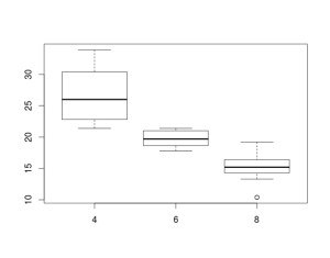
Boxplots are an excellent way of comparing groups visually. In this example, we will compare the ‘mpg’ or miles per gallon variable by the ‘cyl’ or number of cylinders in the engine variable in the ‘cars’ dataset. Below is the code and diagram followed by an explanation.

boxplot(mpg ~ cyl, data = cars)

Rplot

Here is what happened.

  1. We use the ‘boxplot’ function
  2. Within this function we tell are to plot mpg and cyl using the tilda  ” ~ ” to tell R to compare ‘mpg’ by the number of cylinders

The box of the boxplot tells you several things

  1. The bottom of the box tells you the 25th percentile
  2. The line in the middle of the box tells you the median
  3. The top of the box tells you the 75th percentile
  4. The bottom line tells you the minimum or lowest value excluding outliers
  5. The top line tells you the maximum or highest value excluding outliers

In order boxplot above, there are three types of cylinders 4, 6, and 8. For 4 cylinders the 25th percentile is about 23 mpg, the 50th percentile is about 26 mpg, while the 75th percentile is about 31 mpg. The minimum value was about 22 and the maximum value was about 35 mpg. A close look at the different blots indicates that four cylinder cars have the best mpg followed by six and finally eight cylinders.

Conclusions

Histograms and boxplots serve the purpose of describing numerical data in a visual manner. Nothing like a picture helps to explain abstract concepts such mean and median.

Assessing Reliability

In quantitative research, reliability measures an instruments stability and consistency. In simpler terms, reliability is how well an instrument is able to measure something repeatedly. There are several factors that can influence reliability. Some of the factors include unclear questions/statements, poor test administration procedures, and even the participants in the study.

In this post, we will look at different ways that a researcher can assess the reliability of an instrument. In particular, we will look at the following ways of measuring reliability…

  • Test-retest reliability
  • Alternative forms reliability
  • Kuder-Richardson Split Half Test
  • Coefficient Alpha

Test-Retest Reliability

Test-retest reliability assesses the reliability of an instrument by comparing results from several samples over time. A researcher will administer the instrument at two different times to the same participants. The researcher then analyzes the data and looks for a correlation between the results of the two different administrations of the instrument. in general, a correlation above about 0.6 is considered evidence of reasonable reliability of an instrument.

One major drawback of this approach is that often given the same instrument to the same people a second time influences the results of the second administration. It is important that a researcher is aware of this as it indicates that test-retest reliability is not foolproof.

Alternative Forms Reliability 

Alternative forms reliability involves the use of two different instruments that measure the same thing. The two different instruments are given to the same sample. The data from the two instruments are analyzed by calculating the correlation between them. Again, a correlation around 0.6 or higher is considered as an indication of reliability.

The major problem with this is that it is difficult to find two instruments that really measure the same thing. Often scales may claim to measure the same concept but they may both have different operational definitions of the concept.

Kuder-Richardson Split Half Test

The Kuder-Richardson test involves the reliability of categorical variables. In this approach, an instrument is cut in half and the correlation is found between the two halves of the instrument. This approach looks at internal consistency of the items of an instrument.

Coefficient Alpha

Another approach that looks at internal consistency is the Coefficient Alpha. This approach involves administering an instrument and analyze the Cronbach Alpha. Most statistical programs can calculate this number. Normally, scores above 0.7 indicate adequate reliability. The coefficient alpha can only be used for continuous variables like Lickert scales

Conclusion

Assessing reliability is important when conducting research. The approaches discussed here are among the most common. Which approach is best depends on the circumstances of the study that is being conducted.

Measuring Variables

When conducting quantitative research, one of the earliest things a researcher does is determine what their variables are. This involves developing an operational definition of the variable which description of how you define the variable as well as how you intend to measure it.

After developing an operational definition of the variable(s) of a study, it is now necessary to measure the variable in a way that is consistent with the operational definition. In general, there are five forms of measurement and they are…

  • Performance measures
  • Attitudinal measures
  • Behavioral observation
  • Factual Information
  • Web-based data collection

All forms of measurement involve an instrument which is a tool for actually recording what is measured.

Performance Measures

Performance measures assess a person’s ability to do something. Examples of instruments of this type include an aptitude test, intelligence test, or a rubric for assessing an essay. Often these form of measurement leads to “norms” that serves as a criterion for the progress of students.

Attitudinal Measures

Attitudinal measures assess peoples’ perception They are commonly associated with Lickert Scales (strongly disagree to strongly agree). This form of measurement allows a research access to the attitudes of hundreds instead of the attitudes of few as would be found in qualitative research.

Behavioral Observation

Behavioral observation is the observation of behaviors of interest to the researcher. The instrument involved is normally some sort of checklist. When the behavior is seen it is notated using tick marks.

Factual Information

Data that has already been collected and is available to the public is often called factual information.  The researcher takes this information and analyzes it to answer their questions.

Web-Based Data Collection

Surveys or interviews conducted over the internet are examples of web-based data collection. This is still relatively new. There are still people who question this approach as there are concerns over the representativeness of the sample.

Which Measure Should I Choose?

There are several guidelines to keep in mind when deciding how to measure variables.

  • What form of measurement are you able to complete?  Your personal expertise, as well as the context of your study, affected what you are able to do. Naturally, you want to avoid doing publication quality research with a measurement form you are unfamiliar with or do research in an uncooperative place.
  • What are your research questions? Research questions shape the entire study. A close look at research questions should reveal the most appropriate form of measurement.

The actual analysis of the data depends on the research questions. As such, almost any statistical technique can be applied for all of the forms of measurement. The only limitation is what the researcher wants to know.

Conclusion

Measuring variables is the heart of quantitative research. The approach taken depends on the skills of the researcher as well as the research questions. Ever form of measurement has its place when conducting research.

Types of Data

There are two basic types of data and they are qualitative and quantitative. Qualitative data is data that is often put into categories not based on numbers but often some other form of commonality. For example, if a person conduct interviews about student satisfaction, certain concepts, such as good teaching, may be repeated several times by different students. These statements are combined into one category of student satisfaction, which would be good teaching. There is no continuum of data in qualitative it is strictly the development of categories based on a criteria developed by the researcher.

Quantitative data is numerical data that is often based on a continuum. Example of quantitative data is such things as height, weight, and age.  You can treat quantitative data like qualitative by developing categories but this is a discussion for the future.

When to collect qualitative and quantitative data depends on the research questions of the researcher. Neither is superior to the other and it is the context that determines what is best.