Writing the final section of a research paper is the most exciting and at times most tricky part of the research process. The video below provides insights into writing the discussion and conclusion section of a paper.


Writing the final section of a research paper is the most exciting and at times most tricky part of the research process. The video below provides insights into writing the discussion and conclusion section of a paper.
Writing the results of a quantitative research paper can be tricky. However, there are some basic principles that can be powerful in bringing clarity to this experience/ The video below provides some basic insights into developing this section of a research paper.

The purpose of data analysis is to actually generate the answers to your research questions. In the video below you will find insights in to data entry, statistical tools, and answering research questions.

The purpose of a methodology is to articulate how you will answer your research questions. The video below explains the various part of a methodology along with examples.


The video below explains the differences between research questions, hypotheses, and objectives. This is important to understand because these terms are so commonly used when conducting research.

A review of literature in a a research paper is an critical step in the discover process of academic writing. The video below will provide some types on structuring a review of literature.

There are several different ways that a research question can be developed. In this video we will look at three different types of research question that are commonly used in social science quantitative research.

Research questions are a key component of working methodically through the research process. The video below provides some introductory information on defining and explaining traits of research questions.

The significance statement of a research paper two important ideas. The video below explains what these two ideas are and how to develop them when writing.

ad
A purpose statement is a critical component of the introduction of a research paper. In the video below you will learn about how to write this statement for your own research

Writing a research paper is an extremely challenging experience. The beginning in particular is perhaps the most difficult part as it is unclear what to do. The video below provides an overview of the different components of the introduction of a research paper.

Developing a statement of the problem is a an incredibly difficult thing to do. In the video below, we will look at how to shape and scope a problem statement in a quantitative study.

Identifying a research problem is one of the hardest parts of writing a research paper. If this is done poorly you may have to go back and redefine the problem our you may discover that you cannot go forward in your research. For this reason, the video below explains what a research problem is along with a criterion to consider when selecting potential research problem.

In the video below is a brief explanation of the various parts of an academic research paper. The main thrust was to show how these different parts work together to share the learning experience of the authors.


When it comes to measurement in research. There are some rules and concepts a student needs to be aware of that are not difficult to master but can be tricky. Measurement can be conducted at different levels. The two main levels are categorical and continuous.
Categorical measurement involves counting discrete values. An example of something measured at the categorical level is the cellphone brand. A cellphone can be Apple or Samsung, but it cannot be both. In other words, there is no phone out there that is half Samsung and half Apple. Being an Apple or Samsung phone is mutually exclusive, and no phone can have both qualities simultaneously. Therefore, categorical measurement deals with whole numbers, and generally, there are no additional rules to keep in mind.
However, with continuous measurement, things become more complicated. Continuous measurement involves an infinite number of potential values. For example, distance and weight can be measured continuously. A distance can be 1 km or 1.24 km, or 1.234. It all depends on the precision of the measurement tool. The point to remember now is that categorical measurement often has limit values that can be used while continuous has an almost limitless set of values that can be used.

Since the continuous measurement is so limitless, there are several additional concepts that a student needs to mastery. One, the units involved must always be included. At least one reason for this is that it is common to convert units from one to the other. However, with categorical data, you generally will not convert phone units to some other unit.
A second concern is to be aware of the precision and accuracy of your measurement. Precision has to do with how fine the measurement is. For example, you can measure something the to the tenth, the hundredth, the thousandth, etc. As you add decimals, you are improving the precision. Accuracy is how correct the measurement is. If a person’s weight is 80kg, but your measurement is 63.456789kg, this is an example of high precision with low accuracy.
Another important concept when dealing with continuous measurement is understanding how many significant figures are involved. The ideas of significant figures are explored below.
Significant figures
Significant figures are digit that contributes to the precision of a measurement. This term is not related to significance as defined in statistics related to hypothesis testing.
An example of significant figures is as follows. If you have a scale that measures to the thousandth of a kg, you must report measurements to the thousandths of a kg. For example, 2 kg is not how you would report this based on the precision of your tool. Rather, you would report 2.000kg. This implies that the weight is somewhere between 1.995 and 2.004 kg. This is really important if you are conducting measurements in the scientific domain.
There are also several rules in regards to determining the number of significant figures, and they are explained below
Each of the examples discussed so far has been individual examples. However, what happens when numbers are added or multiplied. The next section covers this in detail
Significant Figures in Math
Addition/Subtraction
When adding and subtracting measurements, you must report the measurement results with the less precise measurement.
Multiply/Divide
When multiply or dividing measurements report results with the same number of significant figures as the measurement with the fewest significant figures
This number is too long. The second number, 101, has three significant figures, so our answer will have 3 significant figures, 0.163m. The zero to the left of the decimal is insignificant and does not count in the total.
Converting Units
Finally, there are rules for converting units as well. To convert units, you must know the relationship that the two units have. For example, there are 2.54 cms per inch. Often this information is provided for you, and simply apply it. Once the relationship between units is known, it is common to use the factor label method for conversion. Below is an example.

To solve this problem, it is simply a matter of canceling the numerator of one fraction and the denominator of another fraction because, in this example, they are the same. This is shown below.

Essentially there was no calculation involved. Understanding shortcuts like this saves a tremendous amount of time. What is really important is that this idea applies to units as well. Below is an example.

In the example above, we are converting inches to meters. We know that there is 2.54cm in 1 inch. We set up our fractions as shown above. The inches cancel because they are in the numerator of one fraction and the denominator of another. The only unit left is cm. We multiply across and get our answer. Since 24.0cm has the fewest number of significant figures are the answer will also have three significant figures, and that is why its 61.0cm
Scientiifc Nottation
There can be problems with following the rules of significant figures. For example, if you want to convert meters to centimeters. There can be a problem.

The answer should only have three significant figures, but our answer has one significant figure. We need to move two zeros to the right of the decimal.
This is done with scientific notation as shown vbelow.

This simple trick allows us to keep the number of signifcant figures that we need without hhanging the value of then umber.
Below is an example of how to do this with a really small number that is a decimal.

Conclusion
This post explains some of the rules involved with numbers in scientific measurement. These rules are critical in terms of meeting expectations for communicating quantitative results.

Defining terms is one of the first things required when writing a research paper. However, it is also one of the hardest things to do as we often know what we want to study intuitively rather than literally. This post will provide guidance in the following
Each of the ideas above is fundamental to developing coherent research papers.
Concepts
A concept is a mental construct or a tool used to understand the world around us. An example of a concept would be intelligence, humor, motivation, desire. These terms have meaning, but they cannot be seen or observed directly. You cannot pick up intelligence, buy humor, or weigh either of these. However, you can tell when someone is intelligent or has a sense of humor.

This is because constructs are observed indirectly through behaviors, which provide evidence of the construct. For example, someone demonstrates intelligence through their academic success, how they speak, etc. A person can demonstrate humor by making others laugh through what they say. Concepts represent things around us that we want to study as researchers.
Defining Concepts
To define a concept for the purpose of research requires the following three things
The criteria listed above is essentially a definition of a conceptual definition. Below is an example of a conceptual definition of academic dishonesty
Below is a breakdown of this definition
Academic dishonesty is the extent to which individuals exhibit a disregard towards educational norms of scholarly integrity.
It becomes much easier to shape a research study with these three components.
Conceptual Definition Template
There is also a template readily available in books and the internet to generate a conceptual definition. Below is one example.
The concept of _____________ is defined as the extent to which
_________________________ exhibit the characteristic(s) of _______________.
Here is a revised version of our conceptual defintion of academic dishonesty
The concept of academic dishonesty is defined as the ewxtent to whcih invidivudals exhibit the characteristic of disregard towards educational norms of scholarly integrity.
The same three components are there. The wording is mostly the same, but having a template such as this can really save them time in formulating a study. It also helps make things clearer for them as they go forward with a project.
Operational Definition
Once a concept has been defined, it must next be operationalized. The operational definition indicates how a concept will be measured quantitatively. This means that a researcher must specify at least one metric. Below is an example using academic dishonesty again.
Conceptual Definition: Academic dishonesty is the extent to which an individual exhibits a disregard towards educational norms of scholarly integrity.
Operational Definition: Survey Items
In the example above, academic dishonesty was operationalized using survey items. In other words, we will measure people’s opinions about academic dishonesty by having them respond to survey items.
Measurement error happens when there is a disconnect between the conceptual definition and the measurement method. It can be hard to detect this, so students need to be careful when developing a study.
Measurement Models
A concept is not measured directly, as has already been mentioned. This means that when it is time to analyze our data, our contract is a latent or unobserved variable. The items on the survey are observed because people gave us this information directly. This means that the survey items are observed variables.
The measurement model links the latent variables with the observed variables statistically. A strong measurement model indicates that the observed variables correlate with the underlying latent variable or construct.
For example, academic dishonesty has been the latent variable example of this entire post. The survey items “it’s okay to cheat” and “it’s okay to turn in someon else’s work as my own” are observed variables. Using statistical tools, we can check if these observed variables are associated with our concept of academic dishonesty.
Conclusion
Defining concepts is one of the more challenging aspects of conducting research. It requires a researcher to know what they are trying to study and how to measure it. For students, this is challenging because articulating ideas in this manner is often not done in everyday life.

This post will explore several core concepts that are related to experimentation in research. These concepts include
Randomization
Randomization involves making sure that the order of the individual runs of the experiment are determined by chance. The main reason for this is to ensure that observations and error are independently distributed random variables themselves. Spreading out all variables in a similar manner helps with the validity of the results. This is because the error is averaged out among all variables and not only one.


Many computer software will automatically randomize the runs of an experiment for you. Such a process helps to eliminate any accidental patterns that may arise if you try to randomize yourself. A common mistake people make when doing experiments is to let convenience determine the run order. For example, if it is hard to set up equipment that can be used as an excuse to run the experiments in a way that is most convenient but may also influence the results.
There are times in which complete randomization is not possible. There are ways to address this statistically, as we will see in the future.
Replication
A replication is a repeated run of a particular factor combination. For example, let say you are looking at the role of gender (two levels) and class level (four levels) affects quiz score. One replication would be to have at least two female freshmen take the quiz.
The benefits of replication include the ability to estimate error and a more precise measurement of the mean for that particular combination of factors.
Another term confused with replication is repeated measurement. They are the same thing with the exception that repeated measurement leaves out randomization. In other words, with replication, the measurement is not consecutive but spread out, while with the repeated measurement, you would measure your variable repeatedly in a row.
Blocking
Blocking is used to improve the measurement accuracy of experiments by blocking the effect of nuisance factors. Nuisance factors are factors we do not care about. For example, if you are trying to assess the impact on quiz scores but do not care whether the quizzes are in the morning or afternoon, you can block for the time of day. You then randomly assign people to each block and rn the experiment.
The goal is to create blocks that are as homogeneous as possible, which means only afternoon people in the pm block and only morning people in the am block. Doing this helps to control for the influence of time of day.
Conclusion
The topics discussed here are foundational to experimental design. However, we don’t want to give the impression that this is all there is that you need to know. Instead, what is discussed here serves as a guide concerning other topics that need to be investigated.

This post will provide some basic ideas for developing experiments. The process of doing valid experiments is rather challenging as one misstep can make your results invalid. Therefore, care is needed when attempting to set up an experiment
Definition
An experiment is a process in which changes are made to input variables to see how they affect the output variable(s). The inputs are called controllable variables, while the outputs are called response variables. Other variables that cannot be controlled are called uncontrollable variables.
When developing an experiment, the experimenter’s approach or plan for experimenting is called the strategy of experimentation. Extensive planning is necessary to conduct an experiment, while the actual data collection is often not that difficult.


Best Guess Approach
There are several different strategies for experimentation. The best-guess approach involves manipulating input variables based on prior results from the output variable. For example, if you are teaching a math class and notice that students score better when they work in groups in the morning compared to working in the afternoon. You may switch to group work in the morning and see if lectures may further increase performance.
This guesswork can be highly efficient if you are familiar with the domain in which you are doing the experiments. However, if the guess is wrong, you have to continue guessing, and this can go on for a long time.
One-Factor-At-A-Time
Another strategy of experimentation is the one-factor-at-a-time (OFAT) approach. You begin by having a baseline for each factor (variable) and then vary each variable to see how it affects the output. For example, you can switch whether students study in the morning or even and see how it affects performance. Then you might test whether group work and individual work affect scores.
The biggest weakness with this is that you can see interactions between variables. Interactions are an instance in which one factor does not produce the same results at a different level of another factor. Interactions can be hard to understand, but sometimes when two factors are mapped at the same time with the response variable, the lines cross to indicate that there is an interaction.

Factorial Experiments
Factorial experiments involve varying factors together. For example, a 2^2 factorial design means four combinations of experiments with two variables are varied, and one response variable with four possible combinations of experiments. Often these types of experiments are drawn as a square, as shown below.

Each point represents a different combination of the two factors. The calculation of this involves subtracting the means of the variable or factor on the x-axis. If we run each combination twice, we would calculate the difference, as shown below.

The more significant this difference, the more likely there is a strong effect based on the independent variables in the model.
When the number of combinations becomes large and complicated to manage, it may not be practical to run all possible combinations. In this situation, an experimenter will use a fractional factorial experiment in which only some of the combinations are used. For example, if 32 experiments are possible (2^5), maybe only 12 of them are conducted. The calculation is the same as above, just with more groups to compare.
Conclusion
Experiments are a practical way to determine the best combination of factors or variables for a given output variable(s). The majority of the time is spent planning and designing the experiment, with the actual data collection being straightforward.

In research, there are many terms that have the same underlying meaning which can be confusing for researchers as they try to complete a project. The problem is that people have different backgrounds and learn different terms during their studies and when they try to work with others there is often confusion over what is what.
In this post, we will try to clarify as much as possible various terms that are used when referring to variables. We will look at the following during this discussion
Definition
The word variable has the root of “vary” and the suffix “able”. This literally means that a variable is something that is able to change. Examples include such concepts as height, weigh, salary, etc. All of these concepts change as you gather data from different people. Statistics is primarily about trying to explain and or understand the variability of variables.
However, to make things more confusing there are times in research when a variable dies not change or remains constant. This will be explained in greater detail in a moment.
Minimum You Need to Know
Two broad concepts that you need to understand regardless of the specific variable terms you encounter are the following
When we speak of independent and dependent variables we are looking at the relationship(s) between variables. Dependent variables are explained by independent variables. Therefore, one dimension of variables is understanding how they relate to each other and the most basic way to see this is independent vs dependent.
The second dimension to consider when thinking about variables is how they are measured which is captured with the terms categorical or continuous. A categorical variable has a finite number of values that can be used. Examples in clue gender, hair color, or cellphone brand. A person can only be male or female, have blue or brown eyes, and can only have one brand of cellphone.
Continuous variables are variables that can take on an infinite number of values. Salary, temperature, etc are all continuous in nature. It is possible to limit a continuous variable to categorical variable by creating intervals in which to place values. This is commonly done when creating bins for histograms. In sum, here are the four possible general variable types below
Natural, most models have one dependent categorical or continuous variable, however you can have any combination of continuous and categorical variables as independents. Remember that all variables have the above characteristics despite whatever terms is used for them.
Variable Synonyms
Below is a list of various names that variables go by in different disciplines. This is by no means an exhaustive list.
Experimental variable
A variable whose values are independent of any changes in the values of other variables. In other words, an experimental variable is just another term for independent variable.
Manipulated Variable
A variable that is independent in an experiment but whose value/behavior the researcher is able to control or manipulate. This is also another term for an independent variable.
Control Variable
A variable whose value does not change. Controlling a variable helps to explain the relationship between the independent and dependent variable in an experiment by making sure the control variable has not influenced in the model
Responding Variable
The dependent variable in an experiment. It responds to the experimental variable.
Intervening Variable
This is a hypothetical variable. It is used to explain the causal links between variables. Since they are hypothetical, they are observed in an actual experiment. For example, if you are looking at a strong relationship between income and life expectancy and find a positive relationship. The intervening variable for this may be access to healthcare. People who make more money have more access to health care and this contributes to them often living longer.
Mediating Variable
This is the same thing as an intervening variable. The difference being often that the mediating variable is not always hypothetical in nature and is often measured it’s self.
Confounding Variable
A confounder is a variable that influences both the independent and dependent variable, causing a spurious or false association. Often a confounding variable is a causal idea and cannot be described in terms of correlations or associations with other variables. In other words, it is often the same thing as an intervening variable.
Explanatory Variable
This variable is the same as an independent variable. The difference being that an independent variable is not influenced by any other variables. However, when independence is not for sure, than the variable is called an explanatory variable.
Predictor Variable
A predictor variable is an independent variable. This term is commonly used for regression analysis.
Outcome Variable
An outcome variable is a dependent variable in the context of regression analysis.
Observed Variable
This is a variable that is measured directly. An example would be gender or height. There is no psychology construct to infer the meaning of such variables.
Unobserved Variable
Unobserved variables are constructs that cannot be measured directly. In such situations, observe variables are used to try to determine the characteristic of the unobserved variable. For example, it is hard to measure addiction directly. Instead, other things will be measure to infer addiction such as health, drug use, performance, etc. The measures of this observed variables will indicate the level of the unobserved variable of addiction
Features
A feature is an independent variable in the context of machine learning and data science.
Target Variable
A target variable is the dependent variable in the context f machine learning and data science.
To conclude this, below is a summary of the different variables discussed and whether they are independent, dependent, or neither.
| Independent | Dependent | Neither |
|---|---|---|
| Experimental | Responding | Control |
| Manipulated | Target | Explanatory |
| Predictor | Outcome | Intervening |
| Feature | Mediating | |
| Observed | ||
| Unobserved | ||
| Confounding |
You can see how confusing this can be. Even though variables are mostly independent or dependent, there is a class of variables that do not fall into either category. However, for most purposes, the first to columns cover the majority of needs in simple research.
Conclusion
The confusion over variables is mainly due to an inconsistency in terms across variables. There is nothing right or wrong about the different terms. They all developed in different places to address the same common problem. However, for students or those new to research, this can be confusing and this post hopefully helps to clarify this.

Exploratory data analysis is the main task of a Data Scientist with as much as 60% of their time being devoted to this task. As such, the majority of their time is spent on something that is rather boring compared to building models.
This post will provide a simple example of how to analyze a dataset from the website called Kaggle. This dataset is looking at how is likely to default on their credit. The following steps will be conducted in this analysis.
This is not an exhaustive analysis but rather a simple one for demonstration purposes. The dataset is available here
Load Libraries and Data
Here are some packages we will need
import pandas as pd
import matplotlib.pyplot as plt
import seaborn as sns
from scipy.stats import norm
from sklearn import tree
from scipy import stats
from sklearn import metrics
You can load the data with the code below
df_train=pd.read_csv('/application_train.csv')
You can examine what variables are available with the code below. This is not displayed here because it is rather long
df_train.columns
df_train.head()
Missing Data
I prefer to deal with missing data first because missing values can cause errors throughout the analysis if they are not dealt with immediately. The code below calculates the percentage of missing data in each column.
total=df_train.isnull().sum().sort_values(ascending=False)
percent=(df_train.isnull().sum()/df_train.isnull().count()).sort_values(ascending=False)
missing_data=pd.concat([total,percent],axis=1,keys=['Total','Percent'])
missing_data.head()

                           Total   Percent
COMMONAREA_MEDI           214865  0.698723
COMMONAREA_AVG            214865  0.698723
COMMONAREA_MODE           214865  0.698723
NONLIVINGAPARTMENTS_MODE  213514  0.694330
NONLIVINGAPARTMENTS_MEDI  213514  0.694330
Only the first five values are printed. You can see that some variables have a large amount of missing data. As such, they are probably worthless for inclusion in additional analysis. The code below removes all variables with any missing data.
pct_null = df_train.isnull().sum() / len(df_train)
missing_features = pct_null[pct_null > 0.0].index
df_train.drop(missing_features, axis=1, inplace=True)
You can use the .head() function if you want to see how many variables are left.
Data Description & Visualization
For demonstration purposes, we will print descriptive stats and make visualizations of a few of the variables that are remaining.
round(df_train['AMT_CREDIT'].describe())
Out[8]:
count     307511.0
mean      599026.0
std       402491.0
min        45000.0
25%       270000.0
50%       513531.0
75%       808650.0
max      4050000.0

sns.distplot(df_train['AMT_CREDIT']

round(df_train['AMT_INCOME_TOTAL'].describe())
Out[10]:
count       307511.0
mean        168798.0
std         237123.0
min          25650.0
25%         112500.0
50%         147150.0
75%         202500.0
max      117000000.0
sns.distplot(df_train['AMT_INCOME_TOTAL']

I think you are getting the point. You can also look at categorical variables using the groupby() function.
We also need to address categorical variables in terms of creating dummy variables. This is so that we can develop a model in the future. Below is the code for dealing with all the categorical variables and converting them to dummy variable’s
df_train.groupby('NAME_CONTRACT_TYPE').count()
dummy=pd.get_dummies(df_train['NAME_CONTRACT_TYPE'])
df_train=pd.concat([df_train,dummy],axis=1)
df_train=df_train.drop(['NAME_CONTRACT_TYPE'],axis=1)

df_train.groupby('CODE_GENDER').count()
dummy=pd.get_dummies(df_train['CODE_GENDER'])
df_train=pd.concat([df_train,dummy],axis=1)
df_train=df_train.drop(['CODE_GENDER'],axis=1)

df_train.groupby('FLAG_OWN_CAR').count()
dummy=pd.get_dummies(df_train['FLAG_OWN_CAR'])
df_train=pd.concat([df_train,dummy],axis=1)
df_train=df_train.drop(['FLAG_OWN_CAR'],axis=1)

df_train.groupby('FLAG_OWN_REALTY').count()
dummy=pd.get_dummies(df_train['FLAG_OWN_REALTY'])
df_train=pd.concat([df_train,dummy],axis=1)
df_train=df_train.drop(['FLAG_OWN_REALTY'],axis=1)

df_train.groupby('NAME_INCOME_TYPE').count()
dummy=pd.get_dummies(df_train['NAME_INCOME_TYPE'])
df_train=pd.concat([df_train,dummy],axis=1)
df_train=df_train.drop(['NAME_INCOME_TYPE'],axis=1)

df_train.groupby('NAME_EDUCATION_TYPE').count()
dummy=pd.get_dummies(df_train['NAME_EDUCATION_TYPE'])
df_train=pd.concat([df_train,dummy],axis=1)
df_train=df_train.drop(['NAME_EDUCATION_TYPE'],axis=1)

df_train.groupby('NAME_FAMILY_STATUS').count()
dummy=pd.get_dummies(df_train['NAME_FAMILY_STATUS'])
df_train=pd.concat([df_train,dummy],axis=1)
df_train=df_train.drop(['NAME_FAMILY_STATUS'],axis=1)

df_train.groupby('NAME_HOUSING_TYPE').count()
dummy=pd.get_dummies(df_train['NAME_HOUSING_TYPE'])
df_train=pd.concat([df_train,dummy],axis=1)
df_train=df_train.drop(['NAME_HOUSING_TYPE'],axis=1)

df_train.groupby('ORGANIZATION_TYPE').count()
dummy=pd.get_dummies(df_train['ORGANIZATION_TYPE'])
df_train=pd.concat([df_train,dummy],axis=1)
df_train=df_train.drop(['ORGANIZATION_TYPE'],axis=1)
You have to be careful with this because now you have many variables that are not necessary. For every categorical variable you must remove at least one category in order for the model to work properly. Below we did this manually.
df_train=df_train.drop(['Revolving loans','F','XNA','N','Y','SK_ID_CURR,''Student','Emergency','Lower secondary','Civil marriage','Municipal apartment'],axis=1)
Below are some boxplots with the target variable and other variables in the dataset.
f,ax=plt.subplots(figsize=(8,6))
fig=sns.boxplot(x=df_train['TARGET'],y=df_train['AMT_INCOME_TOTAL'])

There is a clear outlier there. Below is another boxplot with a different variable
f,ax=plt.subplots(figsize=(8,6))
fig=sns.boxplot(x=df_train['TARGET'],y=df_train['CNT_CHILDREN'])

It appears several people have more than 10 children. This is probably a typo.
Below is a correlation matrix using a heatmap technique
corrmat=df_train.corr()
f,ax=plt.subplots(figsize=(12,9))
sns.heatmap(corrmat,vmax=.8,square=True)

The heatmap is nice but it is hard to really appreciate what is happening. The code below will sort the correlations from least to strongest, so we can remove high correlations.
c = df_train.corr().abs()

s = c.unstack()
so = s.sort_values(kind="quicksort")
print(so.head())

FLAG_DOCUMENT_12 FLAG_MOBIL 0.000005
FLAG_MOBIL FLAG_DOCUMENT_12 0.000005
Unknown FLAG_MOBIL 0.000005
FLAG_MOBIL Unknown 0.000005
Cash loans FLAG_DOCUMENT_14 0.000005
The list is to long to show here but the following variables were removed for having a high correlation with other variables.
df_train=df_train.drop(['WEEKDAY_APPR_PROCESS_START','FLAG_EMP_PHONE','REG_CITY_NOT_WORK_CITY','REGION_RATING_CLIENT','REG_REGION_NOT_WORK_REGION'],axis=1)
Below we check a few variables for homoscedasticity, linearity, and normality using plots and histograms
sns.distplot(df_train['AMT_INCOME_TOTAL'],fit=norm)
fig=plt.figure()
res=stats.probplot(df_train['AMT_INCOME_TOTAL'],plot=plt)


This is not normal
sns.distplot(df_train['AMT_CREDIT'],fit=norm)
fig=plt.figure()
res=stats.probplot(df_train['AMT_CREDIT'],plot=plt)


This is not normal either. We could do transformations, or we can make a non-linear model instead.
Model Development
Now comes the easy part. We will make a decision tree using only some variables to predict the target. In the code below we make are X and y dataset.
X=df_train[['Cash loans','DAYS_EMPLOYED','AMT_CREDIT','AMT_INCOME_TOTAL','CNT_CHILDREN','REGION_POPULATION_RELATIVE']]
y=df_train['TARGET']
The code below fits are model and makes the predictions
clf=tree.DecisionTreeClassifier(min_samples_split=20)
clf=clf.fit(X,y)
y_pred=clf.predict(X)
Below is the confusion matrix followed by the accuracy
print (pd.crosstab(y_pred,df_train['TARGET']))
TARGET       0      1
row_0
0       280873  18493
1         1813   6332
accuracy_score(y_pred,df_train['TARGET'])
Out[47]: 0.933966589813047
Lastly, we can look at the precision, recall, and f1 score
print(metrics.classification_report(y_pred,df_train['TARGET']))
              precision    recall  f1-score   support

           0       0.99      0.94      0.97    299366
           1       0.26      0.78      0.38      8145

   micro avg       0.93      0.93      0.93    307511
   macro avg       0.62      0.86      0.67    307511
weighted avg       0.97      0.93      0.95    307511
This model looks rather good in terms of accuracy of the training set. It actually impressive that we could use so few variables from such a large dataset and achieve such a high degree of accuracy.
Conclusion
Data exploration and analysis is the primary task of a data scientist. This post was just an example of how this can be approached. Of course, there are many other creative ways to do this but the simplistic nature of this analysis yielded strong results

In this post, we will learn how to conduct a hierarchical regression analysis in R. Hierarchical regression analysis is used in situation in which you want to see if adding additional variables to your model will significantly change the r2 when accounting for the other variables in the model. This approach is a model comparison approach and not necessarily a statistical one.
We are going to use the “Carseats” dataset from the ISLR package. Our goal will be to predict total sales using the following independent variables in three different models.
model 1 = intercept only
model 2 = Sales~Urban + US + ShelveLoc
model 3 = Sales~Urban + US + ShelveLoc + price + income
model 4 = Sales~Urban + US + ShelveLoc + price + income + Advertising
Often the primary goal with hierarchical regression is to show that the addition of a new variable builds or improves upon a previous model in a statistically significant way. For example, if a previous model was able to predict the total sales of an object using three variables you may want to see if a new additional variable you have in mind may improve model performance. Another way to see this is in the following research question
Is a model that explains the total sales of an object with Urban location, US location, shelf location, price, income and advertising cost as independent variables superior in terms of R2 compared to a model that explains total sales with Urban location, US location, shelf location, price and income as independent variables?
In this complex research question we essentially want to know if adding advertising cost will improve the model significantly in terms of the r square. The formal steps that we will following to complete this analysis is as follows.
We will now begin our analysis. Below is some initial code
library(ISLR)
data("Carseats")We now need to create our models. Model 1 will not have any variables in it and will be created for the purpose of obtaining the total sum of squares. Model 2 will include demographic variables. Model 3 will contain the initial model with the continuous independent variables. Lastly, model 4 will contain all the information of the previous models with the addition of the continuous independent variable of advertising cost. Below is the code.
model1 = lm(Sales~1,Carseats)
model2=lm(Sales~Urban + US + ShelveLoc,Carseats)
model3=lm(Sales~Urban + US + ShelveLoc + Price + Income,Carseats)
model4=lm(Sales~Urban + US + ShelveLoc + Price + Income + Advertising,Carseats)
We can now turn to the ANOVA analysis for model comparison #ANOVA Calculation We will use the anova() function to calculate the total sum of square for model 0. This will serve as a baseline for the other models for calculating r square
anova(model1,model2,model3,model4)## Analysis of Variance Table
##
## Model 1: Sales ~ 1
## Model 2: Sales ~ Urban + US + ShelveLoc
## Model 3: Sales ~ Urban + US + ShelveLoc + Price + Income
## Model 4: Sales ~ Urban + US + ShelveLoc + Price + Income + Advertising
## Res.Df RSS Df Sum of Sq F Pr(>F)
## 1 399 3182.3
## 2 395 2105.4 4 1076.89 89.165 < 2.2e-16 ***
## 3 393 1299.6 2 805.83 133.443 < 2.2e-16 ***
## 4 392 1183.6 1 115.96 38.406 1.456e-09 ***
## ---
## Signif. codes: 0 '***' 0.001 '**' 0.01 '*' 0.05 '.' 0.1 ' ' 1For now, we are only focusing on the residual sum of squares. Here is a basic summary of what we know as we compare the models.
model 1 = sum of squares = 3182.3
model 2 = sum of squares = 2105.4 (with demographic variables of Urban, US, and ShelveLoc)
model 3 = sum of squares = 1299.6 (add price and income)
model 4 = sum of squares = 1183.6 (add Advertising)
Each model is statistical significant which means adding each variable lead to some improvement.
By adding price and income to the model we were able to improve the model in a statistically significant way. The r squared increased by .25 below is how this was calculated.
2105.4-1299.6 #SS of Model 2 - Model 3## [1] 805.8805.8/ 3182.3 #SS difference of Model 2 and Model 3 divided by total sum of sqaure ie model 1## [1] 0.2532131When we add Advertising to the model the r square increases by .03. The calculation is below
1299.6-1183.6 #SS of Model 3 - Model 4## [1] 116116/ 3182.3 #SS difference of Model 3 and Model 4 divided by total sum of sqaure ie model 1## [1] 0.03645162We will now look at a summary of each model using the summary() function.
summary(model2)##
## Call:
## lm(formula = Sales ~ Urban + US + ShelveLoc, data = Carseats)
##
## Residuals:
## Min 1Q Median 3Q Max
## -6.713 -1.634 -0.019 1.738 5.823
##
## Coefficients:
## Estimate Std. Error t value Pr(>|t|)
## (Intercept) 4.8966 0.3398 14.411 < 2e-16 ***
## UrbanYes 0.0999 0.2543 0.393 0.6947
## USYes 0.8506 0.2424 3.510 0.0005 ***
## ShelveLocGood 4.6400 0.3453 13.438 < 2e-16 ***
## ShelveLocMedium 1.8168 0.2834 6.410 4.14e-10 ***
## ---
## Signif. codes: 0 '***' 0.001 '**' 0.01 '*' 0.05 '.' 0.1 ' ' 1
##
## Residual standard error: 2.309 on 395 degrees of freedom
## Multiple R-squared: 0.3384, Adjusted R-squared: 0.3317
## F-statistic: 50.51 on 4 and 395 DF, p-value: < 2.2e-16summary(model3)##
## Call:
## lm(formula = Sales ~ Urban + US + ShelveLoc + Price + Income,
## data = Carseats)
##
## Residuals:
## Min 1Q Median 3Q Max
## -4.9096 -1.2405 -0.0384 1.2754 4.7041
##
## Coefficients:
## Estimate Std. Error t value Pr(>|t|)
## (Intercept) 10.280690 0.561822 18.299 < 2e-16 ***
## UrbanYes 0.219106 0.200627 1.092 0.275
## USYes 0.928980 0.191956 4.840 1.87e-06 ***
## ShelveLocGood 4.911033 0.272685 18.010 < 2e-16 ***
## ShelveLocMedium 1.974874 0.223807 8.824 < 2e-16 ***
## Price -0.057059 0.003868 -14.752 < 2e-16 ***
## Income 0.013753 0.003282 4.190 3.44e-05 ***
## ---
## Signif. codes: 0 '***' 0.001 '**' 0.01 '*' 0.05 '.' 0.1 ' ' 1
##
## Residual standard error: 1.818 on 393 degrees of freedom
## Multiple R-squared: 0.5916, Adjusted R-squared: 0.5854
## F-statistic: 94.89 on 6 and 393 DF, p-value: < 2.2e-16summary(model4)##
## Call:
## lm(formula = Sales ~ Urban + US + ShelveLoc + Price + Income +
## Advertising, data = Carseats)
##
## Residuals:
## Min 1Q Median 3Q Max
## -5.2199 -1.1703 0.0225 1.0826 4.1124
##
## Coefficients:
## Estimate Std. Error t value Pr(>|t|)
## (Intercept) 10.299180 0.536862 19.184 < 2e-16 ***
## UrbanYes 0.198846 0.191739 1.037 0.300
## USYes -0.128868 0.250564 -0.514 0.607
## ShelveLocGood 4.859041 0.260701 18.638 < 2e-16 ***
## ShelveLocMedium 1.906622 0.214144 8.903 < 2e-16 ***
## Price -0.057163 0.003696 -15.467 < 2e-16 ***
## Income 0.013750 0.003136 4.384 1.50e-05 ***
## Advertising 0.111351 0.017968 6.197 1.46e-09 ***
## ---
## Signif. codes: 0 '***' 0.001 '**' 0.01 '*' 0.05 '.' 0.1 ' ' 1
##
## Residual standard error: 1.738 on 392 degrees of freedom
## Multiple R-squared: 0.6281, Adjusted R-squared: 0.6214
## F-statistic: 94.56 on 7 and 392 DF, p-value: < 2.2e-16You can see for yourself the change in the r square. From model 2 to model 3 there is a 26 point increase in r square just as we calculated manually. From model 3 to model 4 there is a 3 point increase in r square. The purpose of the anova() analysis was determined if the significance of the change meet a statistical criterion, The lm() function reports a change but not the significance of it.
Hierarchical regression is just another potential tool for the statistical researcher. It provides you with a way to develop several models and compare the results based on any potential improvement in the r square.

Working with students over the years has led me to the conclusion that often students do not understand the connection between variables, quantitative research questions and the statistical tools


used to answer these questions. In other words, students will take statistics and pass the class. Then they will take research methods, collect data, and have no idea how to analyze the data even though they have the necessary skills in statistics to succeed.
This means that the students have a theoretical understanding of statistics but struggle in the application of it. In this post, we will look at some of the connections between research questions and statistics.
Variables
Variables are important because how they are measured affects the type of question you can ask and get answers to. Students often have no clue how they will measure a variable and therefore have no idea how they will answer any research questions they may have.
Another aspect that can make this confusing is that many variables can be measured more than one way. Sometimes the variable “salary” can be measured in a continuous manner or in a categorical manner. The superiority of one or the other depends on the goals of the research.
It is critical to support students to have a thorough understanding of variables in order to support their research.
Types of Research Questions
In general, there are two types of research questions. These two types are descriptive and relational questions. Descriptive questions involve the use of descriptive statistic such as the mean, median, mode, skew, kurtosis, etc. The purpose is to describe the sample quantitatively with numbers (ie the average height is 172cm) rather than relying on qualitative descriptions of it (ie the people are tall).
Below are several example research questions that are descriptive in nature.
These questions are not intellectually sophisticated but they are all answerable with descriptive statistical tools. Question 1 can be answered by calculating the mean. Question 2 can be answered by determining how many passed the exam and dividing by the total sample size. Question 3 can be answered by calculating the mean of all the survey items that are used to measure respondents perception of the cafeteria.
Understanding the link between research question and statistical tool is critical. However, many people seem to miss the connection between the type of question and the tools to use.
Relational questions look for the connection or link between variables. Within this type there are two sub-types. Comparison question involve comparing groups. The other sub-type is called relational or an association question.
Comparison questions involve comparing groups on a continuous variable. For example, comparing men and women by height. What you want to know is whether there is a difference in the height of men and women. The comparison here is trying to determine if gender is related to height. Therefore, it is looking for a relationship just not in the way that many student understand. Common comparison questions include the following.male
Each of these questions can be answered using ANOVA or if we want to get technical and there are only two groups (ie gender) we can use t-test. This is a broad overview and does not include the complexities of one-sample test and or paired t-test.
Relational or association question involve continuous variables primarily. The goal is to see how variables move together. For example, you may look for the relationship between height and weight of students. Common questions include the following.
Questions 1 can be answered by calculating the correlation. Question 2 requires the use of linear regression in order to answer the question.
Conclusion
The challenging as a teacher is showing the students the connection between statistics and research questions from the real world. It takes time for students to see how the question inspire the type of statistical tool to use. Understanding this is critical because it helps to frame the possibilities of what to do in research based on the statistical knowledge one has.

A common problem in machine learning is data quality. In other words, if the data is bad the model will be bad even if it is designed using best practices. Below is a short of some possible problems with data
Naturally, this list is not exhaustive. Whenever some of the above situations take place it can lead to a model that has bias or variance. Bias takes place when the model highly over and under estimates values. This is common in regression when the relationship among the variables is not linear. The linear line that is developed by the model works sometimes but is often erroneous.


Variance is when the model is too sensitive to the characteristics of the training data. This means that the model develops a complex way to classify or performs regression that does not generalize to other datasets
One solution to addressing these problems is the use of cross-validation. Cross-validation involves dividing the training set into several folds. For example, you may divide the data into 10 folds. With 9 folds you train the data and with the 10rh fold you test it. You then calculate the average prediction or classification of the ten test folds. This method is commonly called k-folds cross-validation. This process helps to stabilize the results of the final model. We will now look at how to do this using Python.
Data Preparation
We will develop a regression model using the PSID dataset. Our goal will be to predict earnings based on the other variables in the dataset. Below is some initial code.
import pandas as pd
import numpy as np
from pydataset import data
from sklearn.model_selection import train_test_split
from sklearn.linear_model import LinearRegression
from sklearn.metrics import mean_squared_error
from sklearn.model_selection import KFold
from sklearn.model_selection import cross_val_score
We now need to load the dataset PSID. When this is done, there are several things we also need to.
Below is the code for completing these steps
df=data('PSID').dropna()
df.loc[df.married!= 'married', 'married'] = 0
df.loc[df.married== 'married','married'] = 1
df['married'] = df['married'].astype(int)
df['marry']=df.married
The code above loads the data while dropping the NAs. We then use the .loc function to make everyone who is not married a 0 and everyone who is married a 1. This variable is then converted to an integer using the .astype function. Lastly, we make a new variable called ‘marry’ and store our data there.
There is one other problem we need to address. In the ‘kids’ and the ‘educatn’ variable are values of 98 and 99. In the original survey, these responses meant that the person did not want to say how man kids or how much education they had or that they did not know. We will remove these individuals from the sample using the code below.
df.drop(df.loc[df['kids']>90].index, inplace=True)
df.drop(df.loc[df['educatn']>90].index, inplace=True)
The code above tells Python to remove in values greater than 90. With this We can now make are dataset that includes the independent variables and the dataset that contains the dependent variable.
X=df[['age','educatn','hours','kids','marry']]
y=df['earnings']
Model Development
We are now going to make several models and use the mean squared error as our way of comparing them. The first model will use all of the data. The second model will use the training data. The third model will use cross-validation. Below is the code for the first model that uses all of the data,
regression=LinearRegression()
regression.fit(X,y)
first_model=(mean_squared_error(y_true=y,y_pred=regression.predict(X)))
print(first_model)
138544429.96275884
For the second model, we first need to make our train and test sets. Then we will run our model. The code is below.
X_train,X_test,y_train,y_test=train_test_split(X,y,test_size=.3,random_state=5)
regression.fit(X_train,y_train)
second_model=(mean_squared_error(y_true=y_train,y_pred=regression.predict(X_train)))
print(second_model)
148286805.4129756
You can see that the number are somewhat different. This is to be expected when dealing with different sample sizes. With cross validation using the full dataset we get results similar to the first model we developed. This is done through an instance of the KFold function. For KFold we want 10 folds, we want to shuffle the data, and set the seed.
The other function we need is the cross_val_score function. In this function, we set the type of model, the data we will use, the metric for evaluation, and the characteristics of the type of cross-validation. Once this is done we print the mean and standard deviation of the fold results. Below is the code.
crossvalidation=KFold(n_splits=10,shuffle=True,random_state=1)
scores=cross_val_score(regression,X,y,scoring='neg_mean_squared_error',cv=crossvalidation,n_jobs=1)
print(len(scores),np.mean(np.abs(scores)),np.std(scores))
10 138817648.05153447 35451961.12217143
These numbers are closer to what is expected from the dataset. Despite the fact that we didn’t use all the data at the same time. You can also run these results on the training set as well for additional comparison.
Conclusion
This post provides an example of cross-validation in Python. The use of cross-validation helps to stabilize the results that ma come from your model. With increase stability comes increased confidence in your models ability to generalize to other datasets.

Writing the results of a research paper is difficult. As a researcher, you have to try and figure out if you answered the question. In addition, you have to figure out what information is important enough to share. As such it is easy to get stuck at this stage of the research experience. Below are some ideas to help with speeding up this process.
Consider the Order of the Answers
This may seem obvious but probably the best advice I could give a student when writing their results section is to be sure to answer their questions in the order they presented them in the introduction of their study. This helps with cohesion and coherency. The reader is anticipating answers to these questions and they often subconsciously remember the order the questions came in.
If a student answers the questions out of order it can be jarring for the reader. When this happens the reader starts to double check what the questions were and they begin to second-guess their understanding of the paper which reflects poorly on the writer. An analogy would be that if you introduce three of your friends to your parents you might share each person’s name and then you might go back and share a little bit of personal information about each friend. When we do this we often go in order 1st 2nd 3rd friend and then going back and talking about the 1st friend. The same courtesy should apply when answering research questions in the results section. Whoever was first is shared first etc.
Consider how to Represent the Answers
Another aspect to consider is the presentation of the answers. Should everything be in text? What about the use of visuals and tables? The answers depend on several factors
Know when to Interpret
Sometimes I have had students try to explain the results while presenting them. I cannot say this is wrong, however, it can be confusing. The reason it is so confusing is that the student is trying to do two things at the same time which are present the results and interpret them. This would be ok in a presentation and even expected but when someone is reading a paper it is difficult to keep two separate threads of thought going at the same time. Therefore, the meaning or interpretation of the results should be saved for the Discussion Conclusion section.
Conclusion
Presenting the results is in many ways the high point of a research experience. It is not easy to take numerical results and try to capture the useful information clearly. As such, the advice given here is intending to help support this experience

Writing a review of literature can be challenging for students. The purpose here is to try and synthesize a huge amount of information and to try and communicate it clearly to someone who has not read what you have read.
From my experience working with students, I have developed several tips that help them to make faster decisions and to develop their writing as well.
Remember the Purpose
Often a student will collect as many articles as possible and try to throw them all together to make a review of the literature. This naturally leads to problems of the paper sounded like a shopping list of various articles. Neither interesting nor coherent.
Instead, when writing a review of literature a student should keep in mind the question
What do my readers need to know in order to understand my study?
This is a foundational principle when writing. Readers don’t need to know everything only what they need to know to appreciate the study they are ready. An extension of this is that different readers need to know different things. As such, there is always a contextual element to framing a review of the literature.
Consider the Format
When working with a student, I always recommend the following format to get there writing started.
For each major variable in your study do the following…
Definition
There first thing that needs to be done is to provide a definition of the construct. This is important because many constructs are defined many different ways. This can lead to confusion if the reader is thinking one definition and the writer is thinking another.
Examples and Theories
Step 2 is more complex. After a definition is provided the student can either provide an example of what this looks like in the real world and or provide more information in regards to theories related to the construct.
Sometimes examples are useful. For example, if writing a paper on addiction it would be useful to not only define it but also to provide examples of the symptoms of addiction. The examples help the reader to see what used to be an abstract definition in the real world.
Theories are important for providing a deeper explanation of a construct. Theories tend to be highly abstract and often do not help a reader to understand the construct better. One benefit of theories is that they provide a historical background of where the construct came from and can be used to develop the significance of the study as the student tries to find some sort of gap to explore in their own paper.
Often it can be beneficial to include both examples and theories as this demonstrates stronger expertise in the subject matter. In theses and dissertations, both are expected whenever possible. However, for articles space limitations and knowing the audience affects the inclusion of both.
Relevant Studies
The relevant studies section is similar breaking news on CNN. The relevant studies should generally be newer. In the social sciences, we are often encouraged to look at literature from the last five years, perhaps ten years in some cases. Generally, readers want to know what has happened recently as experience experts are familiar with older papers. This rule does not apply as strictly to theses and dissertations.
Once recent literature has been found the student needs to organize it thematically. The reason for a thematic organization is that the theme serves as the main idea of the section and the studies themselves serve as the supporting details. This structure is surprisingly clear for many readers as the predictable nature allows the reader to focus on content rather than on trying to figure out what the author is tiring to say. Below is an example
There are several challenges with using technology in class(ref, 2003; ref 2010). For example, Doe (2009) found that technology can be unpredictable in the classroom. James (2010) found that like of training can lead some teachers to resent having to use new technology
The main idea here is “challenges with technology.” The supporting details are Doe (2009) and James (2010). This concept of themes is much more complex than this and can include several paragraphs and or pages.
Conclusion
This process really cuts down on the confusion of students writing. For stronger students, they can be free to do what they want. However, many students require structure and guidance when the first begin writing research papers

There are many different ways in which the variables of a regression model can be selected. In this post, we look at several common ways in which to select variables or features for a regression model. In particular, we look at the following.
Best Subset Regression
Best subset regression fits a regression model for every possible combination of variables. The “best” model can be selected based on such criteria as the adjusted r-square, BIC (Bayesian Information Criteria), etc.
The primary drawback to best subset regression is that it becomes impossible to compute the results when you have a large number of variables. Generally, when the number of variables exceeds 40 best subset regression becomes too difficult to calculate.
Stepwise Selection
Stepwise selection involves adding or taking away one variable at a time from a regression model. There are two forms of stepwise selection and they are forward and backward selection.
In forward selection, the computer starts with a null model ( a model that calculates the mean) and adds one variable at a time to the model. The variable chosen is the one the provides the best improvement to the model fit. This process reduces greatly the number of models that need to be fitted in comparison to best subset regression.
Backward selection starts the full model and removes one variable at a time based on which variable improves the model fit the most. The main problem with either forward or backward selection is that the best model may not always be selected in this process. In addition, backward selection must have a sample size that is larger than the number of variables.
Deciding Which to Choose
Best subset regression is perhaps most appropriate when you have a small number of variables to develop a model with, such as less than 40. When the number of variables grows forward or backward selection are appropriate. If the sample size is small forward selection may be a better choice. However, if the sample size is large as in the number of examples is greater than the number of variables it is now possible to use backward selection.
Conclusion
The examples here are some of the most basic ways to develop a regression model. However, these are not the only ways in which this can be done. What these examples provide is an introduction to regression model development. In addition, these models provide some sort of criteria for the addition or removal of a variable based on statistics rather than intuition.
K-nearest neighbor is one of many nonlinear algorithms that can be used in machine learning. By non-linear I mean that a linear combination of the features or variables is not needed in order to develop decision boundaries. This allows for the analysis of data that naturally does not meet the assumptions of linearity.
KNN is also known as a “lazy learner”. This means that there are known coefficients or parameter estimates. When doing regression we always had coefficient outputs regardless of the type of regression (ridge, lasso, elastic net, etc.). What KNN does instead is used K nearest neighbors to give a label to an unlabeled example. Our job when using KNN is to determine the number of K neighbors to use that is most accurate based on the different criteria for assessing the models.
In this post, we will develop a KNN model using the “Mroz” dataset from the “Ecdat” package. Our goal is to predict if someone lives in the city based on the other predictor variables. Below is some initial code.
library(class);library(kknn);library(caret);library(corrplot)library(reshape2);library(ggplot2);library(pROC);library(Ecdat)
data(Mroz)
str(Mroz)
## 'data.frame':    753 obs. of  18 variables:
##  $ work      : Factor w/ 2 levels "yes","no": 2 2 2 2 2 2 2 2 2 2 ...
##  $ hoursw    : int  1610 1656 1980 456 1568 2032 1440 1020 1458 1600 ...
##  $ child6    : int  1 0 1 0 1 0 0 0 0 0 ...
##  $ child618  : int  0 2 3 3 2 0 2 0 2 2 ...
##  $ agew      : int  32 30 35 34 31 54 37 54 48 39 ...
##  $ educw     : int  12 12 12 12 14 12 16 12 12 12 ...
##  $ hearnw    : num  3.35 1.39 4.55 1.1 4.59 ...
##  $ wagew     : num  2.65 2.65 4.04 3.25 3.6 4.7 5.95 9.98 0 4.15 ...
##  $ hoursh    : int  2708 2310 3072 1920 2000 1040 2670 4120 1995 2100 ...
##  $ ageh      : int  34 30 40 53 32 57 37 53 52 43 ...
##  $ educh     : int  12 9 12 10 12 11 12 8 4 12 ...
##  $ wageh     : num  4.03 8.44 3.58 3.54 10 ...
##  $ income    : int  16310 21800 21040 7300 27300 19495 21152 18900 20405 20425 ...
##  $ educwm    : int  12 7 12 7 12 14 14 3 7 7 ...
##  $ educwf    : int  7 7 7 7 14 7 7 3 7 7 ...
##  $ unemprate : num  5 11 5 5 9.5 7.5 5 5 3 5 ...
##  $ city      : Factor w/ 2 levels "no","yes": 1 2 1 1 2 2 1 1 1 1 ...
##  $ experience: int  14 5 15 6 7 33 11 35 24 21 ...
We need to remove the factor variable “work” as KNN cannot use factor variables. After this, we will use the “melt” function from the “reshape2” package to look at the variables when divided by whether the example was from the city or not.
Mroz$work<-NULL
mroz.melt<-melt(Mroz,id.var='city')
Mroz_plots<-ggplot(mroz.melt,aes(x=city,y=value))+geom_boxplot()+facet_wrap(~variable, ncol = 4)
Mroz_plots
From the plots, it appears there are no differences in how the variable act whether someone is from the city or not. This may be a flag that classification may not work.
We now need to scale our data otherwise the results will be inaccurate. Scaling might also help our box-plots because everything will be on the same scale rather than spread all over the place. To do this we will have to temporarily remove our outcome variable from the data set because it’s a factor and then reinsert it into the data set. Below is the code.
mroz.scale<-as.data.frame(scale(Mroz[,-16]))
mroz.scale$city<-Mroz$city
We will now look at our box-plots a second time but this time with scaled data.
mroz.scale.melt<-melt(mroz.scale,id.var="city")
mroz_plot2<-ggplot(mroz.scale.melt,aes(city,value))+geom_boxplot()+facet_wrap(~variable, ncol = 4)
mroz_plot2
This second plot is easier to read but there is still little indication of difference.
We can now move to checking the correlations among the variables. Below is the code
mroz.cor<-cor(mroz.scale[,-17])
corrplot(mroz.cor,method = 'number')
There is a high correlation between husband’s age (ageh) and wife’s age (agew). Since this algorithm is non-linear this should not be a major problem.
We will now divide our dataset into the training and testing sets
set.seed(502)
ind=sample(2,nrow(mroz.scale),replace=T,prob=c(.7,.3))
train<-mroz.scale[ind==1,]
test<-mroz.scale[ind==2,]
Before creating a model we need to create a grid. We do not know the value of k yet so we have to run multiple models with different values of k in order to determine this for our model. As such we need to create a ‘grid’ using the ‘expand.grid’ function. We will also use cross-validation to get a better estimate of k as well using the “trainControl” function. The code is below.
grid<-expand.grid(.k=seq(2,20,by=1))
control<-trainControl(method="cv")
Now we make our model,
knn.train<-train(city~.,train,method="knn",trControl=control,tuneGrid=grid)
knn.train
## k-Nearest Neighbors
##
## 540 samples
## 16 predictors
## 2 classes: 'no', 'yes'
##
## No pre-processing
## Resampling: Cross-Validated (10 fold)
## Summary of sample sizes: 487, 486, 486, 486, 486, 486, ...
## Resampling results across tuning parameters:
##
## k Accuracy Kappa
## 2 0.6000095 0.1213920
## 3 0.6368757 0.1542968
## 4 0.6424325 0.1546494
## 5 0.6386252 0.1275248
## 6 0.6329998 0.1164253
## 7 0.6589619 0.1616377
## 8 0.6663344 0.1774391
## 9 0.6663681 0.1733197
## 10 0.6609510 0.1566064
## 11 0.6664018 0.1575868
## 12 0.6682199 0.1669053
## 13 0.6572111 0.1397222
## 14 0.6719586 0.1694953
## 15 0.6571425 0.1263937
## 16 0.6664367 0.1551023
## 17 0.6719573 0.1588789
## 18 0.6608811 0.1260452
## 19 0.6590979 0.1165734
## 20 0.6609510 0.1219624
##
## Accuracy was used to select the optimal model using the largest value.
## The final value used for the model was k = 14.R recommends that k = 16. This is based on a combination of accuracy and the kappa statistic. The kappa statistic is a measurement of the accuracy of a model while taking into account chance. We don’t have a model in the sense that we do not use the ~ sign like we do with regression. Instead, we have a train and a test set a factor variable and a number for k. This will make more sense when you see the code. Finally, we will use this information on our test dataset. We will then look at the table and the accuracy of the model.
knn.test<-knn(train[,-17],test[,-17],train[,17],k=16) #-17 removes the dependent variable 'city
table(knn.test,test$city)
##
## knn.test no yes
## no 19 8
## yes 61 125prob.agree<-(15+129)/213
prob.agree## [1] 0.6760563Accuracy is 67% which is consistent with what we found when determining the k. We can also calculate the kappa. This done by calculating the probability and then do some subtraction and division. We already know the accuracy as we stored it in the variable “prob.agree” we now need the probability that this is by chance. Lastly, we calculate the kappa.
prob.chance<-((15+4)/213)*((15+65)/213)
kap<-(prob.agree-prob.chance)/(1-prob.chance)
kap
## [1] 0.664827A kappa of .66 is actually good.
The example we just did was with unweighted k neighbors. There are times when weighted neighbors can improve accuracy. We will look at three different weighing methods. “Rectangular” is unweighted and is the one that we used. The other two are “triangular” and “epanechnikov”. How these calculate the weights is beyond the scope of this post. In the code below the argument “distance” can be set to 1 for Euclidean and 2 for absolute distance.
kknn.train<-train.kknn(city~.,train,kmax = 25,distance = 2,kernel = c("rectangular","triangular",
                                                                      "epanechnikov"))
plot(kknn.train)
kknn.train##
## Call:
## train.kknn(formula = city ~ ., data = train, kmax = 25, distance = 2, kernel = c("rectangular", "triangular", "epanechnikov"))
##
## Type of response variable: nominal
## Minimal misclassification: 0.3277778
## Best kernel: rectangular
## Best k: 14If you look at the plot you can see which value of k is the best by looking at the point that is the lowest on the graph which is right before 15. Looking at the legend it indicates that the point is the “rectangular” estimate which is the same as unweighted. This means that the best classification is unweighted with a k of 14. Although it recommends a different value for k our misclassification was about the same.
Conclusion
In this post, we explored both weighted and unweighted KNN. This algorithm allows you to deal with data that does not meet the assumptions of regression by ignoring the need for parameters. However, because there are no numbers really attached to the results beyond accuracy it can be difficult to explain what is happening in the model to people. As such, perhaps the biggest drawback is communicating results when using KNN.

Developing research questions is an absolute necessity in completing any research project. The questions you ask help to shape the type of analysis that you need to conduct.
The type of questions you ask in the context of analytics and data science are similar to those found in traditional quantitative research. Yet data science, like any other field, has its own distinct traits.
In this post, we will look at six different types of questions that are used frequently in the context of the field of data science. The six questions are…
Understanding the types of question that can be asked will help anyone involved in data science to determine what exactly it is that they want to know.
Descriptive
A descriptive question seeks to describe a characteristic of the dataset. For example, if I collect the GPA of 100 university student I may want to what the average GPA of the students is. Seeking the average is one example of a descriptive question.
With descriptive questions, there is no need for a hypothesis as you are not trying to infer, establish a relationship, or generalize to a broader context. You simply want to know a trait of the dataset.
Exploratory/Inferential
Exploratory questions seek to identify things that may be “interesting” in the dataset. Examples of things that may be interesting include trends, patterns, and or relationships among variables.
Exploratory questions generate hypotheses. This means that they lead to something that may be more formal questioned and tested. For example, if you have GPA and hours of sleep for university students. You may explore the potential that there is a relationship between these two variables.
Inferential questions are an extension of exploratory questions. What this means is that the exploratory question is formally tested by developing an inferential question. Often, the difference between an exploratory and inferential question is the following
In our example, if we find a relationship between GPA and sleep in our dataset. We may test this relationship in a different, perhaps larger dataset. If the relationship holds we can then generalize this to the population of the study.
Causal
Causal questions address if a change in one variable directly affects another. In analytics, A/B testing is one form of data collection that can be used to develop causal questions. For example, we may develop two version of a website and see which one generates more sales.
In this example, the type of website is the independent variable and sales is the dependent variable. By controlling the type of website people see we can see if this affects sales.
Mechanistic
Mechanistic questions deal with how one variable affects another. This is different from causal questions that focus on if one variable affects another. Continuing with the website example, we may take a closer look at the two different websites and see what it was about them that made one more succesful in generating sales. It may be that one had more banners than another or fewer pictures. Perhaps there were different products offered on the home page.
All of these different features, of course, require data that helps to explain what is happening. This leads to an important point that the questions that can be asked are limited by the available data. You can’t answer a question that does not contain data that may answer it.
Conclusion
Answering questions is essential what research is about. In order to do this, you have to know what your questions are. This information will help you to decide on the analysis you wish to conduct. Familiarity with the types of research questions that are common in data science can help you to approach and complete analysis much faster than when this is unclear
In this post, we will look at linear discriminant analysis (LDA) and quadratic discriminant analysis (QDA). Discriminant analysis is used when the dependent variable is categorical. Another commonly used option is logistic regression but there are differences between logistic regression and discriminant analysis. Both LDA and QDA are used in situations in which there is a clear separation between the classes you want to predict. If the categories are fuzzier logistic regression is often the better choice.
For our example, we will use the “Mathlevel” dataset found in the “Ecdat” package. Our goal will be to predict the sex of a respondent based on SAT math score, major, foreign language proficiency, as well as the number of math, physic, and chemistry classes a respondent took. Below is some initial code to start our analysis.
library(MASS);library(Ecdat)data("Mathlevel")
The first thing we need to do is clean up the data set. We have to remove any missing data in order to run our model. We will create a dataset called “math” that has the “Mathlevel” dataset but with the “NA”s removed use the “na.omit” function. After this, we need to set our seed for the purpose of reproducibility using the “set.seed” function. Lastly, we will split the data using the “sample” function using a 70/30 split. The training dataset will be called “math.train” and the testing dataset will be called “math.test”. Below is the code
math<-na.omit(Mathlevel)
set.seed(123)
math.ind<-sample(2,nrow(math),replace=T,prob = c(0.7,0.3))
math.train<-math[math.ind==1,]
math.test<-math[math.ind==2,]
Now we will make our model and it is called “lda.math” and it will include all available variables in the “math.train” dataset. Next, we will check the results by calling the model. Finally, we will examine the plot to see how our model is doing. Below is the code.
lda.math<-lda(sex~.,math.train)
lda.math
## Call:
## lda(sex ~ ., data = math.train)
##
## Prior probabilities of groups:
## male female
## 0.5986079 0.4013921
##
## Group means:
## mathlevel.L mathlevel.Q mathlevel.C mathlevel^4 mathlevel^5
## male -0.10767593 0.01141838 -0.05854724 0.2070778 0.05032544
## female -0.05571153 0.05360844 -0.08967303 0.2030860 -0.01072169
## mathlevel^6 sat languageyes majoreco majoross majorns
## male -0.2214849 632.9457 0.07751938 0.3914729 0.1472868 0.1782946
## female -0.2226767 613.6416 0.19653179 0.2601156 0.1907514 0.2485549
## majorhum mathcourse physiccourse chemistcourse
## male 0.05426357 1.441860 0.7441860 1.046512
## female 0.07514451 1.421965 0.6531792 1.040462
##
## Coefficients of linear discriminants:
## LD1
## mathlevel.L 1.38456344
## mathlevel.Q 0.24285832
## mathlevel.C -0.53326543
## mathlevel^4 0.11292817
## mathlevel^5 -1.24162715
## mathlevel^6 -0.06374548
## sat -0.01043648
## languageyes 1.50558721
## majoreco -0.54528930
## majoross 0.61129797
## majorns 0.41574298
## majorhum 0.33469586
## mathcourse -0.07973960
## physiccourse -0.53174168
## chemistcourse 0.16124610plot(lda.math,type='both')
Calling “lda.math” gives us the details of our model. It starts be indicating the prior probabilities of someone being male or female. Next is the means for each variable by sex. The last part is the coefficients of the linear discriminants. Each of these values is used to determine the probability that a particular example is male or female. This is similar to a regression equation.
The plot provides us with densities of the discriminant scores for males and then for females. The output indicates a problem. There is a great deal of overlap between male and females in the model. What this indicates is that there is a lot of misclassification going on as the two groups are not clearly separated. Furthermore, this means that logistic regression is probably a better choice for distinguishing between male and females. However, since this is for demonstrating purposes we will not worry about this.
We will now use the “predict” function on the training set data to see how well our model classifies the respondents by gender. We will then compare the prediction of the model with the actual classification. Below is the code.
math.lda.predict<-predict(lda.math)
math.train$lda<-math.lda.predict$class
table(math.train$lda,math.train$sex)
##
## male female
## male 219 100
## female 39 73mean(math.train$lda==math.train$sex)## [1] 0.6774942As you can see, we have a lot of misclassification happening. A large amount of false negatives which is a lot of males being classified as female. The overall accuracy is only 59% which is not much better than chance.
We will now conduct the same analysis on the test data set. Below is the code.
lda.math.test<-predict(lda.math,math.test)
math.test$lda<-lda.math.test$class
table(math.test$lda,math.test$sex)
##
## male female
## male 92 43
## female 23 20mean(math.test$lda==math.test$sex)## [1] 0.6292135As you can see the results are similar. To put it simply, our model is terrible. The main reason is that there is little distinction between males and females as shown in the plot. However, we can see if perhaps a quadratic discriminant analysis will do better
QDA allows for each class in the dependent variable to have its own covariance rather than a shared covariance as in LDA. This allows for quadratic terms in the development of the model. To complete a QDA we need to use the “qda” function from the “MASS” package. Below is the code for the training data set.
math.qda.fit<-qda(sex~.,math.train)
math.qda.predict<-predict(math.qda.fit)
math.train$qda<-math.qda.predict$class
table(math.train$qda,math.train$sex)
##
## male female
## male 215 84
## female 43 89mean(math.train$qda==math.train$sex)## [1] 0.7053364You can see there is almost no difference. Below is the code for the test data.
math.qda.test<-predict(math.qda.fit,math.test)
math.test$qda<-math.qda.test$class
table(math.test$qda,math.test$sex)
##
## male female
## male 91 43
## female 24 20mean(math.test$qda==math.test$sex)## [1] 0.6235955Still disappointing. However, in this post, we reviewed linear discriminant analysis as well as learned about the use of quadratic linear discriminant analysis. Both of these statistical tools are used for predicting categorical dependent variables. LDA assumes shared covariance in the dependent variable categories will QDA allows for each category in the dependent variable to have its own variance.
In this post, we will conduct a logistic regression analysis. Logistic regression is used when you want to predict a categorical dependent variable using continuous or categorical dependent variables. In our example, we want to predict Sex (male or female) when using several continuous variables from the “survey” dataset in the “MASS” package.
library(MASS);library(bestglm);library(reshape2);library(corrplot)data(survey)
?MASS::survey #explains the variables in the studyThe first thing we need to do is remove the independent factor variables from our dataset. The reason for this is that the function that we will use for the cross-validation does not accept factors. We will first use the “str” function to identify factor variables and then remove them from the dataset. We also need to remove in examples that are missing data so we use the “na.omit” function for this. Below is the code
survey$Clap<-NULL
survey$W.Hnd<-NULL
survey$Fold<-NULL
survey$Exer<-NULL
survey$Smoke<-NULL
survey$M.I<-NULL
survey<-na.omit(survey)
We now need to check for collinearity using the “corrplot.mixed” function form the “corrplot” package.
pc<-cor(survey[,2:5])
corrplot.mixed(pc)
corrplot.mixed(pc)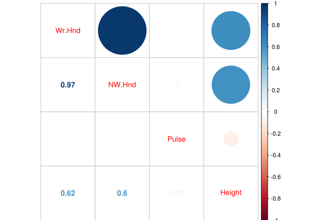
We have an extreme correlation between “We.Hnd” and “NW.Hnd” this makes sense because people’s hands are normally the same size. Since this blog post is a demonstration of logistic regression we will not worry about this too much.
We now need to divide our dataset into a train and a test set. We set the seed for. First, we need to make a variable that we call “ind” that is randomly assigned 70% of the number of rows of survey 1 and 30% 2. We then subset the “train” dataset by taking all rows that are 1’s based on the “ind” variable and we create the “test” dataset for all the rows that line up with 2 in the “ind” variable. This means our data split is 70% train and 30% test. Below is the code
set.seed(123)
ind<-sample(2,nrow(survey),replace=T,prob = c(0.7,0.3))
train<-survey[ind==1,]
test<-survey[ind==2,]
We now make our model. We use the “glm” function for logistic regression. We set the family argument to “binomial”. Next, we look at the results as well as the odds ratios.
fit<-glm(Sex~.,family=binomial,train)
summary(fit)
##
## Call:
## glm(formula = Sex ~ ., family = binomial, data = train)
##
## Deviance Residuals:
## Min 1Q Median 3Q Max
## -1.9875 -0.5466 -0.1395 0.3834 3.4443
##
## Coefficients:
## Estimate Std. Error z value Pr(>|z|)
## (Intercept) -46.42175 8.74961 -5.306 1.12e-07 ***
## Wr.Hnd -0.43499 0.66357 -0.656 0.512
## NW.Hnd 1.05633 0.70034 1.508 0.131
## Pulse -0.02406 0.02356 -1.021 0.307
## Height 0.21062 0.05208 4.044 5.26e-05 ***
## Age 0.00894 0.05368 0.167 0.868
## ---
## Signif. codes: 0 '***' 0.001 '**' 0.01 '*' 0.05 '.' 0.1 ' ' 1
##
## (Dispersion parameter for binomial family taken to be 1)
##
## Null deviance: 169.14 on 122 degrees of freedom
## Residual deviance: 81.15 on 117 degrees of freedom
## AIC: 93.15
##
## Number of Fisher Scoring iterations: 6exp(coef(fit))## (Intercept) Wr.Hnd NW.Hnd Pulse Height
## 6.907034e-21 6.472741e-01 2.875803e+00 9.762315e-01 1.234447e+00
## Age
## 1.008980e+00The results indicate that only height is useful in predicting if someone is a male or female. The second piece of code shares the odds ratios. The odds ratio tell how a one unit increase in the independent variable leads to an increase in the odds of being male in our model. For example, for every one unit increase in height there is a 1.23 increase in the odds of a particular example being male.
We now need to see how well our model does on the train and test dataset. We first capture the probabilities and save them to the train dataset as “probs”. Next we create a “predict” variable and place the string “Female” in the same number of rows as are in the “train” dataset. Then we rewrite the “predict” variable by changing any example that has a probability above 0.5 as “Male”. Then we make a table of our results to see the number correct, false positives/negatives. Lastly, we calculate the accuracy rate. Below is the code.
train$probs<-predict(fit, type = 'response')
train$predict<-rep('Female',123)
train$predict[train$probs>0.5]<-"Male"
table(train$predict,train$Sex)
##
## Female Male
## Female 61 7
## Male 7 48mean(train$predict==train$Sex)## [1] 0.8861789Despite the weaknesses of the model with so many insignificant variables it is surprisingly accurate at 88.6%. Let’s see how well we do on the “test” dataset.
test$prob<-predict(fit,newdata = test, type = 'response')
test$predict<-rep('Female',46)
test$predict[test$prob>0.5]<-"Male"
table(test$predict,test$Sex)
##
## Female Male
## Female 17 3
## Male 0 26mean(test$predict==test$Sex)## [1] 0.9347826As you can see, we do even better on the test set with an accuracy of 93.4%. Our model is looking pretty good and height is an excellent predictor of sex which makes complete sense. However, in the next post we will use cross-validation and the ROC plot to further assess the quality of it.

In logistic regression, there are three terms that are used frequently but can be confusing if they are not thoroughly explained. These three terms are probability, odds, and odds ratio. In this post, we will look at these three terms and provide an explanation of them.
Probability
Probability is probably (no pun intended) the easiest of these three terms to understand. Probability is simply the likelihood that a certain event will happen. To calculate the probability in the traditional sense you need to know the number of events and outcomes to find the probability.
Bayesian probability uses prior probabilities to develop a posterior probability based on new evidence. For example, at one point during Super Bowl LI the Atlanta Falcons had a 99.7% chance of winning. This was base don such factors as the number points they were ahead and the time remaining. As these changed, so did the probability of them winning. yet the Patriots still found a way to win with less than a 1% chance
Bayesian probability was also used for predicting who would win the 2016 US presidential race. It is important to remember that probability is an expression of confidence and not a guarantee as we saw in both examples.
Odds
Odds are the expression of relative probabilities. Odds are calculated using the following equation
probability of the event ⁄ 1 – probability of the event
For example, at one point during Super Bowl LI the odds of the Atlanta Falcons winning were as follows
0.997 ⁄ 1 – 0.997 = 332
This can be interpreted as the odds being 332 to 1! This means that Atlanta was 332 times more likely to win the Super Bowl then loss the Super Bowl.
Odds are commonly used in gambling and this is probably (again no pun intended) where most of us have heard the term before. The odds is just an extension of probabilities and they are most commonly expressed as a fraction such as one in four, etc.
Odds Ratio
A ratio is the comparison of two numbers and indicates how many times one number is contained or contains another number. For example, a ration of boys to girls is 5 to 1 it means that there are five boys for every one girl.
By extension odds ratio is the comparison of two different odds. For example, if the odds of Team A making the playoffs is 45% and the odds of Team B making the playoffs is 35% the odds ratio is calculated as follows.
0.45 ⁄ 0.35 = 1.28
Team A is 1.28 more likely to make the playoffs then Team B.
The value of the odds and the odds ratio can sometimes be the same. Below is the odds ratio of the Atlanta Falcons winning and the New Patriots winning Super Bowl LI
0.997⁄ 0.003 = 332
As such there is little difference between odds and odds ratio except that odds ratio is the ratio of two odds ratio. As you can tell, there is a lot of confusion about this for the average person. However, understanding these terms is critical to the application of logistic regression.
In this post, we will take a look at best subset regression. Best subset regression fits a model for all possible feature or variable combinations and the decision for the most appropriate model is made by the analyst based on judgment or some statistical criteria.
Best subset regression is an alternative to both Forward and Backward stepwise regression. Forward stepwise selection adds one variable at a time based on the lowest residual sum of squares until no more variables continue to lower the residual sum of squares. Backward stepwise regression starts with all variables in the model and removes variables one at a time. The concern with stepwise methods is they can produce biased regression coefficients, conflicting models, and inaccurate confidence intervals.
Best subset regression bypasses these weaknesses of stepwise models by creating all models possible and then allowing you to assess which variables should be included in your final model. The one drawback to best subset is that a large number of variables means a large number of potential models, which can make it difficult to make a decision among several choices.
In this post, we will use the “Fair” dataset from the “Ecdat” package to predict marital satisfaction based on age, Sex, the presence of children, years married, religiosity, education, occupation, and the number of affairs in the past year. Below is some initial code.
library(leaps);library(Ecdat);library(car);library(lmtest)data(Fair)
We begin our analysis by building the initial model with all variables in it. Below is the code
fit<-lm(rate~.,Fair)
summary(fit)
##
## Call:
## lm(formula = rate ~ ., data = Fair)
##
## Residuals:
## Min 1Q Median 3Q Max
## -3.2049 -0.6661 0.2298 0.7705 2.2292
##
## Coefficients:
## Estimate Std. Error t value Pr(>|t|)
## (Intercept) 3.522875 0.358793 9.819 < 2e-16 ***
## sexmale -0.062281 0.099952 -0.623 0.53346
## age -0.009683 0.007548 -1.283 0.20005
## ym -0.019978 0.013887 -1.439 0.15079
## childyes -0.206976 0.116227 -1.781 0.07546 .
## religious 0.042142 0.037705 1.118 0.26416
## education 0.068874 0.021153 3.256 0.00119 **
## occupation -0.015606 0.029602 -0.527 0.59825
## nbaffairs -0.078812 0.013286 -5.932 5.09e-09 ***
## ---
## Signif. codes: 0 '***' 0.001 '**' 0.01 '*' 0.05 '.' 0.1 ' ' 1
##
## Residual standard error: 1.03 on 592 degrees of freedom
## Multiple R-squared: 0.1405, Adjusted R-squared: 0.1289
## F-statistic: 12.1 on 8 and 592 DF, p-value: 4.487e-16The initial results are already interesting even though the r-square is low. When couples have children the have less marital satisfaction than couples without children when controlling for the other factors and this is the strongest regression weight. In addition, the more education a person has there is an increase in marital satisfaction. Lastly, as the number of affairs increases there is also a decrease in marital satisfaction. Keep in mind that the “rate” variable goes from 1 to 5 with one meaning a terrible marriage to five being a great one. The mean marital satisfaction was 3.52 when controlling for the other variables.
We will now create our subset models. Below is the code.
sub.fit<-regsubsets(rate~.,Fair)
best.summary<-summary(sub.fit)
In the code above we create the sub models using the “regsubsets” function from the “leaps” package and saved it in the variable called “sub.fit”. We then saved the summary of “sub.fit” in the variable “best.summary”. We will use the “best.summary” “sub.fit variables several times to determine which model to use.
There are many different ways to assess the model. We will use the following statistical methods that come with the results from the “regsubset” function.
We will make two charts for each of the criteria above. The plot to the left will explain how many features to include in the model. The plot to the right will tell you which variables to include. It is important to note that for both of these methods, the lower the score the better the model. Below is the code for Mallow’s Cp.
par(mfrow=c(1,2))
plot(best.summary$cp)
plot(sub.fit,scale = "Cp")
The plot on the left suggests that a four feature model is the most appropriate. However, this chart does not tell me which four features. The chart on the right is read in reverse order. The high numbers are at the bottom and the low numbers are at the top when looking at the y-axis. Knowing this, we can conclude that the most appropriate variables to include in the model are age, children presence, education, and number of affairs. Below are the results using the Bayesian Information Criterion
par(mfrow=c(1,2))
plot(best.summary$bic)
plot(sub.fit,scale = "bic")
These results indicate that a three feature model is appropriate. The variables or features are years married, education, and number of affairs. Presence of children was not considered beneficial. Since our original model and Mallow’s Cp indicated that presence of children was significant we will include it for now.
Below is the code for the model based on the subset regression.
fit2<-lm(rate~age+child+education+nbaffairs,Fair)
summary(fit2)
##
## Call:
## lm(formula = rate ~ age + child + education + nbaffairs, data = Fair)
##
## Residuals:
## Min 1Q Median 3Q Max
## -3.2172 -0.7256 0.1675 0.7856 2.2713
##
## Coefficients:
## Estimate Std. Error t value Pr(>|t|)
## (Intercept) 3.861154 0.307280 12.566 < 2e-16 ***
## age -0.017440 0.005057 -3.449 0.000603 ***
## childyes -0.261398 0.103155 -2.534 0.011531 *
## education 0.058637 0.017697 3.313 0.000978 ***
## nbaffairs -0.084973 0.012830 -6.623 7.87e-11 ***
## ---
## Signif. codes: 0 '***' 0.001 '**' 0.01 '*' 0.05 '.' 0.1 ' ' 1
##
## Residual standard error: 1.029 on 596 degrees of freedom
## Multiple R-squared: 0.1352, Adjusted R-squared: 0.1294
## F-statistic: 23.29 on 4 and 596 DF, p-value: < 2.2e-16The results look ok. The older a person is the less satisfied they are with their marriage. If children are present the marriage is less satisfying. The more educated the more satisfied they are. Lastly, the higher the number of affairs indicate less marital satisfaction. However, before we get excited we need to check for collinearity and homoscedasticity. Below is the code
vif(fit2)## age child education nbaffairs
## 1.249430 1.228733 1.023722 1.014338No issues with collinearity.For vif values above 5 or 10 indicate a problem. Let’s check for homoscedasticity
par(mfrow=c(2,2))
plot(fit2)
The normal qqplot and residuals vs leverage plot can be used for locating outliers. The residual vs fitted and the scale-location plot do not look good as there appears to be a pattern in the dispersion which indicates homoscedasticity. To confirm this we will use Breusch-Pagan test from the “lmtest” package. Below is the code
bptest(fit2)##
## studentized Breusch-Pagan test
##
## data: fit2
## BP = 16.238, df = 4, p-value = 0.002716There you have it. Our model violates the assumption of homoscedasticity. However, this model was developed for demonstration purpose to provide an example of subset regression.
This post will demonstrate the use of principal component analysis (PCA). PCA is useful for several reasons. One it allows you place your examples into groups similar to linear discriminant analysis but you do not need to know beforehand what the groups are. Second, PCA is used for the purpose of dimension reduction. For example, if you have 50 variables PCA can allow you to reduce this while retaining a certain threshold of variance. If you are working with a large dataset this can greatly reduce the computational time and general complexity of your models.
Keep in mind that there really is not a dependent variable as this is unsupervised learning. What you are trying to see is how different examples can
be mapped in space based on whatever independent variables are used. For our example, we will use the “Carseats” dataset from the “ISLR”. Our goal is to understand the relationship among the variables when examining the shelve location of the car seat. Below is the initial code to begin the analysis
library(ggplot2)
library(ISLR)
data("Carseats")
We first need to rearrange the data and remove the variables we are not going to use in the analysis. Below is the code.
Carseats1<-Carseats
Carseats1<-Carseats1[,c(1,2,3,4,5,6,8,9,7,10,11)]
Carseats1$Urban<-NULL
Carseats1$US<-NULL
Here is what we did 1. We made a copy of the “Carseats” data called “Careseats1” 2. We rearranged the order of the variables so that the factor variables are at the end. This will make sense later 3.We removed the “Urban” and “US” variables from the table as they will not be a part of our analysis
We will now do the PCA. We need to scale and center our data otherwise the larger numbers will have a much stronger influence on the results than smaller numbers. Fortunately, the “prcomp” function has a “scale” and a “center” argument. We will also use only the first 7 columns for the analysis as “sheveLoc” is not useful for this analysis. If we hadn’t moved “shelveLoc” to the end of the dataframe it would cause some headache. Below is the code.
Carseats.pca<-prcomp(Carseats1[,1:7],scale. = T,center = T)
summary(Carseats.pca)
## Importance of components:
## PC1 PC2 PC3 PC4 PC5 PC6 PC7
## Standard deviation 1.3315 1.1907 1.0743 0.9893 0.9260 0.80506 0.41320
## Proportion of Variance 0.2533 0.2026 0.1649 0.1398 0.1225 0.09259 0.02439
## Cumulative Proportion 0.2533 0.4558 0.6207 0.7605 0.8830 0.97561 1.00000The summary of “Carseats.pca” Tells us how much of the variance each component explains. Keep in mind that the number of components is equal to the number of variables. The “proportion of variance” tells us the contribution each component makes and the “cumulative proportion”.
If your goal is dimension reduction than the number of components to keep depends on the threshold you set. For example, if you need around 90% of the variance you would keep the first 5 components. If you need 95% or more of the variance you would keep the first six. To actually use the components you would take the “Carseats.pca$x” data and move it to your data frame.
Keep in mind that the actual components have no conceptual meaning but is a numerical representation of a combination of several variables that were reduced using PCA to fewer variables such as going from 7 variables to 5 variables.
This means that PCA is great for reducing variables for prediction purpose but is much harder for explanatory studies unless you can explain what the new components represent.
For our purposes, we will keep 5 components. This means that we have reduced our dimensions from 7 to 5 while still keeping almost 90% of the variance. Graphing our results is tricky because we have 5 dimensions but the human mind can only conceptualize 3 at the best and normally 2. As such we will plot the first two components and label them by shelf location using ggplot2. Below is the code
scores<-as.data.frame(Carseats.pca$x)
pcaplot<-ggplot(scores,(aes(PC1,PC2,color=Carseats1$ShelveLoc)))+geom_point()
pcaplot
From the plot, you can see there is little separation when using the first two components of the PCA analysis. This makes sense as we can only graph to components so we are missing a lot of the variance. However, for demonstration purposes the analysis is complete.

It is extremely common for beginners and perhaps even experience researchers to lose track of what they are trying to achieve or do when trying to complete a research project. The open nature of research allows for a multitude of equally acceptable ways to complete a project. This leads to an inability to make a decision and or stay on course when doing research.
One way to reduce and eliminate the roadblock to decision making and focus in research is to develop a plan. In this post, we will look at one version of a data analysis plan.
Data Analysis Plan
A data analysis plan includes many features of a research project in it with a particular emphasis on mapping out how research questions will be answered and what is necessary to answer the question. Below is a sample template of the analysis plan.

The majority of this diagram should be familiar to someone who has ever done research. At the top, you state the problem, this is the overall focus of the paper. Next, comes the purpose, the purpose is the over-arching goal of a research project.
After purpose comes the research questions. The research questions are questions about the problem that are answerable. People struggle with developing clear and answerable research questions. It is critical that research questions are written in a way that they can be answered and that the questions are clearly derived from the problem. Poor questions means poor or even no answers.
After the research questions, it is important to know what variables are available for the entire study and specifically what variables can be used to answer each research question. Lastly, you must indicate what analysis or visual you will develop in order to answer your research questions about your problem. This requires you to know how you will answer your research questions
Example
Below is an example of a completed analysis plan for simple undergraduate level research paper

In the example above, the student wants to understand the perceptions of university students about the cafeteria food quality and their satisfaction with the university. There were four research questions, a demographic descriptive question, a descriptive question about the two main variables, a comparison question, and lastly a relationship question.
The variables available for answering the questions are listed off to the left side. Under that, the student indicates the variables needed to answer each question. For example, the demographic variables of sex, class level, and major are needed to answer the question about the demographic profile.
The last section is the analysis. For the demographic profile, the student found the percentage of the population in each sub group of the demographic variables.
Conclusion
A data analysis plan provides an excellent way to determine what needs to be done to complete a study. It also helps a researcher to clearly understand what they are trying to do and provides a visual for those who the research wants to communicate with about the progress of a study.

In our example, we will use the “Auto” dataset from the “ISLR” package and use the variables “mpg”,“displacement”,“horsepower”, and “weight” to predict “acceleration”. We will also use the “mgcv” package. Below is some initial code to begin the analysis
library(mgcv)library(ISLR) data(Auto)
We will now make the model we want to understand the response of “acceleration” to the explanatory variables of “mpg”,“displacement”,“horsepower”, and “weight”. After setting the model we will examine the summary. Below is the code
model1<-gam(acceleration~s(mpg)+s(displacement)+s(horsepower)+s(weight),data=Auto)
summary(model1)
##
## Family: gaussian
## Link function: identity
##
## Formula:
## acceleration ~ s(mpg) + s(displacement) + s(horsepower) + s(weight)
##
## Parametric coefficients:
## Estimate Std. Error t value Pr(>|t|)
## (Intercept) 15.54133 0.07205 215.7 <2e-16 ***
## ---
## Signif. codes: 0 '***' 0.001 '**' 0.01 '*' 0.05 '.' 0.1 ' ' 1
##
## Approximate significance of smooth terms:
## edf Ref.df F p-value
## s(mpg) 6.382 7.515 3.479 0.00101 **
## s(displacement) 1.000 1.000 36.055 4.35e-09 ***
## s(horsepower) 4.883 6.006 70.187 < 2e-16 ***
## s(weight) 3.785 4.800 41.135 < 2e-16 ***
## ---
## Signif. codes: 0 '***' 0.001 '**' 0.01 '*' 0.05 '.' 0.1 ' ' 1
##
## R-sq.(adj) = 0.733 Deviance explained = 74.4%
## GCV = 2.1276 Scale est. = 2.0351 n = 392All of the explanatory variables are significant and the adjust r-squared is .73 which is excellent. edf stands for “effective degrees of freedom”. This modified version of the degree of freedoms is due to the smoothing process in the model. GCV stands for generalized cross-validation and this number is useful when comparing models. The model with the lowest number is the better model.
We can also examine the model visually by using the “plot” function. This will allow us to examine if the curvature fitted by the smoothing process was useful or not for each variable. Below is the code.
plot(model1)


We can also look at a 3d graph that includes the linear predictor as well as the two strongest predictors. This is done with the “vis.gam” function. Below is the code
vis.gam(model1)
If multiple models are developed. You can compare the GCV values to determine which model is the best. In addition, another way to compare models is with the “AIC” function. In the code below, we will create an additional model that includes “year” compare the GCV scores and calculate the AIC. Below is the code.
model2<-gam(acceleration~s(mpg)+s(displacement)+s(horsepower)+s(weight)+s(year),data=Auto)
summary(model2)
##
## Family: gaussian
## Link function: identity
##
## Formula:
## acceleration ~ s(mpg) + s(displacement) + s(horsepower) + s(weight) +
## s(year)
##
## Parametric coefficients:
## Estimate Std. Error t value Pr(>|t|)
## (Intercept) 15.54133 0.07203 215.8 <2e-16 ***
## ---
## Signif. codes: 0 '***' 0.001 '**' 0.01 '*' 0.05 '.' 0.1 ' ' 1
##
## Approximate significance of smooth terms:
## edf Ref.df F p-value
## s(mpg) 5.578 6.726 2.749 0.0106 *
## s(displacement) 2.251 2.870 13.757 3.5e-08 ***
## s(horsepower) 4.936 6.054 66.476 < 2e-16 ***
## s(weight) 3.444 4.397 34.441 < 2e-16 ***
## s(year) 1.682 2.096 0.543 0.6064
## ---
## Signif. codes: 0 '***' 0.001 '**' 0.01 '*' 0.05 '.' 0.1 ' ' 1
##
## R-sq.(adj) = 0.733 Deviance explained = 74.5%
## GCV = 2.1368 Scale est. = 2.0338 n = 392#model1 GCV
model1$gcv.ubre## GCV.Cp
## 2.127589#model2 GCV
model2$gcv.ubre## GCV.Cp
## 2.136797As you can see, the second model has a higher GCV score when compared to the first model. This indicates that the first model is a better choice. This makes sense because in the second model the variable “year” is not significant. To confirm this we will calculate the AIC scores using the AIC function.
AIC(model1,model2)## df AIC
## model1 18.04952 1409.640
## model2 19.89068 1411.156Again, you can see that model1 s better due to its fewer degrees of freedom and slightly lower AIC score.
Conclusion
Using GAMs is most common for exploring potential relationships in your data. This is stated because they are difficult to interpret and to try and summarize. Therefore, it is normally better to develop a generalized linear model over a GAM due to the difficulty in understanding what the data is trying to tell you when using GAMs.
Generalized linear models are another way to approach linear regression. The advantage of of GLM is that allows the error to follow many different distributions rather than only the normal distribution which is an assumption of traditional linear regression.
Often GLM is used for response or dependent variables that are binary or represent count data. THis post will provide a brief explanation of GLM as well as provide an example.
Key Information
There are three important components to a GLM and they are
The error structure is the type of distribution you will use in generating the model. There are many different distributions in statistical modeling such as binomial, gaussian, poission, etc. Each distribution comes with certain assumptions that govern their use.
The linear predictor is the sum of the effects of the independent variables. Lastly, the link function determines the relationship between the linear predictor and the mean of the dependent variable. There are many different link functions and the best link function is the one that reduces the residual deviances the most.
In our example, we will try to predict if a house will have air conditioning based on the interactioon between number of bedrooms and bathrooms, number of stories, and the price of the house. To do this, we will use the “Housing” dataset from the “Ecdat” package. Below is some initial code to get started.
library(Ecdat)data("Housing")
The dependent variable “airco” in the “Housing” dataset is binary. This calls for us to use a GLM. To do this we will use the “glm” function in R. Furthermore, in our example, we want to determine if there is an interaction between number of bedrooms and bathrooms. Interaction means that the two independent variables (bathrooms and bedrooms) influence on the dependent variable (aircon) is not additive, which means that the combined effect of the independnet variables is different than if you just added them together. Below is the code for the model followed by a summary of the results
model<-glm(Housing$airco ~ Housing$bedrooms * Housing$bathrms + Housing$stories + Housing$price, family=binomial)
summary(model)
##
## Call:
## glm(formula = Housing$airco ~ Housing$bedrooms * Housing$bathrms +
## Housing$stories + Housing$price, family = binomial)
##
## Deviance Residuals:
## Min 1Q Median 3Q Max
## -2.7069 -0.7540 -0.5321 0.8073 2.4217
##
## Coefficients:
## Estimate Std. Error z value Pr(>|z|)
## (Intercept) -6.441e+00 1.391e+00 -4.632 3.63e-06
## Housing$bedrooms 8.041e-01 4.353e-01 1.847 0.0647
## Housing$bathrms 1.753e+00 1.040e+00 1.685 0.0919
## Housing$stories 3.209e-01 1.344e-01 2.388 0.0170
## Housing$price 4.268e-05 5.567e-06 7.667 1.76e-14
## Housing$bedrooms:Housing$bathrms -6.585e-01 3.031e-01 -2.173 0.0298
##
## ---
## Signif. codes: 0 '***' 0.001 '**' 0.01 '*' 0.05 '.' 0.1 ' ' 1
##
## (Dispersion parameter for binomial family taken to be 1)
##
## Null deviance: 681.92 on 545 degrees of freedom
## Residual deviance: 549.75 on 540 degrees of freedom
## AIC: 561.75
##
## Number of Fisher Scoring iterations: 4To check how good are model is we need to check for overdispersion as well as compared this model to other potential models. Overdispersion is a measure to determine if there is too much variablity in the model. It is calcualted by dividing the residual deviance by the degrees of freedom. Below is the solution for this
549.75/540## [1] 1.018056Our answer is 1.01, which is pretty good because the cutoff point is 1, so we are really close.
Now we will make several models and we will compare the results of them
Model 2
#add recroom and garagepl
model2<-glm(Housing$airco ~ Housing$bedrooms * Housing$bathrms + Housing$stories + Housing$price + Housing$recroom + Housing$garagepl, family=binomial)
summary(model2)
##
## Call:
## glm(formula = Housing$airco ~ Housing$bedrooms * Housing$bathrms +
## Housing$stories + Housing$price + Housing$recroom + Housing$garagepl,
## family = binomial)
##
## Deviance Residuals:
## Min 1Q Median 3Q Max
## -2.6733 -0.7522 -0.5287 0.8035 2.4239
##
## Coefficients:
## Estimate Std. Error z value Pr(>|z|)
## (Intercept) -6.369e+00 1.401e+00 -4.545 5.51e-06
## Housing$bedrooms 7.830e-01 4.391e-01 1.783 0.0745
## Housing$bathrms 1.702e+00 1.047e+00 1.626 0.1039
## Housing$stories 3.286e-01 1.378e-01 2.384 0.0171
## Housing$price 4.204e-05 6.015e-06 6.989 2.77e-12
## Housing$recroomyes 1.229e-01 2.683e-01 0.458 0.6470
## Housing$garagepl 2.555e-03 1.308e-01 0.020 0.9844
## Housing$bedrooms:Housing$bathrms -6.430e-01 3.054e-01 -2.106 0.0352
##
## ---
## Signif. codes: 0 '***' 0.001 '**' 0.01 '*' 0.05 '.' 0.1 ' ' 1
##
## (Dispersion parameter for binomial family taken to be 1)
##
## Null deviance: 681.92 on 545 degrees of freedom
## Residual deviance: 549.54 on 538 degrees of freedom
## AIC: 565.54
##
## Number of Fisher Scoring iterations: 4#overdispersion calculation
549.54/538## [1] 1.02145Model 3
model3<-glm(Housing$airco ~ Housing$bedrooms * Housing$bathrms + Housing$stories + Housing$price + Housing$recroom + Housing$fullbase + Housing$garagepl, family=binomial)
summary(model3)
##
## Call:
## glm(formula = Housing$airco ~ Housing$bedrooms * Housing$bathrms +
## Housing$stories + Housing$price + Housing$recroom + Housing$fullbase +
## Housing$garagepl, family = binomial)
##
## Deviance Residuals:
## Min 1Q Median 3Q Max
## -2.6629 -0.7436 -0.5295 0.8056 2.4477
##
## Coefficients:
## Estimate Std. Error z value Pr(>|z|)
## (Intercept) -6.424e+00 1.409e+00 -4.559 5.14e-06
## Housing$bedrooms 8.131e-01 4.462e-01 1.822 0.0684
## Housing$bathrms 1.764e+00 1.061e+00 1.662 0.0965
## Housing$stories 3.083e-01 1.481e-01 2.082 0.0374
## Housing$price 4.241e-05 6.106e-06 6.945 3.78e-12
## Housing$recroomyes 1.592e-01 2.860e-01 0.557 0.5778
## Housing$fullbaseyes -9.523e-02 2.545e-01 -0.374 0.7083
## Housing$garagepl -1.394e-03 1.313e-01 -0.011 0.9915
## Housing$bedrooms:Housing$bathrms -6.611e-01 3.095e-01 -2.136 0.0327
##
## ---
## Signif. codes: 0 '***' 0.001 '**' 0.01 '*' 0.05 '.' 0.1 ' ' 1
##
## (Dispersion parameter for binomial family taken to be 1)
##
## Null deviance: 681.92 on 545 degrees of freedom
## Residual deviance: 549.40 on 537 degrees of freedom
## AIC: 567.4
##
## Number of Fisher Scoring iterations: 4#overdispersion calculation
549.4/537## [1] 1.023091Now we can assess the models by using the “anova” function with the “test” argument set to “Chi” for the chi-square test.
anova(model, model2, model3, test = "Chi")## Analysis of Deviance Table
##
## Model 1: Housing$airco ~ Housing$bedrooms * Housing$bathrms + Housing$stories +
## Housing$price
## Model 2: Housing$airco ~ Housing$bedrooms * Housing$bathrms + Housing$stories +
## Housing$price + Housing$recroom + Housing$garagepl
## Model 3: Housing$airco ~ Housing$bedrooms * Housing$bathrms + Housing$stories +
## Housing$price + Housing$recroom + Housing$fullbase + Housing$garagepl
## Resid. Df Resid. Dev Df Deviance Pr(>Chi)
## 1 540 549.75
## 2 538 549.54 2 0.20917 0.9007
## 3 537 549.40 1 0.14064 0.7076The results of the anova indicate that the models are all essentially the same as there is no statistical difference. The only criteria on which to select a model is the measure of overdispersion. The first model has the lowest rate of overdispersion and so is the best when using this criteria. Therefore, determining if a hous has air conditioning depends on examining number of bedrooms and bathrooms simultenously as well as the number of stories and the price of the house.
Conclusion
The post explained how to use and interpret GLM in R. GLM can be used primarilyy for fitting data to disrtibutions that are not normal.

Decision trees are yet another method of machine learning that is used for classifying outcomes. Decision trees are very useful for, as you can guess, making decisions based on the characteristics of the data.
In this post, we will discuss the following
Physical Traits of a Decision Tree
Decision trees consist of what is called a tree structure. The tree structure consists of a root node, decision nodes, branches and leaf nodes.
A root node is an initial decision made in the tree. This depends on which feature the algorithm selects first.
Following the root node, the tree splits into various branches. Each branch leads to an additional decision node where the data is further subdivided. When you reach the bottom of a tree at the terminal node(s) these are also called leaf nodes.
How Decision Trees Work
Decision trees use a heuristic called recursive partitioning. What this does is it splits the overall dataset into smaller and smaller subsets until each subset is as close to pure (having the same characteristics) as possible. This process is also known as divide and conquer.
The mathematics for deciding how to split the data is based on an equation called entropy, which measures the purity of a potential decision node. The lower the entropy scores the purer the decision node is. The entropy can range from 0 (most pure) to 1 (most impure).
One of the most popular algorithms for developing decision trees is the C5.0 algorithm. This algorithm, in particular, uses entropy to assess potential decision nodes.
Pros and Cons
The prose of decision trees includes its versatile nature. Decision trees can deal with all types of data as well as missing data. Furthermore, this approach learns automatically and only uses the most important features. Lastly, a deep understanding of mathematics is not necessary to use this method in comparison to more complex models.
Some problems with decision trees are that they can easily overfit the data. This means that the tree does not generalize well to other datasets. In addition, a large complex tree can be hard to interpret, which may be yet another indication of overfitting.
Conclusion
Decision trees provide another vehicle that researchers can use to empower decision making. This model is most useful particularly when a decision that was made needs to be explained and defended. For example, when rejecting a person’s loan application. Complex models made provide stronger mathematical reasons but would be difficult to explain to an irate customer.
Therefore, for complex calculation presented in an easy to follow format. Decision trees are one possibility.

Mix Methods research involves the combination of qualitative and quantitative approaches to addressing a research problem. Generally, qualitative and quantitative methods have separate philosophical positions when it comes to how to uncover insights in addressing research questions.
For many, mixed methods have their own philosophical position, which is pragmatism. Pragmatists believe that if it works it’s good. Therefore, if mixed methods lead to a solution it’s an appropriate method to use.
This post will try to explain some of the mixed method designs. Before explaining it is important to understand that there are several common ways to approach mixed methods
Convergent Parallel Design
This design involves the simultaneous collecting of qualitative and quantitative data. The results are then compared to provide insights into the problem. The advantage of this design is the quantitative data provides for generalizability while the qualitative data provides information about the context of the study.
However, the challenge is in trying to merge the two types of data. Qualitative and quantitative methods answer slightly different questions about a problem. As such it can be difficult to paint a picture of the results that are comprehensible.
Explanatory Design
This design puts emphasis on the quantitative data with qualitative data playing a secondary role. Normally, the results found in the quantitative data are followed up on in the qualitative part.
For example, if you collect surveys about what students think about college and the results indicate negative opinions, you might conduct an interview with students to understand why they are negative towards college. A Likert survey will not explain why students are negative. Interviews will help to capture why students have a particular position.
The advantage of this approach is the clear organization of the data. Quantitative data is more important. The drawback is deciding what about the quantitative data to explore when conducting the qualitative data collection.
Exploratory Design
This design is the opposite of explanatory. Now the qualitative data is more important than the quantitative. This design is used when you want to understand a phenomenon in order to measure it.
It is common when developing an instrument to interview people in focus groups to understand the phenomenon. For example, if I want to understand what cellphone addiction is I might ask students to share what they think about this in interviews. From there, I could develop a survey instrument to measure cell phone addiction.
The drawback to this approach is the time consumption. It takes a lot of work to conduct interviews, develop an instrument, and assess the instrument.
Conclusions
Mixed methods are not that new. However, they are still a somewhat unusual approach to research in many fields. Despite this, the approaches of mixed methods can be beneficial depending on the context.

Machine learning is about using data to take action. This post will explain common steps that are taking when using machine learning in the analysis of data. In general, there are five steps when applying machine learning.
We will go through each step briefly
Step One, Collecting Data
Data can come from almost anywhere. Data can come from a database in a structured format like mySQL. Data can also come unstructured such as tweets collected from twitter. However you get the data, you need to develop a way to clean and process it so that it is ready for analysis.
There are some distinct terms used in machine learning that some coming from traditional research may not be familiar.
Step Two, Preparing Data
This is actually the most difficult step in machine learning analysis. It can take up to 80% of the time. With data coming from multiple sources and in multiple formats it is a real challenge to get everything where it needs to be for an analysis.
Missing data needs to be addressed, duplicate records, and other issues are a part of this process. Once these challenges are dealt with it is time to explore the data.
Step Three, Explore the Data
Before analyzing the data, it is critical that the data is explored. This is often done visually in the form of plots and graphs but also with summary statistics. You are looking for some insights into the data and the characteristics of different features. You are also looking out for things that might be unusually such as outliers. There are also times when a variable needs to be transformed because there are issues with normality.
Step Four, Training a Model
After exploring the data, you should have an idea of what you want to know if you did not already know. Determining what you want to know helps you to decide which algorithm is most appropriate for developing a model.
To develop a model, we normally split the data into a training and testing set. This allows us to assess the model for its strengths and weaknesses.
Step Five, Assessing the Model
The strength of the model is determined. Every model has certain biases that limit its usefulness. How to assess a model depends on what type of model is developed and the purpose of the analysis. Whenever suitable, we want to try and improve the model.
Step Six, Improving the Model
Improve can happen in many ways. You might decide to normalize the variables in a different way. Or you may choose to add or remove features from the model. Perhaps you may switch to a different model.
Conclusion
Success in data analysis involves have a clear path for achieving your goals. The steps presented here provide one way of tackling machine learning.

One of the most interesting fields of quantitative research today is machine learning. Machine Learning serves the purpose of developing models through the use of algorithms in order to inform action.
Examples of machine learning are all around us. Machine learning is used to make recommendations about what you should purchase at most retail websites. Machine learning is also used to filter spam from your email inbox. Each of these two examples involves making a prediction about previous behavior. This is what machines learning does. It learns what will happen based on what has happened. However, the question remains how does a machine actually learn.
The purpose of this post is to explain how machines actually “learn.” The process of learning involves three steps which are…
Data Input
Data input is simply having access to some form of data whether it be numbers, text, pictures or something else. The data is the factual information that is used to develop insights for future action.
The majority of a person’s time in conducting machine learning is involved in organizing and cleaning data. This process is actually called data mugging by many. Once the data is ready for analysis, it is time for the abstraction process to begin.
Abstraction
Clean beautiful data still does not provide any useful information yet. Abstraction is the process of deriving meaning from the data. The raw data represent knowledge but as we already are aware the problem is how it is currently represented. Numbers and text mean little to us.
Abstraction takes all of the numbers and or text and develops a model. What a model does is summarize data and provides an explanatiofout the data. For example, if you are doing a study for a bank who wants to know who will default on loans. You might discover from the data that a person is more likely to default if they are a student with a credit card balance over $2,000. How this information is shared with the researcher can be in one of the following forms
This kind of information is hard to find manually and is normally found through the use of an algorithm. Abstraction involves the use of some sort of algorithm. An algorithm is a systemic step-by-step procedure for solving a problem. It is very technical to try and understand algorithms unless you have a graduate degree in statistics. The point to remember is that algorithms are what the computer uses to learn and develop models.
Developing a model involves training. Training is achieved when the abstraction process is complete. The completion of this process depends on the criteria of what a “good” model is. This varies depending on the requirements of the model and the preference of the researcher.
Generalization
A machine has not actually learned anything until the model it developed is assessed for bias. Bias is a result of the educated guesses (heuristics) that an algorithm makes to develop a model that is systematically wrong.
For example, let’s say an algorithm learns to identify a man by the length of their hair. If a man has really long hair or if a woman has really short hair the algorithm will misclassify them because each person does not fit the educated guess the algorithm developed. The challenge is that these guesses work most of the time but they struggle with exceptions.
The main way of dealing with this is to develop a model on one set of data and test it on another set of data. This will inform the researcher as to what changes are needed for the model.
Another problem is noise. Noise is caused by measurement error data reporting issues trying to make your model deal with noise can lead to overfitting which means that your model only works for your data and cannot be applied to other data sets. This can also be addressed by testing your model on other data sets.
Conclusion
A machine learns through the use of an algorithm to explain relationships in a data set in a specific manner. This process involves the three steps of data input, abstraction and generalization. The results of a machine learning model is a model that can be use to make prediction about the future with a certain degree of accuracy.


