K-Nearest neighbor is a great technique for dealing with data. In the video below, we will look at how to use this tool with Python.


K-Nearest neighbor is a great technique for dealing with data. In the video below, we will look at how to use this tool with Python.

In this post, we will learn how to conduct a hierarchical regression analysis in R. Hierarchical regression analysis is used in situation in which you want to see if adding additional variables to your model will significantly change the r2 when accounting for the other variables in the model. This approach is a model comparison approach and not necessarily a statistical one.
We are going to use the “Carseats” dataset from the ISLR package. Our goal will be to predict total sales using the following independent variables in three different models.
model 1 = intercept only
model 2 = Sales~Urban + US + ShelveLoc
model 3 = Sales~Urban + US + ShelveLoc + price + income
model 4 = Sales~Urban + US + ShelveLoc + price + income + Advertising
Often the primary goal with hierarchical regression is to show that the addition of a new variable builds or improves upon a previous model in a statistically significant way. For example, if a previous model was able to predict the total sales of an object using three variables you may want to see if a new additional variable you have in mind may improve model performance. Another way to see this is in the following research question
Is a model that explains the total sales of an object with Urban location, US location, shelf location, price, income and advertising cost as independent variables superior in terms of R2 compared to a model that explains total sales with Urban location, US location, shelf location, price and income as independent variables?
In this complex research question we essentially want to know if adding advertising cost will improve the model significantly in terms of the r square. The formal steps that we will following to complete this analysis is as follows.
We will now begin our analysis. Below is some initial code
library(ISLR)
data("Carseats")We now need to create our models. Model 1 will not have any variables in it and will be created for the purpose of obtaining the total sum of squares. Model 2 will include demographic variables. Model 3 will contain the initial model with the continuous independent variables. Lastly, model 4 will contain all the information of the previous models with the addition of the continuous independent variable of advertising cost. Below is the code.
model1 = lm(Sales~1,Carseats)
model2=lm(Sales~Urban + US + ShelveLoc,Carseats)
model3=lm(Sales~Urban + US + ShelveLoc + Price + Income,Carseats)
model4=lm(Sales~Urban + US + ShelveLoc + Price + Income + Advertising,Carseats)
We can now turn to the ANOVA analysis for model comparison #ANOVA Calculation We will use the anova() function to calculate the total sum of square for model 0. This will serve as a baseline for the other models for calculating r square
anova(model1,model2,model3,model4)## Analysis of Variance Table
##
## Model 1: Sales ~ 1
## Model 2: Sales ~ Urban + US + ShelveLoc
## Model 3: Sales ~ Urban + US + ShelveLoc + Price + Income
## Model 4: Sales ~ Urban + US + ShelveLoc + Price + Income + Advertising
## Res.Df RSS Df Sum of Sq F Pr(>F)
## 1 399 3182.3
## 2 395 2105.4 4 1076.89 89.165 < 2.2e-16 ***
## 3 393 1299.6 2 805.83 133.443 < 2.2e-16 ***
## 4 392 1183.6 1 115.96 38.406 1.456e-09 ***
## ---
## Signif. codes: 0 '***' 0.001 '**' 0.01 '*' 0.05 '.' 0.1 ' ' 1For now, we are only focusing on the residual sum of squares. Here is a basic summary of what we know as we compare the models.
model 1 = sum of squares = 3182.3
model 2 = sum of squares = 2105.4 (with demographic variables of Urban, US, and ShelveLoc)
model 3 = sum of squares = 1299.6 (add price and income)
model 4 = sum of squares = 1183.6 (add Advertising)
Each model is statistical significant which means adding each variable lead to some improvement.
By adding price and income to the model we were able to improve the model in a statistically significant way. The r squared increased by .25 below is how this was calculated.
2105.4-1299.6 #SS of Model 2 - Model 3## [1] 805.8805.8/ 3182.3 #SS difference of Model 2 and Model 3 divided by total sum of sqaure ie model 1## [1] 0.2532131When we add Advertising to the model the r square increases by .03. The calculation is below
1299.6-1183.6 #SS of Model 3 - Model 4## [1] 116116/ 3182.3 #SS difference of Model 3 and Model 4 divided by total sum of sqaure ie model 1## [1] 0.03645162We will now look at a summary of each model using the summary() function.
summary(model2)##
## Call:
## lm(formula = Sales ~ Urban + US + ShelveLoc, data = Carseats)
##
## Residuals:
## Min 1Q Median 3Q Max
## -6.713 -1.634 -0.019 1.738 5.823
##
## Coefficients:
## Estimate Std. Error t value Pr(>|t|)
## (Intercept) 4.8966 0.3398 14.411 < 2e-16 ***
## UrbanYes 0.0999 0.2543 0.393 0.6947
## USYes 0.8506 0.2424 3.510 0.0005 ***
## ShelveLocGood 4.6400 0.3453 13.438 < 2e-16 ***
## ShelveLocMedium 1.8168 0.2834 6.410 4.14e-10 ***
## ---
## Signif. codes: 0 '***' 0.001 '**' 0.01 '*' 0.05 '.' 0.1 ' ' 1
##
## Residual standard error: 2.309 on 395 degrees of freedom
## Multiple R-squared: 0.3384, Adjusted R-squared: 0.3317
## F-statistic: 50.51 on 4 and 395 DF, p-value: < 2.2e-16summary(model3)##
## Call:
## lm(formula = Sales ~ Urban + US + ShelveLoc + Price + Income,
## data = Carseats)
##
## Residuals:
## Min 1Q Median 3Q Max
## -4.9096 -1.2405 -0.0384 1.2754 4.7041
##
## Coefficients:
## Estimate Std. Error t value Pr(>|t|)
## (Intercept) 10.280690 0.561822 18.299 < 2e-16 ***
## UrbanYes 0.219106 0.200627 1.092 0.275
## USYes 0.928980 0.191956 4.840 1.87e-06 ***
## ShelveLocGood 4.911033 0.272685 18.010 < 2e-16 ***
## ShelveLocMedium 1.974874 0.223807 8.824 < 2e-16 ***
## Price -0.057059 0.003868 -14.752 < 2e-16 ***
## Income 0.013753 0.003282 4.190 3.44e-05 ***
## ---
## Signif. codes: 0 '***' 0.001 '**' 0.01 '*' 0.05 '.' 0.1 ' ' 1
##
## Residual standard error: 1.818 on 393 degrees of freedom
## Multiple R-squared: 0.5916, Adjusted R-squared: 0.5854
## F-statistic: 94.89 on 6 and 393 DF, p-value: < 2.2e-16summary(model4)##
## Call:
## lm(formula = Sales ~ Urban + US + ShelveLoc + Price + Income +
## Advertising, data = Carseats)
##
## Residuals:
## Min 1Q Median 3Q Max
## -5.2199 -1.1703 0.0225 1.0826 4.1124
##
## Coefficients:
## Estimate Std. Error t value Pr(>|t|)
## (Intercept) 10.299180 0.536862 19.184 < 2e-16 ***
## UrbanYes 0.198846 0.191739 1.037 0.300
## USYes -0.128868 0.250564 -0.514 0.607
## ShelveLocGood 4.859041 0.260701 18.638 < 2e-16 ***
## ShelveLocMedium 1.906622 0.214144 8.903 < 2e-16 ***
## Price -0.057163 0.003696 -15.467 < 2e-16 ***
## Income 0.013750 0.003136 4.384 1.50e-05 ***
## Advertising 0.111351 0.017968 6.197 1.46e-09 ***
## ---
## Signif. codes: 0 '***' 0.001 '**' 0.01 '*' 0.05 '.' 0.1 ' ' 1
##
## Residual standard error: 1.738 on 392 degrees of freedom
## Multiple R-squared: 0.6281, Adjusted R-squared: 0.6214
## F-statistic: 94.56 on 7 and 392 DF, p-value: < 2.2e-16You can see for yourself the change in the r square. From model 2 to model 3 there is a 26 point increase in r square just as we calculated manually. From model 3 to model 4 there is a 3 point increase in r square. The purpose of the anova() analysis was determined if the significance of the change meet a statistical criterion, The lm() function reports a change but not the significance of it.
Hierarchical regression is just another potential tool for the statistical researcher. It provides you with a way to develop several models and compare the results based on any potential improvement in the r square.


Elastic net regression combines the power of ridge and lasso regression into one algorithm. What this means is that with elastic net the algorithm can remove weak variables altogether as with lasso or to reduce them to close to zero as with ridge. All of these algorithms are examples of regularized regression.
This post will provide an example of elastic net regression in Python. Below are the steps of the analysis.
To accomplish this, we will use the Fair dataset from the pydataset library. Our goal will be to predict marriage satisfaction based on the other independent variables. Below is some initial code to begin the analysis.
from pydataset import data
import numpy as np
import pandas as pd
pd.set_option('display.max_rows', 5000)
pd.set_option('display.max_columns', 5000)
pd.set_option('display.width', 10000)
from sklearn.model_selection import GridSearchCV
from sklearn.linear_model import ElasticNet
from sklearn.linear_model import LinearRegression
from sklearn.metrics import mean_squared_error
Data Preparation
We will now load our data. The only preparation that we need to do is convert the factor variables to dummy variables. Then we will make our and y datasets. Below is the code.
df=pd.DataFrame(data('Fair'))
df.loc[df.sex== 'male', 'sex'] = 0
df.loc[df.sex== 'female','sex'] = 1
df['sex'] = df['sex'].astype(int)
df.loc[df.child== 'no', 'child'] = 0
df.loc[df.child== 'yes','child'] = 1
df['child'] = df['child'].astype(int)
X=df[['religious','age','sex','ym','education','occupation','nbaffairs']]
y=df['rate']
We can now proceed to creating the baseline model
Baseline Model
This model is a basic regression model for the purpose of comparison. We will instantiate our regression model, use the fit command and finally calculate the mean squared error of the data. The code is below.
regression=LinearRegression()
regression.fit(X,y)
first_model=(mean_squared_error(y_true=y,y_pred=regression.predict(X)))
print(first_model)
1.0498738644696668
This mean standard error score of 1.05 is our benchmark for determining if the elastic net model will be better or worst. Below are the coefficients of this first model. We use a for loop to go through the model and the zip function to combine the two columns.
coef_dict_baseline = {}
for coef, feat in zip(regression.coef_,X.columns):
    coef_dict_baseline[feat] = coef
coef_dict_baseline
Out[63]:
{'religious': 0.04235281110639178,
 'age': -0.009059645428673819,
 'sex': 0.08882013337087094,
 'ym': -0.030458802565476516,
 'education': 0.06810255742293699,
 'occupation': -0.005979506852998164,
 'nbaffairs': -0.07882571247653956}
We will now move to making the elastic net model.
Elastic Net Model
Elastic net, just like ridge and lasso regression, requires normalize data. This argument is set inside the ElasticNet function. The second thing we need to do is create our grid. This is the same grid as we create for ridge and lasso in prior posts. The only thing that is new is the l1_ratio argument.
When the l1_ratio is set to 0 it is the same as ridge regression. When l1_ratio is set to 1 it is lasso. Elastic net is somewhere between 0 and 1 when setting the l1_ratio. Therefore, in our grid, we need to set several values of this argument. Below is the code.
elastic=ElasticNet(normalize=True)
search=GridSearchCV(estimator=elastic,param_grid={'alpha':np.logspace(-5,2,8),'l1_ratio':[.2,.4,.6,.8]},scoring='neg_mean_squared_error',n_jobs=1,refit=True,cv=10)
We will now fit our model and display the best parameters and the best results we can get with that setup.
search.fit(X,y)
search.best_params_
Out[73]: {'alpha': 0.001, 'l1_ratio': 0.8}
abs(search.best_score_)
Out[74]: 1.0816514028705004
The best hyperparameters was an alpha set to 0.001 and a l1_ratio of 0.8. With these settings we got an MSE of 1.08. This is above our baseline model of MSE 1.05 for the baseline model. Which means that elastic net is doing worse than linear regression. For clarity, we will set our hyperparameters to the recommended values and run on the data.
elastic=ElasticNet(normalize=True,alpha=0.001,l1_ratio=0.75)
elastic.fit(X,y)
second_model=(mean_squared_error(y_true=y,y_pred=elastic.predict(X)))
print(second_model)
1.0566430678343806
Now our values are about the same. Below are the coefficients
coef_dict_baseline = {}
for coef, feat in zip(elastic.coef_,X.columns):
    coef_dict_baseline[feat] = coef
coef_dict_baseline
Out[76]:
{'religious': 0.01947541724957858,
 'age': -0.008630896492807691,
 'sex': 0.018116464568090795,
 'ym': -0.024224831274512956,
 'education': 0.04429085595448633,
 'occupation': -0.0,
 'nbaffairs': -0.06679513627963515}
The coefficients are mostly the same. Notice that occupation was completely removed from the model in the elastic net version. This means that this values was no good to the algorithm. Traditional regression cannot do this.
Conclusion
This post provided an example of elastic net regression. Elastic net regression allows for the maximum flexibility in terms of finding the best combination of ridge and lasso regression characteristics. This flexibility is what gives elastic net its power.

Lasso regression is another form of regularized regression. With this particular version, the coefficient of a variable can be reduced all the way to zero through the use of the l1 regularization. This is in contrast to ridge regression which never completely removes a variable from an equation as it employs l2 regularization.


Regularization helps to stabilize estimates as well as deal with bias and variance in a model. In this post, we will use the “CaSchools” dataset from the pydataset library. Our goal will be to predict test scores based on several independent variables. The steps we will follow are as follows.
The initial code is as follows
from pydataset import data
import numpy as np
import pandas as pd
from sklearn.linear_model import LinearRegression
from sklearn.metrics import mean_squared_error
from sklearn.model_selection import GridSearchCV
from sklearn.linear_model import Lasso
df=pd.DataFrame(data(‘Caschool’))
Data Preparation
The data preparation is simple in this example. We only have to store the desired variables in our X and y datasets. We are not using all of the variables. Some were left out because they were highly correlated. Lasso is able to deal with this to a certain extent w=but it was decided to leave them out anyway. Below is the code.
X=df[['teachers','calwpct','mealpct','compstu','expnstu','str','avginc','elpct']]
y=df['testscr']
Baseline Model
We can now run our baseline model. This will give us a measure of comparison for the lasso model. Our metric is the mean squared error. Below is the code with the results of the model.
regression=LinearRegression()
regression.fit(X,y)
LinearRegression(copy_X=True, fit_intercept=True, n_jobs=1, normalize=False)
first_model=(mean_squared_error(y_true=y,y_pred=regression.predict(X)))
print(first_model)
69.07380530137416
First, we instantiate the LinearRegression class. Then, we run the .fit method to do the analysis. Next, we predicted future values of our regression model and save the results to the object first_model. Lastly, we printed the results.
Below are the coefficient for the baseline regression model.
coef_dict_baseline = {}
for coef, feat in zip(regression.coef_,X.columns):
    coef_dict_baseline[feat] = coef
coef_dict_baseline
Out[52]:
{'teachers': 0.00010011947964873427,
 'calwpct': -0.07813766458116565,
 'mealpct': -0.3754719080127311,
 'compstu': 11.914006268826652,
 'expnstu': 0.001525630709965126,
 'str': -0.19234209691788984,
 'avginc': 0.6211690806021222,
 'elpct': -0.19857026121348267}
The for loop simply combines the features in our model with their coefficients. With this information we can now make our lasso model and compare the results.
Lasso Model
For our lasso model, we have to determine what value to set the l1 or alpha to prior to creating the model. This can be done with the grid function, This function allows you to assess several models with different l1 settings. Then python will tell which setting is the best. Below is the code.
lasso=Lasso(normalize=True)
search=GridSearchCV(estimator=lasso,param_grid={'alpha':np.logspace(-5,2,8)},scoring='neg_mean_squared_error',n_jobs=1,refit=True,cv=10)
search.fit(X,y)
We start be instantiate lasso with normalization set to true. It is important to scale data when doing regularized regression. Next, we setup our grid, we include the estimator, and parameter grid, and scoring. The alpha is set using logspace. We want values between -5 and 2, and we want 8 evenly spaced settings for the alpha. The other arguments include cv which stands for cross-validation. n_jobs effects processing and refit updates the parameters.
After completing this, we used the fit function. The code below indicates the appropriate alpha and the expected score if we ran the model with this alpha setting.
search.best_params_
Out[55]: {'alpha': 1e-05}
abs(search.best_score_)
Out[56]: 85.38831122904011
`The alpha is set almost to zero, which is the same as a regression model. You can also see that the mean squared error is actually worse than in the baseline model. In the code below, we run the lasso model with the recommended alpha setting and print the results.
lasso=Lasso(normalize=True,alpha=1e-05)
lasso.fit(X,y)
second_model=(mean_squared_error(y_true=y,y_pred=lasso.predict(X)))
print(second_model)
69.0738055527604
The value for the second model is almost the same as the first one. The tiny difference is due to the fact that there is some penalty involved. Below are the coefficient values.
coef_dict_baseline = {}
for coef, feat in zip(lasso.coef_,X.columns):
    coef_dict_baseline[feat] = coef
coef_dict_baseline
Out[63]:
{'teachers': 9.795933425676567e-05,
 'calwpct': -0.07810938255735576,
 'mealpct': -0.37548182158171706,
 'compstu': 11.912164626067028,
 'expnstu': 0.001525439984250718,
 'str': -0.19225486069458508,
 'avginc': 0.6211695477945162,
 'elpct': -0.1985510490295491}
The coefficient values are also slightly different. The only difference is the teachers variable was essentially set to zero. This means that it is not a useful variable for predicting testscrs. That is ironic to say the least.
Conclusion
Lasso regression is able to remove variables that are not adequate predictors of the outcome variable. Doing this in Python is fairly simple. This yet another tool that can be used in statistical analysis.


Ridge regression is one of several regularized linear models. Regularization is the process of penalizing coefficients of variables either by removing them and or reduce their impact. Ridge regression reduces the effect of problematic variables close to zero but never fully removes them.
We will go through an example of ridge regression using the VietNamI dataset available in the pydataset library. Our goal will be to predict expenses based on the variables available. We will complete this task using the following steps/
Below is the initial code
from pydataset import data
import numpy as np
import pandas as pd
from sklearn.model_selection import GridSearchCV
from sklearn.linear_model import Ridge
from sklearn.linear_model import LinearRegression
from sklearn.metrics import mean_squared_erro
Data Preparation
The data preparation is simple. All we have to do is load the data and convert the sex variable to a dummy variable. We also need to set up our X and y datasets. Below is the code.
df=pd.DataFrame(data('VietNamI'))
df.loc[df.sex== 'male', 'sex'] = 0
df.loc[df.sex== 'female','sex'] = 1
df['sex'] = df['sex'].astype(int)
X=df[['pharvis','age','sex','married','educ','illness','injury','illdays','actdays','insurance']]
y=df['lnhhexp'
We can now create our baseline regression model.
Baseline Model
The metric we are using is the mean squared error. Below is the code and output for our baseline regression model. This is a model that has no regularization to it. Below is the code.
regression=LinearRegression()
regression.fit(X,y)
first_model=(mean_squared_error(y_true=y,y_pred=regression.predict(X)))
print(first_model)
0.35528915032173053
This value of 0.355289 will be our indicator to determine if the regularized ridge regression model is superior or not.
Ridge Model
In order to create our ridge model we need to first determine the most appropriate value for the l2 regularization. L2 is the name of the hyperparameter that is used in ridge regression. Determining the value of a hyperparameter requires the use of a grid. In the code below, we first are ridge model and indicate normalization in order to get better estimates. Next we setup the grid that we will use. Below is the code.
ridge=Ridge(normalize=True)
search=GridSearchCV(estimator=ridge,param_grid={'alpha':np.logspace(-5,2,8)},scoring='neg_mean_squared_error',n_jobs=1,refit=True,cv=10)
The search object has several arguments within it. Alpha is hyperparameter we are trying to set. The log space is the range of values we want to test. We want the log of -5 to 2, but we only get 8 values from within that range evenly spread out. Are metric is the mean squared error. Refit set true means to adjust the parameters while modeling and cv is the number of folds to develop for the cross-validation. We can now use the .fit function to run the model and then use the .best_params_ and .best_scores_ function to determine the model;s strength. Below is the code.
search.fit(X,y)
search.best_params_
{'alpha': 0.01}
abs(search.best_score_)
0.3801489007094425
The best_params_ tells us what to set alpha too which in this case is 0.01. The best_score_ tells us what the best possible mean squared error is. In this case, the value of 0.38 is worse than what the baseline model was. We can confirm this by fitting our model with the ridge information and finding the mean squared error. This is done below.
ridge=Ridge(normalize=True,alpha=0.01)
ridge.fit(X,y)
second_model=(mean_squared_error(y_true=y,y_pred=ridge.predict(X)))
print(second_model)
0.35529321992606566
The 0.35 is lower than the 0.38. This is because the last results are not cross-validated. In addition, these results indicate that there is little difference between the ridge and baseline models. This is confirmed with the coefficients of each model found below.
coef_dict_baseline = {}
for coef, feat in zip(regression.coef_,data("VietNamI").columns):
    coef_dict_baseline[feat] = coef
coef_dict_baseline
Out[188]:
{'pharvis': 0.013282050886950674,
 'lnhhexp': 0.06480086550467873,
 'age': 0.004012412278795848,
 'sex': -0.08739614349708981,
 'married': 0.075276463838362,
 'educ': -0.06180921300600292,
 'illness': 0.040870384578962596,
 'injury': -0.002763768716569026,
 'illdays': -0.006717063310893158,
 'actdays': 0.1468784364977112}


coef_dict_ridge = {}
for coef, feat in zip(ridge.coef_,data("VietNamI").columns):
    coef_dict_ridge[feat] = coef
coef_dict_ridge
Out[190]:
{'pharvis': 0.012881937698185289,
 'lnhhexp': 0.06335455237380987,
 'age': 0.003896623321297935,
 'sex': -0.0846541637961565,
 'married': 0.07451889604357693,
 'educ': -0.06098723778992694,
 'illness': 0.039430607922053884,
 'injury': -0.002779341753010467,
 'illdays': -0.006551280792122459,
 'actdays': 0.14663287713359757}
The coefficient values are about the same. This means that the penalization made little difference with this dataset.
Conclusion
Ridge regression allows you to penalize variables based on their useful in developing the model. With this form of regularized regression the coefficients of the variables is never set to zero. Other forms of regularization regression allows for the total removal of variables. One example of this is lasso regression.

Random forest is simply the making of dozens if not thousands of decision trees. The decision each tree makes about an example are then tallied for the purpose of voting with the classification that receives the most votes winning. For regression, the results of the trees are averaged in order to give the most accurate results
In this post, we will use the cancer dataset from the pydataset module to predict the age of people. Below is some initial code.
import pandas as pd
import numpy as np
from pydataset import data
from sklearn.model_selection import train_test_split
from sklearn.model_selection import cross_val_score
from sklearn.ensemble import RandomForestRegressor
from sklearn.metrics import mean_squared_error
We can load our dataset as df, drop all NAs, and create our dataset that contains the independent variables and a separate dataset that includes the dependent variable of age. The code is below
df = data('cancer')
df=df.dropna()
X=df[['time','status',"sex","ph.ecog",'ph.karno','pat.karno','meal.cal','wt.loss']]
y=df['age']
Next, we need to set up our train and test sets using a 70/30 split. After that, we set up our model using the RandomForestRegressor function. n_estimators is the number of trees we want to create and the random_state argument is for supporting reproducibility. The code is below
x_train, x_test, y_train, y_test = train_test_split(X, y, test_size=0.3, random_state=0)
h=RandomForestRegressor(n_estimators=100,random_state=1)
We can now run our model and test it. Running the model requires the .fit() function and testing involves the .predict() function. The results of the test are found using the mean_squared_error() function.
h.fit(x_train,y_train)
y_pred=h.predict(x_test)
mean_squared_error(y_test,y_pred)
71.75780196078432
The MSE of 71.75 is only useful for model comparison and has little meaning by its self. Another way to assess the model is by determining variable importance. This helps you to determine in a descriptive way the strongest variables for the regression model. The code is below followed by the plot of the variables.
model_ranks=pd.Series(h.feature_importances_,index=x_train.columns,name="Importance").sort_values(ascending=True,inplace=False)
ax=model_ranks.plot(kind='barh')

As you can see, the strongest predictors of age include calories per meal, weight loss, and time sick. Sex and whether the person is censored or dead make a smaller difference. This makes sense as younger people eat more and probably lose more weight because they are heavier initially when dealing with cancer.
Conclusison
This post provided an example of the use of regression with random forest. Through the use of ensemble voting, you can improve the accuracy of your models. This is a distinct power that is not available with other machine learning algorithm.

This post will provide an example of how to do regression with support vector machines SVM. SVM is a complex algorithm that allows for the development of non-linear models. This is particularly useful for messy data that does not have clear boundaries.
The steps that we will use are listed below
We will use two different kernels in our analysis. The LinearSVR kernel and SVR kernel. The difference between these two kernels has to do with slight changes in the calculations of the boundaries between classes.
Data Preparation
We are going to use the OFP dataset available in the pydataset module. This dataset was used previously for classification with SVM on this site. Our plan this time is that we want to predict family inc (famlinc), which is a continuous variable. Below is some initial code.
import numpy as np
import pandas as pd
from pydataset import data
from sklearn import svm
from sklearn import model_selection
from statsmodels.tools.eval_measures import mse
We now need to load our dataset and remove any missing values.
df=pd.DataFrame(data('OFP'))
df=df.dropna()
AS in the previous post, we need to change the text variables into dummy variables and we also need to scale the data. The code below creates the dummy variables, removes variables that are not needed, and also scales the data.
dummy=pd.get_dummies(df['black'])
df=pd.concat([df,dummy],axis=1)
df=df.rename(index=str, columns={"yes": "black_person"})
df=df.drop('no', axis=1)

dummy=pd.get_dummies(df['sex'])
df=pd.concat([df,dummy],axis=1)
df=df.rename(index=str, columns={"male": "Male"})
df=df.drop('female', axis=1)

dummy=pd.get_dummies(df['employed'])
df=pd.concat([df,dummy],axis=1)
df=df.rename(index=str, columns={"yes": "job"})
df=df.drop('no', axis=1)

dummy=pd.get_dummies(df['maried'])
df=pd.concat([df,dummy],axis=1)
df=df.rename(index=str, columns={"no": "single"})
df=df.drop('yes', axis=1)

dummy=pd.get_dummies(df['privins'])
df=pd.concat([df,dummy],axis=1)
df=df.rename(index=str, columns={"yes": "insured"})
df=df.drop('no', axis=1)
df=df.drop(['black','sex','maried','employed','privins','medicaid','region','hlth'],axis=1)
df = (df - df.min()) / (df.max() - df.min())
df.head()

We now need to set up our datasets. The X dataset will contain the independent variables while the y dataset will contain the dependent variable
X=df[['ofp','ofnp','opp','opnp','emr','hosp','numchron','adldiff','age','school','single','black_person','Male','job','insured']]
y=df['faminc']
We can now move to model development
Model Development
We now need to create our train and test sets for or X and y datasets. We will do a 70/30 split of the data. Below is the code
X_train,X_test,y_train,y_test=model_selection.train_test_split(X,y,test_size=.3,random_state=1)
Next, we will create our two models with the code below.
h1=svm.SVR()
h2=svm.LinearSVR()
We will now run our first model and assess the results. Our metric is the mean squared error. Generally, the lower the number the better. We will use the .fit() function to train the model and the .predict() function for test the model

The mse was 0.27. This number means nothing only and is only beneficial for comparison reasons. Therefore, the second model will be judged as better or worst only if the mse is lower than 0.27. Below are the results of the second model.

We can see that the mse for our second model is 0.34 which is greater than the mse for the first model. This indicates that the first model is superior based on the current results and parameter settings.
Conclusion
This post provided an example of how to use SVM for regression.

In this post, we will go through the process of setting up and a regression model with a training and testing set using Python. We will use the insurance dataset from kaggle. Our goal will be to predict charges. In this analysis, the following steps will be performed.
Data Preparation
Below is a list of the modules we will need in order to complete the analysis
import matplotlib.pyplot as plt
import pandas as pd
from sklearn import linear_model,model_selection, feature_selection,preprocessing
import statsmodels.formula.api as sm
from statsmodels.tools.eval_measures import mse
from statsmodels.tools.tools import add_constant
from sklearn.metrics import mean_squared_error
After you download the dataset you need to load it and take a look at it. You will use the .read_csv function from pandas to load the data and .head() function to look at the data. Below is the code and the output.
insure=pd.read_csv('YOUR LOCATION HERE')

We need to create some dummy variables for sex, smoker, and region. We will address that in a moment, right now we will look at descriptive stats for our continuous variables. We will use the .describe() function for descriptive stats and the .corr() function to find the correlations.

The descriptives are left for your own interpretation. As for the correlations, they are generally weak which is an indication that regression may be appropriate.
As mentioned earlier, we need to make dummy variables sex, smoker, and region in order to do the regression analysis. To complete this we need to do the following.
Below is the code for doing this
dummy=pd.get_dummies(insure['sex'])
insure=pd.concat([insure,dummy],axis=1)
dummy=pd.get_dummies(insure['smoker'])
insure=pd.concat([insure,dummy],axis=1)
dummy=pd.get_dummies(insure['region'])
insure=pd.concat([insure,dummy],axis=1)
insure.head()

The .get_dummies function requires the name of the dataframe and in the brackets the name of the variable to convert. The .concat function requires the name of the two datasets to combine as well the axis on which to perform it.
We now need to remove the original text variables from the dataset. In addition, we need to remove the y variable “charges” because this is the dependent variable.
y = insure.charges
insure=insure.drop(['sex', 'smoker','region','charges'], axis=1)
We can now move to model development.
Model Training
Are train and test sets are model with the model_selection.trainin_test_split function. We will do an 80-20 split of the data. Below is the code.
X_train, X_test, y_train, y_test = model_selection.train_test_split(insure, y, test_size=0.2)
In this single line of code, we create a train and test set of our independent variables and our dependent variable.
We can not run our regression analysis. This requires the use of the .OLS function from statsmodels module. Below is the code.
answer=sm.OLS(y_train, add_constant(X_train)).fit()
In the code above inside the parentheses, we put the dependent variable(y_train) and the independent variables (X_train). However, we had to use the function add_constant to get the intercept for the output. All of this information is then used inside the .fit() function to fit a model.
To see the output you need to use the .summary() function as shown below.
answer.summary()

The assumption is that you know regression but our reading this post to learn python. Therefore, we will not go into great detail about the results. The r-square is strong, however, the region and gender are not statistically significant.
We will now move to model testing
Model Testing
Our goal here is to take the model that we developed and see how it does on other data. First, we need to predict values with the model we made with the new data. This is shown in the code below
ypred=answer.predict(add_constant(X_test))
We use the .predict() function for this action and we use the X_test data as well. With this information, we will calculate the mean squared error. This metric is useful for comparing models. We only made one model so it is not that useful in this situation. Below is the code and results.
print(mse(ypred,y_test))
33678660.23480476
For our final trick, we will make a scatterplot with the predicted and actual values of the test set. In addition, we will calculate the correlation of the predict values and test set values. This is an alternative metric for assessing a model.

You can see the first two lines are for making the plot. Lines 3-4 are for making the correlation matrix and involves the .concat() function. The correlation is high at 0.86 which indicates the model is good at accurately predicting the values. THis is confirmed with the scatterplot which is almost a straight line.
Conclusion
IN this post we learned how to do a regression analysis in Python. We prepared the data, developed a model, and tested a model with an evaluation of it.

This post will provide an example of a logistic regression analysis in Python. Logistic regression is commonly used when the dependent variable is categorical. Our goal will be to predict the gender of an example based on the other variables in the model. Below are the steps we will take to achieve this.
Data Preparation
The dataset we will use is the ‘Survey of Labour and Income Dynamics’ (SLID) dataset available in the pydataset module in Python. This dataset contains basic data on labor and income along with some demographic information. The initial code that we need is below.
import pandas as pd
import statsmodels.api as sm
import numpy as np
import matplotlib.pyplot as plt
from sklearn.linear_model import LogisticRegression
from sklearn.model_selection import train_test_split
from sklearn import metrics
from pydataset import data
The code above loads all the modules and other tools we will need in this example. We now can load our data. In addition to loading the data, we will also look at the count and the characteristics of the variables. Below is the code.

At the top of this code, we create the ‘df’ object which contains our data from the “SLID”. Next, we used the .count() function to determine if there was any missing data and to see what variables were available. It appears that we have five variables and a lot of missing data as each variable has different amounts of data. Lastly, we used the .head() function to see what each variable contained. It appears that wages, education, and age are continuous variables well sex and language are categorical. The categorical variables will need to be converted to dummy variables as well.
The next thing we need to do is drop all the rows that are missing data since it is hard to create a model when data is missing. Below is the code and the output for this process.

In the code above, we used the .dropna() function to remove missing data. Then we used the .count() function to see how many rows remained. You can see that all the variables have the same number of rows which is important for model analysis. We will now make our dummy variables for sex and language in the code below.

Here is what we did,
With this, we are ready to move to model development.
Model Development
The first thing we need to do is put all of the independent variables in one dataframe and the dependent variable in its own dataframe. Below is the code for this
X=df[['wages','education','age',"French","Other"]]
y=df['Male']
Notice that we did not use every variable that was available. For the language variables, we only used “French” and “Other”. This is because when you make dummy variables you only need k-1 dummies created. Since the language variable had three categories we only need two dummy variables. Therefore, we excluded “English” because when “French” and “Other” are coded 0 it means that “English” is the characteristic of the example.
In addition, we only took “male” as our dependent variable because if “male” is set to 0 it means that example is female. We now need to create our train and test dataset. The code is below.
X_train, X_test, y_train, y_test = train_test_split(X, y, test_size=0.3, random_state=0)
We created four datasets
The split is 70/30 with 70% being used for the training and 30% being used for testing. This is the purpose of the “test_size” argument. we used the train_test_split function to do this. We can now run our model and get the results. Below is the code.

Here is what we did
There are some problems with the results. The Pseudo R-square is infinity which is usually. Also, you may have some error output about hessian inversion in your output. For these reasons, we cannot trust the results but will continue for the sake of learning.
The coefficients are clear. Only wage, education, and age are significant. In order to determine the probability you have to take the coefficient from the model and use the .exp() function from numpy. Below are the results.
np.exp(.08)
Out[107]: 1.0832870676749586

np.exp(-0.06)
Out[108]: 0.9417645335842487

np.exp(-.01)
Out[109]: 0.9900498337491681
For the first value, for every unit wages increaser the probability that they are male increase 8%. For every 1 unit increase in education there probability of the person being male decrease 6%. Lastly, for every one unit increase in age the probability of the person being male decrease by 1%. Notice that we subtract 1 from the outputs to find the actual probability.
We will now move to model testing
Model Testing
To do this we first test our model with the code below
y_pred=result.predict(X_test)
We made the result object earlier. Now we just use the .predict() function with the X_test data. Next, we need to flag examples that the model believes has a 60% chance or greater of being male. The code is below
y_pred_flag=y_pred>.6
This creates a boolean object with True and False as the output. Now we will make our confusion matrix as well as other metrics for classification.

The results speak for themselves. There are a lot of false positives if you look at the confusion matrix. In addition precision, recall, and f1 are all low. Hopefully, the coding should be clear the main point is to be sure to use the test set dependent dataset (y_test) with the flag data you made in the previous step.
We will not make the ROC curve. For a strong model, it should have a strong elbow shape while with a weak model it will be a diagonal straight line.

The first plot is of our data. The second plot is what a really bad model would look like. As you can see there is littte difference between the two. Again this is because of all the false positives we have in the model. The actual coding should be clear. fpr is the false positive rate, tpr is the true positive rate. The function is .roc_curve. Inside goes the predict vs actual test data.
Conclusion
This post provided a demonstration of the use of logistic regression in Python. It is necessary to follow the steps above but keep in mind that this was a demonstration and the results are dubious.
Local regression uses something similar to nearest neighbor classification to generate a regression line. In local regression, nearby observations are used to fit the line rather than all observations. It is necessary to indicate the percentage of the observations you want R to use for fitting the local line. The name for this hyperparameter is the span. The higher the span the smoother the line becomes.
Local regression is great one there are only a handful of independent variables in the model. When the total number of variables becomes too numerous the model will struggle. As such, we will only fit a bivariate model. This will allow us to process the model and to visualize it.
In this post, we will use the “Clothing” dataset from the “Ecdat” package and we will examine innovation (inv2) relationship with total sales (tsales). Below is some initial code.
library(Ecdat)data(Clothing)
str(Clothing)## 'data.frame': 400 obs. of 13 variables:
## $ tsales : int 750000 1926395 1250000 694227 750000 400000 1300000 495340 1200000 495340 ...
## $ sales : num 4412 4281 4167 2670 15000 ...
## $ margin : num 41 39 40 40 44 41 39 28 41 37 ...
## $ nown : num 1 2 1 1 2 ...
## $ nfull : num 1 2 2 1 1.96 ...
## $ npart : num 1 3 2.22 1.28 1.28 ...
## $ naux : num 1.54 1.54 1.41 1.37 1.37 ...
## $ hoursw : int 76 192 114 100 104 72 161 80 158 87 ...
## $ hourspw: num 16.8 22.5 17.2 21.5 15.7 ...
## $ inv1 : num 17167 17167 292857 22207 22207 ...
## $ inv2 : num 27177 27177 71571 15000 10000 ...
## $ ssize : int 170 450 300 260 50 90 400 100 450 75 ...
## $ start : num 41 39 40 40 44 41 39 28 41 37 ...There is no data preparation in this example. The first thing we will do is fit two different models that have different values for the span hyperparameter. “fit” will have a span of .41 which means it will use 41% of the nearest examples. “fit2” will use .82. Below is the code.
fit<-loess(tsales~inv2,span = .41,data = Clothing)
fit2<-loess(tsales~inv2,span = .82,data = Clothing)In the code above, we used the “loess” function to fit the model. The “span” argument was set to .41 and .82.
We now need to prepare for the visualization. We begin by using the “range” function to find the distance from the lowest to the highest value. Then use the “seq” function to create a grid. Below is the code.
inv2lims<-range(Clothing$inv2)
inv2.grid<-seq(from=inv2lims[1],to=inv2lims[2])The information in the code above is for setting our x-axis in the plot. We are now ready to fit our model. We will fit the models and draw each regression line.
plot(Clothing$inv2,Clothing$tsales,xlim=inv2lims)
lines(inv2.grid,predict(fit,data.frame(inv2=inv2.grid)),col='blue',lwd=3)
lines(inv2.grid,predict(fit2,data.frame(inv2=inv2.grid)),col='red',lwd=3)
Not much difference in the two models. For our final task, we will predict with our “fit” model using all possible values of “inv2” and also fit the confidence interval lines.
pred<-predict(fit,newdata=inv2.grid,se=T)
plot(Clothing$inv2,Clothing$tsales)
lines(inv2.grid,pred$fit,col='red',lwd=3)
lines(inv2.grid,pred$fit+2*pred$se.fit,lty="dashed",lwd=2,col='blue')
lines(inv2.grid,pred$fit-2*pred$se.fit,lty="dashed",lwd=2,col='blue')
Conclusion
Local regression provides another way to model complex non-linear relationships in low dimensions. The example here provides just the basics of how this is done is much more complicated than described here.
This post will provide information on smoothing splines. Smoothing splines are used in regression when we want to reduce the residual sum of squares by adding more flexibility to the regression line without allowing too much overfitting.
In order to do this, we must tune the parameter called the smoothing spline. The smoothing spline is essentially a natural cubic spline with a knot at every unique value of x in the model. Having this many knots can lead to severe overfitting. This is corrected for by controlling the degrees of freedom through the parameter called lambda. You can manually set this value or select it through cross-validation.
We will now look at an example of the use of smoothing splines with the “Clothing” dataset from the “Ecdat” package. We want to predict “tsales” based on the use of innovation in the stores. Below is some initial code.
library(Ecdat)data(Clothing)
str(Clothing)## 'data.frame': 400 obs. of 13 variables:
## $ tsales : int 750000 1926395 1250000 694227 750000 400000 1300000 495340 1200000 495340 ...
## $ sales : num 4412 4281 4167 2670 15000 ...
## $ margin : num 41 39 40 40 44 41 39 28 41 37 ...
## $ nown : num 1 2 1 1 2 ...
## $ nfull : num 1 2 2 1 1.96 ...
## $ npart : num 1 3 2.22 1.28 1.28 ...
## $ naux : num 1.54 1.54 1.41 1.37 1.37 ...
## $ hoursw : int 76 192 114 100 104 72 161 80 158 87 ...
## $ hourspw: num 16.8 22.5 17.2 21.5 15.7 ...
## $ inv1 : num 17167 17167 292857 22207 22207 ...
## $ inv2 : num 27177 27177 71571 15000 10000 ...
## $ ssize : int 170 450 300 260 50 90 400 100 450 75 ...
## $ start : num 41 39 40 40 44 41 39 28 41 37 ...We are going to create three models. Model one will have 70 degrees of freedom, model two will have 7, and model three will have the number of degrees of freedom are determined through cross-validation. Below is the code.
fit1<-smooth.spline(Clothing$inv2,Clothing$tsales,df=57)
fit2<-smooth.spline(Clothing$inv2,Clothing$tsales,df=7)
fit3<-smooth.spline(Clothing$inv2,Clothing$tsales,cv=T)## Warning in smooth.spline(Clothing$inv2, Clothing$tsales, cv = T): cross-
## validation with non-unique 'x' values seems doubtful(data.frame(fit1$df,fit2$df,fit3$df))## fit1.df fit2.df fit3.df
## 1 57 7.000957 2.791762In the code above we used the “smooth.spline” function which comes with base r.Notice that we did not use the same coding syntax as the “lm” function calls for. The code above also indicates the degrees of freedom for each model. You can see that for “fit3” the cross-validation determine that 2.79 was the most appropriate degrees of freedom. In addition, if you type in the following code.
sapply(data.frame(fit1$x,fit2$x,fit3$x),length)## fit1.x fit2.x fit3.x
## 73 73 73You will see that there are only 73 data points in each model. The “Clothing” dataset has 400 examples in it. The reason for this reduction is that the “smooth.spline” function only takes unique values from the original dataset. As such, though there are 400 examples in the dataset only 73 of them are unique.
Next, we plot our data and add regression lines
plot(Clothing$inv2,Clothing$tsales)
lines(fit1,col='red',lwd=3)
lines(fit2,col='green',lwd=3)
lines(fit3,col='blue',lwd=3)
legend('topright',lty=1,col=c('red','green','blue'),c("df = 57",'df=7','df=CV 2.8'))
You can see that as the degrees of freedom increase so does the flexibility in the line. The advantage of smoothing splines is to have a more flexible way to assess the characteristics of a dataset.
Normally, when least squares regression is used, you fit one line to the model. However, sometimes you may want enough flexibility that you fit different lines over different regions of your independent variable. This process of fitting different lines over different regions of X is known as Regression Splines.
How this works is that there are different coefficient values based on the regions of X. As the researcher, you can set the cutoff points for each region. The cutoff point is called a “knot.” The more knots you use the more flexible the model becomes because there are fewer data points with each range allowing for more variability.
We will now go through an example of polynomial regression splines. Remeber that polynomial means that we will have a curved line as we are using higher order polynomials. Our goal will be to predict total sales based on the amount of innovation a store employs. We will use the “Ecdat” package and the “Clothing” dataset. In addition, we will need the “splines” package. The code is as follows.
library(splines);library(Ecdat)data(Clothing)We will now fit our model. We must indicate the number and placement of the knots. This is commonly down at the 25th 50th and 75th percentile. Below is the code
fit<-lm(tsales~bs(inv2,knots = c(12000,60000,150000)),data = Clothing)In the code above we used the traditional “lm” function to set the model. However, we also used the “bs” function which allows us to create our spline regression model. The argument “knots” was set to have three different values. Lastly, the dataset was indicated.
Remember that the default spline model in R is a third-degree polynomial. This is because it is hard for the eye to detect the discontinuity at the knots.
We now need X values that we can use for prediction purposes. In the code below we first find the range of the “inv2” variable. We then create a grid that includes all the possible values of “inv2” in increments of 1. Lastly, we use the “predict” function to develop the prediction model. We set the “se” argument to true as we will need this information. The code is below.
inv2lims<-range(Clothing$inv2)
inv2.grid<-seq(from=inv2lims[1],to=inv2lims[2])
pred<-predict(fit,newdata=list(inv2=inv2.grid),se=T)We are now ready to plot our model. The code below graphs the model and includes the regression line (red), confidence interval (green), as well as the location of each knot (blue)
plot(Clothing$inv2,Clothing$tsales,main="Regression Spline Plot")
lines(inv2.grid,pred$fit,col='red',lwd=3)
lines(inv2.grid,pred$fit+2*pred$se.fit,lty="dashed",lwd=2,col='green')
lines(inv2.grid,pred$fit-2*pred$se.fit,lty="dashed",lwd=2,col='green')
segments(12000,0,x1=12000,y1=5000000,col='blue' )
segments(60000,0,x1=60000,y1=5000000,col='blue' )
segments(150000,0,x1=150000,y1=5000000,col='blue' )
When this model was created it was essentially three models connected. Model on goes from the first blue line to the second. Model 2 goes form the second blue line to the third and model three was from the third blue line until the end. This kind of flexibility is valuable in understanding nonlinear relationship
Polynomial regression is used when you want to develop a regression model that is not linear. It is common to use this method when performing traditional least squares regression. However, it is also possible to use polynomial regression when the dependent variable is categorical. As such, in this post, we will go through an example of logistic polynomial regression.
Specifically, we will use the “Clothing” dataset from the “Ecdat” package. We will divide the “tsales” dependent variable into two categories to run the analysis. Below is the code to get started.
library(Ecdat)data(Clothing)There is little preparation for this example. Below is the code for the model
fitglm<-glm(I(tsales>900000)~poly(inv2,4),data=Clothing,family = binomial)Here is what we did
1. We created an object called “fitglm” to save our results
2. We used the “glm” function to process the model
3. We used the “I” function. This told R to process the information inside the parentheses as is. As such, we did not have to make a new variable in which we split the “tsales” variable. Simply, if sales were greater than 900000 it was code 1 and 0 if less than this amount.
4. Next, we set the information for the independent variable. We used the “poly” function. Inside this function, we placed the “inv2” variable and the highest order polynomial we want to explore.
5. We set the data to “Clothing”
6. Lastly, we set the “family” argument to “binomial” which is needed for logistic regression
Below is the results
summary(fitglm)##
## Call:
## glm(formula = I(tsales > 9e+05) ~ poly(inv2, 4), family = binomial,
## data = Clothing)
##
## Deviance Residuals:
## Min 1Q Median 3Q Max
## -1.5025 -0.8778 -0.8458 1.4534 1.5681
##
## Coefficients:
## Estimate Std. Error z value Pr(>|z|)
## (Intercept) 3.074 2.685 1.145 0.2523
## poly(inv2, 4)1 641.710 459.327 1.397 0.1624
## poly(inv2, 4)2 585.975 421.723 1.389 0.1647
## poly(inv2, 4)3 259.700 178.081 1.458 0.1448
## poly(inv2, 4)4 73.425 44.206 1.661 0.0967 .
## ---
## Signif. codes: 0 '***' 0.001 '**' 0.01 '*' 0.05 '.' 0.1 ' ' 1
##
## (Dispersion parameter for binomial family taken to be 1)
##
## Null deviance: 521.57 on 399 degrees of freedom
## Residual deviance: 493.51 on 395 degrees of freedom
## AIC: 503.51
##
## Number of Fisher Scoring iterations: 13It appears that only the 4th-degree polynomial is significant and barely at that. We will now find the range of our independent variable “inv2” and make a grid from this information. Doing this will allow us to run our model using the full range of possible values for our independent variable.
inv2lims<-range(Clothing$inv2)
inv2.grid<-seq(from=inv2lims[1],to=inv2lims[2])The “inv2lims” object has two values. The lowest value in “inv2” and the highest value. These values serve as the highest and lowest values in our “inv2.grid” object. This means that we have values started at 350 and going to 400000 by 1 in a grid to be used as values for “inv2” in our prediction model. Below is our prediction model.
predsglm<-predict(fitglm,newdata=list(inv2=inv2.grid),se=T,type="response")Next, we need to calculate the probabilities that a given value of “inv2” predicts a store has “tsales” greater than 900000. The equation is as follows.
pfit<-exp(predsglm$fit)/(1+exp(predsglm$fit))Graphing this leads to interesting insights. Below is the code
plot(pfit)
You can see the curves in the line from the polynomial expression. As it appears. As inv2 increase the probability increase until the values fall between 125000 and 200000. This is interesting, to say the least.
We now need to plot the actual model. First, we need to calculate the confidence intervals. This is done with the code below.
se.bandsglm.logit<-cbind(predsglm$fit+2*predsglm$se.fit,predsglm$fit-2*predsglm$se.fit)
se.bandsglm<-exp(se.bandsglm.logit)/(1+exp(se.bandsglm.logit))The ’se.bandsglm” object contains the log odds of each example and the “se.bandsglm” has the probabilities. Now we plot the results
plot(Clothing$inv2,I(Clothing$tsales>900000),xlim=inv2lims,type='n')
points(jitter(Clothing$inv2),I((Clothing$tsales>900000)),cex=2,pch='|',col='darkgrey')
lines(inv2.grid,pfit,lwd=4)
matlines(inv2.grid,se.bandsglm,col="green",lty=6,lwd=6) In the code above we did the following.
1. We plotted our dependent and independent variables. However, we set the argument “type” to n which means nothing. This was done so we can add the information step-by-step.
2. We added the points. This was done using the “points” function. The “jitter” function just helps to spread the information out. The other arguments (cex, pch, col) our for aesthetics and our optional.
3. We add our logistic polynomial line based on our independent variable grid and the “pfit” object which has all of the predicted probabilities.
4. Last, we add the confidence intervals using the “matlines” function. Which includes the grid object as well as the “se.bandsglm” information.
You can see that these results are similar to when we only graphed the “pfit” information. However, we also add the confidence intervals. You can see the same dip around 125000-200000 were there is also a larger confidence interval. if you look at the plot you can see that there are fewer data points in this range which may be what is making the intervals wider.
Conclusion
Logistic polynomial regression allows the regression line to have more curves to it if it is necessary. This is useful for fitting data that is non-linear in nature.
Polynomial regression is one of the easiest ways to fit a non-linear line to a data set. This is done through the use of higher order polynomials such as cubic, quadratic, etc to one or more predictor variables in a model.
Generally, polynomial regression is used for one predictor and one outcome variable. When there are several predictor variables it is more common to use generalized additive modeling/ In this post, we will use the “Clothing” dataset from the “Ecdat” package to predict total sales with the use of polynomial regression. Below is some initial code.
library(Ecdat)data(Clothing) str(Clothing)
## 'data.frame':    400 obs. of  13 variables:
##  $ tsales : int  750000 1926395 1250000 694227 750000 400000 1300000 495340 1200000 495340 ...
##  $ sales  : num  4412 4281 4167 2670 15000 ...
##  $ margin : num  41 39 40 40 44 41 39 28 41 37 ...
##  $ nown   : num  1 2 1 1 2 ...
##  $ nfull  : num  1 2 2 1 1.96 ...
##  $ npart  : num  1 3 2.22 1.28 1.28 ...
##  $ naux   : num  1.54 1.54 1.41 1.37 1.37 ...
##  $ hoursw : int  76 192 114 100 104 72 161 80 158 87 ...
##  $ hourspw: num  16.8 22.5 17.2 21.5 15.7 ...
##  $ inv1   : num  17167 17167 292857 22207 22207 ...
##  $ inv2   : num  27177 27177 71571 15000 10000 ...
##  $ ssize  : int  170 450 300 260 50 90 400 100 450 75 ...
## $ start : num 41 39 40 40 44 41 39 28 41 37 ...We are going to use the “inv2” variable as our predictor. This variable measures the investment in automation by a particular store. We will now run our polynomial regression model.
fit<-lm(tsales~poly(inv2,5),data = Clothing)
summary(fit)
##
## Call:
## lm(formula = tsales ~ poly(inv2, 5), data = Clothing)
##
## Residuals:
## Min 1Q Median 3Q Max
## -946668 -336447 -96763 184927 3599267
##
## Coefficients:
## Estimate Std. Error t value Pr(>|t|)
## (Intercept) 833584 28489 29.259 < 2e-16 ***
## poly(inv2, 5)1 2391309 569789 4.197 3.35e-05 ***
## poly(inv2, 5)2 -665063 569789 -1.167 0.2438
## poly(inv2, 5)3 49793 569789 0.087 0.9304
## poly(inv2, 5)4 1279190 569789 2.245 0.0253 *
## poly(inv2, 5)5 -341189 569789 -0.599 0.5497
## ---
## Signif. codes: 0 '***' 0.001 '**' 0.01 '*' 0.05 '.' 0.1 ' ' 1
##
## Residual standard error: 569800 on 394 degrees of freedom
## Multiple R-squared: 0.05828, Adjusted R-squared: 0.04633
## F-statistic: 4.876 on 5 and 394 DF, p-value: 0.0002428The code above should be mostly familiar. We use the “lm” function as normal for regression. However, we then used the “poly” function on the “inv2” variable. What this does is runs our model 5 times (5 is the number next to “inv2”). Each time a different polynomial is used from 1 (no polynomial) to 5 (5th order polynomial). The results indicate that the 4th-degree polynomial is significant.
We now will prepare a visual of the results but first, there are several things we need to prepare. First, we want to find what the range of our predictor variable “inv2” is and we will save this information in a grade. The code is below.
inv2lims<-range(Clothing$inv2)Second, we need to create a grid that has all the possible values of “inv2” from the lowest to the highest broken up in intervals of one. Below is the code.
inv2.grid<-seq(from=inv2lims[1],to=inv2lims[2])We now have a dataset with almost 400000 data points in the “inv2.grid” object through this approach. We will now use these values to predict “tsales.” We also want the standard errors so we se “se” to TRUE
preds<-predict(fit,newdata=list(inv2=inv2.grid),se=TRUE)We now need to find the confidence interval for our regression line. This is done by making a dataframe that takes the predicted fit adds or subtracts 2 and multiples this number by the standard error as shown below.
se.bands<-cbind(preds$fit+2*preds$se.fit,preds$fit-2*preds$se.fit)With these steps completed, we are ready to create our civilization.
To make our visual, we use the “plot” function on the predictor and outcome. Doing this gives us a plot without a regression line. We then use the “lines” function to add the polynomial regression line, however, this line is based on the “inv2.grid” object (40,000 observations) and our predictions. Lastly, we use the “matlines” function to add the confidence intervals we found and stored in the “se.bands” object.
plot(Clothing$inv2,Clothing$tsales)
lines(inv2.grid,preds$fit,lwd=4,col='blue')
matlines(inv2.grid,se.bands,lwd = 4,col = "yellow",lty=4)
Conclusion
You can clearly see the curvature of the line. Which helped to improve model fit. Now any of you can tell that we are fitting this line to mostly outliers. This is one reason we the standard error gets wider and wider it is because there are fewer and fewer observations on which to base it. However, for demonstration purposes, this is a clear example of the power of polynomial regression.
Partial least squares regression is a form of regression that involves the development of components of the original variables in a supervised way. What this means is that the dependent variable is used to help create the new components form the original variables. This means that when pls is used the linear combination of the new features helps to explain both the independent and dependent variables in the model.
In this post, we will use predict “income” in the “Mroz” dataset using pls. Below is some initial code.
library(pls);library(Ecdat)data("Mroz")
str(Mroz)## 'data.frame': 753 obs. of 18 variables:
## $ work : Factor w/ 2 levels "yes","no": 2 2 2 2 2 2 2 2 2 2 ...
## $ hoursw : int 1610 1656 1980 456 1568 2032 1440 1020 1458 1600 ...
## $ child6 : int 1 0 1 0 1 0 0 0 0 0 ...
## $ child618 : int 0 2 3 3 2 0 2 0 2 2 ...
## $ agew : int 32 30 35 34 31 54 37 54 48 39 ...
## $ educw : int 12 12 12 12 14 12 16 12 12 12 ...
## $ hearnw : num 3.35 1.39 4.55 1.1 4.59 ...
## $ wagew : num 2.65 2.65 4.04 3.25 3.6 4.7 5.95 9.98 0 4.15 ...
## $ hoursh : int 2708 2310 3072 1920 2000 1040 2670 4120 1995 2100 ...
## $ ageh : int 34 30 40 53 32 57 37 53 52 43 ...
## $ educh : int 12 9 12 10 12 11 12 8 4 12 ...
## $ wageh : num 4.03 8.44 3.58 3.54 10 ...
## $ income : int 16310 21800 21040 7300 27300 19495 21152 18900 20405 20425 ...
## $ educwm : int 12 7 12 7 12 14 14 3 7 7 ...
## $ educwf : int 7 7 7 7 14 7 7 3 7 7 ...
## $ unemprate : num 5 11 5 5 9.5 7.5 5 5 3 5 ...
## $ city : Factor w/ 2 levels "no","yes": 1 2 1 1 2 2 1 1 1 1 ...
## $ experience: int 14 5 15 6 7 33 11 35 24 21 ...First, we must prepare our data by dividing it into a training and test set. We will do this by doing a 50/50 split of the data.
set.seed(777)
train<-sample(c(T,F),nrow(Mroz),rep=T) #50/50 train/test split
test<-(!train)
In the code above we set the “set.seed function in order to assure reduplication. Then we created the “train” object and used the “sample” function to make a vector with ‘T’ and ‘F’ based on the number of rows in “Mroz”. Lastly, we created the “test”” object base don everything that is not in the “train” object as that is what the exclamation point is for.
Now we create our model using the “plsr” function from the “pls” package and we will examine the results using the “summary” function. We will also scale the data since this the scale affects the development of the components and use cross-validation. Below is the code.
set.seed(777)
pls.fit<-plsr(income~.,data=Mroz,subset=train,scale=T,validation="CV")
summary(pls.fit)
## Data: X dimension: 392 17
## Y dimension: 392 1
## Fit method: kernelpls
## Number of components considered: 17
##
## VALIDATION: RMSEP
## Cross-validated using 10 random segments.
## (Intercept) 1 comps 2 comps 3 comps 4 comps 5 comps 6 comps
## CV 11218 8121 6701 6127 5952 5886 5857
## adjCV 11218 8114 6683 6108 5941 5872 5842
## 7 comps 8 comps 9 comps 10 comps 11 comps 12 comps 13 comps
## CV 5853 5849 5854 5853 5853 5852 5852
## adjCV 5837 5833 5837 5836 5836 5835 5835
## 14 comps 15 comps 16 comps 17 comps
## CV 5852 5852 5852 5852
## adjCV 5835 5835 5835 5835
##
## TRAINING: % variance explained
## 1 comps 2 comps 3 comps 4 comps 5 comps 6 comps 7 comps
## X 17.04 26.64 37.18 49.16 59.63 64.63 69.13
## income 49.26 66.63 72.75 74.16 74.87 75.25 75.44
## 8 comps 9 comps 10 comps 11 comps 12 comps 13 comps 14 comps
## X 72.82 76.06 78.59 81.79 85.52 89.55 92.14
## income 75.49 75.51 75.51 75.52 75.52 75.52 75.52
## 15 comps 16 comps 17 comps
## X 94.88 97.62 100.00
## income 75.52 75.52 75.52The printout includes the root mean squared error for each of the components in the VALIDATION section as well as the variance explained in the TRAINING section. There are 17 components because there are 17 independent variables. You can see that after component 3 or 4 there is little improvement in the variance explained in the dependent variable. Below is the code for the plot of these results. It requires the use of the “validationplot” function with the “val.type” argument set to “MSEP” Below is the code
validationplot(pls.fit,val.type = "MSEP")
We will do the predictions with our model. We use the “predict” function, use our “Mroz” dataset but only those index in the “test” vector and set the components to three based on our previous plot. Below is the code.
set.seed(777)
pls.pred<-predict(pls.fit,Mroz[test,],ncomp=3)
After this, we will calculate the mean squared error. This is done by subtracting the results of our predicted model from the dependent variable of the test set. We then square this information and calculate the mean. Below is the code
mean((pls.pred-Mroz$income[test])^2)## [1] 63386682As you know, this information is only useful when compared to something else. Therefore, we will run the data with a tradition least squares regression model and compare the results.
set.seed(777)
lm.fit<-lm(income~.,data=Mroz,subset=train)
lm.pred<-predict(lm.fit,Mroz[test,])
mean((lm.pred-Mroz$income[test])^2)
## [1] 59432814The least squares model is slightly better then our partial least squares model but if we look at the model we see several variables that are not significant. We will remove these see what the results are
summary(lm.fit)##
## Call:
## lm(formula = income ~ ., data = Mroz, subset = train)
##
## Residuals:
## Min 1Q Median 3Q Max
## -20131 -2923 -1065 1670 36246
##
## Coefficients:
## Estimate Std. Error t value Pr(>|t|)
## (Intercept) -1.946e+04 3.224e+03 -6.036 3.81e-09 ***
## workno -4.823e+03 1.037e+03 -4.651 4.59e-06 ***
## hoursw 4.255e+00 5.517e-01 7.712 1.14e-13 ***
## child6 -6.313e+02 6.694e+02 -0.943 0.346258
## child618 4.847e+02 2.362e+02 2.052 0.040841 *
## agew 2.782e+02 8.124e+01 3.424 0.000686 ***
## educw 1.268e+02 1.889e+02 0.671 0.502513
## hearnw 6.401e+02 1.420e+02 4.507 8.79e-06 ***
## wagew 1.945e+02 1.818e+02 1.070 0.285187
## hoursh 6.030e+00 5.342e-01 11.288 < 2e-16 ***
## ageh -9.433e+01 7.720e+01 -1.222 0.222488
## educh 1.784e+02 1.369e+02 1.303 0.193437
## wageh 2.202e+03 8.714e+01 25.264 < 2e-16 ***
## educwm -4.394e+01 1.128e+02 -0.390 0.697024
## educwf 1.392e+02 1.053e+02 1.322 0.186873
## unemprate -1.657e+02 9.780e+01 -1.694 0.091055 .
## cityyes -3.475e+02 6.686e+02 -0.520 0.603496
## experience -1.229e+02 4.490e+01 -2.737 0.006488 **
## ---
## Signif. codes: 0 '***' 0.001 '**' 0.01 '*' 0.05 '.' 0.1 ' ' 1
##
## Residual standard error: 5668 on 374 degrees of freedom
## Multiple R-squared: 0.7552, Adjusted R-squared: 0.744
## F-statistic: 67.85 on 17 and 374 DF, p-value: < 2.2e-16set.seed(777)
lm.fit<-lm(income~work+hoursw+child618+agew+hearnw+hoursh+wageh+experience,data=Mroz,subset=train)
lm.pred<-predict(lm.fit,Mroz[test,])
mean((lm.pred-Mroz$income[test])^2)## [1] 57839715As you can see the error decreased even more which indicates that the least squares regression model is superior to the partial least squares model. In addition, the partial least squares model is much more difficult to explain because of the use of components. As such, the least squares model is the favored one.
This post will explain and provide an example of principal component regression (PCR). Principal component regression involves having the model construct components from the independent variables that are a linear combination of the independent variables. This is similar to principal component analysis but the components are designed in a way to best explain the dependent variable. Doing this often allows you to use fewer variables in your model and usually improves the fit of your model as well.
Since PCR is based on principal component analysis it is an unsupervised method, which means the dependent variable has no influence on the development of the components. As such, there are times when the components that are developed may not be beneficial for explaining the dependent variable.
Our example will use the “Mroz” dataset from the “Ecdat” package. Our goal will be to predict “income” based on the variables in the dataset. Below is the initial code
library(pls);library(Ecdat)data(Mroz)
str(Mroz)## 'data.frame': 753 obs. of 18 variables:
## $ work : Factor w/ 2 levels "yes","no": 2 2 2 2 2 2 2 2 2 2 ...
## $ hoursw : int 1610 1656 1980 456 1568 2032 1440 1020 1458 1600 ...
## $ child6 : int 1 0 1 0 1 0 0 0 0 0 ...
## $ child618 : int 0 2 3 3 2 0 2 0 2 2 ...
## $ agew : int 32 30 35 34 31 54 37 54 48 39 ...
## $ educw : int 12 12 12 12 14 12 16 12 12 12 ...
## $ hearnw : num 3.35 1.39 4.55 1.1 4.59 ...
## $ wagew : num 2.65 2.65 4.04 3.25 3.6 4.7 5.95 9.98 0 4.15 ...
## $ hoursh : int 2708 2310 3072 1920 2000 1040 2670 4120 1995 2100 ...
## $ ageh : int 34 30 40 53 32 57 37 53 52 43 ...
## $ educh : int 12 9 12 10 12 11 12 8 4 12 ...
## $ wageh : num 4.03 8.44 3.58 3.54 10 ...
## $ income : int 16310 21800 21040 7300 27300 19495 21152 18900 20405 20425 ...
## $ educwm : int 12 7 12 7 12 14 14 3 7 7 ...
## $ educwf : int 7 7 7 7 14 7 7 3 7 7 ...
## $ unemprate : num 5 11 5 5 9.5 7.5 5 5 3 5 ...
## $ city : Factor w/ 2 levels "no","yes": 1 2 1 1 2 2 1 1 1 1 ...
## $ experience: int 14 5 15 6 7 33 11 35 24 21 ...Our first step is to divide our dataset into a train and test set. We will do a simple 50/50 split for this demonstration.
train<-sample(c(T,F),nrow(Mroz),rep=T) #50/50 train/test split
test<-(!train)
In the code above we use the “sample” function to create a “train” index based on the number of rows in the “Mroz” dataset. Basically, R is making a vector that randomly assigns different rows in the “Mroz” dataset to be marked as True or False. Next, we use the “train” vector and we assign everything or every number that is not in the “train” vector to the test vector by using the exclamation mark.
We are now ready to develop our model. Below is the code
set.seed(777)
pcr.fit<-pcr(income~.,data=Mroz,subset=train,scale=T,validation="CV")
To make our model we use the “pcr” function from the “pls” package. The “subset” argument tells r to use the “train” vector to select examples from the “Mroz” dataset. The “scale” argument makes sure everything is measured the same way. This is important when using a component analysis tool as variables with different scale have a different influence on the components. Lastly, the “validation” argument enables cross-validation. This will help us to determine the number of components to use for prediction. Below is the results of the model using the “summary” function.
summary(pcr.fit)## Data: X dimension: 381 17
## Y dimension: 381 1
## Fit method: svdpc
## Number of components considered: 17
##
## VALIDATION: RMSEP
## Cross-validated using 10 random segments.
## (Intercept) 1 comps 2 comps 3 comps 4 comps 5 comps 6 comps
## CV 12102 11533 11017 9863 9884 9524 9563
## adjCV 12102 11534 11011 9855 9878 9502 9596
## 7 comps 8 comps 9 comps 10 comps 11 comps 12 comps 13 comps
## CV 9149 9133 8811 8527 7265 7234 7120
## adjCV 9126 9123 8798 8877 7199 7172 7100
## 14 comps 15 comps 16 comps 17 comps
## CV 7118 7141 6972 6992
## adjCV 7100 7123 6951 6969
##
## TRAINING: % variance explained
## 1 comps 2 comps 3 comps 4 comps 5 comps 6 comps 7 comps
## X 21.359 38.71 51.99 59.67 65.66 71.20 76.28
## income 9.927 19.50 35.41 35.63 41.28 41.28 46.75
## 8 comps 9 comps 10 comps 11 comps 12 comps 13 comps 14 comps
## X 80.70 84.39 87.32 90.15 92.65 95.02 96.95
## income 47.08 50.98 51.73 68.17 68.29 68.31 68.34
## 15 comps 16 comps 17 comps
## X 98.47 99.38 100.00
## income 68.48 70.29 70.39There is a lot of information here.The VALIDATION: RMSEP section gives you the root mean squared error of the model broken down by component. The TRAINING section is similar the printout of any PCA but it shows the amount of cumulative variance of the components, as well as the variance, explained for the dependent variable “income.” In this model, we are able to explain up to 70% of the variance if we use all 17 components.
We can graph the MSE using the “validationplot” function with the argument “val.type” set to “MSEP”. The code is below.
validationplot(pcr.fit,val.type = "MSEP")
How many components to pick is subjective, however, there is almost no improvement beyond 13 so we will use 13 components in our prediction model and we will calculate the means squared error.
set.seed(777)
pcr.pred<-predict(pcr.fit,Mroz[test,],ncomp=13)
mean((pcr.pred-Mroz$income[test])^2)
## [1] 48958982MSE is what you would use to compare this model to other models that you developed. Below is the performance of a least squares regression model
set.seed(777)
lm.fit<-lm(income~.,data=Mroz,subset=train)
lm.pred<-predict(lm.fit,Mroz[test,])
mean((lm.pred-Mroz$income[test])^2)
## [1] 47794472If you compare the MSE the least squares model performs slightly better than the PCR one. However, there are a lot of non-significant features in the model as shown below.
summary(lm.fit)##
## Call:
## lm(formula = income ~ ., data = Mroz, subset = train)
##
## Residuals:
## Min 1Q Median 3Q Max
## -27646 -3337 -1387 1860 48371
##
## Coefficients:
## Estimate Std. Error t value Pr(>|t|)
## (Intercept) -2.215e+04 3.987e+03 -5.556 5.35e-08 ***
## workno -3.828e+03 1.316e+03 -2.909 0.00385 **
## hoursw 3.955e+00 7.085e-01 5.582 4.65e-08 ***
## child6 5.370e+02 8.241e+02 0.652 0.51512
## child618 4.250e+02 2.850e+02 1.491 0.13673
## agew 1.962e+02 9.849e+01 1.992 0.04709 *
## educw 1.097e+02 2.276e+02 0.482 0.63013
## hearnw 9.835e+02 2.303e+02 4.270 2.50e-05 ***
## wagew 2.292e+02 2.423e+02 0.946 0.34484
## hoursh 6.386e+00 6.144e-01 10.394 < 2e-16 ***
## ageh -1.284e+01 9.762e+01 -0.132 0.89542
## educh 1.460e+02 1.592e+02 0.917 0.35982
## wageh 2.083e+03 9.930e+01 20.978 < 2e-16 ***
## educwm 1.354e+02 1.335e+02 1.014 0.31115
## educwf 1.653e+02 1.257e+02 1.315 0.18920
## unemprate -1.213e+02 1.148e+02 -1.057 0.29140
## cityyes -2.064e+02 7.905e+02 -0.261 0.79421
## experience -1.165e+02 5.393e+01 -2.159 0.03147 *
## ---
## Signif. codes: 0 '***' 0.001 '**' 0.01 '*' 0.05 '.' 0.1 ' ' 1
##
## Residual standard error: 6729 on 363 degrees of freedom
## Multiple R-squared: 0.7039, Adjusted R-squared: 0.69
## F-statistic: 50.76 on 17 and 363 DF, p-value: < 2.2e-16Removing these and the MSE is almost the same for the PCR and least square models
set.seed(777)
lm.fit2<-lm(income~work+hoursw+hearnw+hoursh+wageh,data=Mroz,subset=train)
lm.pred2<-predict(lm.fit2,Mroz[test,])
mean((lm.pred2-Mroz$income[test])^2)
## [1] 47968996Conclusion
Since the least squares model is simpler it is probably the superior model. PCR is strongest when there are a lot of variables involve and if there are issues with multicollinearity.
This post will provide an example of best subset regression. This is a topic that has been covered before in this blog. However, in the current post, we will approach this using a slightly different coding and a different dataset. We will be using the “HI” dataset from the “Ecdat” package. Our goal will be to predict the number of hours a women works based on the other variables in the dataset. Below is some initial code.
library(leaps);library(Ecdat)data(HI)
str(HI)## 'data.frame': 22272 obs. of 13 variables:
## $ whrswk : int 0 50 40 40 0 40 40 25 45 30 ...
## $ hhi : Factor w/ 2 levels "no","yes": 1 1 2 1 2 2 2 1 1 1 ...
## $ whi : Factor w/ 2 levels "no","yes": 1 2 1 2 1 2 1 1 2 1 ...
## $ hhi2 : Factor w/ 2 levels "no","yes": 1 1 2 2 2 2 2 1 1 2 ...
## $ education : Ord.factor w/ 6 levels "<9years"<"9-11years"<..: 4 4 3 4 2 3 5 3 5 4 ...
## $ race : Factor w/ 3 levels "white","black",..: 1 1 1 1 1 1 1 1 1 1 ...
## $ hispanic : Factor w/ 2 levels "no","yes": 1 1 1 1 1 1 1 1 1 1 ...
## $ experience: num 13 24 43 17 44.5 32 14 1 4 7 ...
## $ kidslt6 : int 2 0 0 0 0 0 0 1 0 1 ...
## $ kids618 : int 1 1 0 1 0 0 0 0 0 0 ...
## $ husby : num 12 1.2 31.3 9 0 ...
## $ region : Factor w/ 4 levels "other","northcentral",..: 2 2 2 2 2 2 2 2 2 2 ...
## $ wght : int 214986 210119 219955 210317 219955 208148 213615 181960 214874 214874 ...To develop a model we use the “regsubset” function from the “leap” package. Most of the coding is the same as linear regression. The only difference is the “nvmax” argument which is set to 13. The default setting for “nvmax” is 8. This is good if you only have 8 variables. However, the results from the “str” function indicate that we have 13 functions. Therefore, we need to set the “nvmax” argument to 13 instead of the default value of 8 in order to be sure to include all variables. Below is the code
regfit.full<-regsubsets(whrswk~.,HI, nvmax = 13)We can look at the results with the “summary” function. For space reasons, the code is shown but the results will not be shown here.
summary(regfit.full)If you run the code above in your computer you will 13 columns that are named after the variables created. A star in a column means that that variable is included in the model. To the left is the numbers 1-13 which. One means one variable in the model two means two variables in the model etc.
Our next step is to determine which of these models is the best. First, we need to decide what our criteria for inclusion will be. Below is a list of available fit indices.
names(summary(regfit.full))## [1] "which" "rsq" "rss" "adjr2" "cp" "bic" "outmat" "obj"For our purposes, we will use “rsq” (r-square) and “bic” “Bayesian Information Criteria.” In the code below we are going to save the values for these two fit indices in their own objects.
rsq<-summary(regfit.full)$rsq
bic<-summary(regfit.full)$bic
Now let’s plot them
plot(rsq,type='l',main="R-Square",xlab="Number of Variables")
plot(bic,type='l',main="BIC",xlab="Number of Variables")
You can see that for r-square the values increase and for BIC the values decrease. We will now make both of these plots again but we will have r tell the optimal number of variables when considering each model index. For we use the “which” function to determine the max r-square and the minimum BIC
which.max(rsq)## [1] 13which.min(bic)## [1] 12The model with the best r-square is the one with 13 variables. This makes sense as r-square always improves as you add variables. Since this is a demonstration we will not correct for this. For BIC the lowest values was for 12 variables. We will now plot this information and highlight the best model in the plot using the “points” function, which allows you to emphasis one point in a graph
plot(rsq,type='l',main="R-Square with Best Model Highlighted",xlab="Number of Variables")
points(13,(rsq[13]),col="blue",cex=7,pch=20)
plot(bic,type='l',main="BIC with Best Model Highlighted",xlab="Number of Variables")
points(12,(bic[12]),col="blue",cex=7,pch=20)
Since BIC calls for only 12 variables it is simpler than the r-square recommendation of 13. Therefore, we will fit our final model using the BIC recommendation of 12. Below is the code.
coef(regfit.full,12)## (Intercept) hhiyes whiyes
## 30.31321796 1.16940604 18.25380263
## education.L education^4 education^5
## 6.63847641 1.54324869 -0.77783663
## raceblack hispanicyes experience
## 3.06580207 -1.33731802 -0.41883100
## kidslt6 kids618 husby
## -6.02251640 -0.82955827 -0.02129349
## regionnorthcentral
## 0.94042820So here is our final model. This is what we would use for our test set.
Conclusion
Best subset regression provides the researcher with insights into every possible model as well as clues as to which model is at least statistically superior. This knowledge can be used for developing models for data science applications.
There are times when least squares regression is not able to provide accurate predictions or explanation in an object. One example in which least scares regression struggles with a small sample size. By small, we mean when the total number of variables is greater than the sample size. Another term for this is high dimensions which means more variables than examples in the dataset
This post will explain the consequences of what happens when high dimensions is a problem and also how to address the problem.
Inaccurate measurements
One problem with high dimensions in regression is that the results for the various metrics are overfitted to the data. Below is an example using the “attitude” dataset. There are 2 variables and 3 examples for developing a model. This is not strictly high dimensions but it is an example of a small sample size.
data("attitude")
reg1 <- lm(complaints[1:3]~rating[1:3],data=attitude[1:3])
summary(reg1)
##
## Call:
## lm(formula = complaints[1:3] ~ rating[1:3], data = attitude[1:3])
##
## Residuals:
## 1 2 3
## 0.1026 -0.3590 0.2564
##
## Coefficients:
## Estimate Std. Error t value Pr(>|t|)
## (Intercept) 21.95513 1.33598 16.43 0.0387 *
## rating[1:3] 0.67308 0.02221 30.31 0.0210 *
## ---
## Signif. codes: 0 '***' 0.001 '**' 0.01 '*' 0.05 '.' 0.1 ' ' 1
##
## Residual standard error: 0.4529 on 1 degrees of freedom
## Multiple R-squared: 0.9989, Adjusted R-squared: 0.9978
## F-statistic: 918.7 on 1 and 1 DF, p-value: 0.021With only 3 data points the fit is perfect. You can also examine the mean squared error of the model. Below is a function for this followed by the results
mse <- function(sm){
        mean(sm$residuals^2)}
mse(reg1)
## [1] 0.06837607Almost no error. Lastly, let’s look at a visual of the model
with(attitude[1:3],plot(complaints[1:3]~ rating[1:3]))
title(main = "Sample Size 3")
abline(lm(complaints[1:3]~rating[1:3],data = attitude))
You can see that the regression line goes almost perfectly through each data point. If we tried to use this model on the test set in a real data science problem there would be a huge amount of bias. Now we will rerun the analysis this time with the full sample.
reg2<- lm(complaints~rating,data=attitude)
summary(reg2)
##
## Call:
## lm(formula = complaints ~ rating, data = attitude)
##
## Residuals:
## Min 1Q Median 3Q Max
## -13.3880 -6.4553 -0.2997 6.1462 13.3603
##
## Coefficients:
## Estimate Std. Error t value Pr(>|t|)
## (Intercept) 8.2445 7.6706 1.075 0.292
## rating 0.9029 0.1167 7.737 1.99e-08 ***
## ---
## Signif. codes: 0 '***' 0.001 '**' 0.01 '*' 0.05 '.' 0.1 ' ' 1
##
## Residual standard error: 7.65 on 28 degrees of freedom
## Multiple R-squared: 0.6813, Adjusted R-squared: 0.6699
## F-statistic: 59.86 on 1 and 28 DF, p-value: 1.988e-08You can clearly see a huge reduction in the r-square from .99 to .68. Next, is the mean-square error
mse(reg2)## [1] 54.61425The error has increased a great deal. Lastly, we fit the regression line
with(attitude,plot(complaints~ rating))
title(main = "Full Sample Size")
abline(lm(complaints~rating,data = attitude))
Naturally, the second model is more likely to perform better with a test set. The problem is that least squares regression is too flexible when the number of features is greater than or equal to the number of examples in a dataset.
What to Do?
If least squares regression must be used. One solution to overcoming high dimensionality is to use some form of regularization regression such as ridge, lasso, or elastic net. Any of these regularization approaches will help to reduce the number of variables or dimensions in the final model through the use of shrinkage.
However, keep in mind that no matter what you do as the number of dimensions increases so does the r-square even if the variable is useless. This is known as the curse of dimensionality. Again, regularization can help with this.
Remember that with a large number of dimensions there are normally several equally acceptable models. To determine which is most useful depends on understanding the problem and context of the study.
Conclusion
With the ability to collect huge amounts of data has led to the growing problem of high dimensionality. One there are more features than examples it can lead to statistical errors. However, regularization is one tool for dealing with this problem.

One problem with least squares regression is determining what variables to keep in a model. One solution to this problem is the use of shrinkage methods. Shrinkage regression involves constraining or regularizing the coefficient estimates towards zero. The benefit of this is that it is an efficient way to either remove variables from a model or significantly reduce the influence of less important variables.
In this post, we will look at two common forms of regularization and these are.
Ridge
Ridge regression includes a tuning parameter called lambda that can be used to reduce to weak coefficients almost to zero. This shrinkage penalty helps with the bias-variance trade-off. Lambda can be set to any value from 0 to infinity. A lambda set to 0 is the same as least square regression while a lambda set to infinity will produce a null model. The technical term for lambda when ridge is used is the “l2 norm”
Finding the right value of lambda is the primary goal when using this algorithm,. Finding it involves running models with several values of lambda and seeing which returns the best results on predetermined metrics.
The primary problem with ridge regression is that it does not actually remove any variables from the model. As such, the prediction might be excellent but explanatory power is not improve if there are a large number of variables.
Lasso
Lasso regression has the same characteristics as Ridge with one exception. The one exception is the Lasso algorithm can actually remove variables by setting them to zero. This means that lasso regression models are usually superior in terms of the ability to interpret and explain them. The technical term for lambda when lasso is used is the “l1 norm.”
It is not clear when lasso or ridge is superior. Normally, if the goal is explanatory lasso is often stronger. However, if the goal is prediction, ridge may be an improvement but not always.
Conclusion
Shrinkage methods are not limited to regression. Many other forms of analysis can employ shrinkage such as artificial neural networks. Most machine learning models can accommodate shrinkage.
Generally, ridge and lasso regression is employed when you have a huge number of predictors as well as a larger dataset. The primary goal is the simplification of an overly complex model. Therefore, the shrinkage methods mentioned here are additional ways to use statistical models in regression.

There are many different ways in which the variables of a regression model can be selected. In this post, we look at several common ways in which to select variables or features for a regression model. In particular, we look at the following.
Best Subset Regression
Best subset regression fits a regression model for every possible combination of variables. The “best” model can be selected based on such criteria as the adjusted r-square, BIC (Bayesian Information Criteria), etc.
The primary drawback to best subset regression is that it becomes impossible to compute the results when you have a large number of variables. Generally, when the number of variables exceeds 40 best subset regression becomes too difficult to calculate.
Stepwise Selection
Stepwise selection involves adding or taking away one variable at a time from a regression model. There are two forms of stepwise selection and they are forward and backward selection.
In forward selection, the computer starts with a null model ( a model that calculates the mean) and adds one variable at a time to the model. The variable chosen is the one the provides the best improvement to the model fit. This process reduces greatly the number of models that need to be fitted in comparison to best subset regression.
Backward selection starts the full model and removes one variable at a time based on which variable improves the model fit the most. The main problem with either forward or backward selection is that the best model may not always be selected in this process. In addition, backward selection must have a sample size that is larger than the number of variables.
Deciding Which to Choose
Best subset regression is perhaps most appropriate when you have a small number of variables to develop a model with, such as less than 40. When the number of variables grows forward or backward selection are appropriate. If the sample size is small forward selection may be a better choice. However, if the sample size is large as in the number of examples is greater than the number of variables it is now possible to use backward selection.
Conclusion
The examples here are some of the most basic ways to develop a regression model. However, these are not the only ways in which this can be done. What these examples provide is an introduction to regression model development. In addition, these models provide some sort of criteria for the addition or removal of a variable based on statistics rather than intuition.

In regression, one of the assumptions is the additive assumption. This assumption states that the influence of a predictor variable on the dependent variable is independent of any other influence. However, in practice, it is common that this assumption does not hold.
In this post, we will look at how to address violations of the additive assumption through the use of interactions in a regression model.
An interaction effect is when you have two predictor variables whose effect on the dependent variable is not the same. As such, their effect must be considered simultaneously rather than separately. This is done through the use of an interaction term. An interaction term is the product of the two predictor variables.
Let’s begin by making a regular regression model with an interaction. To do this we will use the “Carseats” data from the “ISLR” package to predict “Sales”. Below is the code.
library(ISLR);library(ggplot2)
data(Carseats)
saleslm<-lm(Sales~.,Carseats)
summary(saleslm)
##
## Call:
## lm(formula = Sales ~ ., data = Carseats)
##
## Residuals:
## Min 1Q Median 3Q Max
## -2.8692 -0.6908 0.0211 0.6636 3.4115
##
## Coefficients:
## Estimate Std. Error t value Pr(>|t|)
## (Intercept) 5.6606231 0.6034487 9.380 < 2e-16 ***
## CompPrice 0.0928153 0.0041477 22.378 < 2e-16 ***
## Income 0.0158028 0.0018451 8.565 2.58e-16 ***
## Advertising 0.1230951 0.0111237 11.066 < 2e-16 ***
## Population 0.0002079 0.0003705 0.561 0.575
## Price -0.0953579 0.0026711 -35.700 < 2e-16 ***
## ShelveLocGood 4.8501827 0.1531100 31.678 < 2e-16 ***
## ShelveLocMedium 1.9567148 0.1261056 15.516 < 2e-16 ***
## Age -0.0460452 0.0031817 -14.472 < 2e-16 ***
## Education -0.0211018 0.0197205 -1.070 0.285
## UrbanYes 0.1228864 0.1129761 1.088 0.277
## USYes -0.1840928 0.1498423 -1.229 0.220
## ---
## Signif. codes: 0 '***' 0.001 '**' 0.01 '*' 0.05 '.' 0.1 ' ' 1
##
## Residual standard error: 1.019 on 388 degrees of freedom
## Multiple R-squared: 0.8734, Adjusted R-squared: 0.8698
## F-statistic: 243.4 on 11 and 388 DF, p-value: < 2.2e-16The results are rather excellent for the social sciences. The model explains 87.3% of the variance in “Sales”. The current results that we have are known as main effects. These are effects that directly influence the dependent variable. Most regression models only include main effects.
We will now examine an interaction effect between two continuous variables. Let’s see if there is an interaction between “Population” and “Income”.
saleslm1<-lm(Sales~CompPrice+Income+Advertising+Population+Price+Age+Education+US+
                     Urban+ShelveLoc+Population*Income, Carseats)
summary(saleslm1)
##
## Call:
## lm(formula = Sales ~ CompPrice + Income + Advertising + Population +
## Price + Age + Education + US + Urban + ShelveLoc + Population *
## Income, data = Carseats)
##
## Residuals:
## Min 1Q Median 3Q Max
## -2.8699 -0.7624 0.0139 0.6763 3.4344
##
## Coefficients:
## Estimate Std. Error t value Pr(>|t|)
## (Intercept) 6.195e+00 6.436e-01 9.625 <2e-16 ***
## CompPrice 9.262e-02 4.126e-03 22.449 <2e-16 ***
## Income 7.973e-03 3.869e-03 2.061 0.0400 *
## Advertising 1.237e-01 1.107e-02 11.181 <2e-16 ***
## Population -1.811e-03 9.524e-04 -1.901 0.0580 .
## Price -9.511e-02 2.659e-03 -35.773 <2e-16 ***
## Age -4.566e-02 3.169e-03 -14.409 <2e-16 ***
## Education -2.157e-02 1.961e-02 -1.100 0.2722
## USYes -2.160e-01 1.497e-01 -1.443 0.1498
## UrbanYes 1.330e-01 1.124e-01 1.183 0.2375
## ShelveLocGood 4.859e+00 1.523e-01 31.901 <2e-16 ***
## ShelveLocMedium 1.964e+00 1.255e-01 15.654 <2e-16 ***
## Income:Population 2.879e-05 1.253e-05 2.298 0.0221 *
## ---
## Signif. codes: 0 '***' 0.001 '**' 0.01 '*' 0.05 '.' 0.1 ' ' 1
##
## Residual standard error: 1.013 on 387 degrees of freedom
## Multiple R-squared: 0.8751, Adjusted R-squared: 0.8712
## F-statistic: 226 on 12 and 387 DF, p-value: < 2.2e-16The new contribution is at the bottom of the coefficient table and is the “Income:Population” coefficient. What this means is “the increase of Sales given a one unit increase in Income and Population simultaneously” In other words the “Income:Population” coefficient looks at their combined simultaneous effect on Sales rather than just their independent effect on Sales.
This makes practical sense as well. The larger the population the more available income and vice versa. However, for our current model, the improvement in the r-squared is relatively small. The actual effect is a small increase in sales. Below is a graph of income and population by sales. Notice how the lines cross. This is a visual of what an interaction looks like. The lines are not parallel by any means.
ggplot(data=Carseats, aes(x=Income, y=Sales, group=1)) +geom_smooth(method=lm,se=F)+
        geom_smooth(aes(Population,Sales), method=lm, se=F,color="black")+xlab("Income and Population")+labs(
                title="Income in Blue Population in Black")
We will now repeat this process but this time using a categorical variable and a continuous variable. We will look at the interaction between “US” location (categorical) and “Advertising” (continuous).
saleslm2<-lm(Sales~CompPrice+Income+Advertising+Population+Price+Age+Education+US+
                     Urban+ShelveLoc+US*Advertising, Carseats)
summary(saleslm2)
##
## Call:
## lm(formula = Sales ~ CompPrice + Income + Advertising + Population +
## Price + Age + Education + US + Urban + ShelveLoc + US * Advertising,
## data = Carseats)
##
## Residuals:
## Min 1Q Median 3Q Max
## -2.8531 -0.7140 0.0266 0.6735 3.3773
##
## Coefficients:
## Estimate Std. Error t value Pr(>|t|)
## (Intercept) 5.6995305 0.6023074 9.463 < 2e-16 ***
## CompPrice 0.0926214 0.0041384 22.381 < 2e-16 ***
## Income 0.0159111 0.0018414 8.641 < 2e-16 ***
## Advertising 0.2130932 0.0530297 4.018 7.04e-05 ***
## Population 0.0001540 0.0003708 0.415 0.6782
## Price -0.0954623 0.0026649 -35.823 < 2e-16 ***
## Age -0.0463674 0.0031789 -14.586 < 2e-16 ***
## Education -0.0233500 0.0197122 -1.185 0.2369
## USYes -0.1057320 0.1561265 -0.677 0.4987
## UrbanYes 0.1191653 0.1127047 1.057 0.2910
## ShelveLocGood 4.8726025 0.1532599 31.793 < 2e-16 ***
## ShelveLocMedium 1.9665296 0.1259070 15.619 < 2e-16 ***
## Advertising:USYes -0.0933384 0.0537807 -1.736 0.0834 .
## ---
## Signif. codes: 0 '***' 0.001 '**' 0.01 '*' 0.05 '.' 0.1 ' ' 1
##
## Residual standard error: 1.016 on 387 degrees of freedom
## Multiple R-squared: 0.8744, Adjusted R-squared: 0.8705
## F-statistic: 224.5 on 12 and 387 DF, p-value: < 2.2e-16Again, you can see that when the store is in the US you have to also consider the advertising budget as well. When these two variables are considered there is a slight decline in sales. What this means in practice is that advertising in the US is not as beneficial as advertising outside the US.
Below you can again see a visual of the interaction effect when the lines for US yes and no cross each other in the plot below.
ggplot(data=Carseats, aes(x=Advertising, y=Sales, group = US, colour = US)) +
        geom_smooth(method=lm,se=F)+scale_x_continuous(limits = c(0, 25))+scale_y_continuous(limits = c(0, 25))
Lastly, we will look at an interaction effect for two categorical variables.
saleslm3<-lm(Sales~CompPrice+Income+Advertising+Population+Price+Age+Education+US+
                     Urban+ShelveLoc+ShelveLoc*US, Carseats)
summary(saleslm3)
##
## Call:
## lm(formula = Sales ~ CompPrice + Income + Advertising + Population +
## Price + Age + Education + US + Urban + ShelveLoc + ShelveLoc *
## US, data = Carseats)
##
## Residuals:
## Min 1Q Median 3Q Max
## -2.8271 -0.6839 0.0213 0.6407 3.4537
##
## Coefficients:
## Estimate Std. Error t value Pr(>|t|)
## (Intercept) 5.8120748 0.6089695 9.544 <2e-16 ***
## CompPrice 0.0929370 0.0041283 22.512 <2e-16 ***
## Income 0.0158793 0.0018378 8.640 <2e-16 ***
## Advertising 0.1223281 0.0111143 11.006 <2e-16 ***
## Population 0.0001899 0.0003721 0.510 0.6100
## Price -0.0952439 0.0026585 -35.826 <2e-16 ***
## Age -0.0459380 0.0031830 -14.433 <2e-16 ***
## Education -0.0267021 0.0197807 -1.350 0.1778
## USYes -0.3683074 0.2379400 -1.548 0.1225
## UrbanYes 0.1438775 0.1128171 1.275 0.2030
## ShelveLocGood 4.3491643 0.2734344 15.906 <2e-16 ***
## ShelveLocMedium 1.8967193 0.2084496 9.099 <2e-16 ***
## USYes:ShelveLocGood 0.7184116 0.3320759 2.163 0.0311 *
## USYes:ShelveLocMedium 0.0907743 0.2631490 0.345 0.7303
## ---
## Signif. codes: 0 '***' 0.001 '**' 0.01 '*' 0.05 '.' 0.1 ' ' 1
##
## Residual standard error: 1.014 on 386 degrees of freedom
## Multiple R-squared: 0.8753, Adjusted R-squared: 0.8711
## F-statistic: 208.4 on 13 and 386 DF, p-value: < 2.2e-16In this case, we can see that when the store is in the US and the shelf location is good it has an effect on Sales when compared to a bad location. The plot below is a visual of this. However, it is harder to see this because the x-axis has only two categories
ggplot(data=Carseats, aes(x=US, y=Sales, group = ShelveLoc, colour = ShelveLoc)) +
        geom_smooth(method=lm,se=F)
Conclusion
Interactions effects are a great way to fine-tune a model, especially for explanatory purposes. Often, the change in r-square is not strong enough for prediction but can be used for nuanced understanding of the relationships among the variables.
In this post, we are going to look at Bayesian regression. In particular, we will compare the results of ordinary least squares regression with Bayesian regression.
Bayesian Statistics
Bayesian statistics involves the use of probabilities rather than frequencies when addressing uncertainty. This allows you to determine the distribution of the model parameters and not only the values. This is done through averaging over the model parameters through marginalizing the joint probability distribution.
Linear Regression
We will now develop our two models. The first model will be a normal regression and the second a Bayesian model. We will be looking at factors that affect the tax rate of homes in the “Hedonic” dataset in the “Ecdat” package. We will load our packages and partition our data. Below is some initial code
library(ISLR);library(caret);library(arm);library(Ecdat);library(gridExtra)data("Hedonic")
inTrain<-createDataPartition(y=Hedonic$tax,p=0.7, list=FALSE)
trainingset <- Hedonic[inTrain, ]
testingset <- Hedonic[-inTrain, ]
str(Hedonic)## 'data.frame': 506 obs. of 15 variables:
## $ mv : num 10.09 9.98 10.45 10.42 10.5 ...
## $ crim : num 0.00632 0.02731 0.0273 0.03237 0.06905 ...
## $ zn : num 18 0 0 0 0 0 12.5 12.5 12.5 12.5 ...
## $ indus : num 2.31 7.07 7.07 2.18 2.18 ...
## $ chas : Factor w/ 2 levels "no","yes": 1 1 1 1 1 1 1 1 1 1 ...
## $ nox : num 28.9 22 22 21 21 ...
## $ rm : num 43.2 41.2 51.6 49 51.1 ...
## $ age : num 65.2 78.9 61.1 45.8 54.2 ...
## $ dis : num 1.41 1.6 1.6 1.8 1.8 ...
## $ rad : num 0 0.693 0.693 1.099 1.099 ...
## $ tax : int 296 242 242 222 222 222 311 311 311 311 ...
## $ ptratio: num 15.3 17.8 17.8 18.7 18.7 ...
## $ blacks : num 0.397 0.397 0.393 0.395 0.397 ...
## $ lstat : num -3 -2.39 -3.21 -3.53 -2.93 ...
## $ townid : int 1 2 2 3 3 3 4 4 4 4 ...We will now create our regression model
ols.reg<-lm(tax~.,trainingset)
summary(ols.reg)
##
## Call:
## lm(formula = tax ~ ., data = trainingset)
##
## Residuals:
## Min 1Q Median 3Q Max
## -180.898 -35.276 2.731 33.574 200.308
##
## Coefficients:
## Estimate Std. Error t value Pr(>|t|)
## (Intercept) 305.1928 192.3024 1.587 0.11343
## mv -41.8746 18.8490 -2.222 0.02697 *
## crim 0.3068 0.6068 0.506 0.61339
## zn 1.3278 0.2006 6.618 1.42e-10 ***
## indus 7.0685 0.8786 8.045 1.44e-14 ***
## chasyes -17.0506 15.1883 -1.123 0.26239
## nox 0.7005 0.4797 1.460 0.14518
## rm -0.1840 0.5875 -0.313 0.75431
## age 0.3054 0.2265 1.349 0.17831
## dis -7.4484 14.4654 -0.515 0.60695
## rad 98.9580 6.0964 16.232 < 2e-16 ***
## ptratio 6.8961 2.1657 3.184 0.00158 **
## blacks -29.6389 45.0043 -0.659 0.51061
## lstat -18.6637 12.4674 -1.497 0.13532
## townid 1.1142 0.1649 6.758 6.07e-11 ***
## ---
## Signif. codes: 0 '***' 0.001 '**' 0.01 '*' 0.05 '.' 0.1 ' ' 1
##
## Residual standard error: 63.72 on 341 degrees of freedom
## Multiple R-squared: 0.8653, Adjusted R-squared: 0.8597
## F-statistic: 156.4 on 14 and 341 DF, p-value: < 2.2e-16The model does a reasonable job. Next, we will do our prediction and compare the results with the test set using correlation, summary statistics, and the mean absolute error. In the code below, we use the “predict.lm” function and include the arguments “interval” for the prediction as well as “se.fit” for the standard error
ols.regTest<-predict.lm(ols.reg,testingset,interval = 'prediction',se.fit = T)Below is the code for the correlation, summary stats, and mean absolute error. For MAE, we need to create a function.
cor(testingset$tax,ols.regTest$fit[,1])## [1] 0.9313795summary(ols.regTest$fit[,1])## Min. 1st Qu. Median Mean 3rd Qu. Max.
## 144.7 288.3 347.6 399.4 518.4 684.1summary(trainingset$tax)## Min. 1st Qu. Median Mean 3rd Qu. Max.
## 188.0 279.0 330.0 410.4 666.0 711.0MAE<-function(actual, predicted){
mean(abs(actual-predicted))
}
MAE(ols.regTest$fit[,1], testingset$tax)## [1] 41.07212The correlation is excellent. The summary stats are similar and the error is not unreasonable. Below is a plot of the actual and predicted values
We now need to combine some data into one dataframe. In particular, we need the following actual dependent variable results predicted dependent variable results The upper confidence value of the prediction THe lower confidence value of the prediction
The code is below
yout.ols <- as.data.frame(cbind(testingset$tax,ols.regTest$fit))
ols.upr <- yout.ols$upr
ols.lwr <- yout.ols$lwr
We can now plot this
p.ols <- ggplot(data = yout.ols, aes(x = testingset$tax, y = ols.regTest$fit[,1])) + geom_point() + ggtitle("Ordinary Regression") + labs(x = "Actual", y = "Predicted")
p.ols + geom_errorbar(ymin = ols.lwr, ymax = ols.upr)
You can see the strong linear relationship. However, the confidence intervals are rather wide. Let’s see how Bayes does.
Bayes Regression
Bayes regression uses the “bayesglm” function from the “arm” package. We need to set the family to “gaussian” and the link to “identity”. In addition, we have to set the “prior.df” (prior degrees of freedom) to infinity as this indicates we want a normal distribution
bayes.reg<-bayesglm(tax~.,family=gaussian(link=identity),trainingset,prior.df = Inf)bayes.regTest<-predict.glm(bayes.reg,newdata = testingset,se.fit = T)
cor(testingset$tax,bayes.regTest$fit)## [1] 0.9313793summary(bayes.regTest$fit)## Min. 1st Qu. Median Mean 3rd Qu. Max.
## 144.7 288.3 347.5 399.4 518.4 684.1summary(trainingset$tax)## Min. 1st Qu. Median Mean 3rd Qu. Max.
## 188.0 279.0 330.0 410.4 666.0 711.0MAE(bayes.regTest$fit, testingset$tax)## [1] 41.07352The numbers are essentially the same. This leads to the question of what is the benefit of Bayesian regression? The answer is in the confidence intervals. Next, we will calculate the confidence intervals for the Bayesian model.
yout.bayes <- as.data.frame(cbind(testingset$tax,bayes.regTest$fit))
names(yout.bayes) <- c("tax", "fit")
critval <- 1.96 #approx for 95% CI
bayes.upr <- bayes.regTest$fit + critval * bayes.regTest$se.fit
bayes.lwr <- bayes.regTest$fit - critval * bayes.regTest$se.fit
We now create our Bayesian regression plot.
p.bayes <- ggplot(data = yout.bayes, aes(x = yout.bayes$tax, y = yout.bayes$fit)) + geom_point() + ggtitle("Bayesian Regression Prediction") + labs(x = "Actual", y = "Predicted")Lastly, we display both plots as a comparison.
ols.plot <-  p.ols + geom_errorbar(ymin = ols.lwr, ymax = ols.upr)
bayes.plot <-  p.bayes + geom_errorbar(ymin = bayes.lwr, ymax = bayes.upr)
grid.arrange(ols.plot,bayes.plot,ncol=2)
As you can see, the Bayesian approach gives much more compact confidence intervals. This is because the Bayesian approach a distribution of parameters is calculated from a posterior distribution. These values are then averaged to get the final prediction that appears on the plot. This reduces the variance and strengthens the confidence we can have in each individual example.
Elastic net is a combination of ridge and lasso regression. What is most unusual about elastic net is that it has two tuning parameters (alpha and lambda) while lasso and ridge regression only has 1.
In this post, we will go through an example of the use of elastic net using the “VietnamI” dataset from the “Ecdat” package. Our goal is to predict how many days a person is ill based on the other variables in the dataset. Below is some initial code for our analysis
library(Ecdat);library(corrplot);library(caret);library(glmnet)data("VietNamI") str(VietNamI)
## 'data.frame':    27765 obs. of  12 variables:
##  $ pharvis  : num  0 0 0 1 1 0 0 0 2 3 ...
##  $ lnhhexp  : num  2.73 2.74 2.27 2.39 3.11 ...
##  $ age      : num  3.76 2.94 2.56 3.64 3.3 ...
##  $ sex      : Factor w/ 2 levels "female","male": 2 1 2 1 2 2 1 2 1 2 ...
##  $ married  : num  1 0 0 1 1 1 1 0 1 1 ...
##  $ educ     : num  2 0 4 3 3 9 2 5 2 0 ...
##  $ illness  : num  1 1 0 1 1 0 0 0 2 1 ...
##  $ injury   : num  0 0 0 0 0 0 0 0 0 0 ...
##  $ illdays  : num  7 4 0 3 10 0 0 0 4 7 ...
##  $ actdays  : num  0 0 0 0 0 0 0 0 0 0 ...
##  $ insurance: num  0 0 1 1 0 1 1 1 0 0 ...
##  $ commune  : num  192 167 76 123 148 20 40 57 49 170 ...
##  - attr(*, "na.action")=Class 'omit'  Named int 27734
##   .. ..- attr(*, "names")= chr "27734"
We need to check the correlations among the variables. We need to exclude the “sex” variable as it is categorical. The code is below.
p.cor<-cor(VietNamI[,-4])
corrplot.mixed(p.cor)
No major problems with correlations. Next, we set up our training and testing datasets. We need to remove the variable “commune” because it adds no value to our results. In addition, to reduce the computational time we will only use the first 1000 rows from the data set.
VietNamI$commune<-NULL
VietNamI_reduced<-VietNamI[1:1000,]
ind<-sample(2,nrow(VietNamI_reduced),replace=T,prob = c(0.7,0.3))
train<-VietNamI_reduced[ind==1,]
test<-VietNamI_reduced[ind==2,]
We need to create a grid that will allow us to investigate different models with different combinations of alpha and lambda. This is done using the “expand.grid” function. In combination with the “seq” function below is the code
grid<-expand.grid(.alpha=seq(0,1,by=.5),.lambda=seq(0,0.2,by=.1))We also need to set the resampling method, which allows us to assess the validity of our model. This is done using the “trainControl” function” from the “caret” package. In the code below “LOOCV” stands for “leave one out cross-validation”.
control<-trainControl(method = "LOOCV")We are no ready to develop our model. The code is mostly self-explanatory. This initial model will help us to determine the appropriate values for the alpha and lambda parameters
enet.train<-train(illdays~.,train,method="glmnet",trControl=control,tuneGrid=grid)
enet.train
## glmnet
##
## 694 samples
## 10 predictors
##
## No pre-processing
## Resampling: Leave-One-Out Cross-Validation
## Summary of sample sizes: 693, 693, 693, 693, 693, 693, ...
## Resampling results across tuning parameters:
##
## alpha lambda RMSE Rsquared
## 0.0 0.0 5.229759 0.2968354
## 0.0 0.1 5.229759 0.2968354
## 0.0 0.2 5.229759 0.2968354
## 0.5 0.0 5.243919 0.2954226
## 0.5 0.1 5.225067 0.2985989
## 0.5 0.2 5.200415 0.3038821
## 1.0 0.0 5.244020 0.2954519
## 1.0 0.1 5.203973 0.3033173
## 1.0 0.2 5.182120 0.3083819
##
## RMSE was used to select the optimal model using the smallest value.
## The final values used for the model were alpha = 1 and lambda = 0.2.The output list all the possible alpha and lambda values that we set in the “grid” variable. It even tells us which combination was the best. For our purposes, the alpha will be .5 and the lambda .2. The r-square is also included.
We will set our model and run it on the test set. We have to convert the “sex” variable to a dummy variable for the “glmnet” function. We next have to make matrices for the predictor variables and a for our outcome variable “illdays”
train$sex<-model.matrix( ~ sex - 1, data=train ) #convert to dummy variable
test$sex<-model.matrix( ~ sex - 1, data=test )
predictor_variables<-as.matrix(train[,-9])
days_ill<-as.matrix(train$illdays)
enet<-glmnet(predictor_variables,days_ill,family = "gaussian",alpha = 0.5,lambda = .2)
We can now look at specific coefficient by using the “coef” function.
enet.coef<-coef(enet,lambda=.2,alpha=.5,exact=T)
enet.coef
## 12 x 1 sparse Matrix of class "dgCMatrix"
## s0
## (Intercept) -1.304263895
## pharvis 0.532353361
## lnhhexp -0.064754000
## age 0.760864404
## sex.sexfemale 0.029612290
## sex.sexmale -0.002617404
## married 0.318639271
## educ .
## illness 3.103047473
## injury .
## actdays 0.314851347
## insurance .You can see for yourself that several variables were removed from the model. Medical expenses (lnhhexp), sex, education, injury, and insurance do not play a role in the number of days ill for an individual in Vietnam.
With our model developed. We now can test it using the predict function. However, we first need to convert our test dataframe into a matrix and remove the outcome variable from it
test.matrix<-as.matrix(test[,-9])
enet.y<-predict(enet, newx = test.matrix, type = "response", lambda=.2,alpha=.5)
Let’s plot our results
plot(enet.y)
This does not look good. Let’s check the mean squared error
enet.resid<-enet.y-test$illdays
mean(enet.resid^2)
## [1] 20.18134We will now do a cross-validation of our model. We need to set the seed and then use the “cv.glmnet” to develop the cross-validated model. We can see the model by plotting it.
set.seed(317)
enet.cv<-cv.glmnet(predictor_variables,days_ill,alpha=.5)
plot(enet.cv)
You can see that as the number of features are reduce (see the numbers on the top of the plot) the MSE increases (y-axis). In addition, as the lambda increases, there is also an increase in the error but only when the number of variables is reduced as well.
The dotted vertical lines in the plot represent the minimum MSE for a set lambda (on the left) and the one standard error from the minimum (on the right). You can extract these two lambda values using the code below.
enet.cv$lambda.min## [1] 0.3082347enet.cv$lambda.1se## [1] 2.874607We can see the coefficients for a lambda that is one standard error away by using the code below. This will give us an alternative idea for what to set the model parameters to when we want to predict.
coef(enet.cv,s="lambda.1se")## 12 x 1 sparse Matrix of class "dgCMatrix"
## 1
## (Intercept) 2.34116947
## pharvis 0.003710399
## lnhhexp .
## age .
## sex.sexfemale .
## sex.sexmale .
## married .
## educ .
## illness 1.817479480
## injury .
## actdays .
## insurance .Using the one standard error lambda we lose most of our features. We can now see if the model improves by rerunning it with this information.
enet.y.cv<-predict(enet.cv,newx = test.matrix,type='response',lambda="lambda.1se", alpha = .5)
enet.cv.resid<-enet.y.cv-test$illdays
mean(enet.cv.resid^2)
## [1] 25.47966A small improvement. Our model is a mess but this post served as an example of how to conduct an analysis using elastic net regression.
In this post, we will conduct an analysis using the lasso regression. Remember lasso regression will actually eliminate variables by reducing them to zero through how the shrinkage penalty can be applied.
We will use the dataset “nlschools” from the “MASS” packages to conduct our analysis. We want to see if we can predict language test scores “lang” with the other available variables. Below is some initial code to begin the analysis
library(MASS);library(corrplot);library(glmnet)data("nlschools") str(nlschools)
## 'data.frame':    2287 obs. of  6 variables:
##  $ lang : int  46 45 33 46 20 30 30 57 36 36 ...
##  $ IQ   : num  15 14.5 9.5 11 8 9.5 9.5 13 9.5 11 ...
##  $ class: Factor w/ 133 levels "180","280","1082",..: 1 1 1 1 1 1 1 1 1 1 ...
##  $ GS   : int  29 29 29 29 29 29 29 29 29 29 ...
##  $ SES  : int  23 10 15 23 10 10 23 10 13 15 ...
##  $ COMB : Factor w/ 2 levels "0","1": 1 1 1 1 1 1 1 1 1 1 ...
We need to remove the “class” variable as it is used as an identifier and provides no useful data. After this, we can check the correlations among the variables. Below is the code for this.
nlschools$class<-NULL
p.cor<-cor(nlschools[,-5])
corrplot.mixed(p.cor)
No problems with collinearity. We will now setup are training and testing sets.
ind<-sample(2,nrow(nlschools),replace=T,prob = c(0.7,0.3))
train<-nlschools[ind==1,]
test<-nlschools[ind==2,]
Remember that the ‘glmnet’ function does not like factor variables. So we need to convert our “COMB” variable to a dummy variable. In addition, “glmnet” function does not like data frames so we need to make two data frames. The first will include all the predictor variables and the second we include only the outcome variable. Below is the code
train$COMB<-model.matrix( ~ COMB - 1, data=train ) #convert to dummy variable
test$COMB<-model.matrix( ~ COMB - 1, data=test )
predictor_variables<-as.matrix(train[,2:4])
language_score<-as.matrix(train$lang)
We can now run our model. We place both matrices inside the “glmnet” function. The family is set to “gaussian” because our outcome variable is continuous. The “alpha” is set to 1 as this indicates that we are using lasso regression.
lasso<-glmnet(predictor_variables,language_score,family="gaussian",alpha=1)Now we need to look at the results using the “print” function. This function prints a lot of information as explained below.
When you use the “print” function for a lasso model it will print up to 100 different models. Fewer models are possible if the percent of deviance stops improving. 100 is the default stopping point. In the code below we will use the “print” function but, I only printed the first 5 and last 5 models in order to reduce the size of the printout. Fortunately, it only took 60 models to converge.
print(lasso)##
## Call: glmnet(x = predictor_variables, y = language_score, family = "gaussian", alpha = 1)
##
## Df %Dev Lambda
## [1,] 0 0.00000 5.47100
## [2,] 1 0.06194 4.98500
## [3,] 1 0.11340 4.54200
## [4,] 1 0.15610 4.13900
## [5,] 1 0.19150 3.77100
............................
## [55,] 3 0.39890 0.03599
## [56,] 3 0.39900 0.03280
## [57,] 3 0.39900 0.02988
## [58,] 3 0.39900 0.02723
## [59,] 3 0.39900 0.02481
## [60,] 3 0.39900 0.02261The results from the “print” function will allow us to set the lambda for the “test” dataset. Based on the results we can set the lambda at 0.02 because this explains the highest amount of deviance at .39.
The plot below shows us lambda on the x-axis and the coefficients of the predictor variables on the y-axis. The numbers next to the coefficient lines refers to the actual coefficient of a particular variable as it changes from using different lambda values. Each number corresponds to a variable going from left to right in a dataframe/matrix using the “View” function. For example, 1 in the plot refers to “IQ” 2 refers to “GS” etc.
plot(lasso,xvar="lambda",label=T)
As you can see, as lambda increase the coefficient decrease in value. This is how regularized regression works. However, unlike ridge regression which never reduces a coefficient to zero, lasso regression does reduce a coefficient to zero. For example, coefficient 3 (SES variable) and coefficient 2 (GS variable) are reduced to zero when lambda is near 1.
You can also look at the coefficient values at a specific lambda values. The values are unstandardized and are used to determine the final model selection. In the code below the lambda is set to .02 and we use the “coef” function to do see the results
lasso.coef<-coef(lasso,s=.02,exact = T)
lasso.coef
## 4 x 1 sparse Matrix of class "dgCMatrix"
## 1
## (Intercept) 9.35736325
## IQ 2.34973922
## GS -0.02766978
## SES 0.16150542Results indicate that for a 1 unit increase in IQ there is a 2.41 point increase in language score. When GS (class size) goes up 1 unit there is a .03 point decrease in language score. Finally, when SES (socioeconomic status) increase 1 unit language score improves .13 point.
The second plot shows us the deviance explained on the x-axis. On the y-axis is the coefficients of the predictor variables. Below is the code
plot(lasso,xvar='dev',label=T)
If you look carefully, you can see that the two plots are completely opposite to each other. increasing lambda cause a decrease in the coefficients. Furthermore, increasing the fraction of deviance explained leads to an increase in the coefficient. You may remember seeing this when we used the “print”” function. As lambda became smaller there was an increase in the deviance explained.
Now, we will assess our model using the test data. We need to convert the test dataset to a matrix. Then we will use the “predict”” function while setting our lambda to .02. Lastly, we will plot the results. Below is the code.
test.matrix<-as.matrix(test[,2:4])
lasso.y<-predict(lasso,newx = test.matrix,type = 'response',s=.02)
plot(lasso.y,test$lang)
The visual looks promising. The last thing we need to do is calculated the mean squared error. By its self this number does not mean much. However, it provides a benchmark for comparing our current model with any other models that we may develop. Below is the code
lasso.resid<-lasso.y-test$lang
mean(lasso.resid^2)
## [1] 46.74314Knowing this number, we can, if we wanted, develop other models using other methods of analysis to try to reduce it. Generally, the lower the error the better while keeping in mind the complexity of the model.
In this post, we will conduct an analysis using ridge regression. Ridge regression is a type of regularized regression. By applying a shrinkage penalty, we are able to reduce the coefficients of many variables almost to zero while still retaining them in the model. This allows us to develop models that have many more variables in them compared to models using the best subset or stepwise regression.
In the example used in this post, we will use the “SAheart” dataset from the “ElemStatLearn” package. We want to predict systolic blood pressure (sbp) using all of the other variables available as predictors. Below is some initial code that we need to begin.
library(ElemStatLearn);library(car);library(corrplot)
library(leaps);library(glmnet);library(caret)data(SAheart)
str(SAheart)
## 'data.frame':    462 obs. of  10 variables:
##  $ sbp      : int  160 144 118 170 134 132 142 114 114 132 ...
##  $ tobacco  : num  12 0.01 0.08 7.5 13.6 6.2 4.05 4.08 0 0 ...
##  $ ldl      : num  5.73 4.41 3.48 6.41 3.5 6.47 3.38 4.59 3.83 5.8 ...
##  $ adiposity: num  23.1 28.6 32.3 38 27.8 ...
##  $ famhist  : Factor w/ 2 levels "Absent","Present": 2 1 2 2 2 2 1 2 2 2 ...
##  $ typea    : int  49 55 52 51 60 62 59 62 49 69 ...
##  $ obesity  : num  25.3 28.9 29.1 32 26 ...
##  $ alcohol  : num  97.2 2.06 3.81 24.26 57.34 ...
##  $ age      : int  52 63 46 58 49 45 38 58 29 53 ...
##  $ chd      : int  1 1 0 1 1 0 0 1 0 1 ...
A look at the object using the “str” function indicates that one variable “famhist” is a factor variable. The “glmnet” function that does the ridge regression analysis cannot handle factors so we need to convert this to a dummy variable. However, there are two things we need to do before this. First, we need to check the correlations to make sure there are no major issues with multicollinearity Second, we need to create our training and testing data sets. Below is the code for the correlation plot.
p.cor<-cor(SAheart[,-5])
corrplot.mixed(p.cor)
First we created a variable called “p.cor” the -5 in brackets means we removed the 5th column from the “SAheart” data set which is the factor variable “Famhist”. The correlation plot indicates that there is one strong relationship between adiposity and obesity. However, one common cut-off for collinearity is 0.8 and this value is 0.72 which is not a problem.
We will now create are training and testing sets and convert “famhist” to a dummy variable.
ind<-sample(2,nrow(SAheart),replace=T,prob = c(0.7,0.3))
train<-SAheart[ind==1,]
test<-SAheart[ind==2,]
train$famhist<-model.matrix( ~ famhist - 1, data=train ) #convert to dummy variable
test$famhist<-model.matrix( ~ famhist - 1, data=test )
We are still not done preparing our data yet. “glmnet” cannot use data frames, instead, it can only use matrices. Therefore, we now need to convert our data frames to matrices. We have to create two matrices, one with all of the predictor variables and a second with the outcome variable of blood pressure. Below is the code
predictor_variables<-as.matrix(train[,2:10])
blood_pressure<-as.matrix(train$sbp)
We are now ready to create our model. We use the “glmnet” function and insert our two matrices. The family is set to Gaussian because “blood pressure” is a continuous variable. Alpha is set to 0 as this indicates ridge regression. Below is the code
ridge<-glmnet(predictor_variables,blood_pressure,family = 'gaussian',alpha = 0)Now we need to look at the results using the “print” function. This function prints a lot of information as explained below.
When you use the “print” function for a ridge model it will print up to 100 different models. Fewer models are possible if the percent of deviance stops improving. 100 is the default stopping point. In the code below we have the “print” function. However, I have only printed the first 5 and last 5 models in order to save space.
print(ridge)##
## Call: glmnet(x = predictor_variables, y = blood_pressure, family = "gaussian", alpha = 0)
##
## Df %Dev Lambda
## [1,] 10 7.622e-37 7716.0000
## [2,] 10 2.135e-03 7030.0000
## [3,] 10 2.341e-03 6406.0000
## [4,] 10 2.566e-03 5837.0000
## [5,] 10 2.812e-03 5318.0000
................................
## [95,] 10 1.690e-01 1.2290
## [96,] 10 1.691e-01 1.1190
## [97,] 10 1.692e-01 1.0200
## [98,] 10 1.693e-01 0.9293
## [99,] 10 1.693e-01 0.8468
## [100,] 10 1.694e-01 0.7716The results from the “print” function are useful in setting the lambda for the “test” dataset. Based on the results we can set the lambda at 0.83 because this explains the highest amount of deviance at .20.
The plot below shows us lambda on the x-axis and the coefficients of the predictor variables on the y-axis. The numbers refer to the actual coefficient of a particular variable. Inside the plot, each number corresponds to a variable going from left to right in a data-frame/matrix using the “View” function. For example, 1 in the plot refers to “tobacco” 2 refers to “ldl” etc. Across the top of the plot is the number of variables used in the model. Remember this number never changes when doing ridge regression.
plot(ridge,xvar="lambda",label=T)
As you can see, as lambda increase the coefficient decrease in value. This is how ridge regression works yet no coefficient ever goes to absolute 0.
You can also look at the coefficient values at a specific lambda value. The values are unstandardized but they provide a useful insight when determining final model selection. In the code below the lambda is set to .83 and we use the “coef” function to do this
ridge.coef<-coef(ridge,s=.83,exact = T)
ridge.coef
## 11 x 1 sparse Matrix of class "dgCMatrix"
## 1
## (Intercept) 105.69379942
## tobacco -0.25990747
## ldl -0.13075557
## adiposity 0.29515034
## famhist.famhistAbsent 0.42532887
## famhist.famhistPresent -0.40000846
## typea -0.01799031
## obesity 0.29899976
## alcohol 0.03648850
## age 0.43555450
## chd -0.26539180The second plot shows us the deviance explained on the x-axis and the coefficients of the predictor variables on the y-axis. Below is the code
plot(ridge,xvar='dev',label=T)
The two plots are completely opposite to each other. Increasing lambda cause a decrease in the coefficients while increasing the fraction of deviance explained leads to an increase in the coefficient. You can also see this when we used the “print” function. As lambda became smaller there was an increase in the deviance explained.
We now can begin testing our model on the test data set. We need to convert the test dataset to a matrix and then we will use the predict function while setting our lambda to .83 (remember a lambda of .83 explained the most of the deviance). Lastly, we will plot the results. Below is the code.
test.matrix<-as.matrix(test[,2:10])
ridge.y<-predict(ridge,newx = test.matrix,type = 'response',s=.83)
plot(ridge.y,test$sbp)
The last thing we need to do is calculated the mean squared error. By it’s self this number is useless. However, it provides a benchmark for comparing the current model with any other models you may develop. Below is the code
ridge.resid<-ridge.y-test$sbp
mean(ridge.resid^2)
## [1] 372.4431Knowing this number, we can develop other models using other methods of analysis to try to reduce it as much as possible.

Traditional linear regression has been a tried and true model for making predictions for decades. However, with the growth of Big Data and datasets with 100’s of variables problems have begun to arise. For example, using stepwise or best subset method with regression could take hours if not days to converge in even some of the best computers.
To deal with this problem, regularized regression has been developed to help to determine which features or variables to keep when developing models from large datasets with a huge number of variables. In this post, we will look at the following concepts
Regularization
Regularization involves the use of a shrinkage penalty in order to reduce the residual sum of squares (RSS). This is done by selecting a value for a tuning parameter called “lambda”. Tuning parameters are used in machine learning algorithms to control the behavior of the models that are developed.
The lambda is multiplied by the normalized coefficients of the model and added to the RSS. Below is an equation of what was just said
RSS + λ(normalized coefficients)
The benefits of regularization are at least three-fold. First, regularization is highly computationally efficient. Instead of fitting k-1 models when k is the number of variables available (for example, 50 variables would lead 49 models!), with regularization only one model is developed for each value of lambda you specify.
Second, regularization helps to deal with the bias-variance headache of model development. When small changes are made to data, such as switching from the training to testing data, there can be wild changes in the estimates. Regularization can often smooth this problem out substantially.
Finally, regularization can help to reduce or eliminate any multicollinearity in a model. As such, the benefits of using regularization make it clear that this should be considered when working with larger datasets.
Ridge Regression
Ridge regression involves the normalization of the squared weights or as shown in the equation below
RSS + λ(normalized coefficients^2)
This is also referred to as the L2-norm. As lambda increase in value, the coefficients in the model are shrunk towards 0 but never reach 0. This is how the error is shrunk. The higher the lambda the lower the value of the coefficients as they are reduced more and more thus reducing the RSS.
The benefit is that predictive accuracy is often increased. However, interpreting and communicating your results can become difficult because no variables are removed from the model. Instead, the variables are reduced near to zero. This can be especially tough if you have dozens of variables remaining in your model to try to explain.
Lasso
Lasso is short for “Least Absolute Shrinkage and Selection Operator”. This approach uses the L1-norm which is the sum of the absolute value of the coefficients or as shown in the equation below
RSS + λ(Σ|normalized coefficients|)
This shrinkage penalty will reduce a coefficient to 0 which is another way of saying that variables will be removed from the model. One problem is that highly correlated variables that need to be in your model may be removed when Lasso shrinks coefficients. This is one reason why ridge regression is still used.
Elastic Net
Elastic net is the best of ridge and Lasso without the weaknesses of either. It combines extracts variables like Lasso and Ridge does not while also group variables like Ridge does but Lasso does not.
This is done by including a second tuning parameter called “alpha”. If alpha is set to 0 it is the same as ridge regression and if alpha is set to 1 it is the same as lasso regression. If you are able to appreciate it below is the formula used for elastic net regression
(RSS + l[(1 – alpha)(S|normalized coefficients|2)/2 + alpha(S|normalized coefficients|)])/N)
As such when working with elastic net you have to set two different tuning parameters (alpha and lambda) in order to develop a model.
Conclusion
Regularized regression was developed as an answer to the growth in the size and number of variables in a data set today. Ridge, lasso an elastic net all provide solutions to converging over large datasets and selecting features.
In this post, we will take a look at best subset regression. Best subset regression fits a model for all possible feature or variable combinations and the decision for the most appropriate model is made by the analyst based on judgment or some statistical criteria.
Best subset regression is an alternative to both Forward and Backward stepwise regression. Forward stepwise selection adds one variable at a time based on the lowest residual sum of squares until no more variables continue to lower the residual sum of squares. Backward stepwise regression starts with all variables in the model and removes variables one at a time. The concern with stepwise methods is they can produce biased regression coefficients, conflicting models, and inaccurate confidence intervals.
Best subset regression bypasses these weaknesses of stepwise models by creating all models possible and then allowing you to assess which variables should be included in your final model. The one drawback to best subset is that a large number of variables means a large number of potential models, which can make it difficult to make a decision among several choices.
In this post, we will use the “Fair” dataset from the “Ecdat” package to predict marital satisfaction based on age, Sex, the presence of children, years married, religiosity, education, occupation, and the number of affairs in the past year. Below is some initial code.
library(leaps);library(Ecdat);library(car);library(lmtest)data(Fair)
We begin our analysis by building the initial model with all variables in it. Below is the code
fit<-lm(rate~.,Fair)
summary(fit)
##
## Call:
## lm(formula = rate ~ ., data = Fair)
##
## Residuals:
## Min 1Q Median 3Q Max
## -3.2049 -0.6661 0.2298 0.7705 2.2292
##
## Coefficients:
## Estimate Std. Error t value Pr(>|t|)
## (Intercept) 3.522875 0.358793 9.819 < 2e-16 ***
## sexmale -0.062281 0.099952 -0.623 0.53346
## age -0.009683 0.007548 -1.283 0.20005
## ym -0.019978 0.013887 -1.439 0.15079
## childyes -0.206976 0.116227 -1.781 0.07546 .
## religious 0.042142 0.037705 1.118 0.26416
## education 0.068874 0.021153 3.256 0.00119 **
## occupation -0.015606 0.029602 -0.527 0.59825
## nbaffairs -0.078812 0.013286 -5.932 5.09e-09 ***
## ---
## Signif. codes: 0 '***' 0.001 '**' 0.01 '*' 0.05 '.' 0.1 ' ' 1
##
## Residual standard error: 1.03 on 592 degrees of freedom
## Multiple R-squared: 0.1405, Adjusted R-squared: 0.1289
## F-statistic: 12.1 on 8 and 592 DF, p-value: 4.487e-16The initial results are already interesting even though the r-square is low. When couples have children the have less marital satisfaction than couples without children when controlling for the other factors and this is the strongest regression weight. In addition, the more education a person has there is an increase in marital satisfaction. Lastly, as the number of affairs increases there is also a decrease in marital satisfaction. Keep in mind that the “rate” variable goes from 1 to 5 with one meaning a terrible marriage to five being a great one. The mean marital satisfaction was 3.52 when controlling for the other variables.
We will now create our subset models. Below is the code.
sub.fit<-regsubsets(rate~.,Fair)
best.summary<-summary(sub.fit)
In the code above we create the sub models using the “regsubsets” function from the “leaps” package and saved it in the variable called “sub.fit”. We then saved the summary of “sub.fit” in the variable “best.summary”. We will use the “best.summary” “sub.fit variables several times to determine which model to use.
There are many different ways to assess the model. We will use the following statistical methods that come with the results from the “regsubset” function.
We will make two charts for each of the criteria above. The plot to the left will explain how many features to include in the model. The plot to the right will tell you which variables to include. It is important to note that for both of these methods, the lower the score the better the model. Below is the code for Mallow’s Cp.
par(mfrow=c(1,2))
plot(best.summary$cp)
plot(sub.fit,scale = "Cp")
The plot on the left suggests that a four feature model is the most appropriate. However, this chart does not tell me which four features. The chart on the right is read in reverse order. The high numbers are at the bottom and the low numbers are at the top when looking at the y-axis. Knowing this, we can conclude that the most appropriate variables to include in the model are age, children presence, education, and number of affairs. Below are the results using the Bayesian Information Criterion
par(mfrow=c(1,2))
plot(best.summary$bic)
plot(sub.fit,scale = "bic")
These results indicate that a three feature model is appropriate. The variables or features are years married, education, and number of affairs. Presence of children was not considered beneficial. Since our original model and Mallow’s Cp indicated that presence of children was significant we will include it for now.
Below is the code for the model based on the subset regression.
fit2<-lm(rate~age+child+education+nbaffairs,Fair)
summary(fit2)
##
## Call:
## lm(formula = rate ~ age + child + education + nbaffairs, data = Fair)
##
## Residuals:
## Min 1Q Median 3Q Max
## -3.2172 -0.7256 0.1675 0.7856 2.2713
##
## Coefficients:
## Estimate Std. Error t value Pr(>|t|)
## (Intercept) 3.861154 0.307280 12.566 < 2e-16 ***
## age -0.017440 0.005057 -3.449 0.000603 ***
## childyes -0.261398 0.103155 -2.534 0.011531 *
## education 0.058637 0.017697 3.313 0.000978 ***
## nbaffairs -0.084973 0.012830 -6.623 7.87e-11 ***
## ---
## Signif. codes: 0 '***' 0.001 '**' 0.01 '*' 0.05 '.' 0.1 ' ' 1
##
## Residual standard error: 1.029 on 596 degrees of freedom
## Multiple R-squared: 0.1352, Adjusted R-squared: 0.1294
## F-statistic: 23.29 on 4 and 596 DF, p-value: < 2.2e-16The results look ok. The older a person is the less satisfied they are with their marriage. If children are present the marriage is less satisfying. The more educated the more satisfied they are. Lastly, the higher the number of affairs indicate less marital satisfaction. However, before we get excited we need to check for collinearity and homoscedasticity. Below is the code
vif(fit2)## age child education nbaffairs
## 1.249430 1.228733 1.023722 1.014338No issues with collinearity.For vif values above 5 or 10 indicate a problem. Let’s check for homoscedasticity
par(mfrow=c(2,2))
plot(fit2)
The normal qqplot and residuals vs leverage plot can be used for locating outliers. The residual vs fitted and the scale-location plot do not look good as there appears to be a pattern in the dispersion which indicates homoscedasticity. To confirm this we will use Breusch-Pagan test from the “lmtest” package. Below is the code
bptest(fit2)##
## studentized Breusch-Pagan test
##
## data: fit2
## BP = 16.238, df = 4, p-value = 0.002716There you have it. Our model violates the assumption of homoscedasticity. However, this model was developed for demonstration purpose to provide an example of subset regression.
Generalized linear models are another way to approach linear regression. The advantage of of GLM is that allows the error to follow many different distributions rather than only the normal distribution which is an assumption of traditional linear regression.
Often GLM is used for response or dependent variables that are binary or represent count data. THis post will provide a brief explanation of GLM as well as provide an example.
Key Information
There are three important components to a GLM and they are
The error structure is the type of distribution you will use in generating the model. There are many different distributions in statistical modeling such as binomial, gaussian, poission, etc. Each distribution comes with certain assumptions that govern their use.
The linear predictor is the sum of the effects of the independent variables. Lastly, the link function determines the relationship between the linear predictor and the mean of the dependent variable. There are many different link functions and the best link function is the one that reduces the residual deviances the most.
In our example, we will try to predict if a house will have air conditioning based on the interactioon between number of bedrooms and bathrooms, number of stories, and the price of the house. To do this, we will use the “Housing” dataset from the “Ecdat” package. Below is some initial code to get started.
library(Ecdat)data("Housing")
The dependent variable “airco” in the “Housing” dataset is binary. This calls for us to use a GLM. To do this we will use the “glm” function in R. Furthermore, in our example, we want to determine if there is an interaction between number of bedrooms and bathrooms. Interaction means that the two independent variables (bathrooms and bedrooms) influence on the dependent variable (aircon) is not additive, which means that the combined effect of the independnet variables is different than if you just added them together. Below is the code for the model followed by a summary of the results
model<-glm(Housing$airco ~ Housing$bedrooms * Housing$bathrms + Housing$stories + Housing$price, family=binomial)
summary(model)
##
## Call:
## glm(formula = Housing$airco ~ Housing$bedrooms * Housing$bathrms +
## Housing$stories + Housing$price, family = binomial)
##
## Deviance Residuals:
## Min 1Q Median 3Q Max
## -2.7069 -0.7540 -0.5321 0.8073 2.4217
##
## Coefficients:
## Estimate Std. Error z value Pr(>|z|)
## (Intercept) -6.441e+00 1.391e+00 -4.632 3.63e-06
## Housing$bedrooms 8.041e-01 4.353e-01 1.847 0.0647
## Housing$bathrms 1.753e+00 1.040e+00 1.685 0.0919
## Housing$stories 3.209e-01 1.344e-01 2.388 0.0170
## Housing$price 4.268e-05 5.567e-06 7.667 1.76e-14
## Housing$bedrooms:Housing$bathrms -6.585e-01 3.031e-01 -2.173 0.0298
##
## ---
## Signif. codes: 0 '***' 0.001 '**' 0.01 '*' 0.05 '.' 0.1 ' ' 1
##
## (Dispersion parameter for binomial family taken to be 1)
##
## Null deviance: 681.92 on 545 degrees of freedom
## Residual deviance: 549.75 on 540 degrees of freedom
## AIC: 561.75
##
## Number of Fisher Scoring iterations: 4To check how good are model is we need to check for overdispersion as well as compared this model to other potential models. Overdispersion is a measure to determine if there is too much variablity in the model. It is calcualted by dividing the residual deviance by the degrees of freedom. Below is the solution for this
549.75/540## [1] 1.018056Our answer is 1.01, which is pretty good because the cutoff point is 1, so we are really close.
Now we will make several models and we will compare the results of them
Model 2
#add recroom and garagepl
model2<-glm(Housing$airco ~ Housing$bedrooms * Housing$bathrms + Housing$stories + Housing$price + Housing$recroom + Housing$garagepl, family=binomial)
summary(model2)
##
## Call:
## glm(formula = Housing$airco ~ Housing$bedrooms * Housing$bathrms +
## Housing$stories + Housing$price + Housing$recroom + Housing$garagepl,
## family = binomial)
##
## Deviance Residuals:
## Min 1Q Median 3Q Max
## -2.6733 -0.7522 -0.5287 0.8035 2.4239
##
## Coefficients:
## Estimate Std. Error z value Pr(>|z|)
## (Intercept) -6.369e+00 1.401e+00 -4.545 5.51e-06
## Housing$bedrooms 7.830e-01 4.391e-01 1.783 0.0745
## Housing$bathrms 1.702e+00 1.047e+00 1.626 0.1039
## Housing$stories 3.286e-01 1.378e-01 2.384 0.0171
## Housing$price 4.204e-05 6.015e-06 6.989 2.77e-12
## Housing$recroomyes 1.229e-01 2.683e-01 0.458 0.6470
## Housing$garagepl 2.555e-03 1.308e-01 0.020 0.9844
## Housing$bedrooms:Housing$bathrms -6.430e-01 3.054e-01 -2.106 0.0352
##
## ---
## Signif. codes: 0 '***' 0.001 '**' 0.01 '*' 0.05 '.' 0.1 ' ' 1
##
## (Dispersion parameter for binomial family taken to be 1)
##
## Null deviance: 681.92 on 545 degrees of freedom
## Residual deviance: 549.54 on 538 degrees of freedom
## AIC: 565.54
##
## Number of Fisher Scoring iterations: 4#overdispersion calculation
549.54/538## [1] 1.02145Model 3
model3<-glm(Housing$airco ~ Housing$bedrooms * Housing$bathrms + Housing$stories + Housing$price + Housing$recroom + Housing$fullbase + Housing$garagepl, family=binomial)
summary(model3)
##
## Call:
## glm(formula = Housing$airco ~ Housing$bedrooms * Housing$bathrms +
## Housing$stories + Housing$price + Housing$recroom + Housing$fullbase +
## Housing$garagepl, family = binomial)
##
## Deviance Residuals:
## Min 1Q Median 3Q Max
## -2.6629 -0.7436 -0.5295 0.8056 2.4477
##
## Coefficients:
## Estimate Std. Error z value Pr(>|z|)
## (Intercept) -6.424e+00 1.409e+00 -4.559 5.14e-06
## Housing$bedrooms 8.131e-01 4.462e-01 1.822 0.0684
## Housing$bathrms 1.764e+00 1.061e+00 1.662 0.0965
## Housing$stories 3.083e-01 1.481e-01 2.082 0.0374
## Housing$price 4.241e-05 6.106e-06 6.945 3.78e-12
## Housing$recroomyes 1.592e-01 2.860e-01 0.557 0.5778
## Housing$fullbaseyes -9.523e-02 2.545e-01 -0.374 0.7083
## Housing$garagepl -1.394e-03 1.313e-01 -0.011 0.9915
## Housing$bedrooms:Housing$bathrms -6.611e-01 3.095e-01 -2.136 0.0327
##
## ---
## Signif. codes: 0 '***' 0.001 '**' 0.01 '*' 0.05 '.' 0.1 ' ' 1
##
## (Dispersion parameter for binomial family taken to be 1)
##
## Null deviance: 681.92 on 545 degrees of freedom
## Residual deviance: 549.40 on 537 degrees of freedom
## AIC: 567.4
##
## Number of Fisher Scoring iterations: 4#overdispersion calculation
549.4/537## [1] 1.023091Now we can assess the models by using the “anova” function with the “test” argument set to “Chi” for the chi-square test.
anova(model, model2, model3, test = "Chi")## Analysis of Deviance Table
##
## Model 1: Housing$airco ~ Housing$bedrooms * Housing$bathrms + Housing$stories +
## Housing$price
## Model 2: Housing$airco ~ Housing$bedrooms * Housing$bathrms + Housing$stories +
## Housing$price + Housing$recroom + Housing$garagepl
## Model 3: Housing$airco ~ Housing$bedrooms * Housing$bathrms + Housing$stories +
## Housing$price + Housing$recroom + Housing$fullbase + Housing$garagepl
## Resid. Df Resid. Dev Df Deviance Pr(>Chi)
## 1 540 549.75
## 2 538 549.54 2 0.20917 0.9007
## 3 537 549.40 1 0.14064 0.7076The results of the anova indicate that the models are all essentially the same as there is no statistical difference. The only criteria on which to select a model is the measure of overdispersion. The first model has the lowest rate of overdispersion and so is the best when using this criteria. Therefore, determining if a hous has air conditioning depends on examining number of bedrooms and bathrooms simultenously as well as the number of stories and the price of the house.
Conclusion
The post explained how to use and interpret GLM in R. GLM can be used primarilyy for fitting data to disrtibutions that are not normal.
Proportions are a fraction or “portion” of a total amount. For example, if there are ten men and ten women in a room the proportion of men in the room is 50% (5 / 10). There are times when doing an analysis that you want to evaluate proportions in our data rather than individual measurements of mean, correlation, standard deviation etc.
In this post we will learn how to do a test of proportions using R. We will use the dataset “Default” which is found in the “ISLR” package. We will compare the proportion of those who are students in the dataset to a theoretical value. We will calculate the results using the z-test and the binomial exact test. Below is some initial code to get started.
library(ISLR)
data("Default")
We first need to determine the actual number of students that are in the sample. This is calculated below using the “table” function.
table(Default$student)##
## No Yes
## 7056 2944We have 2944 students in the sample and 7056 people who are not students. We now need to determine how many people are in the sample. If we sum the results from the table below is the code.
sum(table(Default$student))## [1] 10000There are 10000 people in the sample. To determine the proportion of students we take the number 2944 / 10000 which equals 29.44 or 29.44%. Below is the code to calculate this
table(Default$student) / sum(table(Default$student))##
## No Yes
## 0.7056 0.2944The proportion test compares a particular value with a theoretical value. For our example, the particular value we have is 29.44% of the people were students. We want to compare this value with a theoretical value of 50%. Before we do so it is better to state specificallt what are hypotheses are. NULL = The value of 29.44% of the sample being students is the same as 50% found in the population ALTERNATIVE = The value of 29.44% of the sample being students is NOT the same as 50% found in the population.
Below is the code to complete the z-test.
prop.test(2944,n = 10000, p = 0.5, alternative = "two.sided", correct = FALSE)##
## 1-sample proportions test without continuity correction
##
## data: 2944 out of 10000, null probability 0.5
## X-squared = 1690.9, df = 1, p-value < 2.2e-16
## alternative hypothesis: true p is not equal to 0.5
## 95 percent confidence interval:
## 0.2855473 0.3034106
## sample estimates:
## p
## 0.2944Here is what the code means. 1. prop.test is the function used 2. The first value of 2944 is the total number of students in the sample 3. n = is the sample size 4. p= 0.5 is the theoretical proportion 5. alternative =“two.sided” means we want a two-tail test 6. correct = FALSE means we do not want a correction applied to the z-test. This is useful for small sample sizes but not for our sample of 10000
The p-value is essentially zero. This means that we reject the null hypothesis and conclude that the proportion of students in our sample is different from a theortical proportion of 50% in the population.
Below is the same analysis using the binomial exact test.
binom.test(2944, n = 10000, p = 0.5)##
## Exact binomial test
##
## data: 2944 and 10000
## number of successes = 2944, number of trials = 10000, p-value <
## 2.2e-16
## alternative hypothesis: true probability of success is not equal to 0.5
## 95 percent confidence interval:
## 0.2854779 0.3034419
## sample estimates:
## probability of success
## 0.2944The results are the same. Whether to use the “prop.test”” or “binom.test” is a major argument among statisticians. The purpose here was to provide an example of the use of both
This post will explore an example of testing if a dataset fits a specific theoretical distribution. This is a very important aspect of statistical modeling as it allows to understand the normality of the data and the appropriate steps needed to take to prepare for analysis.
In our example, we will use the “Auto” dataset from the “ISLR” package. We will check if the horsepower of the cars in the dataset is normally distributed or not. Below is some initial code to begin the process.
library(ISLR)
library(nortest)
library(fBasics)data("Auto")
Determining if a dataset is normally distributed is simple in R. This is normally done visually through making a Quantile-Quantile plot (Q-Q plot). It involves using two functions the “qnorm” and the “qqline”. Below is the code for the Q-Q plot
qqnorm(Auto$horsepower)
We now need to add the Q-Q line to see how are distribution lines up with the theoretical normal one. Below is the code. Note that we have to repeat the code above in order to get the completed plot.
qqnorm(Auto$horsepower)
qqline(Auto$horsepower, distribution = qnorm, probs=c(.25,.75))
The “qqline” function needs the data you want to test as well as the distribution and probability. The distribution we wanted is normal and is indicated by the argument “qnorm”. The probs argument means probability. The default values are .25 and .75. The resulting graph indicates that the distribution of “horsepower”, in the “Auto” dataset is not normally distributed. That are particular problems with the lower and upper values.
We can confirm our suspicion by running a statistical test. The Anderson-Darling test from the “nortest” package will allow us to test whether our data is normally distributed or not. The code is below
ad.test(Auto$horsepower)## Anderson-Darling normality test
##
## data: Auto$horsepower
## A = 12.675, p-value < 2.2e-16From the results, we can conclude that the data is not normally distributed. This could mean that we may need to use non-parametric tools for statistical analysis.
We can further explore our distribution in terms of its skew and kurtosis. Skew measures how far to the left or right the data leans and kurtosis measures how peaked or flat the data is. This is done with the “fBasics” package and the functions “skewness” and “kurtosis”.
First we will deal with skewness. Below is the code for calculating skewness.
horsepowerSkew<-skewness(Auto$horsepower)
horsepowerSkew
## [1] 1.079019
## attr(,"method")
## [1] "moment"We now need to determine if this value of skewness is significantly different from zero. This is done with a simple t-test. We must calculate the t-value before calculating the probability. The standard error of the skew is defined as the square root of six divided by the total number of samples. The code is below
stdErrorHorsepower<-horsepowerSkew/(sqrt(6/length(Auto$horsepower)))
stdErrorHorsepower
## [1] 8.721607
## attr(,"method")
## [1] "moment"Now we take the standard error of Horsepower and plug this into the “pt” function (t probability) with the degrees of freedom (sample size – 1 = 391) we also put in the number 1 and subtract all of this information. Below is the code
1-pt(stdErrorHorsepower,391)## [1] 0
## attr(,"method")
## [1] "moment"The value zero means that we reject the null hypothesis that the skew is not significantly different form zero and conclude that the skew is different form zero. However, the value of the skew was only 1.1 which is not that non-normal.
We will now repeat this process for the kurtosis. The only difference is that instead of taking the square root divided by six we divided by 24 in the example below.
horsepowerKurt<-kurtosis(Auto$horsepower)
horsepowerKurt
## [1] 0.6541069
## attr(,"method")
## [1] "excess"stdErrorHorsepowerKurt<-horsepowerKurt/(sqrt(24/length(Auto$horsepower)))
stdErrorHorsepowerKurt## [1] 2.643542
## attr(,"method")
## [1] "excess"1-pt(stdErrorHorsepowerKurt,391)## [1] 0.004267199
## attr(,"method")
## [1] "excess"Again the pvalue is essentially zero, which means that the kurtosis is significantly different from zero. With a value of 2.64 this is not that bad. However, when both skew and kurtosis are non-normally it explains why our overall distributions was not normal either.
Conclusion
This post provided insights into assessing the normality of a dataset. Visually inspection can take place using Q-Q plots. Statistical inspection can be done through hypothesis testing along with checking skew and kurtosis.

A confusion matrix is a table that is used to organize the predictions made during an analysis of data. Without making a joke confusion matrices can be confusing especially for those who are new to research.
In this post, we will look at how confusion matrices are set up as well as what the information in the means.
Actual Vs Predicted Class
The most common confusion matrix is a two class matrix. This matrix compares the actual class of an example with the predicted class of the model. Below is an example
| A | B |
|---|---|
| Correctly classified as A | Incorrectly classified as B |
| Incorrectly classified as A | Correctly classified as B |
Actual class is along the vertical side
Looking at the table there are four possible outcomes.
These four types of classifications have four different names which are true positive, true negative, false positive, and false negative. We will look at another example to understand these four terms.
| Lazy | Not Lazy |
|---|---|
| 1. Correctly classified as lazy | 2. Incorrectly classified as not Lazy |
| 3. Incorrectly classified as Lazy | 4. Correctly classified as not lazy |
Actual class is along the vertical side
In the example above, we want to predict which students are lazy. Group one is the group in which students who are lazy are correctly classified as lazy. This is called true positive.
Group 2 are those who are lazy but are predicted as not being lazy. This is known as a false negative also known as a type II error in statistics. This is a problem because if the student is misclassified they may not get the support they need.
Group three is students who are not lazy but are classified as such. This is known as a false positive or type I error. In this example, being labeled lazy is a major headache for the students but not as dangerous perhaps as a false negative.
Lastly, group four are students who are not lazy and are correctly classified as such. This is known as a true negative.
Conclusion
The primary purpose of a confusion matrix is to display this information visually. In a future post, we will see that there is even more information found in a confusion matrix than what was cover briefly here.
The goal of the post is to attempt to explain the salary of a baseball based on several variables. We will see how to test various assumptions of multiple regression as well as deal with missing data. The first thing we need to do is load our data. Our data will come from the “ISLR” package and we will use the dataset “Hitters”. There are 20 variables in the dataset as shown by the “str” function
#Load data
library(ISLR)
data("Hitters")
str(Hitters)
## 'data.frame': 322 obs. of 20 variables:
## $ AtBat : int 293 315 479 496 321 594 185 298 323 401 ...
## $ Hits : int 66 81 130 141 87 169 37 73 81 92 ...
## $ HmRun : int 1 7 18 20 10 4 1 0 6 17 ...
## $ Runs : int 30 24 66 65 39 74 23 24 26 49 ...
## $ RBI : int 29 38 72 78 42 51 8 24 32 66 ...
## $ Walks : int 14 39 76 37 30 35 21 7 8 65 ...
## $ Years : int 1 14 3 11 2 11 2 3 2 13 ...
## $ CAtBat : int 293 3449 1624 5628 396 4408 214 509 341 5206 ...
## $ CHits : int 66 835 457 1575 101 1133 42 108 86 1332 ...
## $ CHmRun : int 1 69 63 225 12 19 1 0 6 253 ...
## $ CRuns : int 30 321 224 828 48 501 30 41 32 784 ...
## $ CRBI : int 29 414 266 838 46 336 9 37 34 890 ...
## $ CWalks : int 14 375 263 354 33 194 24 12 8 866 ...
## $ League : Factor w/ 2 levels "A","N": 1 2 1 2 2 1 2 1 2 1 ...
## $ Division : Factor w/ 2 levels "E","W": 1 2 2 1 1 2 1 2 2 1 ...
## $ PutOuts : int 446 632 880 200 805 282 76 121 143 0 ...
## $ Assists : int 33 43 82 11 40 421 127 283 290 0 ...
## $ Errors : int 20 10 14 3 4 25 7 9 19 0 ...
## $ Salary : num NA 475 480 500 91.5 750 70 100 75 1100 ...
## $ NewLeague: Factor w/ 2 levels "A","N": 1 2 1 2 2 1 1 1 2 1 ...We now need to assess the amount of missing data. This is important because missing data can cause major problems with the different analysis. We are going to create a simple function that will explain to us the amount of missing data for each variable in the “Hitters” dataset. After using the function we need to use the “apply” function to display the results according to the amount of data missing by column and row.
Missing_Data <- function(x){sum(is.na(x))/length(x)*100}
apply(Hitters,2,Missing_Data)
## AtBat Hits HmRun Runs RBI Walks Years ## 0.00000 0.00000 0.00000 0.00000 0.00000 0.00000 0.00000 ## CAtBat CHits CHmRun CRuns CRBI CWalks League ## 0.00000 0.00000 0.00000 0.00000 0.00000 0.00000 0.00000 ## Division PutOuts Assists Errors Salary NewLeague ## 0.00000 0.00000 0.00000 0.00000 18.32298 0.00000apply(Hitters,1,Missing_Data)
For column, we can see that the missing data is all in the salary variable, which is missing 18% of its data. By row (not displayed here) you can see that a row might be missing anywhere from 0-5% of its data. The 5% is from the fact that there are 20 variables and there is only missing data in the salary variable. Therefore 1/20 = 5% missing data for a row. To deal with the missing data, we will use the ‘mice’ package. You can install it yourself and run the following code
library(mice)md.pattern(Hitters)## AtBat Hits HmRun Runs RBI Walks Years CAtBat CHits CHmRun CRuns CRBI
## 263 1 1 1 1 1 1 1 1 1 1 1 1
## 59 1 1 1 1 1 1 1 1 1 1 1 1
## 0 0 0 0 0 0 0 0 0 0 0 0
## CWalks League Division PutOuts Assists Errors NewLeague Salary
## 263 1 1 1 1 1 1 1 1 0
## 59 1 1 1 1 1 1 1 0 1
## 0 0 0 0 0 0 0 59 59Hitters1 <- mice(Hitters,m=5,maxit=50,meth='pmm',seed=500)summary(Hitters1)## Multiply imputed data set
## Call:
## mice(data = Hitters, m = 5, method = "pmm", maxit = 50, seed = 500)
In the code above we did the following
There are 263 complete cases and 59 incomplete ones (not displayed). All the missing data is in the ‘Salary’ variable. The ‘mice’ function shares various information of how the missing data was dealt with. The ‘mice’ function makes five guesses for each missing data point. You can view the guesses for each row by the name of the baseball player. We will then select the first dataset as are new dataset to continue the analysis using the ‘complete’ function from the ‘mice’ package.
#View Imputed data
Hitters1$imp$Salary#Make Complete Dataset
completedData <- complete(Hitters1,1)Now we need to deal with the normality of each variable which is the first assumption we will deal with. To save time, I will only explain how I dealt with the non-normal variables. The two variables that were non-normal were “salary” and “Years”. To fix these two variables I did a log transformation of the data. The new variables are called ‘log_Salary’ and “log_Years”. Below is the code for this with the before and after histograms
#Histogram of Salary
hist(completedData$Salary)
#log transformation of Salary
completedData$log_Salary<-log(completedData$Salary)
#Histogram of transformed salary
hist(completedData$log_Salary)
#Histogram of years hist(completedData$Years)
 #Log transformation of Years completedData$log_Years<-log(completedData$Years) hist(completedData$log_Years)
We can now do are regression analysis and produce the residual plot in order to deal with the assumption of homoscedasticity and linearity. Below is the code
Salary_Model<-lm(log_Salary~Hits+HmRun+Walks+log_Years+League, data=completedData)
#Residual Plot checks Linearity
plot(Salary_Model)When using the ‘plot’ function you will get several plots. The first is the residual vs fitted which assesses linearity. The next is the qq plot which explains if our data is normally distributed. The scale location plot explains if there is equal variance. The residual vs leverage plot is used for finding outliers. All plots look good.


summary(Salary_Model)##
## Call:
## lm(formula = log_Salary ~ Hits + HmRun + Walks + log_Years +
## League, data = completedData)
##
## Residuals:
## Min 1Q Median 3Q Max
## -2.1052 -0.3649 0.0171 0.3429 3.2139
##
## Coefficients:
## Estimate Std. Error t value Pr(>|t|)
## (Intercept) 3.8790683 0.1098027 35.328 < 2e-16 ***
## Hits 0.0049427 0.0009928 4.979 1.05e-06 ***
## HmRun 0.0081890 0.0046938 1.745 0.08202 .
## Walks 0.0063070 0.0020284 3.109 0.00205 **
## log_Years 0.6390014 0.0429482 14.878 < 2e-16 ***
## League2 0.1217445 0.0668753 1.820 0.06963 .
## ---
## Signif. codes: 0 '***' 0.001 '**' 0.01 '*' 0.05 '.' 0.1 ' ' 1
##
## Residual standard error: 0.5869 on 316 degrees of freedom
## Multiple R-squared: 0.5704, Adjusted R-squared: 0.5636
## F-statistic: 83.91 on 5 and 316 DF, p-value: < 2.2e-16Furthermore, the model explains 57% of the variance in salary. All variables (Hits, HmRun, Walks, Years, and League) are significant at 0.1. Our last step is to find the correlations among the variables. To do this, we need to make a correlational matrix. We need to remove variables that are not a part of our study to do this. We also need to load the “Hmisc” package and use the ‘rcorr’ function to produce the matrix along with the p values. Below is the code
#find correlation
completedData1<-completedData;completedData1$Chits<-NULL;completedData1$CAtBat<-NULL;completedData1$CHmRun<-NULL;completedData1$CRuns<-NULL;completedData1$CRBI<-NULL;completedData1$CWalks<-NULL;completedData1$League<-NULL;completedData1$Division<-NULL;completedData1$PutOuts<-NULL;completedData1$Assists<-NULL; completedData1$NewLeague<-NULL;completedData1$AtBat<-NULL;completedData1$Runs<-NULL;completedData1$RBI<-NULL;completedData1$Errors<-NULL; completedData1$CHits<-NULL;completedData1$Years<-NULL; completedData1$Salary<-NULL
library(Hmisc) rcorr(as.matrix(completedData1))## Hits HmRun Walks log_Salary log_Years
## Hits 1.00 0.56 0.64 0.47 0.13
## HmRun 0.56 1.00 0.48 0.36 0.14
## Walks 0.64 0.48 1.00 0.46 0.18
## log_Salary 0.47 0.36 0.46 1.00 0.63
## log_Years 0.13 0.14 0.18 0.63 1.00
##
## n= 322
##
##
## P
## Hits HmRun Walks log_Salary log_Years
## Hits 0.0000 0.0000 0.0000 0.0227
## HmRun 0.0000 0.0000 0.0000 0.0153
## Walks 0.0000 0.0000 0.0000 0.0009
## log_Salary 0.0000 0.0000 0.0000 0.0000
## log_Years 0.0227 0.0153 0.0009 0.0000There are no high correlations among our variables so multicollinearity is not an issue
Conclusion
This post provided an example dealing with missing data, checking the assumptions of a regression model, and displaying plots. All this was done using R.

The Wilcoxon Signed Rank Test is the non-parametric equivalent of the t-test. If you have questions whether or not your data is normally distributed the Wilcoxon Signed Rank Test can still indicate to you if there is a difference between the means of your sample.
Th Wilcoxon Test compares the medians of two samples instead of their means. The differences between the median and each individual value for each sample is calculated. Values that come to zero are removed. Any remaining values are ranked from lowest to highest. Lastly, the ranks are summed. If the rank sum is different between the two samples it indicates statistical difference between samples.
We will now do an example using r. We want to see if there is a difference in enrollment between private and public universities. Below is the code
We will begin by loading the ISLR package. Then we will load the ‘College’ data and take a look at the variables in the “College” dataset by using the ‘str’ function.
library(ISLR)
data=College
str(College)## 'data.frame': 777 obs. of 18 variables:
## $ Private : Factor w/ 2 levels "No","Yes": 2 2 2 2 2 2 2 2 2 2 ...
## $ Apps : num 1660 2186 1428 417 193 ...
## $ Accept : num 1232 1924 1097 349 146 ...
## $ Enroll : num 721 512 336 137 55 158 103 489 227 172 ...
## $ Top10perc : num 23 16 22 60 16 38 17 37 30 21 ...
## $ Top25perc : num 52 29 50 89 44 62 45 68 63 44 ...
## $ F.Undergrad: num 2885 2683 1036 510 249 ...
## $ P.Undergrad: num 537 1227 99 63 869 ...
## $ Outstate : num 7440 12280 11250 12960 7560 ...
## $ Room.Board : num 3300 6450 3750 5450 4120 ...
## $ Books : num 450 750 400 450 800 500 500 450 300 660 ...
## $ Personal : num 2200 1500 1165 875 1500 ...
## $ PhD : num 70 29 53 92 76 67 90 89 79 40 ...
## $ Terminal : num 78 30 66 97 72 73 93 100 84 41 ...
## $ S.F.Ratio : num 18.1 12.2 12.9 7.7 11.9 9.4 11.5 13.7 11.3 11.5 ...
## $ perc.alumni: num 12 16 30 37 2 11 26 37 23 15 ...
## $ Expend : num 7041 10527 8735 19016 10922 ...
## $ Grad.Rate : num 60 56 54 59 15 55 63 73 80 52 ...We will now look at the Enroll variable and see if it is normally distributed
hist(College$Enroll)
This variable is highly skewed to the right. This may mean that it is not normally distributed. Therefore, we may not be able to use a regular t-test to compare private and public universities and the Wilcoxon Test is more appropriate. We will now use the Wilcoxon Test. Below are the results
wilcox.test(College$Enroll~College$Private)##
## Wilcoxon rank sum test with continuity correction
##
## data: College$Enroll by College$Private
## W = 104090, p-value < 2.2e-16
## alternative hypothesis: true location shift is not equal to 0The results indicate a difference we will now calculate the medians of the two groups using the ‘aggregate’ function. This function allows us to compare our two groups based on the median. Below is the code with the results.
aggregate(College$Enroll~College$Private, FUN=median)## College$Private College$Enroll
## 1 No 1337.5
## 2 Yes 328.0
As you can see, there is a large difference in enrollment in private and public colleges. We can then make the conclusion that there is a difference in the medians of private and public colleges with public colleges have a much higher enrollment.
Conclusion
The Wilcoxon Test is used for a non-parametric analysis of data. This test is useful whenever there are concerns with the normality of the data.
Sometimes when the data that needs to be analyzed is not normally distributed. This makes it difficult to make any inferences based on the results because one of the main assumptions of parametric statistical test such as ANOVA, t-test, etc is normal distribution of the data.
Fortunately, for every parametric test there is a non-parametric test. Non-parametric test are test that make no assumptions about the normality of the data. This means that the non-normal data can still be analyzed with a certain measure of confidence in terms of the results.
This post will look at non-parametric test that are used to test the difference in means. For three or more groups we used the Kruskal-Wallis Test. The Kruskal-Wallis Test is the non-parametric version of ANOVA.
Setup
We are going to use the “ISLR” package available on R to demonstrate the use of the Kruskal-Wallis test. After downloading this package you need to load the “Auto” data. Below is the code to do all of this.
install.packages('ISLR')
library(ISLR)
data=Auto
We now need to examine the structure of the data set. This is done with the “str” function below is code followed by the results
str(Auto)
'data.frame': 392 obs. of 9 variables:
$ mpg : num 18 15 18 16 17 15 14 14 14 15 ...
$ cylinders : num 8 8 8 8 8 8 8 8 8 8 ...
$ displacement: num 307 350 318 304 302 429 454 440 455 390 ...
$ horsepower : num 130 165 150 150 140 198 220 215 225 190 ...
$ weight : num 3504 3693 3436 3433 3449 ...
$ acceleration: num 12 11.5 11 12 10.5 10 9 8.5 10 8.5 ...
$ year : num 70 70 70 70 70 70 70 70 70 70 ...
$ origin : num 1 1 1 1 1 1 1 1 1 1 ...
$ name : Factor w/ 304 levels "amc ambassador brougham",..: 49 36 231 14 161 141 54 223 241 2 ...
So we have 9 variables. We first need to find if any of the continuous variables are non-normal because this indicates that the Kruskal-Willis test is needed. We will look at the ‘displacement’ variable and look at the histogram to see if it is normally distributed. Below is the code followed by the histogram
hist(Auto$displacement)
This does not look normally distributed. We now need a factor variable with 3 or more groups. We are going to use the ‘origin’ variable. This variable indicates were the care was made 1 = America, 2 = Europe, and 3 = Japan. However, this variable is currently a numeric variable. We need to change it into a factor variable. Below is the code for this
Auto$origin<-as.factor(Auto$origin)
The Test
We will now use the Kruskal-Wallis test. The question we have is “is there a difference in displacement based on the origin of the vehicle?” The code for the analysis is below followed by the results.
> kruskal.test(displacement ~ origin, data = Auto) Kruskal-Wallis rank sum test data: displacement by origin Kruskal-Wallis chi-squared = 201.63, df = 2, p-value < 2.2e-16
Based on the results, we know there is a difference among the groups. However, just like ANOVA, we do not know were. We have to do a post-hoc test in order to determine where the difference in means is among the three groups.
To do this we need to install a new package and do a new analysis. We will download the “PCMR” package and run the code below
install.packages('PMCMR')
library(PMCMR)
data(Auto)
attach(Auto)
posthoc.kruskal.nemenyi.test(x=displacement, g=origin, dist='Tukey')
Here is what we did,
Below are the results
Pairwise comparisons using Tukey and Kramer (Nemenyi) test
with Tukey-Dist approximation for independent samples
data: displacement and origin
1 2
2 3.4e-14 -
3 < 2e-16 0.51
P value adjustment method: none
Warning message:
In posthoc.kruskal.nemenyi.test.default(x = displacement, g = origin, :
Ties are present, p-values are not corrected.
The results are listed in a table. When a comparison was made between group 1 and 2 the results were significant (p < 0.0001). The same when group 1 and 3 are compared (p < 0.0001). However, there was no difference between group 2 and 3 (p = 0.51).
Do not worry about the warning message this can be corrected if necessary
Perhaps you are wondering what the actually means for each group is. Below is the code with the results
> aggregate(Auto[, 3], list(Auto$origin), mean) Group.1 x 1 1 247.5122 2 2 109.6324 3 3 102.7089
Cares made in America have an average displacement of 247.51 while cars from Europe and Japan have a displacement of 109.63 and 102.70. Below is the code for the boxplot followed by the graph
boxplot(displacement~origin, data=Auto, ylab= 'Displacement', xlab='Origin')
title('Car Displacement')

Conclusion
This post provided an example of the Kruskal-Willis test. This test is useful when the data is not normally distributed. The main problem with this test is that it is less powerful than an ANOVA test. However, this is a problem with most non-parametric test when compared to parametric test.

Hypothesis testing in statistics involves deciding whether to reject or not reject a null hypothesis. There are problems that can occur when making decisions about a null hypothesis. A researcher can reject a null when they should not reject it, which is called a type I error. The other mistake is not rejecting a null when they should have, which is a type II error. Both of these mistakes represent can seriously damage the interpretation of data.
An Example
The classic example that explains type I and type II errors is a courtroom. In a trial, the defendant is considered innocent until proven guilty. The defendant can be compared to the null hypothesis being true. The prosecutor job is to present evidence that the defendant is guilty. This is the same as providing statistical evidence to reject the null hypothesis which indicates that the null is not true and needs to be rejected.
There are four possible outcomes of our trial and our statistical test…
Important Notes
The probability of committing a type I error is the same as the alpha or significance level of a statistical test. Common values associated with alpha are o.1, 0.05, and 0.01. This means that the likelihood of committing a type I error depends on the level of the significance that the researcher picks.
The probability of committing a type II error is known as beta. Calculating beta is complicated as you need specific values in your null and alternative hypothesis. It is not always possible to supply this. As such, researcher often do not focus on type II error avoidance as they do with type I.
Another concern is that decrease the risk of committing one type of error increases the risk of committing the other. This means that if you reduce the risk of type I error you increase the risk of committing a type II error.
Conclusion
The risk of error or incorrect judgment of a null hypothesis is a risk in statistical analysis. As such, researchers need to be aware of these problems as they study data.
In this post, we will learn how to predict using multiple regression in R. In a previous post, we learn how to predict with simple regression. This post will be a large repeat of this other post with the addition of using more than one predictor variable. We will use the “College” dataset and we will try to predict Graduation rate with the following variables
Preparing the Data
First we need to load several packages and divide the dataset int training and testing sets. This is not new for this blog. Below is the code for this.
library(ISLR); library(ggplot2); library(caret)
data("College")
inTrain<-createDataPartition(y=College$Grad.Rate,
p=0.7, list=FALSE)
trainingset <- College[inTrain, ]
testingset <- College[-inTrain, ]
dim(trainingset); dim(testingset)
Visualizing the Data
We now need to get a visual idea of the data. Since we are using several variables the code for this is slightly different so we can look at several charts at the same time. Below is the code followed by the plots
> featurePlot(x=trainingset[,c("S.F.Ratio","PhD","Expend")],y=trainingset$Grad.Rate, plot="pairs")
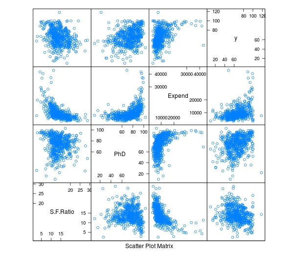
To make these plots we did the following
Developing the Model
We will now develop the model. Below is the code for creating the model. How to interpret this information is in another post.
> TrainingModel <-lm(Grad.Rate ~ S.F.Ratio+PhD+Expend, data=trainingset) > summary(TrainingModel)
As you look at the summary, you can see that all of our variables are significant and that the current model explains 18% of the variance of graduation rate.
Visualizing the Multiple Regression Model
We cannot use a regular plot because are model involves more than two dimensions. To get around this problem to see are modeling, we will graph fitted values against the residual values. Fitted values are the predict values while residual values are the acutal values from the data. Below is the code followed by the plot.
> CheckModel<-train(Grad.Rate~S.F.Ratio+PhD+Expend, method="lm", data=trainingset) > DoubleCheckModel<-CheckModel$finalModel > plot(DoubleCheckModel, 1, pch=19, cex=0.5)
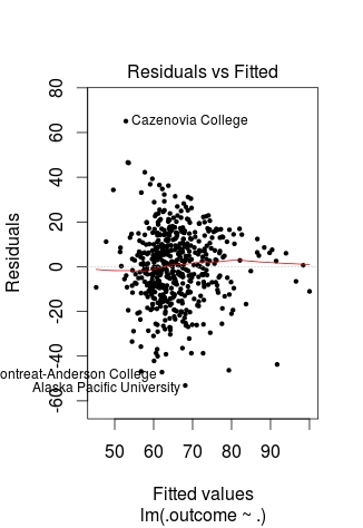
Here is what happened
The regression line was automatically added for us. As you can see, the model does not predict much but shows some linearity.
Predict with Model
We will now do one prediction. We want to know the graduation rate when we have the following information
Here is the code with the answer
> newdata<-data.frame(S.F.Ratio=33, PhD=76, Expend=11000) > predict(TrainingModel, newdata) 1 57.04367
To put it simply, if the student-to-faculty ratio is 33, the percentage of PhD faculty is 76%, and the expenditures per student is 11,000, we can expect 57% of the students to graduate.
Testing
We will now test our model with the testing dataset. We will calculate the RMSE. Below is the code for creating the testing model followed by the codes for calculating each RMSE.
> TestingModel<-lm(Grad.Rate~S.F.Ratio+PhD+Expend, data=testingset)
> sqrt(sum((TrainingModel$fitted-trainingset$Grad.Rate)^2)) [1] 369.4451 > sqrt(sum((TestingModel$fitted-testingset$Grad.Rate)^2)) [1] 219.4796
Here is what happened
Conclusion
This post attempted to explain how to predict and assess models with multiple variables. Although complex for some, prediction is a valuable statistical tool in many situations.
In the last post about R, we looked at plotting information to make predictions. We will now look at an example of making predictions using regression.
We will use the same data as last time with the help of the ‘caret’ package as well. The code below sets up the seed and the training and testing set we need.
> library(caret); library(ISLR); library(ggplot2)
> data("College");set.seed(1)
> PracticeSet<-createDataPartition(y=College$Grad.Rate, + p=0.5, list=FALSE) > TrainingSet<-College[PracticeSet, ]; TestingSet<- + College[-PracticeSet, ] > head(TrainingSet)
The code above should look familiar from the previous post.
Make the Scatterplot
We will now create the scatterplot showing the relationship between “S.F. Ratio” and “Grad.Rate” with the code below and the scatterplot.
> plot(TrainingSet$S.F.Ratio, TrainingSet$Grad.Rate, pch=5, col="green", xlab="Student Faculty Ratio", ylab="Graduation Rate")

Here is what we did
Fitting the Model
We will now develop the linear model. This model will help us to predict future models. Furthermore, we will compare the model of the Training Set with the Test Set. Below is the code for developing the model.
> TrainingModel<-lm(Grad.Rate~S.F.Ratio, data=TrainingSet) > summary(TrainingModel)
How to interpret this information was presented in a previous post. However, to summarize, we can say that when the student to faculty ratio increases one the graduation rate decreases 1.29. In other words, an increase in the student to faculty ratio leads to decrease in the graduation rate.
Adding the Regression Line to the Plot
Below is the code for adding the regression line followed by the scatterplot
> plot(TrainingSet$S.F.Ratio, TrainingSet$Grad.Rate, pch=19, col="green", xlab="Student Faculty Ratio", ylab="Graduation Rate") > lines(TrainingSet$S.F.Ratio, TrainingModel$fitted, lwd=3)

Predicting New Values
With our model complete we can now predict values. For our example, we will only predict one value. We want to know what the graduation rate would be if we have a student to faculty ratio of 33. Below is the code for this with the answer
> newdata<-data.frame(S.F.Ratio=33) > predict(TrainingModel, newdata) 1 40.6811
Here is what we did
Testing the Model
We will now test the model we made with the training set with the testing set. First, we will make a visual of both models by using the “plot” function. Below is the code follow by the plots.
par(mfrow=c(1,2))
plot(TrainingSet$S.F.Ratio,
TrainingSet$Grad.Rate, pch=19, col=’green’, xlab=”Student Faculty Ratio”, ylab=’Graduation Rate’)
lines(TrainingSet$S.F.Ratio, predict(TrainingModel), lwd=3)
plot(TestingSet$S.F.Ratio, TestingSet$Grad.Rate, pch=19, col=’purple’,
xlab=”Student Faculty Ratio”, ylab=’Graduation Rate’)
lines(TestingSet$S.F.Ratio, predict(TrainingModel, newdata = TestingSet),lwd=3)

In the code, all that is new is the “par” function which allows us to see to plots at the same time. We also used the ‘predict’ function to set the plots. As you can see, the two plots are somewhat differ based on a visual inspection. To determine how much so, we need to calculate the error. This is done through computing the root mean square error as shown below.
> sqrt(sum((TrainingModel$fitted-TrainingSet$Grad.Rate)^2)) [1] 328.9992 > sqrt(sum((predict(TrainingModel, newdata=TestingSet)-TestingSet$Grad.Rate)^2)) [1] 315.0409
The main take away from this complicated calculation is the number 328.9992 and 315.0409. These numbers tell you the amount of error in the training model and testing model. The lower the number the better the model. Since the error number in the testing set is lower than the training set we know that our model actually improves when using the testing set. This means that our model is beneficial in assessing graduation rates. If there were problems we may consider using other variables in the model.
Conclusion
This post shared ways to develop a regression model for the purpose of prediction and for model testing.
It is common in machine learning to look at the training set of your data visually. This helps you to decide what to do as you begin to build your model. In this post, we will make several different visual representations of data using datasets available in several R packages.
We are going to explore data in the “College” dataset in the “ISLR” package. If you have not done so already, you need to download the “ISLR” package along with “ggplot2” and the “caret” package.
Once these packages are installed in R you want to look at a summary of the variables use the summary function as shown below.
summary(College)
You should get a printout of information about 18 different variables. Based on this printout, we want to explore the relationship between graduation rate “Grad.Rate” and student to faculty ratio “S.F.Ratio”. This is the objective of this post.
Next, we need to create a training and testing dataset below is the code to do this.
> library(ISLR);library(ggplot2);library(caret)
> data("College")
> PracticeSet<-createDataPartition(y=College$Enroll, p=0.7, + list=FALSE) > trainingSet<-College[PracticeSet,] > testSet<-College[-PracticeSet,] > dim(trainingSet); dim(testSet)
[1] 545 18
[1] 232 18
The explanation behind this code was covered in predicting with caret so we will not explain it again. You just need to know that the dataset you will use for the rest of this post is called “trainingSet”.
Developing a Plot
We now want to explore the relationship between graduation rates and student to faculty ratio. We will be used the ‘ggpolt2’ package to do this. Below is the code for this followed by the plot.
qplot(S.F.Ratio, Grad.Rate, data=trainingSet)
As you can see, there appears to be a negative relationship between student faculty ratio and grad rate. In other words, as the ration of student to faculty increases there is a decrease in the graduation rate.
Next, we will color the plots on the graph based on whether they are a public or private university to get a better understanding of the data. Below is the code for this followed by the plot.
> qplot(S.F.Ratio, Grad.Rate, colour = Private, data=trainingSet)
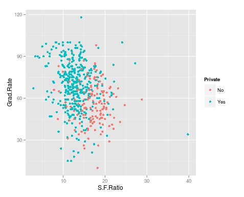
It appears that private colleges usually have lower student to faculty ratios and also higher graduation rates than public colleges
Add Regression Line
We will now plot the same data but will add a regression line. This will provide us with a visual of the slope. Below is the code followed by the plot.
> collegeplot<-qplot(S.F.Ratio, Grad.Rate, colour = Private, data=trainingSet) > collegeplot+geom_smooth(method = ‘lm’,formula=y~x)
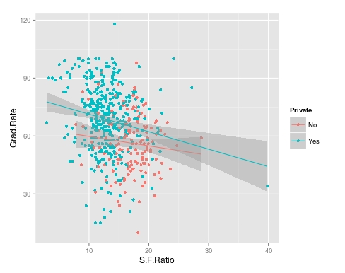
Most of this code should be familiar to you. We saved the plot as the variable ‘collegeplot’. In the second line of code, we add specific coding for ‘ggplot2’ to add the regression line. ‘lm’ means linear model and formula is for creating the regression.
Cutting the Data
We will now divide the data based on the student-faculty ratio into three equal size groups to look for additional trends. To do this you need the “Hmisc” packaged. Below is the code followed by the table
> library(Hmisc)
> divide_College<-cut2(trainingSet$S.F.Ratio, g=3) > table(divide_College) divide_College [ 2.9,12.3) [12.3,15.2) [15.2,39.8] 185 179 181
Our data is now divided into three equal sizes.
Box Plots
Lastly, we will make a box plot with our three equal size groups based on student-faculty ratio. Below is the code followed by the box plot
CollegeBP<-qplot(divide_College, Grad.Rate, data=trainingSet, fill=divide_College, geom=c(“boxplot”)) > CollegeBP
As you can see, the negative relationship continues even when student-faculty is divided into three equally size groups. However, our information about private and public college is missing. To fix this we need to make a table as shown in the code below.
> CollegeTable<-table(divide_College, trainingSet$Private) > CollegeTable divide_College No Yes [ 2.9,12.3) 14 171 [12.3,15.2) 27 152 [15.2,39.8] 106 75
This table tells you how many public and private colleges there based on the division of the student-faculty ratio into three groups. We can also get proportions by using the following
> prop.table(CollegeTable, 1) divide_College No Yes [ 2.9,12.3) 0.07567568 0.92432432 [12.3,15.2) 0.15083799 0.84916201 [15.2,39.8] 0.58563536 0.41436464
In this post, we found that there is a negative relationship between student-faculty ratio and graduation rate. We also found that private colleges have a lower student-faculty ratio and a higher graduation rate than public colleges. In other words, the status of a university as public or private moderates the relationship between student-faculty ratio and graduation rate.
You can probably tell by now that R can be a lot of fun with some basic knowledge of coding.

Correlational research is focused on examining the relationships among two or more variables. This information can be used either to explain a phenomenon or to make predictions. This post will explain the two forms of correlational design as well as the characteristics of correlational design in general.
Explanatory Design
An explanatory design seeks to determine to what extent two or more variables co-vary. Co-vary simply means the strength of the relationship of one variable to another. In general, two or more variables can have a strong, weak, or no relationship. This is determined by the product moment correlation coefficient, which is usually referred to as r. The r is measured on a scale of -1 to 1. The higher the absolute value the stronger the relationship.
For example, let’s say we do a study to determine the strength of the relationship between exercise and health. Exercise is the explanatory variable and health is the response variable. This means that we are hoping the exercise will explain health or you can say we are hoping that health responds to exercise. In this example, let’s say that there is a strong relationship between exercise and health with an r of 0.7. This literally means that when exercise goes up one unit, that health improves by 0.7 units or that the more exercise a person gets the healthier they are. In other words, when one increases the other increase as well.
Exercise is able to explain a certain amount of the variance (amount of change) in health. This is done by squaring the r to get the r-squared. The higher the r-squared to more appropriate the model is in explaining the relationship between the explanatory and response variable. This is where regression comes from.
This also holds true for a negative relationship but in negative relationships when the explanatory variables increase the response variable decreases. For example, let’s say we do a study that examines the relationship between exercise and age and we calculate an r of -0.85. This means that when exercise increases one unit age decreases 0.85. In other words, more exercises mean that the person is probably younger. In this example, the relationship is strong but indicates that the variables move in opposite directions.
Prediction Design
Prediction design has most of the same functions as explanatory design with a few minor changes. In prediction design, we normally do not use the term explanatory and response variable. Rather we have predictor and outcome variable as terms. This is because we are trying to predict and not explain. In research, there are many terms for independent and dependent variable and this is because different designs often use different terms.
Another difference is the prediction designs are focused on determining future results or forecasting. For example, if we are using exercise to predict age we can develop an equation that allows us to determine a person’s age based on how much they exercise or vice versa. Off course, no model is 100% accurate but a good model can be useful even if it is wrong at times.
What both designs have in common is the use of r and r square and the analysis of the strength of the relationship among the variables.
Conclusion
In research, explanatory and prediction correlational designs have a place in understanding data. Which to use depends on the goals of the research and or the research questions. Both designs have

Analysis of variance (ANOVA) is used when you want to see if there is a difference in the means of three or more groups due to some form of treatment(s). In this post, we will look at conducting an ANOVA calculation using R.
We are going to use a dataset that is already built into R called ‘InsectSprays.’ This dataset contains information on different insecticides and their ability to kill insects. What we want to know is which insecticide was the best at killing insects.
In the dataset ‘InsectSprays’, there are two variables, ‘count’, which is the number of dead bugs, and ‘spray’ which is the spray that was used to kill the bug. For the ‘spray’ variable there are six types label A-F. There are 72 total observations for the six types of spray which comes to about 12 observations per spray.
Building the Model
The code for calculating the ANOVA is below
> BugModel<- aov(count ~ spray, data=InsectSprays) > BugModel Call: aov(formula = count ~ spray, data = InsectSprays) Terms: spray Residuals Sum of Squares 2668.833 1015.167 Deg. of Freedom 5 66 Residual standard error: 3.921902 Estimated effects may be unbalanced
Here is what we did
Now we need to see if there are any significant results. To do this we will use the ‘summary’ function as shown in the script below
> summary(BugModel) Df Sum Sq Mean Sq F value Pr(>F) spray 5 2669 533.8 34.7 <2e-16 *** Residuals 66 1015 15.4 --- Signif. codes: 0 ‘***’ 0.001 ‘**’ 0.01 ‘*’ 0.05 ‘.’ 0.1 ‘ ’ 1
These results indicate that there are significant results in the model as shown by the p-value being essentially zero (Pr(>F)). In other words, there is at least one mean that is different from the other means statistically.
We need to see what the means are overall for all sprays and for each spray individually. This is done with the following script
> model.tables(BugModel, type = 'means') Tables of means Grand mean 9.5 spray spray A B C D E F 14.500 15.333 2.083 4.917 3.500 16.667
The ‘model.tables’ function tells us the means overall and for each spray. As you can see, it appears spray F is the most efficient at killing bugs with a mean of 16.667.
However, this table does not indicate the statistically significance. For this we need to conduct a post-hoc Tukey test. This test will determine which mean is significantly different from the others. Below is the script
> BugSpraydiff<- TukeyHSD(BugModel) > BugSpraydiff Tukey multiple comparisons of means 95% family-wise confidence level Fit: aov(formula = count ~ spray, data = InsectSprays) $spray diff lwr upr p adj B-A 0.8333333 -3.866075 5.532742 0.9951810 C-A -12.4166667 -17.116075 -7.717258 0.0000000 D-A -9.5833333 -14.282742 -4.883925 0.0000014 E-A -11.0000000 -15.699409 -6.300591 0.0000000 F-A 2.1666667 -2.532742 6.866075 0.7542147 C-B -13.2500000 -17.949409 -8.550591 0.0000000 D-B -10.4166667 -15.116075 -5.717258 0.0000002 E-B -11.8333333 -16.532742 -7.133925 0.0000000 F-B 1.3333333 -3.366075 6.032742 0.9603075 D-C 2.8333333 -1.866075 7.532742 0.4920707 E-C 1.4166667 -3.282742 6.116075 0.9488669 F-C 14.5833333 9.883925 19.282742 0.0000000 E-D -1.4166667 -6.116075 3.282742 0.9488669 F-D 11.7500000 7.050591 16.449409 0.0000000 F-E 13.1666667 8.467258 17.866075 0.0000000
There is a lot of information here. To make things easy, wherever there is a p adj of less than 0.05 that means that there is a difference between those two means. For example, bug spray F and E have a difference of 13.16 that has a p adj of zero. So these two means are really different statistically.This chart also includes the lower and upper bounds of the confidence interval.
The results can also be plotted with the script below
> plot(BugSpraydiff, las=1)
Below is the plot

Conclusion
ANOVA is used to calculate if there is a difference of means among three or more groups. This analysis can be conducted in R using various scripts and codes.