
It is common in machine learning to look at the training set of your data visually. This helps you to decide what to do as you begin to build your model. In this post, we will make several different visual representations of data using datasets available in several R packages.
We are going to explore data in the “College” dataset in the “ISLR” package. If you have not done so already, you need to download the “ISLR” package along with “ggplot2” and the “caret” package.

Once these packages are installed in R you want to look at a summary of the variables use the summary function as shown below.
summary(College)
You should get a printout of information about 18 different variables. Based on this printout, we want to explore the relationship between graduation rate “Grad.Rate” and student to faculty ratio “S.F.Ratio”. This is the objective of this post.
Next, we need to create a training and testing dataset below is the code to do this.
> library(ISLR);library(ggplot2);library(caret)
> data("College")
> PracticeSet<-createDataPartition(y=College$Enroll, p=0.7, +                                  list=FALSE) > trainingSet<-College[PracticeSet,] > testSet<-College[-PracticeSet,] > dim(trainingSet); dim(testSet)
[1] 545  18
[1] 232  18
The explanation behind this code was covered in predicting with caret so we will not explain it again. You just need to know that the dataset you will use for the rest of this post is called “trainingSet”.
Developing a Plot
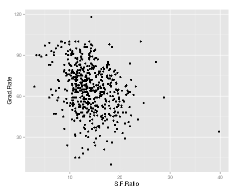
We now want to explore the relationship between graduation rates and student to faculty ratio. We will be used the ‘ggpolt2’ package to do this. Below is the code for this followed by the plot.
qplot(S.F.Ratio, Grad.Rate, data=trainingSet)
As you can see, there appears to be a negative relationship between student faculty ratio and grad rate. In other words, as the ration of student to faculty increases there is a decrease in the graduation rate.
Next, we will color the plots on the graph based on whether they are a public or private university to get a better understanding of the data. Below is the code for this followed by the plot.
> qplot(S.F.Ratio, Grad.Rate, colour = Private, data=trainingSet)
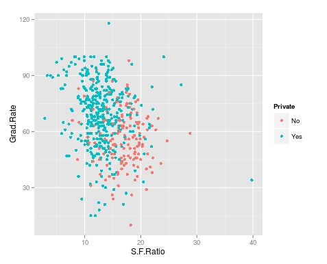
It appears that private colleges usually have lower student to faculty ratios and also higher graduation rates than public colleges
Add Regression Line
We will now plot the same data but will add a regression line. This will provide us with a visual of the slope. Below is the code followed by the plot.
> collegeplot<-qplot(S.F.Ratio, Grad.Rate, colour = Private, data=trainingSet) > collegeplot+geom_smooth(method = ‘lm’,formula=y~x)
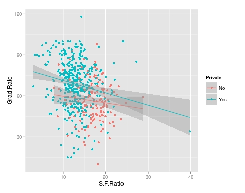
Most of this code should be familiar to you. We saved the plot as the variable ‘collegeplot’. In the second line of code, we add specific coding for ‘ggplot2’ to add the regression line. ‘lm’ means linear model and formula is for creating the regression.
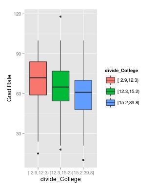
Cutting the Data
We will now divide the data based on the student-faculty ratio into three equal size groups to look for additional trends. To do this you need the “Hmisc” packaged. Below is the code followed by the table
> library(Hmisc)
> divide_College<-cut2(trainingSet$S.F.Ratio, g=3)
> table(divide_College)
divide_College
[ 2.9,12.3) [12.3,15.2) [15.2,39.8]
        185         179         181
Our data is now divided into three equal sizes.
Box Plots
Lastly, we will make a box plot with our three equal size groups based on student-faculty ratio. Below is the code followed by the box plot
CollegeBP<-qplot(divide_College, Grad.Rate, data=trainingSet, fill=divide_College, geom=c(“boxplot”)) > CollegeBP
As you can see, the negative relationship continues even when student-faculty is divided into three equally size groups. However, our information about private and public college is missing. To fix this we need to make a table as shown in the code below.
> CollegeTable<-table(divide_College, trainingSet$Private)
> CollegeTable

divide_College  No Yes
   [ 2.9,12.3)  14 171
   [12.3,15.2)  27 152
   [15.2,39.8] 106  75
This table tells you how many public and private colleges there based on the division of the student-faculty ratio into three groups. We can also get proportions by using the following
> prop.table(CollegeTable, 1)

divide_College         No        Yes
   [ 2.9,12.3) 0.07567568 0.92432432
   [12.3,15.2) 0.15083799 0.84916201
   [15.2,39.8] 0.58563536 0.41436464
In this post, we found that there is a negative relationship between student-faculty ratio and graduation rate. We also found that private colleges have a lower student-faculty ratio and a higher graduation rate than public colleges. In other words, the status of a university as public or private moderates the relationship between student-faculty ratio and graduation rate.
You can probably tell by now that R can be a lot of fun with some basic knowledge of coding.
Pingback: Using Regression for Prediction in R | educationalresearchtechniques