Tag Archives: data analysis

Primary Tasks in Data Analysis

Performing a data analysis in the realm of data science is a difficult task due to the huge number of decisions that need to be made. For some people,  plotting the course to conduct an analysis is easy. However, for most of us, beginning a project leads to a sense of paralysis as we struggle to determine what to do.

In light of this challenge, there are at least 5 core task that you need to consider when preparing to analyze data. These five tasks are

  1. Developing  your question(s)
  2. Data exploration
  3. Developing a statistical model
  4. Interpreting the results
  5. Sharing the results

Developing Your Question(s)

You really cannot analyze data until you first determine what it is you want to know. It is tempting to just jump in and start looking for interesting stuff but you will not know if something you find is interesting unless it helps to answer your question(s).

There are several types of research questions. The point is you need to ask them in order to answer them.

Data Exploration

Data exploration allows you to determine if you can answer your questions with the data you have. In data science, the data is normally already collected by the time you are called upon to analyze it. As such, what you want to find may not be possible.

In addition, exploration of the data allows you to determine if there are any problems with the data set such as missing data, strange variables, and if necessary to develop a data dictionary so you know the characteristics of the variables.

Data exploration allows you to determine what kind of data wrangling needs to be done. This involves the preparation of the data for a more formal analysis when you develop your statistical models. This process takes up the majority of a data scientist time and is not easy at all.  Mastery of this in many ways means being a master of data science

Develop a Statistical Model

Your research questions and the data exploration process helps you to determine what kind of model to develop. The factors that can affect this is whether your data is supervised or unsupervised and whether you want to classify or predict numerical values.

This is probably the funniest part of data analysis and is much easier than having to wrangle with the data. Your goal is to determine if the model helps to answer your question(s)

Interpreting the Results

Once a model is developed it is time to explain what it means. Sometimes you can make a really cool model that nobody (including yourself) can explain. This is especially true of “black box” methods such as support vector machines and artificial neural networks. Models need to normally be explainable to non-technical stakeholders.

With interpretation, you are trying to determine “what does this answer mean to the stakeholders?”  For example, if you find that people who smoke are 5 times more likely to die before the age of 50 what are the implications of this? How can the stakeholders use this information to achieve their own goals? In other words, why should they care about what you found out?

Communication of Results

Now is the time to actually share the answer(s) to your question(s). How this is done varies but it can be written, verbal or both. Whatever the mode of communication it is necessary to consider the following

  • The audience or stakeholders
  • The actual answers to the questions
  • The benefits of knowing this

You must remember the stakeholders because this affects how you communicate. How you speak to business professionals would be different from academics. Next, you must share the answers to the questions. This can be done with charts, figures, illustrations etc. Data visualization is an expertise of its own. Lastly, you explain how this information is useful in a practical way.

Conclusion

The process shared here is one way to approach the analysis of data. Think of this as a framework from which to develop your own method of analysis.

Principal Component Analysis in R

This post will demonstrate the use of principal component analysis (PCA). PCA is useful for several reasons. One it allows you place your examples into groups similar to linear discriminant analysis but you do not need to know beforehand what the groups are. Second, PCA is used for the purpose of dimension reduction. For example, if you have 50 variables PCA can allow you to reduce this while retaining a certain threshold of variance. If you are working with a large dataset this can greatly reduce the computational time and general complexity of your models.

Keep in mind that there really is not a dependent variable as this is unsupervised learning. What you are trying to see is how different examples can

be mapped in space based on whatever independent variables are used. For our example, we will use the “Carseats” dataset from the “ISLR”. Our goal is to understand the relationship among the variables when examining the shelve location of the car seat. Below is the initial code to begin the analysis

library(ggplot2)
library(ISLR)
data("Carseats")

We first need to rearrange the data and remove the variables we are not going to use in the analysis. Below is the code.

Carseats1<-Carseats
Carseats1<-Carseats1[,c(1,2,3,4,5,6,8,9,7,10,11)]
Carseats1$Urban<-NULL
Carseats1$US<-NULL

Here is what we did 1. We made a copy of the “Carseats” data called “Careseats1” 2. We rearranged the order of the variables so that the factor variables are at the end. This will make sense later 3.We removed the “Urban” and “US” variables from the table as they will not be a part of our analysis

We will now do the PCA. We need to scale and center our data otherwise the larger numbers will have a much stronger influence on the results than smaller numbers. Fortunately, the “prcomp” function has a “scale” and a “center” argument. We will also use only the first 7 columns for the analysis as “sheveLoc” is not useful for this analysis. If we hadn’t moved “shelveLoc” to the end of the dataframe it would cause some headache. Below is the code.

Carseats.pca<-prcomp(Carseats1[,1:7],scale. = T,center = T)
summary(Carseats.pca)
## Importance of components:
##                           PC1    PC2    PC3    PC4    PC5     PC6     PC7
## Standard deviation     1.3315 1.1907 1.0743 0.9893 0.9260 0.80506 0.41320
## Proportion of Variance 0.2533 0.2026 0.1649 0.1398 0.1225 0.09259 0.02439
## Cumulative Proportion  0.2533 0.4558 0.6207 0.7605 0.8830 0.97561 1.00000

The summary of “Carseats.pca” Tells us how much of the variance each component explains. Keep in mind that the number of components is equal to the number of variables. The “proportion of variance” tells us the contribution each component makes and the “cumulative proportion”.

If your goal is dimension reduction than the number of components to keep depends on the threshold you set. For example, if you need around 90% of the variance you would keep the first 5 components. If you need 95% or more of the variance you would keep the first six. To actually use the components you would take the “Carseats.pca$x” data and move it to your data frame.

Keep in mind that the actual components have no conceptual meaning but is a numerical representation of a combination of several variables that were reduced using PCA to fewer variables such as going from 7 variables to 5 variables.

This means that PCA is great for reducing variables for prediction purpose but is much harder for explanatory studies unless you can explain what the new components represent.

For our purposes, we will keep 5 components. This means that we have reduced our dimensions from 7 to 5 while still keeping almost 90% of the variance. Graphing our results is tricky because we have 5 dimensions but the human mind can only conceptualize 3 at the best and normally 2. As such we will plot the first two components and label them by shelf location using ggplot2. Below is the code

scores<-as.data.frame(Carseats.pca$x)
pcaplot<-ggplot(scores,(aes(PC1,PC2,color=Carseats1$ShelveLoc)))+geom_point()
pcaplot

1.png

From the plot, you can see there is little separation when using the first two components of the PCA analysis. This makes sense as we can only graph to components so we are missing a lot of the variance. However, for demonstration purposes the analysis is complete.

Understanding Confusion Matrices

A confusion matrix is a table that is used to organize the predictions made during an analysis of data. Without making a joke confusion matrices can be confusing especially for those who are new to research.

In this post, we will look at how confusion matrices are set up as well as what the information in the means.

Actual Vs Predicted Class

The most common confusion matrix is a two class matrix. This matrix compares the actual class of an example with the predicted class of the model. Below is an example

Two Class Matrix
Predicted Class
A  B
Correctly classified as A Incorrectly classified as B
Incorrectly classified as A Correctly classified as B

 Actual class is along the vertical side

Looking at the table there are four possible outcomes.

  • Correctly classified as A-This means that the example was a part of the A category and the model predicted it as such
  • Correctly classified as B-This means that the example was a part of the B category and the model predicted it as such
  • Incorrectly classified as A-This means that the example was a part of the B category but the model predicted it to be a part of the A group
  • Incorrectly classified as B-This means that the example was a part of the A category but the model predicted it to be a part of the B group

These four types of classifications have four different names which are true positive, true negative, false positive, and false negative. We will look at another example to understand these four terms.

Two Class Matrix
Predicted Lazy Students
Lazy  Not Lazy
1. Correctly classified as lazy 2. Incorrectly classified as not Lazy
3. Incorrectly classified as Lazy 4. Correctly classified as not lazy

Actual class is along the vertical side

In the example above, we want to predict which students are lazy. Group one is the group in which students who are lazy are correctly classified as lazy. This is called true positive.

Group 2 are those who are lazy but are predicted as not being lazy. This is known as a false negative also known as a type II error in statistics. This is a problem because if the student is misclassified they may not get the support they need.

Group three is students who are not lazy but are classified as such. This is known as a false positive or type I error. In this example, being labeled lazy is a major headache for the students but not as dangerous perhaps as a false negative.

Lastly, group four are students who are not lazy and are correctly classified as such. This is known as a true negative.

Conclusion

The primary purpose of a confusion matrix is to display this information visually. In a future post, we will see that there is even more information found in a confusion matrix than what was cover briefly here.

Nearest Neighbor Classification

There are times when the relationships among examples you want to classify are messy and complicated. This makes it difficult to actually classify them. Yet in this same situation, items of the same class have a lot of features in common even though the overall sample is messy. In such a situation, nearest neighbor classification may be useful.

Nearest neighbor classification uses a simple technique to classify unlabeled examples. The algorithm assigns an unlabeled example the label of the nearest example. This based on the assumption that if two examples are next to each other they must be of the same class.

In this post, we will look at the characteristics of nearest neighbor classification as well as the strengths and weakness of this approach.

Characteristics

Nearest neighbor classification uses the features of the data set to create a multidimensional feature space. The number of features determines the number of dimensions. Therefore, two features leads to a two-dimensional feature space, three features leads to a three dimensional feature space, etc. In this feature space all the examples are placed based on their respective features.

The label of the unknown examples are determined by who the closet neighbor is or are. This calculation is based on Euclidean distance, which is the shortest distance possible. The number of neighbors that are used to calculate the distance varies at the discretion of the researcher. For example, we could use one neighbor or several to determine the label of an unlabeled example. There are pros and cons to how many neighbors to use. The more neighbors used the more complicated the classification becomes.

Nearest neighbor classification is considered a type of lazy learning. What is meant by lazy is that no abstraction of the data happens. This means there is no real explanation or theory provide by the model to understand why there are certain relationships. Nearest neighbor tells you where the relationships are but not why or how. This is partly due to the fact that it is a non-parametric learning method and provides no parameters (summary statistics) about the data.

Pros and Cons

Nearest neighbor classification has the advantage of being simple, highly effective, and fast during the training phase. There are also no assumptions made about the data distribution. This means that common problems like a lack of normality are not an issue.

Some problems include the lack of a model. This deprives us of insights into the relationships in the data. Another concern is the headache of missing data.  This forces you to spend time cleaning the data more thoroughly.  One final issue is that the classification phase of a project is slow and cumbersome because of the messy nature of the data.

Conclusion

Nearest neighbor classification is one useful tool in machine learning. This approach is valuable for times when the data is heterogeneous but with clear homogeneous groups in the data. In a future post, we will go through an example of this classification approach using R.

Using Plots for Prediction in R

It is common in machine learning to look at the training set of your data visually. This helps you to decide what to do as you begin to build your model.  In this post, we will make several different visual representations of data using datasets available in several R packages.

We are going to explore data in the “College” dataset in the “ISLR” package. If you have not done so already, you need to download the “ISLR” package along with “ggplot2” and the “caret” package.

Once these packages are installed in R you want to look at a summary of the variables use the summary function as shown below.

summary(College)

You should get a printout of information about 18 different variables. Based on this printout, we want to explore the relationship between graduation rate “Grad.Rate” and student to faculty ratio “S.F.Ratio”. This is the objective of this post.

Next, we need to create a training and testing dataset below is the code to do this.

> library(ISLR);library(ggplot2);library(caret)
> data("College")
> PracticeSet<-createDataPartition(y=College$Enroll, p=0.7, +                                  list=FALSE) > trainingSet<-College[PracticeSet,] > testSet<-College[-PracticeSet,] > dim(trainingSet); dim(testSet)
[1] 545  18
[1] 232  18

The explanation behind this code was covered in predicting with caret so we will not explain it again. You just need to know that the dataset you will use for the rest of this post is called “trainingSet”.

Developing a Plot

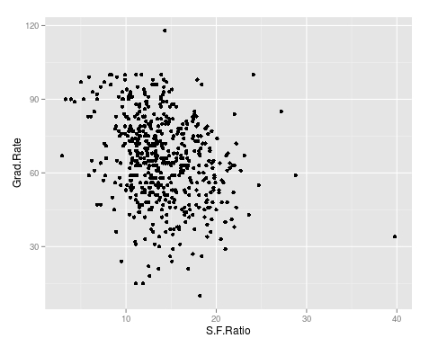
We now want to explore the relationship between graduation rates and student to faculty ratio. We will be used the ‘ggpolt2’  package to do this. Below is the code for this followed by the plot.

qplot(S.F.Ratio, Grad.Rate, data=trainingSet)
Rplot10
As you can see, there appears to be a negative relationship between student faculty ratio and grad rate. In other words, as the ration of student to faculty increases there is a decrease in the graduation rate.

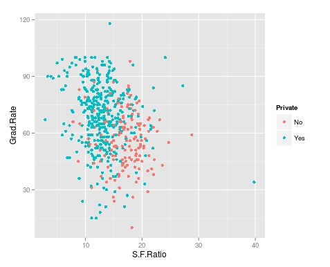
Next, we will color the plots on the graph based on whether they are a public or private university to get a better understanding of the data. Below is the code for this followed by the plot.

> qplot(S.F.Ratio, Grad.Rate, colour = Private, data=trainingSet)
Rplot.jpeg
It appears that private colleges usually have lower student to faculty ratios and also higher graduation rates than public colleges

Add Regression Line

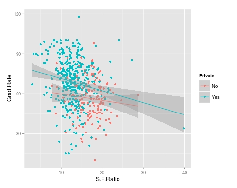
We will now plot the same data but will add a regression line. This will provide us with a visual of the slope. Below is the code followed by the plot.

> collegeplot<-qplot(S.F.Ratio, Grad.Rate, colour = Private, data=trainingSet) > collegeplot+geom_smooth(method = ‘lm’,formula=y~x)
Rplot01.jpeg
Most of this code should be familiar to you. We saved the plot as the variable ‘collegeplot’. In the second line of code, we add specific coding for ‘ggplot2’ to add the regression line. ‘lm’ means linear model and formula is for creating the regression.

Cutting the Data

We will now divide the data based on the student-faculty ratio into three equal size groups to look for additional trends. To do this you need the “Hmisc” packaged. Below is the code followed by the table

> library(Hmisc)
> divide_College<-cut2(trainingSet$S.F.Ratio, g=3)
> table(divide_College)
divide_College
[ 2.9,12.3) [12.3,15.2) [15.2,39.8] 
        185         179         181

Our data is now divided into three equal sizes.

Box Plots

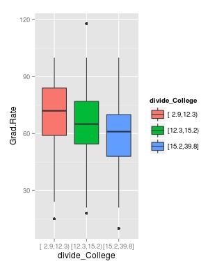
Lastly, we will make a box plot with our three equal size groups based on student-faculty ratio. Below is the code followed by the box plot

CollegeBP<-qplot(divide_College, Grad.Rate, data=trainingSet, fill=divide_College, geom=c(“boxplot”)) > CollegeBP
Rplot02
As you can see, the negative relationship continues even when student-faculty is divided into three equally size groups. However, our information about private and public college is missing. To fix this we need to make a table as shown in the code below.

> CollegeTable<-table(divide_College, trainingSet$Private)
> CollegeTable
              
divide_College  No Yes
   [ 2.9,12.3)  14 171
   [12.3,15.2)  27 152
   [15.2,39.8] 106  75

This table tells you how many public and private colleges there based on the division of the student-faculty ratio into three groups. We can also get proportions by using the following

> prop.table(CollegeTable, 1)
              
divide_College         No        Yes
   [ 2.9,12.3) 0.07567568 0.92432432
   [12.3,15.2) 0.15083799 0.84916201
   [15.2,39.8] 0.58563536 0.41436464

In this post, we found that there is a negative relationship between student-faculty ratio and graduation rate. We also found that private colleges have a lower student-faculty ratio and a higher graduation rate than public colleges. In other words, the status of a university as public or private moderates the relationship between student-faculty ratio and graduation rate.

You can probably tell by now that R can be a lot of fun with some basic knowledge of coding.

Analyzing Qualitative Data

Analyzing qualitative data is not an easy task. Instead of punching script into a statistical programming and receiving results, you become the computer who needs to analyze the data. For this reason alone, the analysis of qualitative data is difficult as different people will have vastly different interpretations of data.

This post will look at the following

  • The basic characteristics of qualitative data analysis
  • Exploring and coding data

Basic Characteristics

Qualitative data analysis has the following traits

  • Inductive form
  • Analyzing data while still collecting data
  • Interpretative

Qualitative analysis is inductive by nature. This indicates that a researcher goes from specific examples to the generation of broad concepts or themes. In many ways, the researcher is trying to organize and summarize what they found in their research coherently in nice neat categories and themes.

Qualitative analysis also involves analyzing while still collecting data.You begin to process the data while still accumulating data. This is an iterative process that involves moving back and forth between analysis and collection of data. This is a strong contrast to quantitative research which is usually linear in nature.

Lastly, qualitative analysis is highly subjective. Everyone who views the data will have a different perspective on the results of a study. This means that people will all see different ideas and concepts that are important in qualitative research.

Exploring and Coding

Coding data in qualitative research can be done with text, images, and or observations. In coding, a researcher determines which information to share through the development of segments, codes, categories, themes. Below is the process for developing codes and categories

1. Read the text

Reading the text means to get familiar with it and now what is discussed.

2. Pick segments of quotes to include in the article

After reading the text, you begin to pick quotes from the interview that will be used for further inductive processing

3, Develop codes from segments

After picking many different segments, you need to organize them into codes. All segments in one code have something in common that unites them as a code.

4. Develop categories from codes

The next level of abstract is developing categories from codes. The same process in step 3 is performed here.

5. Develop themes from categories

This final step involves further summarizing the results of the categories development into themes. The process is the same as steps 3 and 4.

Please keep in mind that as you move from step 1 to 5 the number of concepts decreases. For example, you may start with 50 segments that are reduced to 10 codes then reduce to 5 categories and finally 3 themes.

Conclusion

Qualitative data analysis is not agreed upon. There are many different ways to approach this. In general, the best approach possible is one that is consistent in terms of its treatment of the data. The example provided here is just one approach to organizing data in qualitative research.

Content Analysis In Qualitative Research

Content analysis serves the purpose in qualitative research to enable you to study human behavior indirectly through how people choose to communicate. The type of data collected can vary tremendously in this form of research. However, common examples of data include images, documents, and media.

In this post, we will look at the following in relation to content analysis

  • The purpose of content analysis
  • Coding in content analysis
  • Analysis in content analysis
  • Pros and cons in content analysis

Purpose

The purpose of content analysis is to study the central phenomenon through the analysis of examples of the communication of people connected with the central phenomenon. This information is coded into categories and themes. Categories and themes are just different levels of summarizing the results of the analysis. Themes are a summary of categories and categories are a direct summary of the data that was analyzed.

Coding

Coding the data is the process of organizing the results in a comprehensible way. In terms of coding, there are two choices.

  • Establish categories before beginning the analysis
  • Allow the categories to emerge during analysis

Which is best depends on the research questions and context of the study.

There are two forms of content manifest content and latent content. Manifest content is evidence that is directly seen such as the words in an interview. Latent content refers to the underlying meaning of content such as the interpretation of an interview.

The difference between these two forms of content is the objective or subjective nature of them. Many studies include both forms as this provides a fuller picture of the central phenomenon.

Analysis

There are several steps to consider when conducting a content analysis such as…

  • Define your terms-This helps readers to know what you are talking about
  • Explain what you are analyzing-This can be words, phrases, interviews, pictures, etc.
  • Explain your coding approach-Explained above
  • Present results

This list is far from complete but provides some basis for content analysis

Pros and Cons

Pros of content analysis include

  • Unobtrusive-Content analysis does not disturb the field or a people group normally
  • Replication-Since the documents are permanent, it is possible to replicate a study
  • Simplicity-Compared to other forms of research, content analysis is highly practical to complete

Cons include

  • Validity-It is hard to assess the validity of the analysis. The results of an analysis is the subjective opinion of an individual(s)
  • Limited data-Content analysis is limited to recorded content. This leaves out other forms of information

Conclusion

Content analysis provides another way for the qualitative research to analyze the world. There are strengths and weaknesses to this approach as there are such for forms of analysis. The point is to understand that there are times when the content analysis is appropriate

Quantitative Data Analysis Preparation

There are many different ways to approach data analysis preparation for quantitative studies. This post will provide some insight into how to do this. In particular, we will look at the following steps in quantitative data analysis preparation.

  • Scoring the data
  • Deciding on the types of scores to analyze
  • Inputting data
  • Cleaning the data

Scoring the Data

Scoring the data involves the researching assigning a numerical value to each response on an instrument. This includes categorical and continuous variables. Below is an example

Gender: Male(1)____________ Female(2)___________

I think school is boring

  1. Strongly Agree
  2. Agree
  3. Neutral
  4. Disagree
  5. Strongly Disagree

In the example of above, the first item about gender has the value 1 for male and 2 for female. The second item asks the person’s perception of school from 1 being strongly agree all the way to 5 which indicates strongly disagree. Every response was given a numerical value and it is the number that is inputted into the computer for analysis

Determining the Types of scores to Analyze

Once data has been received, it is necessary to determine what types of scores to analyze. Single-item score involves assessing the results from how each individual person responded. An example would be voting, in voting each individual score is add up to determine the results.

Another approach is summed scores. In this approach, the results of several items are added together. This is done because one item alone does not fully capture whatever is being measured. For example, there are many different instruments that measure depression. Several questions are asked and then the sum of the scores indicates the level of depression the individual is experiencing. No single question can accurately measure a person’s depression so a summed score approach is often much better.

Difference scores can involve single-item or summed scores. The difference is that difference scores measure change over time. For example, a teacher might measure a student’s reading comprehension before and after teaching the students basic skills. The difference is then calculated as below

  • Score 2 – Score 1 = Difference

Inputting Data

Inputting data often happens in Microsoft Excel since it is easy to load an excel file into various statistical programs. In general, inputting data involves giving each item its own column. In this column, you put the respondent’s responses. Each row belongs to one respondent. For example Row 2 would refer to respondent 2. All the results for respondent 2 would be in this row for all the items on the instrument.

If you are summing scores are looking for differences, you would need to create a column to hold the results of the summation or difference calculation. Often this is done in the statistical program and not Microsoft Excel.

Cleaning Data

Cleaning data involves searching for scores that are outside the range of the scale of an item(s) and dealing with missing data. Out range scores can be found through a visual inspection or through running some descriptive statistics. For example, if you have a Lickert scale of 1-5 and one item has a standard deviation of 7 it is an indication that something is wrong because the standard deviation cannot be larger than the range.

Missing data are items that do not have a response. Depending on the type of analysis this can be a major problem. There are several ways o deal with missing data.

  • Listwise deletion is the removal of any respondent who missed even one item on an instrument
  • Mean imputation is the inputting of the mean of the variable wherever there is a missing response

There are other more complicated approaches but this provides some idea of what to do.

Conclusion

Preparing data involves planning what you will do. You need to consider how you will score the items, what type of score you will analyze, input the data, and how you will clean it. From here, a deeper analysis is possible.