
In this post, we will learn how to predict using multiple regression in R. In a previous post, we learn how to predict with simple regression. This post will be a large repeat of this other post with the addition of using more than one predictor variable. We will use the “College” dataset and we will try to predict Graduation rate with the following variables

- Student to faculty ratio
- Percentage of faculty with PhD
- Expenditures per student
Preparing the Data
First we need to load several packages and divide the dataset int training and testing sets. This is not new for this blog. Below is the code for this.
library(ISLR); library(ggplot2); library(caret)
data("College")
inTrain<-createDataPartition(y=College$Grad.Rate,
 p=0.7, list=FALSE)
trainingset <- College[inTrain, ]
testingset <- College[-inTrain, ]
dim(trainingset); dim(testingset)
Visualizing the Data
We now need to get a visual idea of the data. Since we are using several variables the code for this is slightly different so we can look at several charts at the same time. Below is the code followed by the plots
> featurePlot(x=trainingset[,c("S.F.Ratio","PhD","Expend")],y=trainingset$Grad.Rate, plot="pairs")
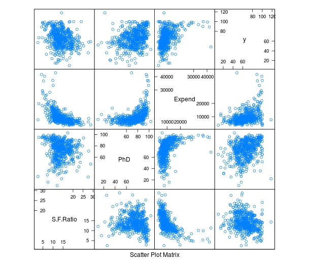
To make these plots we did the following
- We used the ‘featureplot’ function told R to use the ‘trainingset’ data set and subsetted the data to use the three independent variables.
- Next, we told R what the y= variable was and told R to plot the data in pairs
Developing the Model
We will now develop the model. Below is the code for creating the model. How to interpret this information is in another post.
> TrainingModel <-lm(Grad.Rate ~ S.F.Ratio+PhD+Expend, data=trainingset) > summary(TrainingModel)
As you look at the summary, you can see that all of our variables are significant and that the current model explains 18% of the variance of graduation rate.
Visualizing the Multiple Regression Model
We cannot use a regular plot because are model involves more than two dimensions. To get around this problem to see are modeling, we will graph fitted values against the residual values. Fitted values are the predict values while residual values are the acutal values from the data. Below is the code followed by the plot.
> CheckModel<-train(Grad.Rate~S.F.Ratio+PhD+Expend, method="lm", data=trainingset)
> DoubleCheckModel<-CheckModel$finalModel
> plot(DoubleCheckModel, 1, pch=19, cex=0.5)
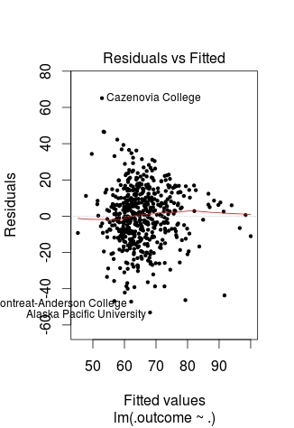
Here is what happened
- We created the variable ‘CheckModel’. In this variable, we used the ‘train’ function to create a linear model with all of our variables
- We then created the variable ‘DoubleCheckModel’ which includes the information from ‘CheckModel’ plus the new column of ‘finalModel’
- Lastly, we plot ‘DoubleCheckModel’
The regression line was automatically added for us. As you can see, the model does not predict much but shows some linearity.
Predict with Model
We will now do one prediction. We want to know the graduation rate when we have the following information
- Student-to-faculty ratio = 33
- Phd percent = 76
- Expenditures per Student = 11000
Here is the code with the answer
> newdata<-data.frame(S.F.Ratio=33, PhD=76, Expend=11000)
> predict(TrainingModel, newdata)
       1
57.04367
To put it simply, if the student-to-faculty ratio is 33, the percentage of PhD faculty is 76%, and the expenditures per student is 11,000, we can expect 57% of the students to graduate.
Testing
We will now test our model with the testing dataset. We will calculate the RMSE. Below is the code for creating the testing model followed by the codes for calculating each RMSE.
> TestingModel<-lm(Grad.Rate~S.F.Ratio+PhD+Expend, data=testingset)
> sqrt(sum((TrainingModel$fitted-trainingset$Grad.Rate)^2))
[1] 369.4451
> sqrt(sum((TestingModel$fitted-testingset$Grad.Rate)^2))
[1] 219.4796
Here is what happened
- We created the ‘TestingModel’ by using the same model as before but using the ‘testingset’ instead of the ‘trainingset’.
- The next two lines of codes should look familiar.
- From this output the performance of the model improvement on the testing set since the RMSE is lower than compared to the training results.
Conclusion
This post attempted to explain how to predict and assess models with multiple variables. Although complex for some, prediction is a valuable statistical tool in many situations.


