R has many fascinating features for creating histograms and plots. In this post, we will only cover some of the most basic concepts of make histograms and plots in R. The code for the data we are using is available in a previous post.
Making a Histogram
We are going to make a histogram of the ‘mpg’ variable in our ‘cars’ dataset. Below is the code for doing this followed by the actual histogram.
Here is what we did
- We used the ‘hist’ function to create the histogram
- Within the hist function we told r to make a histogram of ‘mpg’ variable found in the ‘cars’ dataset.
- An additional argument that we added was ‘col’. This argument is used to determine the color of the bars in the histogram. For our example, the color was set to gray.
Plotting Multiple Variables
Before we look at plotting multiple variables you need to make an adjustment to the ‘cyl’ variable in our cars variable. THis variable needs t be changed from a numeric to a factor variable as shown below
cars$cyl<- as.factor(cars$cyl)
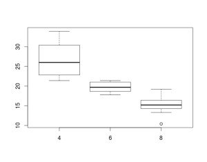
Boxplots are an excellent way of comparing groups visually. In this example, we will compare the ‘mpg’ or miles per gallon variable by the ‘cyl’ or number of cylinders in the engine variable in the ‘cars’ dataset. Below is the code and diagram followed by an explanation.
boxplot(mpg ~ cyl, data = cars)
Here is what happened.
- We use the ‘boxplot’ function
- Within this function we tell are to plot mpg and cyl using the tilda ” ~ ” to tell R to compare ‘mpg’ by the number of cylinders
The box of the boxplot tells you several things
- The bottom of the box tells you the 25th percentile
- The line in the middle of the box tells you the median
- The top of the box tells you the 75th percentile
- The bottom line tells you the minimum or lowest value excluding outliers
- The top line tells you the maximum or highest value excluding outliers
In order boxplot above, there are three types of cylinders 4, 6, and 8. For 4 cylinders the 25th percentile is about 23 mpg, the 50th percentile is about 26 mpg, while the 75th percentile is about 31 mpg. The minimum value was about 22 and the maximum value was about 35 mpg. A close look at the different blots indicates that four cylinder cars have the best mpg followed by six and finally eight cylinders.
Conclusions
Histograms and boxplots serve the purpose of describing numerical data in a visual manner. Nothing like a picture helps to explain abstract concepts such mean and median.


Pingback: Basics of Histograms and Plots in R | education...