Solving double inequalities

Solving double inequalities

The LibreOffice Suite is a free open-source office suit that is considered an alternative to Microsoft Office Suite. The primary benefit of LibreOffice is that it offers similar features as Microsoft Office with having to spend any money. In addition, LibreOffice is legitimately free and is not some sort of nefarious pirated version of Microsoft Office, which means that anyone can use LibreOffice without legal concerns on as many machines as they desire.
In this post, we will go over how to make plots and graphs in LibreOffice Calc. LibreOffice Calc is the equivalent to Microsoft Excel. We will learn how to make the following visualizations.
Bar Graph
We are going to make a bar graph from a single column of data in LibreOffice Calc. To make a visualization you need to aggregate some data. For this post, I simply made some random data that uses a likert scale of SD, D, N, A, SA. Below is a sample of the first five rows of the data.
| Var 1 |
| N |
| SD |
| D |
| SD |
| D |
In order to aggregate the data you need to make bins and count the frequency of each category in the bin. Here is how you do this. First you make a variable called “bin” in a column and you place SD, D, N, A, and SA each in their own row in the column you named “bin” as shown below.
| bin |
| SD |
| D |
| N |
| A |
| SA |
In the next column, you created a variable called “freq” in each column you need to use the countif function as shown below
=COUNTIF(1st value in data: last value in data, criteria for counting)
Below is how this looks for my data.
=COUNTIF(A2:A177,B2)
What I told LibreOffice was that my data is in A2 to A177 and they need to count the row if it contains the same data as B2 which for me contains SD. You repeat this process four more time adjusting the last argument in the function. When I finished I this is what I had.
| bin | freq |
| SD | 35 |
| D | 47 |
| N | 56 |
| A | 32 |
| SA | 5 |
We can now proceed to making the visualization.
To make the bar graph you need to first highlight the data you want to use. For us the information we want to select is the “bin” and “freq” variables we just created. Keep in mind that you never use the raw data but rather the aggregated data. Then click insert -> chart and you will see the following

Simply click next, and you will see the following

Make sure that the last three options are selected or your chart will look funny. Data series in rows or in columns has to do with how the data is read in a long or short form. Labels in first row makes sure that Calc does not insert “bin” and “freq” in the graph. First columns as label helps in identifying what the values are in the plot.
Once you click next you will see the following.

This window normally does not need adjusting and can be confusing to try to do so. It does allow you to adjust the range of the data and even and more data to your chart. For now, we will click on next and see the following.
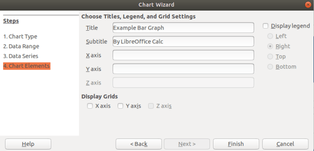
In the last window above, you can add a title and label the axes if you want. You can see that I gave my graph a name. In addition, you can decide if you want to display a legend if you look to the right. For my graph, that was not adding any additional information so I unchecked this option. When you click finish you will see the following on the spreadsheet.

Histogram
Histogram are for continuous data. Therefore, I convert my SD, D, N, A, SA to 1, 2, 3, 4, and 5. All the other steps are the same as above. The one difference is that you want to remove the spacing between bars. Below is how to do this.
Click on one of the bars in the bar graph until you see the green squares as shown below.

After you did this, there should be a new toolbar at the top of the spreadsheet. You need to click on the Green and blue cube as shown below

In the next window, you need to change the spacing to zero percent. This will change the bar graph into a histogram. Below is what the settings should look like.

When you click ok you should see the final histogram shown below

For free software this is not too bad. There are a lot of options that were left unexplained especial in regards to how you can manipulate the colors of everything and even make the plots 3D.
Conclusion
LibreOffice provides an alternative to paying for Microsoft products. The example below shows that Calc is capable of making visually appealing graphs just as Excel is.
Uniform motion equations

Exploratory data analysis is the main task of a Data Scientist with as much as 60% of their time being devoted to this task. As such, the majority of their time is spent on something that is rather boring compared to building models.
This post will provide a simple example of how to analyze a dataset from the website called Kaggle. This dataset is looking at how is likely to default on their credit. The following steps will be conducted in this analysis.
This is not an exhaustive analysis but rather a simple one for demonstration purposes. The dataset is available here
Load Libraries and Data
Here are some packages we will need
import pandas as pd
import matplotlib.pyplot as plt
import seaborn as sns
from scipy.stats import norm
from sklearn import tree
from scipy import stats
from sklearn import metrics
You can load the data with the code below
df_train=pd.read_csv('/application_train.csv')
You can examine what variables are available with the code below. This is not displayed here because it is rather long
df_train.columns
df_train.head()
Missing Data
I prefer to deal with missing data first because missing values can cause errors throughout the analysis if they are not dealt with immediately. The code below calculates the percentage of missing data in each column.
total=df_train.isnull().sum().sort_values(ascending=False)
percent=(df_train.isnull().sum()/df_train.isnull().count()).sort_values(ascending=False)
missing_data=pd.concat([total,percent],axis=1,keys=['Total','Percent'])
missing_data.head()

                           Total   Percent
COMMONAREA_MEDI           214865  0.698723
COMMONAREA_AVG            214865  0.698723
COMMONAREA_MODE           214865  0.698723
NONLIVINGAPARTMENTS_MODE  213514  0.694330
NONLIVINGAPARTMENTS_MEDI  213514  0.694330
Only the first five values are printed. You can see that some variables have a large amount of missing data. As such, they are probably worthless for inclusion in additional analysis. The code below removes all variables with any missing data.
pct_null = df_train.isnull().sum() / len(df_train)
missing_features = pct_null[pct_null > 0.0].index
df_train.drop(missing_features, axis=1, inplace=True)
You can use the .head() function if you want to see how many variables are left.
Data Description & Visualization
For demonstration purposes, we will print descriptive stats and make visualizations of a few of the variables that are remaining.
round(df_train['AMT_CREDIT'].describe())
Out[8]:
count     307511.0
mean      599026.0
std       402491.0
min        45000.0
25%       270000.0
50%       513531.0
75%       808650.0
max      4050000.0

sns.distplot(df_train['AMT_CREDIT']

round(df_train['AMT_INCOME_TOTAL'].describe())
Out[10]:
count       307511.0
mean        168798.0
std         237123.0
min          25650.0
25%         112500.0
50%         147150.0
75%         202500.0
max      117000000.0
sns.distplot(df_train['AMT_INCOME_TOTAL']

I think you are getting the point. You can also look at categorical variables using the groupby() function.
We also need to address categorical variables in terms of creating dummy variables. This is so that we can develop a model in the future. Below is the code for dealing with all the categorical variables and converting them to dummy variable’s
df_train.groupby('NAME_CONTRACT_TYPE').count()
dummy=pd.get_dummies(df_train['NAME_CONTRACT_TYPE'])
df_train=pd.concat([df_train,dummy],axis=1)
df_train=df_train.drop(['NAME_CONTRACT_TYPE'],axis=1)

df_train.groupby('CODE_GENDER').count()
dummy=pd.get_dummies(df_train['CODE_GENDER'])
df_train=pd.concat([df_train,dummy],axis=1)
df_train=df_train.drop(['CODE_GENDER'],axis=1)

df_train.groupby('FLAG_OWN_CAR').count()
dummy=pd.get_dummies(df_train['FLAG_OWN_CAR'])
df_train=pd.concat([df_train,dummy],axis=1)
df_train=df_train.drop(['FLAG_OWN_CAR'],axis=1)

df_train.groupby('FLAG_OWN_REALTY').count()
dummy=pd.get_dummies(df_train['FLAG_OWN_REALTY'])
df_train=pd.concat([df_train,dummy],axis=1)
df_train=df_train.drop(['FLAG_OWN_REALTY'],axis=1)

df_train.groupby('NAME_INCOME_TYPE').count()
dummy=pd.get_dummies(df_train['NAME_INCOME_TYPE'])
df_train=pd.concat([df_train,dummy],axis=1)
df_train=df_train.drop(['NAME_INCOME_TYPE'],axis=1)

df_train.groupby('NAME_EDUCATION_TYPE').count()
dummy=pd.get_dummies(df_train['NAME_EDUCATION_TYPE'])
df_train=pd.concat([df_train,dummy],axis=1)
df_train=df_train.drop(['NAME_EDUCATION_TYPE'],axis=1)

df_train.groupby('NAME_FAMILY_STATUS').count()
dummy=pd.get_dummies(df_train['NAME_FAMILY_STATUS'])
df_train=pd.concat([df_train,dummy],axis=1)
df_train=df_train.drop(['NAME_FAMILY_STATUS'],axis=1)

df_train.groupby('NAME_HOUSING_TYPE').count()
dummy=pd.get_dummies(df_train['NAME_HOUSING_TYPE'])
df_train=pd.concat([df_train,dummy],axis=1)
df_train=df_train.drop(['NAME_HOUSING_TYPE'],axis=1)

df_train.groupby('ORGANIZATION_TYPE').count()
dummy=pd.get_dummies(df_train['ORGANIZATION_TYPE'])
df_train=pd.concat([df_train,dummy],axis=1)
df_train=df_train.drop(['ORGANIZATION_TYPE'],axis=1)
You have to be careful with this because now you have many variables that are not necessary. For every categorical variable you must remove at least one category in order for the model to work properly. Below we did this manually.
df_train=df_train.drop(['Revolving loans','F','XNA','N','Y','SK_ID_CURR,''Student','Emergency','Lower secondary','Civil marriage','Municipal apartment'],axis=1)
Below are some boxplots with the target variable and other variables in the dataset.
f,ax=plt.subplots(figsize=(8,6))
fig=sns.boxplot(x=df_train['TARGET'],y=df_train['AMT_INCOME_TOTAL'])

There is a clear outlier there. Below is another boxplot with a different variable
f,ax=plt.subplots(figsize=(8,6))
fig=sns.boxplot(x=df_train['TARGET'],y=df_train['CNT_CHILDREN'])

It appears several people have more than 10 children. This is probably a typo.
Below is a correlation matrix using a heatmap technique
corrmat=df_train.corr()
f,ax=plt.subplots(figsize=(12,9))
sns.heatmap(corrmat,vmax=.8,square=True)

The heatmap is nice but it is hard to really appreciate what is happening. The code below will sort the correlations from least to strongest, so we can remove high correlations.
c = df_train.corr().abs()

s = c.unstack()
so = s.sort_values(kind="quicksort")
print(so.head())

FLAG_DOCUMENT_12 FLAG_MOBIL 0.000005
FLAG_MOBIL FLAG_DOCUMENT_12 0.000005
Unknown FLAG_MOBIL 0.000005
FLAG_MOBIL Unknown 0.000005
Cash loans FLAG_DOCUMENT_14 0.000005
The list is to long to show here but the following variables were removed for having a high correlation with other variables.
df_train=df_train.drop(['WEEKDAY_APPR_PROCESS_START','FLAG_EMP_PHONE','REG_CITY_NOT_WORK_CITY','REGION_RATING_CLIENT','REG_REGION_NOT_WORK_REGION'],axis=1)
Below we check a few variables for homoscedasticity, linearity, and normality using plots and histograms
sns.distplot(df_train['AMT_INCOME_TOTAL'],fit=norm)
fig=plt.figure()
res=stats.probplot(df_train['AMT_INCOME_TOTAL'],plot=plt)


This is not normal
sns.distplot(df_train['AMT_CREDIT'],fit=norm)
fig=plt.figure()
res=stats.probplot(df_train['AMT_CREDIT'],plot=plt)


This is not normal either. We could do transformations, or we can make a non-linear model instead.
Model Development
Now comes the easy part. We will make a decision tree using only some variables to predict the target. In the code below we make are X and y dataset.
X=df_train[['Cash loans','DAYS_EMPLOYED','AMT_CREDIT','AMT_INCOME_TOTAL','CNT_CHILDREN','REGION_POPULATION_RELATIVE']]
y=df_train['TARGET']
The code below fits are model and makes the predictions
clf=tree.DecisionTreeClassifier(min_samples_split=20)
clf=clf.fit(X,y)
y_pred=clf.predict(X)
Below is the confusion matrix followed by the accuracy
print (pd.crosstab(y_pred,df_train['TARGET']))
TARGET       0      1
row_0
0       280873  18493
1         1813   6332
accuracy_score(y_pred,df_train['TARGET'])
Out[47]: 0.933966589813047
Lastly, we can look at the precision, recall, and f1 score
print(metrics.classification_report(y_pred,df_train['TARGET']))
              precision    recall  f1-score   support

           0       0.99      0.94      0.97    299366
           1       0.26      0.78      0.38      8145

   micro avg       0.93      0.93      0.93    307511
   macro avg       0.62      0.86      0.67    307511
weighted avg       0.97      0.93      0.95    307511
This model looks rather good in terms of accuracy of the training set. It actually impressive that we could use so few variables from such a large dataset and achieve such a high degree of accuracy.
Conclusion
Data exploration and analysis is the primary task of a data scientist. This post was just an example of how this can be approached. Of course, there are many other creative ways to do this but the simplistic nature of this analysis yielded strong results

Disagreements among students and even teachers is part of working at any institution. People have different perceptions and opinions of what they see and experience. With these differences often comes disagreements that can lead to serious problems.
This post will look at several broad categories in which conflicts can be resolved when dealing with conflicts in the classroom. The categories are as follows.
Avoiding
The avoidance strategy involves ignoring the problem. The tension of trying to work out the difficulty is not worth the effort. The hope is that the problem will somehow go away with any form of intervention. Often the problem becomes worst.
Teachers sometimes use avoidance in dealing with conflict. One common classroom management strategy is avoidance in which a teacher deliberately ignores poor behavior of a student to extinguish it. Since the student is not getting any attention from their poor behavior they will often stop the behavior.
Accommodating
Accommodating is focused on making everyone involved in the conflict happy. The focus is on relationships and not productivity. Many who employ this strategy believe that confrontation is destructive. Actual applications of this approach involve using humor, or some other tension breaking technique during a conflict. Again, the problem is never actually solved but rather some form of “happiness band-aid” is applied.
In the classroom, accommodation happens when teachers use humor to smooth over tense situations and when they make adjustments to goals to ameliorate students complaints. Generally, the first step in accommodation leads to more and more accommodating until the teacher is backed into a corner.
Another use of the term accommodating is the mandate in education under the catchphrase “meeting student needs”. Teachers are expected to accommodate as much as possible within guidelines given to them by the school. This leads to extraordinarily large amount of work and effort on the part of the teacher.
Forcing
Force involves simply making people do something through the power you have over them. It gets things done but can lead to long term relational problems. As people are forced the often lose motivation and new conflicts begin to arise.
Forcing is often a default strategy for teachers. After all, the teacher is t an authority over children. However, force is highly demotivating and should be avoided if possible. If students have no voice they quickly can become passive which is often in opposite of active learning in the classroom.
Compromising
Compromise involves trying to develop a win win situation for both parties. However, the reality is that often compromising can be the most frustrating. To totally avoid conflict means no fighting. TO be force means to have no power. However, compromise means that a person almost got what they wanted but not exactly, which can be more annoying.
Depending on the age a teacher is working with, compromising can be difficult to achieve. Younger children often lack the skills to see alternative solutions and half-way points of agreement. Compromising can also be viewed as accommodating by older kids which can lead to perceptions of the teacher’s weakness when conflict arises. Therefore, compromise is an excellent strategy when used with care.
Problem-Solving
Problem-solving is similar to compromising except that both parties are satisfied with the decision and the problem is actually solved, at least temporarily. This takes a great deal of trust and communication between the parties involved.
For this to work in the classroom, a teacher must de-emphasize their position of authority in order to work with the students. This is counterintuitive for most in teachers and even for many students. It is also necessary to developing strong listening and communication skills to allow both parties to provide ways of dealing with the conflict. As with compromise, problem-solving is better reserved for older students.
Conclusion
Teachers need to know what their options are when it comes to addressing conflict. This post provided several ideas or ways for maneuvering disagreements and setbacks in the classroom.

Deception is a common tool students use when trying to avoid discipline or some other uncomfortable situation with a teacher. However, there are some tips and indicators that you can be aware of to help you to determine if a student is lying to you. This post will share some ways to determine if a student may be lying. The tips are as follows
Determine What is Normal
People are all individuals and thus unique. Therefore, determining deception first requires determining what is normal for the student. This involves some observation and getting to know the student. These are natural parts of teaching.
However, if you are in an administrative position and may not know the student that well it will be much harder to determine what is normal for the student sot that it can be compared to their behavior if you believe they are lying. One solution for this challenge is to first engage in small talk with the student so you can establish what appears to be natural behavior for the student.
Clothing Signs
One common sign that someone is lying is that they begin to play with their clothing. This can include tugging on clothes, closing buttons, pulling down on sleeves, and or rubbing a spot. This all depends on what is considered normal for the individual.
Personal Space
When people pull away when talking it is often a sign of dishonesty. This can be done through such actions as shifting one’s chair, or leaning back. Other individuals will fold their arms across their chest. All these behaviors are subconscious was of trying to protect one’s self.
Voice
The voice provides several clues of deception. Often the rate or speed of the speaking slows down. Deceptive answers are often much longer and detailed than honest ones. Liars often show hesitations and pauses that are out of the ordinary for them.
A change in pitch is perhaps the strongest sigh of lying. Students will often speak with a much higher pitch one lying. This is perhaps do to the nervousness they are experiencing.
Movement
Liars have a habit of covering their mouth when speaking. Gestures also become more mute and closer to the bottom when a student is lying. Another common cue is gestures with the palms up rather than down when speaking. Additional signs include nervous tapping with the feet.
Conclusion
People lie for many reasons. Due to this, it is important that a teacher is able to determine the honesty of a student when necessary. The tips in this post provide some basic ways of potentially identifying who is being truthful.
Calculating Confidence Intervals for Proportions

Few of us want to admit it but all teachers have had problems at one time or another listening to their students. There are many reasons for this but in this post we will look at the following barriers to listening that teachers may face.
Inability to Focus
Sometimes a teacher or even a student may not be able to focus on the discussion or conversation. This could be due to a lack of motivation or desire to pay attention. Listening can be taxing mental work. Therefore, the teacher must be engaged and have some desire to try to understand what is happening.
Differences in the Speed of Speaking and Listening
We speak much slower than we think. Some have put the estimate that we speak at 1/4 the speed at which we can think. What this means is that if you can think 100 words per minute you can speak at only 25 words per minute. With thinking being 4 times faster than speaking this leaves a lot of mental energy lying around unused which can lead to daydreaming.
This difference can lead to impatience and to anticipation of what the person is going to say. Neither of these are beneficial because they discourage listening.
Willingness
There are times, rightfully so, that a teacher does not want to listen. This can be when a student is not cooperating or giving an unjustified excuse for their actions. The main point here is that a teacher needs to be aware of their unwillingness to listen. Is it justified or is it unjustified? This is the question to ask.
Detours
Detours happen when we respond to a specific point or comment by the student which changes the subject. This barrier is tricking because what is happening is that you are actually paying attention but allow the conversation to wander from the original purpose. Wandering conversation is natural and often happens when we are enjoying the talk.
Preventing this requires mental discipline to stay on topic and to not what you are listening for. This is not easy but is necessary at times.
Noise
Noise can be external or internal. External noise is factors beyond our control. For example, if there is a lot of noise in the classroom it may be hard to hear a student speak. A soft-spoken student in a loud place is frustrating to try and listen to even when there is a willingness to do so.
Internal noise has to do with what is happening inside your own mind If you are tired, sick, or feeling rush due to a lack of time, these can all affect your ability to listening to others.
Debate
Sometimes we listen until we want to jump in and try to defend a point are disagree with something. This is not so much as listening as it is hunting and waiting to pounce and the slightest misstep of logic from the person we are supposed to listen to.
It is critical to show restraint and focus on allowing the other side to be heard rather than interrupted by you.
Conclusion
We often view teachers as communicators. However, half the job of a communicator is to listen. At times, due to the position and the need to be the talker a teacher may neglect the need to be a listener. The barriers explained here should help teachers to be aware of why they may neglect to do this.

Henri Fayol (1841-1925) had a major impact on managerial communication in his develop of 14 principles of management. In this post, we will look at these principles briefly and see how at least some of them can be applied in the classroom as educators.
Below is a list of the 14 principles of management by Fayol
Division of Work & Authority
Division of work has to do with breaking work into small parts with each worker having responsibility for one aspect of the work. In the classroom, this would apply to group projects in which collaboration is required to complete a task.
Authority is the power to give orders and commands. The source of the authority cannot only be in the position. The leader must demonstrate expertise and competency in order to lead. For the classroom, it is a well-known tenet of education that the teacher must demonstrate expertise in their subject matter and knowledge of teaching.
Discipline & Unity of command
Discipline has to do with obedience. The workers should obey the leader. In the classroom this relates to concepts found in classroom management. The teacher must put in place mechanisms to ensure that the students follow directions.
Unity of command means that there should only be directions given from one leader to the workers. This is the default setting in some schools until about junior high or high school. At that point, students have several teachers at once. However, generally it is one teacher per classroom even if the students have several teachers.
Unity of Direction & Subordination i of Individual Interests
The employees activities must all be linked to the same objectives. This ensures everyone is going in the same directions. In the classroom, this relates to the idea of goals and objectives in teaching. The curriculum needs to be aligned with students all going in the same direction. A major difference here is that the activities may vary in terms of achieving the learning goals from student to student.
Subordination of individual interests in tells putting the organization ahead of personal goals. This is where there may be a break in managerial and educational practices. Currently, education in many parts of the world are highly focused on the students interest at the expense of what may be most efficient and beneficial to the institution.
Remuneration & Degree of Centralization
Remuneration has to do with the compensation. This can be monetary or non-monetary. Monetary needs to be high enough to provide some motivation to work. Non-monetary can include recognition, honor or privileges. In education, non-monetary compensation is standard in the form of grades, compliments, privileges, recognition, etc. Whatever is done is usually contributes to intrinsic or extrinsic motivation.
Centralization has to do with who makes decisions. A highly centralized institution has top down decision-making while a decentralized institution has decisions coming from many directions. Generally, in the classroom setting, decisions are made by the teacher. Students may be given autonomy over how to approach assignments or which assignments to do but the major decisions are made by the teacher even in highly decentralized classrooms due to the students inexperience and lack of maturity.
Scalar Chain & Order
Scalar chain has to do with recognizing the chain of command. The employee should contact the immediate supervisor when there is a problem. This prevents to many people going to the same person. In education, this is enforced by default as the only authority in a classroom is usually a teacher.
Order deals with having the resources to get the job done. In the classroom, there are many things the teacher can supply such as books, paper, pencils, etc. and even social needs such as attention and encouragement. However, sometimes there are physical needs that are neglected such as kids who miss breakfast and come to school hungry.
Equity & Stability of Personal
Equity means workers are treated fairly. This principle again relates to classroom management and even assessment. Students need to know that the process for discipline is fair even if it is dislike and that there is adequate preparation for assessments such as quizzes and tests.
Stability of personnel means keeping turnover to a minimum. In education, schools generally prefer to keep teacher long term if possible. Leaving during the middle of a school year whether a student or teacher is discouraged as it is disruptive.
Initiative & Esprit de Corps
Initiative means allowing workers to contribute new ideas and do things. This empowers workers and adds value to the company. In education, this also relates to classroom management in that students need to be able to share their opinion freely during discussions and also when they have concerns about what is happening in the classroom.
Esprit de corps focuses on morale. Workers need to feel good and appreciated. The classroom learning environment is a topic that is frequently studied in education. Students need to have their psychological needs meet through having a place to study that is safe and friendly.
Conclusion
These 14 principles are found in the business world, but they also have a strong influence in the world of education as well. Teachers can pull these principles any ideas that may be useful l in their classroom.

In this post, we will learn how to conduct a hierarchical regression analysis in R. Hierarchical regression analysis is used in situation in which you want to see if adding additional variables to your model will significantly change the r2 when accounting for the other variables in the model. This approach is a model comparison approach and not necessarily a statistical one.
We are going to use the “Carseats” dataset from the ISLR package. Our goal will be to predict total sales using the following independent variables in three different models.
model 1 = intercept only
model 2 = Sales~Urban + US + ShelveLoc
model 3 = Sales~Urban + US + ShelveLoc + price + income
model 4 = Sales~Urban + US + ShelveLoc + price + income + Advertising
Often the primary goal with hierarchical regression is to show that the addition of a new variable builds or improves upon a previous model in a statistically significant way. For example, if a previous model was able to predict the total sales of an object using three variables you may want to see if a new additional variable you have in mind may improve model performance. Another way to see this is in the following research question
Is a model that explains the total sales of an object with Urban location, US location, shelf location, price, income and advertising cost as independent variables superior in terms of R2 compared to a model that explains total sales with Urban location, US location, shelf location, price and income as independent variables?
In this complex research question we essentially want to know if adding advertising cost will improve the model significantly in terms of the r square. The formal steps that we will following to complete this analysis is as follows.
We will now begin our analysis. Below is some initial code
library(ISLR)
data("Carseats")We now need to create our models. Model 1 will not have any variables in it and will be created for the purpose of obtaining the total sum of squares. Model 2 will include demographic variables. Model 3 will contain the initial model with the continuous independent variables. Lastly, model 4 will contain all the information of the previous models with the addition of the continuous independent variable of advertising cost. Below is the code.
model1 = lm(Sales~1,Carseats)
model2=lm(Sales~Urban + US + ShelveLoc,Carseats)
model3=lm(Sales~Urban + US + ShelveLoc + Price + Income,Carseats)
model4=lm(Sales~Urban + US + ShelveLoc + Price + Income + Advertising,Carseats)
We can now turn to the ANOVA analysis for model comparison #ANOVA Calculation We will use the anova() function to calculate the total sum of square for model 0. This will serve as a baseline for the other models for calculating r square
anova(model1,model2,model3,model4)## Analysis of Variance Table
##
## Model 1: Sales ~ 1
## Model 2: Sales ~ Urban + US + ShelveLoc
## Model 3: Sales ~ Urban + US + ShelveLoc + Price + Income
## Model 4: Sales ~ Urban + US + ShelveLoc + Price + Income + Advertising
## Res.Df RSS Df Sum of Sq F Pr(>F)
## 1 399 3182.3
## 2 395 2105.4 4 1076.89 89.165 < 2.2e-16 ***
## 3 393 1299.6 2 805.83 133.443 < 2.2e-16 ***
## 4 392 1183.6 1 115.96 38.406 1.456e-09 ***
## ---
## Signif. codes: 0 '***' 0.001 '**' 0.01 '*' 0.05 '.' 0.1 ' ' 1For now, we are only focusing on the residual sum of squares. Here is a basic summary of what we know as we compare the models.
model 1 = sum of squares = 3182.3
model 2 = sum of squares = 2105.4 (with demographic variables of Urban, US, and ShelveLoc)
model 3 = sum of squares = 1299.6 (add price and income)
model 4 = sum of squares = 1183.6 (add Advertising)
Each model is statistical significant which means adding each variable lead to some improvement.
By adding price and income to the model we were able to improve the model in a statistically significant way. The r squared increased by .25 below is how this was calculated.
2105.4-1299.6 #SS of Model 2 - Model 3## [1] 805.8805.8/ 3182.3 #SS difference of Model 2 and Model 3 divided by total sum of sqaure ie model 1## [1] 0.2532131When we add Advertising to the model the r square increases by .03. The calculation is below
1299.6-1183.6 #SS of Model 3 - Model 4## [1] 116116/ 3182.3 #SS difference of Model 3 and Model 4 divided by total sum of sqaure ie model 1## [1] 0.03645162We will now look at a summary of each model using the summary() function.
summary(model2)##
## Call:
## lm(formula = Sales ~ Urban + US + ShelveLoc, data = Carseats)
##
## Residuals:
## Min 1Q Median 3Q Max
## -6.713 -1.634 -0.019 1.738 5.823
##
## Coefficients:
## Estimate Std. Error t value Pr(>|t|)
## (Intercept) 4.8966 0.3398 14.411 < 2e-16 ***
## UrbanYes 0.0999 0.2543 0.393 0.6947
## USYes 0.8506 0.2424 3.510 0.0005 ***
## ShelveLocGood 4.6400 0.3453 13.438 < 2e-16 ***
## ShelveLocMedium 1.8168 0.2834 6.410 4.14e-10 ***
## ---
## Signif. codes: 0 '***' 0.001 '**' 0.01 '*' 0.05 '.' 0.1 ' ' 1
##
## Residual standard error: 2.309 on 395 degrees of freedom
## Multiple R-squared: 0.3384, Adjusted R-squared: 0.3317
## F-statistic: 50.51 on 4 and 395 DF, p-value: < 2.2e-16summary(model3)##
## Call:
## lm(formula = Sales ~ Urban + US + ShelveLoc + Price + Income,
## data = Carseats)
##
## Residuals:
## Min 1Q Median 3Q Max
## -4.9096 -1.2405 -0.0384 1.2754 4.7041
##
## Coefficients:
## Estimate Std. Error t value Pr(>|t|)
## (Intercept) 10.280690 0.561822 18.299 < 2e-16 ***
## UrbanYes 0.219106 0.200627 1.092 0.275
## USYes 0.928980 0.191956 4.840 1.87e-06 ***
## ShelveLocGood 4.911033 0.272685 18.010 < 2e-16 ***
## ShelveLocMedium 1.974874 0.223807 8.824 < 2e-16 ***
## Price -0.057059 0.003868 -14.752 < 2e-16 ***
## Income 0.013753 0.003282 4.190 3.44e-05 ***
## ---
## Signif. codes: 0 '***' 0.001 '**' 0.01 '*' 0.05 '.' 0.1 ' ' 1
##
## Residual standard error: 1.818 on 393 degrees of freedom
## Multiple R-squared: 0.5916, Adjusted R-squared: 0.5854
## F-statistic: 94.89 on 6 and 393 DF, p-value: < 2.2e-16summary(model4)##
## Call:
## lm(formula = Sales ~ Urban + US + ShelveLoc + Price + Income +
## Advertising, data = Carseats)
##
## Residuals:
## Min 1Q Median 3Q Max
## -5.2199 -1.1703 0.0225 1.0826 4.1124
##
## Coefficients:
## Estimate Std. Error t value Pr(>|t|)
## (Intercept) 10.299180 0.536862 19.184 < 2e-16 ***
## UrbanYes 0.198846 0.191739 1.037 0.300
## USYes -0.128868 0.250564 -0.514 0.607
## ShelveLocGood 4.859041 0.260701 18.638 < 2e-16 ***
## ShelveLocMedium 1.906622 0.214144 8.903 < 2e-16 ***
## Price -0.057163 0.003696 -15.467 < 2e-16 ***
## Income 0.013750 0.003136 4.384 1.50e-05 ***
## Advertising 0.111351 0.017968 6.197 1.46e-09 ***
## ---
## Signif. codes: 0 '***' 0.001 '**' 0.01 '*' 0.05 '.' 0.1 ' ' 1
##
## Residual standard error: 1.738 on 392 degrees of freedom
## Multiple R-squared: 0.6281, Adjusted R-squared: 0.6214
## F-statistic: 94.56 on 7 and 392 DF, p-value: < 2.2e-16You can see for yourself the change in the r square. From model 2 to model 3 there is a 26 point increase in r square just as we calculated manually. From model 3 to model 4 there is a 3 point increase in r square. The purpose of the anova() analysis was determined if the significance of the change meet a statistical criterion, The lm() function reports a change but not the significance of it.
Hierarchical regression is just another potential tool for the statistical researcher. It provides you with a way to develop several models and compare the results based on any potential improvement in the r square.
Solving mixture problems

RANSAC is an acronym for Random Sample Consensus. What this algorithm does is fit a regression model on a subset of data that the algorithm judges as inliers while removing outliers. This naturally improves the fit of the model due to the removal of some data points.
The process that is used to determine inliers and outliers is described below.
In this post, we will use the tips data from the pydataset module. Our goal will be to predict the tip amount using two different models.
The process we will use to complete this example is as follows
Below are the packages we will need for this example
import pandas as pd
from pydataset import data
from sklearn.linear_model import RANSACRegressor
from sklearn.linear_model import LinearRegression
import numpy as np
import matplotlib.pyplot as plt
from sklearn.metrics import mean_absolute_error
from sklearn.metrics import r2_score
Data Preparation
For the data preparation, we need to do the following
Below is the code for these steps
df=data('tips')
X,y=df[['total_bill','sex','size','smoker','time']],df['tip']
male=pd.get_dummies(X['sex'])
X['male']=male['Male']
smoker=pd.get_dummies(X['smoker'])
X['smoker']=smoker['Yes']
dinner=pd.get_dummies(X['time'])
X['dinner']=dinner['Dinner']
X=X.drop(['sex','time'],1)
Most of this is self-explanatory, we first load the tips dataset and divide the independent and dependent variables into an X and y dataframe respectively. Next, we converted the sex, smoker, and dinner variables into dummy variables, and then we dropped the original categorical variables.
We can now move to fitting the first model that uses simple regression.
Simple Regression Model
For our model, we want to use total bill to predict tip amount. All this is done in the following steps.
Below is the code for all of this.
ransacReg1= RANSACRegressor(LinearRegression(),residual_threshold=2,random_state=0)
ransacReg1.fit(X[['total_bill']],y)
prediction1=ransacReg1.predict(X[['total_bill']])
r2_score(y,prediction1)
Out[150]: 0.4381748268686979

mean_absolute_error(y,prediction1)
Out[151]: 0.7552429811944833
The r-square is 44% while the MAE is 0.75. These values are most comparative and will be looked at again when we create the multiple regression model.
The next step is to make the visualization. The code below will create a plot that shows the X and y variables and the regression. It also identifies which samples are inliers and outliers. Te coding will not be explained because of the complexity of it.
inlier=ransacReg1.inlier_mask_
outlier=np.logical_not(inlier)
line_X=np.arange(3,51,2)
line_y=ransacReg1.predict(line_X[:,np.newaxis])
plt.scatter(X[['total_bill']][inlier],y[inlier],c='lightblue',marker='o',label='Inliers')
plt.scatter(X[['total_bill']][outlier],y[outlier],c='green',marker='s',label='Outliers')
plt.plot(line_X,line_y,color='black')
plt.xlabel('Total Bill')
plt.ylabel('Tip')
plt.legend(loc='upper left')

Plot is self-explanatory as a handful of samples were considered outliers. We will now move to creating our multiple regression model.
Multiple Regression Model Development
The steps for making the model are mostly the same. The real difference takes place in make the plot which we will discuss in a moment. Below is the code for developing the model.
ransacReg2= RANSACRegressor(LinearRegression(),residual_threshold=2,random_state=0)
ransacReg2.fit(X,y)
prediction2=ransacReg2.predict(X)
r2_score(y,prediction2)
Out[154]: 0.4298703800652126

mean_absolute_error(y,prediction2)
Out[155]: 0.7649733201032204
Things have actually gotten slightly worst in terms of r-square and MAE.
For the visualization, we cannot plot directly several variables t once. Therefore, we will compare the predicted values with the actual values. The better the correlated the better our prediction is. Below is the code for the visualization
inlier=ransacReg2.inlier_mask_
outlier=np.logical_not(inlier)
line_X=np.arange(1,8,1)
line_y=(line_X[:,np.newaxis])
plt.scatter(prediction2[inlier],y[inlier],c='lightblue',marker='o',label='Inliers')
plt.scatter(prediction2[outlier],y[outlier],c='green',marker='s',label='Outliers')
plt.plot(line_X,line_y,color='black')
plt.xlabel('Predicted Tip')
plt.ylabel('Actual Tip')
plt.legend(loc='upper left')

The plots are mostly the same as you cans see for yourself.
Conclusion
This post provided an example of how to use the RANSAC regressor algorithm. This algorithm will remove samples from the model based on a criterion you set. The biggest complaint about this algorithm is that it removes data from the model. Generally, we want to avoid losing data when developing models. In addition, the algorithm removes outliers objectively this is a problem because outlier removal is often subjective. Despite these flaws, RANSAC regression is another tool that can be use din machine learning.
A demo on the use of the Zotero Reference software

Teaching English or any other subject requires that the teacher be able to walk into the classroom and find ways to have an immediate impact. This is much easier said than done. In this post we look at several ways to increase the likelihood of being able to help students.
Address Needs
People’s reasons for learning a language such as English can vary tremendously. Knowing this, it is critical that you as a teacher know what the need in their learning. This allows you to adjust the methods and techniques that you used to help them learn.
For example, some students may study English for academic purposes while others are just looking to develop communications skills. Some students maybe trying to pass a proficiency examine in order to study at university or in graduate school.
How you teach these different groups will be different. The academic students want academic English and language skills. Therefore, if you plan to play games in the classroom and other fun activities there may be some frustration because the students will not see how this helps them.
On the other hand, for students who just want to learn to converse in English, if you smother them with heavy readings and academic like work they will also become frustrated from how “rigorous” the course is. This is why you must know what the goals of the students are and make the needed changes as possible
Stay Focused
When dealing with students, it is tempting to answer and following ever question that they have. However, this can quickly lead to a lost of directions as the class goes here there and everywhere to answer every nuance question.
Even though the teacher needs to know what the students want help with the teacher is also the expert and needs to place limits over how far they will go in terms of addressing questions and needs. Everything cannot be accommodated no matter how hard one tries.
As the teacher, things that limit your ability to explore questions and concerns of students includes time, resources, your own expertise, and the importance of the question/concern. Of course, we help students, but not to the detriment of the larger group.
Providing a sense of direction is critical as a teacher. The students have their needs but it is your goal to lead them to the answers. This requires a sense of knowing what you want and being able to get there. There re a lot of experts out there who cannot lead a group of students to the knowledge they need as this requires communication skills and an ability to see the forest from the trees.
Conclusion
Teaching is a mysterious profession as so many things happen that cannot be seen or measured but clearly have an effect on the classroom. Despite the confusion it never hurts to determine where the students want to go and to find a way to get them there academically.
Calculating Confidence intervals

Lecturing is a necessary evil at the university level. The university system was founded during a time when lecturing was the only way to share information. Originally, owning books was nearly impossible due to their price, there was no internet or computer, and there were few options for reviewing material. For these reasons, lecturing was the go to approach for centuries.
With all the advantages in technology, the world has changed but lecturing has not. This has led to students becoming disengaged in the learning experience with the emphasis on lecture style teaching.
This post will look at times when lecturing is necessary as well as ways to improve the lecturing experience.
Times to Lecture
Despite the criticism given earlier, there are times when lecturing is an appropriate strategy. Below are some examples.
The point here is not to say that lecturing is bad but rather that it is overly relied upon by the typical college lecturer. Below are ways to improve lecturing when it is necessary.
Prepare Own Materials
With all the tools on the internet from videos to textbook supplied PowerPoint slides. It is tempting to just use these materials as they are and teach. However, preparing your own materials allows you to bring yourself and your personality into the teaching experience.
You can add anecdotes to illustrate various concepts, bring in additional resources, are leave information that you do not think is pertinent. Furthermore, by preparing your own material you know inside and out where you are going and when. This can also help to organize your thinking on a topic due to the highly structured nature of PowerPoint slides.
Even modifying others materials can provide some benefit. By owning your own material it allows you to focus less on what someone else said and more on what you want to say with your own materials that you are using.
Focus on the Presentation
If many teachers listen to themselves lecturing, they might be convinced that they are boring. When presenting a lecture a teacher should make sure to try to share the content extemporaneously. There should be a sense of energy and direction to the content. The students need to be convinced that you have something to say.
There is even a component of body language to this. A teacher needs to walk into a room like they “own the place” and speak accordingly. This means standing up straight, shoulders back with a strong voice that changes speed. These are all examples of having a commanding stage presence. Make it clear you are the leader through your behavior. Who wants to listen to someone who lacks self-confidence and mumbles?
Read the Audience
If all you do is have confidence and run through your PowerPoint like nobody exists there will be little improvement for the students. A good speaker must read the audience and respond accordingly. If, despite all your efforts to prepare an interesting talk on a subject, the students are on their phones or even unconscience there is no point continuing but to do some sort of diversionary activity to get people refocus. Some examples of diversionary tactics include the following.
The lecture should be dynamic which means that it changes in nature at times. Breaking up the content into 10 minutes periods followed by some sort of activity can really prevent fatigue in the listeners.
Conclusion
Lecturing is a classic skill that can still be used in the 21st century. However, given that times have changed it is necessary to make some adjustments to how a teacher approaches lecturing.


