

The LibreOffice Suite is a free open-source office suit that is considered an alternative to Microsoft Office Suite. The primary benefit of LibreOffice is that it offers similar features as Microsoft Office with having to spend any money. In addition, LibreOffice is legitimately free and is not some sort of nefarious pirated version of Microsoft Office, which means that anyone can use LibreOffice without legal concerns on as many machines as they desire.
In this post, we will go over how to make plots and graphs in LibreOffice Calc. LibreOffice Calc is the equivalent to Microsoft Excel. We will learn how to make the following visualizations.

- Bar graph
- histogram
Bar Graph
We are going to make a bar graph from a single column of data in LibreOffice Calc. To make a visualization you need to aggregate some data. For this post, I simply made some random data that uses a likert scale of SD, D, N, A, SA. Below is a sample of the first five rows of the data.
| Var 1 |
| N |
| SD |
| D |
| SD |
| D |
In order to aggregate the data you need to make bins and count the frequency of each category in the bin. Here is how you do this. First you make a variable called “bin” in a column and you place SD, D, N, A, and SA each in their own row in the column you named “bin” as shown below.
| bin |
| SD |
| D |
| N |
| A |
| SA |
In the next column, you created a variable called “freq” in each column you need to use the countif function as shown below
=COUNTIF(1st value in data: last value in data, criteria for counting)
Below is how this looks for my data.
=COUNTIF(A2:A177,B2)
What I told LibreOffice was that my data is in A2 to A177 and they need to count the row if it contains the same data as B2 which for me contains SD. You repeat this process four more time adjusting the last argument in the function. When I finished I this is what I had.
| bin | freq |
| SD | 35 |
| D | 47 |
| N | 56 |
| A | 32 |
| SA | 5 |
We can now proceed to making the visualization.
To make the bar graph you need to first highlight the data you want to use. For us the information we want to select is the “bin” and “freq” variables we just created. Keep in mind that you never use the raw data but rather the aggregated data. Then click insert -> chart and you will see the following

Simply click next, and you will see the following

Make sure that the last three options are selected or your chart will look funny. Data series in rows or in columns has to do with how the data is read in a long or short form. Labels in first row makes sure that Calc does not insert “bin” and “freq” in the graph. First columns as label helps in identifying what the values are in the plot.
Once you click next you will see the following.

This window normally does not need adjusting and can be confusing to try to do so. It does allow you to adjust the range of the data and even and more data to your chart. For now, we will click on next and see the following.
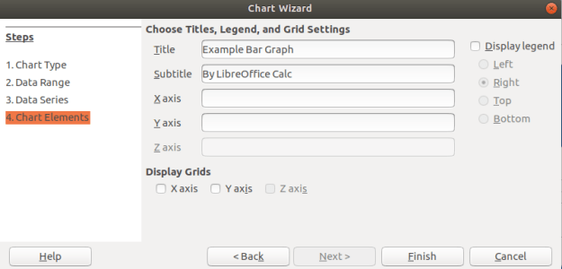
In the last window above, you can add a title and label the axes if you want. You can see that I gave my graph a name. In addition, you can decide if you want to display a legend if you look to the right. For my graph, that was not adding any additional information so I unchecked this option. When you click finish you will see the following on the spreadsheet.

Histogram
Histogram are for continuous data. Therefore, I convert my SD, D, N, A, SA to 1, 2, 3, 4, and 5. All the other steps are the same as above. The one difference is that you want to remove the spacing between bars. Below is how to do this.
Click on one of the bars in the bar graph until you see the green squares as shown below.

After you did this, there should be a new toolbar at the top of the spreadsheet. You need to click on the Green and blue cube as shown below

In the next window, you need to change the spacing to zero percent. This will change the bar graph into a histogram. Below is what the settings should look like.

When you click ok you should see the final histogram shown below

For free software this is not too bad. There are a lot of options that were left unexplained especial in regards to how you can manipulate the colors of everything and even make the plots 3D.
Conclusion
LibreOffice provides an alternative to paying for Microsoft products. The example below shows that Calc is capable of making visually appealing graphs just as Excel is.