In this post, we will learn how to create a generalized additive model (GAM). GAMs are non-parametric generalized linear models. This means that linear predictor of the model uses smooth functions on the predictor variables. As such, you do not need to specify the functional relationship between the response and continuous variables. This allows you to explore the data for potential relationships that can be more rigorously tested with other statistical models
In our example, we will use the “Auto” dataset from the “ISLR” package and use the variables “mpg”,“displacement”,“horsepower”, and “weight” to predict “acceleration”. We will also use the “mgcv” package. Below is some initial code to begin the analysis
library(mgcv)
library(ISLR)data(Auto)
We will now make the model we want to understand the response of “acceleration” to the explanatory variables of “mpg”,“displacement”,“horsepower”, and “weight”. After setting the model we will examine the summary. Below is the code
All of the explanatory variables are significant and the adjust r-squared is .73 which is excellent. edf stands for “effective degrees of freedom”. This modified version of the degree of freedoms is due to the smoothing process in the model. GCV stands for generalized cross-validation and this number is useful when comparing models. The model with the lowest number is the better model.
We can also examine the model visually by using the “plot” function. This will allow us to examine if the curvature fitted by the smoothing process was useful or not for each variable. Below is the code.
plot(model1)
We can also look at a 3d graph that includes the linear predictor as well as the two strongest predictors. This is done with the “vis.gam” function. Below is the code
vis.gam(model1)
If multiple models are developed. You can compare the GCV values to determine which model is the best. In addition, another way to compare models is with the “AIC” function. In the code below, we will create an additional model that includes “year” compare the GCV scores and calculate the AIC. Below is the code.
As you can see, the second model has a higher GCV score when compared to the first model. This indicates that the first model is a better choice. This makes sense because in the second model the variable “year” is not significant. To confirm this we will calculate the AIC scores using the AIC function.
Again, you can see that model1 s better due to its fewer degrees of freedom and slightly lower AIC score.
Conclusion
Using GAMs is most common for exploring potential relationships in your data. This is stated because they are difficult to interpret and to try and summarize. Therefore, it is normally better to develop a generalized linear model over a GAM due to the difficulty in understanding what the data is trying to tell you when using GAMs.
Generalized linear models are another way to approach linear regression. The advantage of of GLM is that allows the error to follow many different distributions rather than only the normal distribution which is an assumption of traditional linear regression.
Often GLM is used for response or dependent variables that are binary or represent count data. THis post will provide a brief explanation of GLM as well as provide an example.
Key Information
There are three important components to a GLM and they are
Error structure
Linear predictor
Link function
The error structure is the type of distribution you will use in generating the model. There are many different distributions in statistical modeling such as binomial, gaussian, poission, etc. Each distribution comes with certain assumptions that govern their use.
The linear predictor is the sum of the effects of the independent variables. Lastly, the link function determines the relationship between the linear predictor and the mean of the dependent variable. There are many different link functions and the best link function is the one that reduces the residual deviances the most.
In our example, we will try to predict if a house will have air conditioning based on the interactioon between number of bedrooms and bathrooms, number of stories, and the price of the house. To do this, we will use the “Housing” dataset from the “Ecdat” package. Below is some initial code to get started.
library(Ecdat)
data("Housing")
The dependent variable “airco” in the “Housing” dataset is binary. This calls for us to use a GLM. To do this we will use the “glm” function in R. Furthermore, in our example, we want to determine if there is an interaction between number of bedrooms and bathrooms. Interaction means that the two independent variables (bathrooms and bedrooms) influence on the dependent variable (aircon) is not additive, which means that the combined effect of the independnet variables is different than if you just added them together. Below is the code for the model followed by a summary of the results
##
## Call:
## glm(formula = Housing$airco ~ Housing$bedrooms * Housing$bathrms +
##     Housing$stories + Housing$price, family = binomial)
##
## Deviance Residuals:
##     Min       1Q   Median       3Q      Max
## -2.7069  -0.7540  -0.5321   0.8073   2.4217
##
## Coefficients:
##                                    Estimate Std. Error z value Pr(>|z|)
## (Intercept)                      -6.441e+00  1.391e+00  -4.632 3.63e-06
## Housing$bedrooms                  8.041e-01  4.353e-01   1.847   0.0647
## Housing$bathrms                   1.753e+00  1.040e+00   1.685   0.0919
## Housing$stories                   3.209e-01  1.344e-01   2.388   0.0170
## Housing$price                     4.268e-05  5.567e-06   7.667 1.76e-14
## Housing$bedrooms:Housing$bathrms -6.585e-01  3.031e-01  -2.173   0.0298
##
## ---
## Signif. codes:  0 '***' 0.001 '**' 0.01 '*' 0.05 '.' 0.1 ' ' 1
##
## (Dispersion parameter for binomial family taken to be 1)
##
##     Null deviance: 681.92  on 545  degrees of freedom
## Residual deviance: 549.75  on 540  degrees of freedom
## AIC: 561.75
##
## Number of Fisher Scoring iterations: 4
To check how good are model is we need to check for overdispersion as well as compared this model to other potential models. Overdispersion is a measure to determine if there is too much variablity in the model. It is calcualted by dividing the residual deviance by the degrees of freedom. Below is the solution for this
549.75/540
## [1] 1.018056
Our answer is 1.01, which is pretty good because the cutoff point is 1, so we are really close.
Now we will make several models and we will compare the results of them
Model 2
#add recroom and garageplmodel2<-glm(Housing$airco~Housing$bedrooms*Housing$bathrms+Housing$stories+Housing$price+Housing$recroom+Housing$garagepl, family=binomial)summary(model2)
##
## Call:
## glm(formula = Housing$airco ~ Housing$bedrooms * Housing$bathrms +
##     Housing$stories + Housing$price + Housing$recroom + Housing$garagepl,
##     family = binomial)
##
## Deviance Residuals:
##     Min       1Q   Median       3Q      Max
## -2.6733  -0.7522  -0.5287   0.8035   2.4239
##
## Coefficients:
##                                    Estimate Std. Error z value Pr(>|z|)
## (Intercept)                      -6.369e+00  1.401e+00  -4.545 5.51e-06
## Housing$bedrooms                  7.830e-01  4.391e-01   1.783   0.0745
## Housing$bathrms                   1.702e+00  1.047e+00   1.626   0.1039
## Housing$stories                   3.286e-01  1.378e-01   2.384   0.0171
## Housing$price                     4.204e-05  6.015e-06   6.989 2.77e-12
## Housing$recroomyes                1.229e-01  2.683e-01   0.458   0.6470
## Housing$garagepl                  2.555e-03  1.308e-01   0.020   0.9844
## Housing$bedrooms:Housing$bathrms -6.430e-01  3.054e-01  -2.106   0.0352
##
## ---
## Signif. codes:  0 '***' 0.001 '**' 0.01 '*' 0.05 '.' 0.1 ' ' 1
##
## (Dispersion parameter for binomial family taken to be 1)
##
##     Null deviance: 681.92  on 545  degrees of freedom
## Residual deviance: 549.54  on 538  degrees of freedom
## AIC: 565.54
##
## Number of Fisher Scoring iterations: 4
The results of the anova indicate that the models are all essentially the same as there is no statistical difference. The only criteria on which to select a model is the measure of overdispersion. The first model has the lowest rate of overdispersion and so is the best when using this criteria. Therefore, determining if a hous has air conditioning depends on examining number of bedrooms and bathrooms simultenously as well as the number of stories and the price of the house.
Conclusion
The post explained how to use and interpret GLM in R. GLM can be used primarilyy for fitting data to disrtibutions that are not normal.
Proportions are a fraction or “portion” of a total amount. For example, if there are ten men and ten women in a room the proportion of men in the room is 50% (5 / 10). There are times when doing an analysis that you want to evaluate proportions in our data rather than individual measurements of mean, correlation, standard deviation etc.
In this post we will learn how to do a test of proportions using R. We will use the dataset “Default” which is found in the “ISLR” package. We will compare the proportion of those who are students in the dataset to a theoretical value. We will calculate the results using the z-test and the binomial exact test. Below is some initial code to get started.
library(ISLR)data("Default")
We first need to determine the actual number of students that are in the sample. This is calculated below using the “table” function.
table(Default$student)
##
##   No  Yes
## 7056 2944
We have 2944 students in the sample and 7056 people who are not students. We now need to determine how many people are in the sample. If we sum the results from the table below is the code.
sum(table(Default$student))
## [1] 10000
There are 10000 people in the sample. To determine the proportion of students we take the number 2944 / 10000 which equals 29.44 or 29.44%. Below is the code to calculate this
The proportion test compares a particular value with a theoretical value. For our example, the particular value we have is 29.44% of the people were students. We want to compare this value with a theoretical value of 50%. Before we do so it is better to state specificallt what are hypotheses are. NULL = The value of 29.44% of the sample being students is the same as 50% found in the population ALTERNATIVE = The value of 29.44% of the sample being students is NOT the same as 50% found in the population.
##
##  1-sample proportions test without continuity correction
##
## data:  2944 out of 10000, null probability 0.5
## X-squared = 1690.9, df = 1, p-value < 2.2e-16
## alternative hypothesis: true p is not equal to 0.5
## 95 percent confidence interval:
##  0.2855473 0.3034106
## sample estimates:
##      p
## 0.2944
Here is what the code means. 1. prop.test is the function used 2. The first value of 2944 is the total number of students in the sample 3. n = is the sample size 4. p= 0.5 is the theoretical proportion 5. alternative =“two.sided” means we want a two-tail test 6. correct = FALSE means we do not want a correction applied to the z-test. This is useful for small sample sizes but not for our sample of 10000
The p-value is essentially zero. This means that we reject the null hypothesis and conclude that the proportion of students in our sample is different from a theortical proportion of 50% in the population.
Below is the same analysis using the binomial exact test.
binom.test(2944, n=10000, p=0.5)
##
##  Exact binomial test
##
## data:  2944 and 10000
## number of successes = 2944, number of trials = 10000, p-value <
## 2.2e-16
## alternative hypothesis: true probability of success is not equal to 0.5
## 95 percent confidence interval:
##  0.2854779 0.3034419
## sample estimates:
## probability of success
##                 0.2944
The results are the same. Whether to use the “prop.test”” or “binom.test” is a major argument among statisticians. The purpose here was to provide an example of the use of both
This post will explore an example of testing if a dataset fits a specific theoretical distribution. This is a very important aspect of statistical modeling as it allows to understand the normality of the data and the appropriate steps needed to take to prepare for analysis.
In our example, we will use the “Auto” dataset from the “ISLR” package. We will check if the horsepower of the cars in the dataset is normally distributed or not. Below is some initial code to begin the process.
library(ISLR)library(nortest)library(fBasics)
data("Auto")
Determining if a dataset is normally distributed is simple in R. This is normally done visually through making a Quantile-Quantile plot (Q-Q plot). It involves using two functions the “qnorm” and the “qqline”. Below is the code for the Q-Q plot
qqnorm(Auto$horsepower)
We now need to add the Q-Q line to see how are distribution lines up with the theoretical normal one. Below is the code. Note that we have to repeat the code above in order to get the completed plot.
The “qqline” function needs the data you want to test as well as the distribution and probability. The distribution we wanted is normal and is indicated by the argument “qnorm”. The probs argument means probability. The default values are .25 and .75. The resulting graph indicates that the distribution of “horsepower”, in the “Auto” dataset is not normally distributed. That are particular problems with the lower and upper values.
We can confirm our suspicion by running a statistical test. The Anderson-Darling test from the “nortest” package will allow us to test whether our data is normally distributed or not. The code is below
ad.test(Auto$horsepower)
##  Anderson-Darling normality test
##
## data:  Auto$horsepower
## A = 12.675, p-value < 2.2e-16
From the results, we can conclude that the data is not normally distributed. This could mean that we may need to use non-parametric tools for statistical analysis.
We can further explore our distribution in terms of its skew and kurtosis. Skew measures how far to the left or right the data leans and kurtosis measures how peaked or flat the data is. This is done with the “fBasics” package and the functions “skewness” and “kurtosis”.
First we will deal with skewness. Below is the code for calculating skewness.
We now need to determine if this value of skewness is significantly different from zero. This is done with a simple t-test. We must calculate the t-value before calculating the probability. The standard error of the skew is defined as the square root of six divided by the total number of samples. The code is below
Now we take the standard error of Horsepower and plug this into the “pt” function (t probability) with the degrees of freedom (sample size – 1 = 391) we also put in the number 1 and subtract all of this information. Below is the code
1-pt(stdErrorHorsepower,391)
## [1] 0
## attr(,"method")
## [1] "moment"
The value zero means that we reject the null hypothesis that the skew is not significantly different form zero and conclude that the skew is different form zero. However, the value of the skew was only 1.1 which is not that non-normal.
We will now repeat this process for the kurtosis. The only difference is that instead of taking the square root divided by six we divided by 24 in the example below.
Again the pvalue is essentially zero, which means that the kurtosis is significantly different from zero. With a value of 2.64 this is not that bad. However, when both skew and kurtosis are non-normally it explains why our overall distributions was not normal either.
Conclusion
This post provided insights into assessing the normality of a dataset. Visually inspection can take place using Q-Q plots. Statistical inspection can be done through hypothesis testing along with checking skew and kurtosis.
In this post, we will use probability distributions and ggplot2 in R to solve a hypothetical example. This provides a practical example of the use of R in everyday life through the integration of several statistical and coding skills. Below is the scenario.
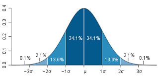
At a busing company the average number of stops for a bus is 81 with a standard deviation of 7.9. The data is normally distributed. Knowing this complete the following.
Calculate the interval value to use using the 68-95-99.7 rule
Calculate the density curve
Graph the normal curve
Evaluate the probability of a bus having less then 65 stops
Evaluate the probability of a bus having more than 93 stops
Calculate the Interval Value
Our first step is to calculate the interval value. This is the range in which 99.7% of the values falls within. Doing this requires knowing the mean and the standard deviation and subtracting/adding the standard deviation as it is multiplied by three from the mean. Below is the code for this.
The values above mean that we can set are interval between 55 and 110 with 100 buses in the data. Below is the code to set the interval.
interval<-seq(55,110, length=100)#length here represents
100 fictitious buses
Density Curve
The next step is to calculate the density curve. This is done with our knowledge of the interval, mean, and standard deviation. We also need to use the “dnorm” function. Below is the code for this.
densityCurve<-dnorm(interval,mean=81,sd=7.9)
We will now plot the normal curve of our data using ggplot. Before we need to put our “interval” and “densityCurve” variables in a dataframe. We will call the dataframe “normal” and then we will create the plot. Below is the code.
library(ggplot2)normal<-data.frame(interval, densityCurve)ggplot(normal, aes(interval, densityCurve))+geom_line()+ggtitle("Number of Stops for Buses")
Probability Calculation
We now want to determine what is the provability of a bus having less than 65 stops. To do this we use the “pnorm” function in R and include the value 65, along with the mean, standard deviation, and tell R we want the lower tail only. Below is the code for completing this.
pnorm(65,mean=81,sd=7.9,lower.tail=TRUE)
## [1] 0.02141744
As you can see, at 2% it would be unusually to. We can also plot this using ggplot. First, we need to set a different density curve using the “pnorm” function. Combine this with our “interval” variable in a dataframe and then use this information to make a plot in ggplot2. Below is the code.
CumulativeProb<-pnorm(interval, mean=81,sd=7.9,lower.tail=TRUE)pnormal<-data.frame(interval, CumulativeProb)ggplot(pnormal, aes(interval, CumulativeProb))+geom_line()+ggtitle("Cumulative Density of Stops for Buses")
Second Probability Problem
We will now calculate the probability of a bus have 93 or more stops. To make it more interesting we will create a plot that shades the area under the curve for 93 or more stops. The code is a little to complex to explain so just enjoy the visual.
pnorm(93,mean=81,sd=7.9,lower.tail=FALSE)
## [1] 0.06438284
x<-intervalytop<-dnorm(93,81,7.9)MyDF<-data.frame(x=x,y=densityCurve)p<-ggplot(MyDF,aes(x,y))+geom_line()+scale_x_continuous(limits=c(50, 110))
+ggtitle("Probabilty of 93 Stops or More is 6.4%")shade<-rbind(c(93,0), subset(MyDF, x>93), c(MyDF[nrow(MyDF), "X"], 0))p+geom_segment(aes(x=93,y=0,xend=93,yend=ytop))+geom_polygon(data=shade, aes(x, y))
Conclusion
A lot of work was done but all in a practical manner. Looking at realistic problem. We were able to calculate several different probabilities and graph them accordingly.
Structural Equation Modeling (SEM) is a complex form of multiple regression that is commonly used in social science research. In many ways, SEM is an amalgamation of factor analysis and path analysis as we shall see. The history of this data analysis approach can be traced all the way back to the beginning of the 20th century.
This post will provide a brief overview of SEM. Specifically, we will look at the role of factory and path analysis in the development of SEM.
The Beginning with Factor and Path Analysis
The foundation of SEM was laid with the development of Spearman’s work with intelligence in the early 20th century. Spearman was trying to trace the various dimensions of intelligence back to a single factor. In the 1930’s Thurstone developed multi-factor analysis as he saw intelligence, not as a single factor as Spearman but rather as several factors. Thurstone also bestowed the gift of factor rotation on the statistical community.
Around the same time (1920’s-1930’s), Wright was developing path analysis. Path analysis relies on manifest variables with the ability to model indirect relationships among variables. This is something that standard regression normally does not do.
In economics, an econometrics was using many of the same ideas as Wright. It was in the early 1950’s that econometricians saw what Wright was doing in his discipline of biometrics.
SEM is Born
In the 1970’s, Joreskog combined the measurement powers of factor analysis with the regression modeling power of path analysis. The factor analysis capabilities of SEM allow it to assess the accuracy of the measurement of the model. The path analysis capabilities of SEM allow it to model direct and indirect relationships among latent variables.
From there, there was an explosion in ways to assess models as well as best practice suggestions. In addition, there are many different software available for conducting SEM analysis. Examples include the LISREL which was the first software available, AMOS which allows the use of a graphical interface.
One software worthy of mentioning is Lavaan. Lavaan is a r package that performs SEM. The primary benefit of Lavaan is that it is available for free. Other software can be exceedingly expensive but Lavaan provides the same features for a price that cannot be beaten.
Conclusion
SEM is by far not new to the statistical community. With a history that is almost 100 years old, SEM has been in many ways with the statistical community since the birth of modern statistics.
One way to improve a machine learning model is to not make just one model. Instead, you can make several models that all have different strengths and weaknesses. This combination of diverse abilities can allow for much more accurate predictions.
The use of multiple models is known as ensemble learning. This post will provide insights into ensemble learning as they are used in developing machine models.
The Major Challenge
The biggest challenges in creating an ensemble of models are deciding what models to develop and how the various models are combined to make predictions. To deal with these challenges involves the use of training data and several different functions.
The Process
Developing an ensemble model begins with training data. The next step is the use of some sort of allocation function. The allocation function determines how much data each model receives in order to make predictions. For example, each model may receive a subset of the data or limit how many features each model can use. However, if several different algorithms are used the allocation function may pass all the data to each model with making any changes.
After the data is allocated, it is necessary for the models to be created. From there, the next step is to determine how to combine the models. The decision on how to combine the models is made with a combination function.
The combination function can take one of several approaches for determining final predictions. For example, a simple majority vote can be used which means that if 5 models where developed and 3 vote “yes” than the example is classified as a yes. Another option is to weight the models so that some have more influence than others in the final predictions.
Benefits of Ensemble Learning
Ensemble learning provides several advantages. One, ensemble learning improves the generalizability of your model. With the combined strengths of many different models and or algorithms it is difficult to go wrong
Two, ensemble learning approaches allow for tackling large datasets. The biggest enemy to machine learning is memory. With ensemble approaches, the data can be broken into smaller pieces for each model.
Conclusion
Ensemble learning is yet another critical tool in the data scientist’s toolkit. The complexity of the world today makes it too difficult to lean on a singular model to explain things. Therefore, understanding the application of ensemble methods is a necessary step.
In this post, we will learn how to develop customize criteria for tuning a machine learning model using the “caret” package. There are two things that need to be done in order to completely assess a model using customized features. These two steps are…
Determine the model evaluation criteria
Create a grid of parameters to optimize
The model we are going to tune is the decision tree model made in a previous post with the C5.0 algorithm. Below is code for loading some prior information.
library(caret); library(Ecdat)
data(Wages1)
DETERMINE the MODEL EVALUATION CRITERIA
We are going to begin by using the “trainControl” function to indicate to R what re-sampling method we want to use, the number of folds in the sample, and the method for determining the best model. Remember, that there are many more options but these are the ones we will use. All this information must be saved into a variable using the “trainControl” function. Later, the information we place into the variable will be used when we rerun our model.
For our example, we are going to code the following information into a variable we will call “chck” for resampling we will use k-fold cross-validation. The number of folds will be set to 10. The criteria for selecting the best model will be the through the use of the “oneSE” method. The “oneSE” method selects the simplest model within one standard error of the best performance. Below is the code for our variable “chck”
For now, this information is stored to be used later
CREATE GRID OF PARAMETERS TO OPTIMIZE
We now need to create a grid of parameters. The grid is essential the characteristics of each model. For the C5.0 model we need to optimize the model, the number of trials, and if winnowing was used. Therefore we will do the following.
For model, we want decision trees only
Trials will go from 1-35 by increments of 5
For winnowing, we do not want any winnowing to take place.
In all, we are developing 8 models. We know this based on the trial parameter which is set to 1, 5, 10, 15, 20, 25, 30, 35. To make the grid we use the “expand.grid” function. Below is the code.
## C5.0
##
## 3294 samples
##    3 predictors
##    2 classes: 'female', 'male'
##
## No pre-processing
## Resampling: Cross-Validated (10 fold)
## Summary of sample sizes: 2966, 2965, 2964, 2964, 2965, 2964, ...
## Resampling results across tuning parameters:
##
##   trials  Accuracy   Kappa      Accuracy SD  Kappa SD
##    1      0.5922991  0.1792161  0.03328514   0.06411924
##    5      0.6147547  0.2255819  0.03394219   0.06703475
##   10      0.6077693  0.2129932  0.03113617   0.06103682
##   15      0.6077693  0.2129932  0.03113617   0.06103682
##   20      0.6077693  0.2129932  0.03113617   0.06103682
##   25      0.6077693  0.2129932  0.03113617   0.06103682
##   30      0.6077693  0.2129932  0.03113617   0.06103682
##   35      0.6077693  0.2129932  0.03113617   0.06103682
##
## Tuning parameter 'model' was held constant at a value of tree
##
## Tuning parameter 'winnow' was held constant at a value of FALSE
## Kappa was used to select the optimal model using  the one SE rule.
## The final values used for the model were trials = 5, model = tree
##  and winnow = FALSE.
The actual output is similar to the model that “caret” can automatically create. The difference here is that the criteria was set by us rather than automatically. A close look reveals that all of the models perform poorly but that there is no change in performance after ten trials.
CONCLUSION
This post provided a brief explanation of developing a customized way of assessing a models performance. To complete this, you need to configure your options as well as setup your grid in order to assess a model. Understanding the customization process for evaluating machine learning models is one of the strongest ways to develop supremely accurate models that retain generalizability.
For many, especially beginners, making a machine learning model is difficult enough. Trying to understand what to do, how to specify the model, among other things, is confusing in itself. However, after developing a model it is necessary to assess ways in which to improve performance.
This post will serve as an introduction to understanding how to improving model performance. In particular, we will look at the following
When it is necessary to improve performance
Parameter tuning
When to Improve
It is not always necessary to try and improve the performance of a model. There are times when a model does well and you know this through the evaluating it. If the commonly used measures are adequate there is no cause for concern.
However, there are times when improvement is necessary. Complex problems, noisy data, and trying to look for subtle/unclear relationships can make improvement necessary. Normally, real-world data has the problems so model improvement is usually necessary.
Model improvement requires the application of scientific means in an artistic manner. It requires a sense of intuition at times and also brute trial-and-error effort as well. The point is that there is no singular agreed upon way to improve a model. It is better to focus on explaining how you did it if necessary.
Parameter Tuning
Parameter tuning is the actual adjustment of model fit options. Different machine learning models have different options that can be adjusted. Often, this process can be automated in r through the use of the “caret” package.
When trying to decide what to do when tuning parameters it is important to remember the following.
What machine learning model and algorithm you are using for your data.
Which parameters you can adjust.
What criteria you are using to evaluate the model
Naturally, you need to know what kind of model and algorithm you are using in order to improve the model. There are three types of models in machine learning, those that classify, those that employ regression, and those that can do both. Understanding this helps you to make a decision about what you are trying to do.
Next, you need to understand what exactly you or r are adjusting when analyzing the model. For example, for C5.0 decision trees “trials” is one parameter you can adjust. If you don’t know this, you will not know how the model was improved.
Lastly, it is important to know what criteria you are using to compare the various models. For classifying models you can look at the kappa and the various information derived from the confusion matrix. For regression-based models, you may look at the r-square, the RMSE (Root mean squared error), or the ROC curve.
Conclusion
As you can perhaps tell there is an incredible amount of choice and options in trying to improve a model. As such, model improvement requires a clearly developed strategy that allows for clear decision-making.
In a future post, we will look at an example of model improvement.
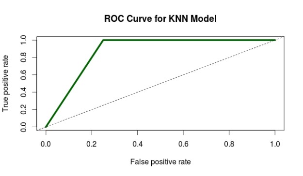
The receiver operating characteristic curve (ROC curve) is a tool used in statistical research to assess the trade-off of detecting true positives and true negatives. The origins of this tool goes all the way back to WWII when engineers were trying to distinguish between true and false alarms. Now this technique is used in machine learning
This post will explain the ROC curve and provide an example using R.
Below is a diagram of a ROC curve
On the X axis, we have the false positive rate. As you move to the right the false positive rate increases which is bad. We want to be as close to zero as possible.
On the y-axis, we have the true positive rate. Unlike the x-axis, we want the true positive rate to be as close to 100 as possible. In general, we want a low value on the x-axis and a high value on the y-axis.
In the diagram above, the diagonal line called “Test without diagnostic benefit” represents a model that cannot tell the difference between true and false positives. Therefore, it is not useful for our purpose.
The L-shaped curve call “Good diagnostic test” is an example of an excellent model. This is because all the true positives are detected.
Lastly, the curved-line called “Medium diagnostic test” represents an actual model. This model is a balance between the perfect L-shaped model and the useless straight-line model. The curved-line model is able to moderately distinguish between false and true positives.
Area Under the ROC Curve
The area under a ROC curve is literally called the “Area Under the Curve” (AUC). This area is calculated with a standardized value ranging from 0 – 1. The closer to 1 the better the model
The first two variables (predCollege & realCollege) is just for converting the values of the prediction of the model and the actual results to numeric variables
The “pr” variable is for storing the actual values to be used for the ROC curve. The “prediction” function comes from the “ROCR” package
With the information of the “pr” variable we can now analyze the true and false positives, which are stored in the “collegeResults” variable. The “performance” function also comes from the “ROCR” package.
The next two lines of code are for the plot the ROC curve. You can see the results below
6. The curve looks pretty good. To confirm this we use the last two lines of code to calculate the actually AUC. The actual AUC is 0.88 which is excellent. In other words, the model developed does an excellent job of discerning between true and false positives.
Conclusion
The ROC curve provides one of many ways in which to assess the appropriateness of a model. As such, it is yet another tool available for a person who is trying to test models.
The data within a confusion matrix can be used to calculate several different statistics that can indicate the usefulness of a statistical model in machine learning. In this post, we will look at several commonly used measures, specifically…
accuracy
error
sensitivity
specificity
precision
recall
f-measure
Accuracy
Accuracy is probably the easiest statistic to understand. Accuracy is the total number of items correctly classified divided by the total number of items below is the equation
Accuracy can range in value from 0-1 with one representing 100% accuracy. Normally, you don’t want perfect accuracy as this is an indication of overfitting and your model will probably not do well with other data.
Error
Error is the opposite of accuracy and represents the percentage of examples that are incorrectly classified its equation is as follows.
error = FP + FN TP + TN + FP + FN
The lower the error the better in general. However, if an error is 0 it indicates overfitting. Keep in mind that error is the inverse of accuracy. As one increases the other decreases.
Sensitivity
Sensitivity is the proportion of true positives that were correctly classified.The formula is as follows
sensitivity = TP TP + FN
This may sound confusing but high sensitivity is useful for assessing a negative result. In other words, if I am testing people for a disease and my model has a high sensitivity. This means that the model is useful telling me a person does not have a disease.
Specificity
Specificity measures the proportion of negative examples that were correctly classified. The formula is below
specificity = TN TN + FP
Returning to the disease example, a high specificity is a good measure for determining if someone has a disease if they test positive for it. Remember that no test is foolproof and there are always false positives and negatives happening. The role of the researcher is to maximize the sensitivity or specificity based on the purpose of the model.
Precision
Precision is the proportion of examples that are really positive. The formula is as follows
precision = TP TP + FP
The more precise a model is the more trustworthy it is. In other words, high precision indicates that the results are relevant.
Recall
Recall is a measure of the completeness of the results of a model. It is calculated as follows
recall = TP TP + FN
This formula is the same as the formula for sensitivity. The difference is in the interpretation. High recall means that the results have a breadth to them such as in search engine results.
F-Measure
The f-measure uses recall and precision to develop another way to assess a model. The formula is below
sensitivity = 2 * TP 2 * TP + FP + FN
The f-measure can range from 0 – 1 and is useful for comparing several potential models using one convenient number.
Conclusion
This post provided a basic explanation of various statistics that can be used to determine the strength of a model. Through using a combination of statistics a researcher can develop insights into the strength of a model. The only mistake is relying exclusively on any single statistical measurement.
A confusion matrix is a table that is used to organize the predictions made during an analysis of data. Without making a joke confusion matrices can be confusing especially for those who are new to research.
In this post, we will look at how confusion matrices are set up as well as what the information in the means.
Actual Vs Predicted Class
The most common confusion matrix is a two class matrix. This matrix compares the actual class of an example with the predicted class of the model. Below is an example
Two Class Matrix
Predicted Class
A
B
Correctly classified as A
Incorrectly classified as B
Incorrectly classified as A
Correctly classified as B
Actual class is along the vertical side
Looking at the table there are four possible outcomes.
Correctly classified as A-This means that the example was a part of the A category and the model predicted it as such
Correctly classified as B-This means that the example was a part of the B category and the model predicted it as such
Incorrectly classified as A-This means that the example was a part of the B category but the model predicted it to be a part of the A group
Incorrectly classified as B-This means that the example was a part of the A category but the model predicted it to be a part of the B group
These four types of classifications have four different names which are true positive, true negative, false positive, and false negative. We will look at another example to understand these four terms.
Two Class Matrix
Predicted Lazy Students
Lazy
Not Lazy
1. Correctly classified as lazy
2. Incorrectly classified as not Lazy
3. Incorrectly classified as Lazy
4. Correctly classified as not lazy
Actual class is along the vertical side
In the example above, we want to predict which students are lazy. Group one is the group in which students who are lazy are correctly classified as lazy. This is called true positive.
Group 2 are those who are lazy but are predicted as not being lazy. This is known as a false negative also known as a type II error in statistics. This is a problem because if the student is misclassified they may not get the support they need.
Group three is students who are not lazy but are classified as such. This is known as a false positive or type I error. In this example, being labeled lazy is a major headache for the students but not as dangerous perhaps as a false negative.
Lastly, group four are students who are not lazy and are correctly classified as such. This is known as a true negative.
Conclusion
The primary purpose of a confusion matrix is to display this information visually. In a future post, we will see that there is even more information found in a confusion matrix than what was cover briefly here.
Market basket analysis a machine learning approach that attempts to find relationships among a group of items in a data set. For example, a famous use of this method was when retailers discovered an association between beer and diapers.
Upon closer examination, the retailers found that when men came to purchase diapers for their babies they would often buy beer in the same trip. With this knowledge, the retailers placed beer and diapers next to each other in the store and this further increased sales.
In addition, many of the recommendation systems we experience when shopping online use market basket analysis results to suggest additional products to us. As such, market basket analysis is an intimate part of our lives with us even knowing.
In this post, we will look at some of the details of market basket analysis such as association rules, apriori, and the role of support and confidence.
Association Rules
The heart of market basket analysis are association rules. Association rules explain patterns of relationship among items. Below is an example
{rice, seaweed} -> {soy sauce}
Everything in curly braces { } is an itemset, which is some form of data that occurs often in the dataset based on criteria. Rice and seaweed are our itemset on the left and soy sauce is our itemset on the right. The arrow -> indicates what comes first as we read from left to right. If we put this association rule in simple English it would say “if someone buys rice and seaweed then they will buy soy sauce”.
The practical application of this rule is to place rice, seaweed and soy sauce near each other in order to reinforce this rule when people come to shop.
The Algorithm
Market basket analysis uses an apriori algorithm. This algorithm is useful for unsupervised learning that does not require any training and thus no predictions. The Apriori algorithm is especially useful with large datasets but it employs simple procedures to find useful relationships among the items.
The shortcut that this algorithm uses is the “apriori property” which states that all suggsets of a frequent itemset must also be frequent. What this means in simple English is that the items in an itemset need to be common in the overall dataset. This simple rule saves a tremendous amount of computational time.
Support and Confidence
Two key pieces of information that can further refine the work of the Apriori algorithm is support and confidence. Support is a measure of the frequency of an itemset ranging from 0 (no support) to 1 (highest support). High support indicates the importance of the itemset in the data and contributes to the itemset being used to generate association rule(s).
Returning to our rice, seaweed, and soy sauce example. We can say that the support for soy sauce is 0.4. This means that soy sauce appears in 40% of the purchases in the dataset which is pretty high.
Confidence is a measure of the accuracy of an association rule which is measured from 0 to 1. The higher the confidence the more accurate the association rule. If we say that our rice, seaweed, and soy sauce rule has a confidence of 0.8 we are saying that when rice and seaweed are purchased together, 80% of the time soy sauce is purchased as well.
Support and confidence can be used to influence the apriori algorithm by setting cutoff values to be searched for. For example, if we set a minimum support of 0.5 and a confidence of 0.65 we are telling the computer to only report to us association rules that are above these cutoff points. This helps to remove useless rules that are obvious or useless.
Conclusion
Market basket analysis is a useful tool for mining information from large datasets. The rules are easy to understanding. In addition, market basket analysis can be used in many fields beyond shopping and can include relationships within DNA, and other forms of human behavior. As such, care must be made so that unsound conclusions are not drawn from random patterns in the data
Support vector machines (SVM) is another one of those mysterious black box methods in machine learning. This post will try to explain in simple terms what SVM are and their strengths and weaknesses.
Definition
SVM is a combination of nearest neighbor and linear regression. For the nearest neighbor, SVM uses the traits of an identified example to classify an unidentified one. For regression, a line is drawn that divides the various groups.It is preferred that the line is straight but this is not always the case
This combination of using the nearest neighbor along with the development of a line leads to the development of a hyperplane. The hyperplane is drawn in a place that creates the greatest amount of distance among the various groups identified.
The examples in each group that are closest to the hyperplane are the support vectors. They support the vectors by providing the boundaries for the various groups.
If for whatever reason a line cannot be straight because the boundaries are not nice and night. R will still draw a straight line but make accommodations through the use of a slack variable, which allows for error and or for examples to be in the wrong group.
Another trick used in SVM analysis is the kernel trick. A kernel will add a new dimension or feature to the analysis by combining features that were measured in the data. For example, latitude and longitude might be combined mathematically to make altitude. This new feature is now used to develop the hyperplane for the data.
There are several different types of kernel tricks that achieve their goal using various mathematics. There is no rule for which one to use and playing different choices is the only strategy currently.
Pros and Cons
The pros of SVM is their flexibility of use as they can be used to predict numbers or classify. SVM are also able to deal with nosy data and are easier to use than artificial neural networks. Lastly, SVM are often able to resist overfitting and are usually highly accurate.
Cons of SVM include they are still complex as they are a member of black box machine learning methods even if they are simpler than artificial neural networks. The lack of criteria for kernel selection makes it difficult to determine which model is the best.
Conclusion
SVM provide yet another approach to analyzing data in a machine learning context. Success with this approach depends on determining specifically what the goals of a project are.
In machine learning, there are a set of analytical techniques know as black box methods. What is meant by black box methods is that the actual models developed are derived from complex mathematical processes that are difficult to understand and interpret. This difficulty in understanding them is what makes them mysterious.
One black method is artificial neural network (ANN). This method tries to imitate mathematically the behavior of neurons in the nervous system of humans. This post will attempt to explain ANN in simplistic terms.
The Human Mind and the Artificial One
We will begin by looking at how real neurons work before looking at ANN. In simple terms, as this is not a biology blog, neurons send and receive signals. They receive signals through their dendrites, process information in the soma, and the send signals through their axon terminal. Below is a picture of a neuron.
An ANN works in a highly similar manner. The x variables are the dendrites that are providing information to the cell body when they are summed. Different dendrites or x variables can have different weights (w). Next, the summation of the x variables is passed to an activation function before moving to the output or dependent variable y. Below is a picture of this process.
If you compare the two pictures they are similar yet different. ANN mimics the mind in a way that has fascinated people for over 50 years.
Activation Function (f)
The activation function purpose is to determine if there should be an activation. In the human body, activation takes place when the nerve cell sends the message to the next cell. This indicates that the message was strong enough to have it move forward.
The same concept applies in ANN. A signal will not be passed on unless it meets a minimum threshold. This threshold can vary depending on how the ANN is model.
ANN Design
The makeup of an ANNs can vary greatly. Some models have more than one output variable as shown below.
Two outputs
Other models have what are called hidden layers. These are variables that are both input and output variables. They could be seen as mediating variables. Below is a visual example.
Hidden layer is the two circles in the middle
How many layers to developed is left to the researcher. When models become really complex with several hidden layers and or outcome variables it is referred to as deep learning in the machine learning community.
Another complexity of ANN is the direction of information. Just as in the human body information can move forward and backward in an ANN. This provides for opportunities to model highly complex data and relationships.
Conclusion
ANN can be used for classifying virtually anything. They are a highly accurate model as well that is not bogged down by many assumptions. However, ANN’s are so hard to understand that it makes it difficult to use them despite their advantages. As such, this form of analysis can be beneficial if the user is able to explain the results.
Classification rules represent knowledge in an if-else format. These types of rules involve the terms antecedent and consequent. The antecedent is the before and consequent is after. For example, I may have the following rule.
If the students studies 5 hours a week then they will pass the class with an A
This simple rule can be broken down into the following antecedent and consequent.
Antecedent–If the student studies 5 hours a week
Consequent-then they will pass the class with an A
The antecedent determines if the consequent takes place. For example, the student must study 5 hours a week to get an A. This is the rule in this particular context.
This post will further explain the characteristics and traits of classification rules.
Classification Rules and Decision Trees
Classification rules are developed on current data to make decisions about future actions. They are highly similar to the more common decision trees. The primary difference is that decision trees involve a complex step-by-step process to make a decision.
Classification rules are stand-alone rules that are abstracted from a process. To appreciate a classification rule you do not need to be familiar with the process that created it. While with decision trees you do need to be familiar with the process that generated the decision.
One catch with classification rules in machine learning is that the majority of the variables need to be nominal in nature. As such, classification rules are not as useful for large amounts of numeric variables. This is not a problem with decision trees.
The Algorithm
Classification rules use algorithms that employ a separate and conquer heuristic. What this means is that the algorithm will try to separate the data into smaller and smaller subset by generating enough rules to make homogeneous subsets. The goal is always to separate the examples in the data set into subgroups that have similar characteristics.
Common algorithms used in classification rules include the One Rule Algorithm and the RIPPER Algorithm. The One Rule Algorithm analyzes data and generates one all-encompassing rule. This algorithm works by finding the single rule that contains the less amount of error. Despite its simplicity, it is surprisingly accurate.
The RIPPER algorithm grows as many rules as possible. When a rule begins to become so complex that in no longer helps to purify the various groups the rule is pruned or the part of the rule that is not beneficial is removed. This process of growing and pruning rules is continued until there is no further benefit.
RIPPER algorithm rules are more complex than One Rule Algorithm. This allows for the development of complex models. The drawback is that the rules can become too complex to make practical sense.
Conclusion
Classification rules are a useful way to develop clear principles as found in the data. The advantage of such an approach is simplicity. However, numeric data is harder to use when trying to develop such rules.
In this post, we are going to learn how to use the C5.0 algorithm to make a classification tree in order to make predictions about gender based on wage, education, and job experience using a data set in the “Ecdat” package in R. Below is some code to get started.
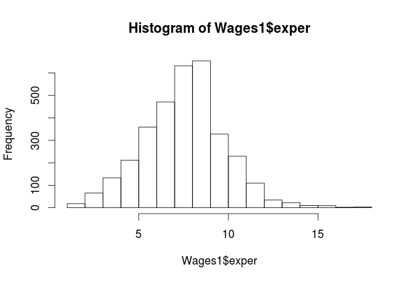
summary(Wages1$exper)
 ## Min. 1st Qu. Median Mean 3rd Qu. Max.
 ## 1.000 7.000 8.000 8.043 9.000 18.000
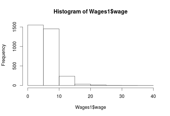
hist(Wages1$wage)
summary(Wages1$wage)
## Min. 1st Qu. Median Mean 3rd Qu. Max.
## 0.07656 3.62200 5.20600 5.75800 7.30500 39.81000
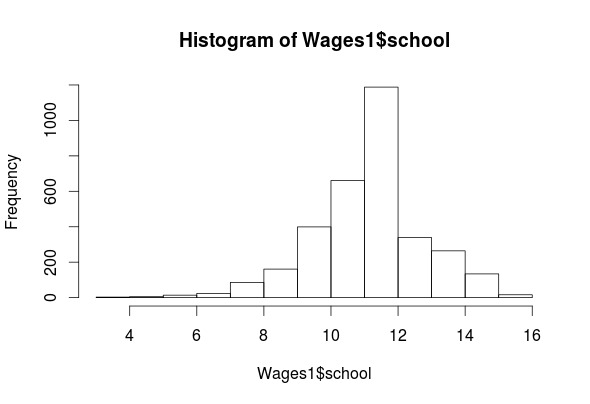
hist(Wages1$school)
summary(Wages1$school)
 ## Min. 1st Qu. Median Mean 3rd Qu. Max.
 ## 3.00 11.00 12.00 11.63 12.00 16.00
table(Wages1$sex)
## female male
## 1569 1725
As you can see, we have four features (exper, sex, school, wage) in the “Wages1” data set. The histogram for “exper” indicates that it is normally distributed. The “wage” feature is highly left-skewed and almost bimodal. This is not a big deal as classification trees are robust against non-normality. The ‘school’ feature is mostly normally distributed. Lastly, the ‘sex’ feature is categorical but there is almost an equal number of men and women in the data. All of the outputs for the means are listed above.
Create Training and Testing Sets
We now need to create our training and testing data sets. In order to do this, we need to first randomly reorder our data set. For example, if the data is sorted by one of the features, to split it now would lead to extreme values all being lumped together in one data set.
To make things more confusing, we also need to set our seed. This allows us to be able to replicate our results. Below is the code for doing this.
set the seed using the ‘set.seed’ function (We randomly picked the number 12345)
We created the variable ‘Wage_rand’ and we assigned the following
From the ‘Wages1’ dataset we used the ‘runif’ function to create a list of 3294 numbers (1-3294) we did this because there are a total of 3294 examples in the dataset.
After generating the 3294 numbers we then order sequentially using the “order” function.
We then assigned each example in the “Wages1” dataset one of the numbers we created
We will now create are training and testing set using the code below.
Make the Model
We can now begin training a model below is the code.
Wage_model<-C5.0(Wage_train[-2], Wage_train$sex)
The coding for making the model should be familiar by now. One thing that is new is the brackets with the -2 inside. This tells r to ignore the second column in the dataset. We are doing this because we want to predict sex. If it is a part of the independent variables we cannot predict it. We can now examine the results of our model by using the following code.
Wage_model
##
## Call:
## C5.0.default(x = Wage_train[-2], y = Wage_train$sex)
##
## Classification Tree
## Number of samples: 2294
## Number of predictors: 3
##
## Tree size: 9
##
## Non-standard options: attempt to group attributes
summary(Wage_model)
##
## Call:
## C5.0.default(x = Wage_train[-2], y = Wage_train$sex)
##
##
## C5.0 [Release 2.07 GPL Edition] Wed May 25 10:55:22 2016
## ——————————-
##
## Class specified by attribute `outcome’
##
## Read 2294 cases (4 attributes) from undefined.data
##
## Decision tree:
##
## wage <= 3.985179: ## :…school > 11: female (345/109)
## : school <= 11:
## : :…exper <= 8: female (224/96) ## : exper > 8: male (143/59)
## wage > 3.985179:
## :…wage > 9.478313: male (254/61)
## wage <= 9.478313: ## :…school > 12: female (320/132)
## school <= 12:
## :…school <= 10: male (246/70) ## school > 10:
## :…school <= 11: male (265/114) ## school > 11:
## :…exper <= 6: female (83/35) ## exper > 6: male (414/173)
##
##
## Evaluation on training data (2294 cases):
##
## Decision Tree
## —————-
## Size Errors
##
## 9 849(37.0%) <<
##
##
## (a) (b) ## —- —-
## 600 477 (a): class female
## 372 845 (b): class male
##
##
## Attribute usage:
##
## 100.00% wage
## 88.93% school
## 37.66% exper
##
##
## Time: 0.0 secs
The “Wage_model” indicates a small decision tree of only 9 decisions. The “summary” function shows the actual decision tree. It’s somewhat complicated but I will explain the beginning part of the tree.
If wages are less than or equal to 3.98 then the person is female THEN
If the school is greater than 11 then the person is female ELSE
If the school is less than or equal to 11 THEN
If The experience of the person is less than or equal to 8 the person is female ELSE
If the experience is greater than 8 the person is male etc.
The next part of the output shows the amount of error. This model misclassified 37% of the examples which is pretty high. 477 men were misclassified as women and 372 women were misclassified as men.
Predict with the Model
We will now see how well this model predicts gender in the testing set. Below is the code
The output will not display properly here. Please see C50 for a pdf of this post and go to page 7
Again, this code should be mostly familiar for the prediction model. For the table, we are comparing the test set sex with predicted sex. The overall model was correct 269 + 346/1000 for 61.5% accuracy rate, which is pretty bad.
Improve the Model
There are two ways we are going to try and improve our model. The first is adaptive boosting and the second is error cost.
Adaptive boosting involves making several models that “vote” how to classify an example. To do this you need to add the ‘trials’ parameter to the code. The ‘trial’ parameter sets the upper limit of the number of models R will iterate if necessary. Below is the code for this and the code for the results.
Wage_boost10<-C5.0(Wage_train[-2], Wage_train$sex, trials = 10)
 #view boosted model
 summary(Wage_boost10)
 ##
 ## Call:
 ## C5.0.default(x = Wage_train[-2], y = Wage_train$sex, trials = 10)
 ##
 ##
 ## C5.0 [Release 2.07 GPL Edition] Wed May 25 10:55:22 2016
 ## -------------------------------
 ##
 ## Class specified by attribute `outcome'
 ##
 ## Read 2294 cases (4 attributes) from undefined.data
 ##
 ## ----- Trial 0: -----
 ##
 ## Decision tree:
 ##
 ## wage <= 3.985179: ## :...school > 11: female (345/109)
 ## : school <= 11:
 ## : :...exper <= 8: female (224/96) ## : exper > 8: male (143/59)
 ## wage > 3.985179:
 ## :...wage > 9.478313: male (254/61)
 ## wage <= 9.478313: ## :...school > 12: female (320/132)
 ## school <= 12:
 ## :...school <= 10: male (246/70) ## school > 10:
 ## :...school <= 11: male (265/114) ## school > 11:
 ## :...exper <= 6: female (83/35) ## exper > 6: male (414/173)
 ##
 ## ----- Trial 1: -----
 ##
 ## Decision tree:
 ##
 ## wage > 6.848846: male (663.6/245)
 ## wage <= 6.848846:
 ## :...school <= 10: male (413.9/175) ## school > 10: female (1216.5/537.6)
 ##
 ## ----- Trial 2: -----
 ##
 ## Decision tree:
 ##
 ## wage <= 3.234474: female (458.1/192.9) ## wage > 3.234474: male (1835.9/826.2)
 ##
 ## ----- Trial 3: -----
 ##
 ## Decision tree:
 ##
 ## wage > 9.478313: male (234.8/82.1)
 ## wage <= 9.478313:
 ## :...school <= 11: male (883.2/417.8) ## school > 11: female (1175.9/545.1)
 ##
 ## ----- Trial 4: -----
 ##
 ## Decision tree:
 ## male (2294/1128.1)
 ##
 ## *** boosting reduced to 4 trials since last classifier is very inaccurate
 ##
 ##
 ## Evaluation on training data (2294 cases):
 ##
 ## Trial Decision Tree
 ## ----- ----------------
 ## Size Errors
 ##
 ## 0 9 849(37.0%)
 ## 1 3 917(40.0%)
 ## 2 2 958(41.8%)
 ## 3 3 949(41.4%)
 ## boost 864(37.7%) <<
 ##
 ##
 ## (a) (b) ## ---- ----
 ## 507 570 (a): class female
 ## 294 923 (b): class male
 ##
 ##
 ## Attribute usage:
 ##
 ## 100.00% wage
 ## 88.93% school
 ## 37.66% exper
 ##
 ##
 ## Time: 0.0 secs
R only created 4 models as there was no additional improvement after this. You can see each model in the printout. The overall results are similar to our original model that was not boosted. We will now see how well our boosted model predicts with the code below.
Wage_boost_pred10<-predict(Wage_boost10, Wage_test)
 CrossTable(Wage_test$sex, Wage_boost_pred10, prop.c = FALSE,
 prop.r = FALSE, dnn=c('actual Sex Boost', 'predicted Sex Boost'))
Our boosted model has an accuracy rate 223+379/1000 = 60.2% which is about 1% better then our unboosted model (59.1%). As such, boosting the model was not useful (see page 11 of the pdf for the table printout.)
Our next effort will be through the use of a cost matrix. A cost matrix allows you to impose a penalty on false positives and negatives at your discretion. This is useful if certain mistakes are too costly for the learner to make. IN our example, we are going to make it 4 times more costly misclassify a female as a male (false negative) and 1 times for costly to misclassify a male as a female (false positive). Below is the code
Decision trees are yet another method of machine learning that is used for classifying outcomes. Decision trees are very useful for, as you can guess, making decisions based on the characteristics of the data.
In this post, we will discuss the following
Physical traits of decision trees
How decision trees work
Pros and cons of decision trees
Physical Traits of a Decision Tree
Decision trees consist of what is called a tree structure. The tree structure consists of a root node, decision nodes, branches and leaf nodes.
A root node is an initial decision made in the tree. This depends on which feature the algorithm selects first.
Following the root node, the tree splits into various branches. Each branch leads to an additional decision node where the data is further subdivided. When you reach the bottom of a tree at the terminal node(s) these are also called leaf nodes.
How Decision Trees Work
Decision trees use a heuristic called recursive partitioning. What this does is it splits the overall dataset into smaller and smaller subsets until each subset is as close to pure (having the same characteristics) as possible. This process is also known as divide and conquer.
The mathematics for deciding how to split the data is based on an equation called entropy, which measures the purity of a potential decision node. The lower the entropy scores the purer the decision node is. The entropy can range from 0 (most pure) to 1 (most impure).
One of the most popular algorithms for developing decision trees is the C5.0 algorithm. This algorithm, in particular, uses entropy to assess potential decision nodes.
Pros and Cons
The prose of decision trees includes its versatile nature. Decision trees can deal with all types of data as well as missing data. Furthermore, this approach learns automatically and only uses the most important features. Lastly, a deep understanding of mathematics is not necessary to use this method in comparison to more complex models.
Some problems with decision trees are that they can easily overfit the data. This means that the tree does not generalize well to other datasets. In addition, a large complex tree can be hard to interpret, which may be yet another indication of overfitting.
Conclusion
Decision trees provide another vehicle that researchers can use to empower decision making. This model is most useful particularly when a decision that was made needs to be explained and defended. For example, when rejecting a person’s loan application. Complex models made provide stronger mathematical reasons but would be difficult to explain to an irate customer.
Therefore, for complex calculation presented in an easy to follow format. Decision trees are one possibility.
In a previous post, we looked at mix methods and some examples of this design. Mixed methods are focused on combining quantitative and qualitative methods to study a research problem. In this post, we will look at several additional mixed method designs. Specifically, we will look at the follow designs
Embedded design
Transformative design
Multi-phase design
Embedded Design
Embedded design is the simultaneous collection of quantitative and qualitative data with one form of data by supportive to the other. The supportive data augments the conclusions of the main data collection.
The benefits of this design is that allows for one method to lead the analysis with the secondary method provides additional information. For example, quantitative measures are excellent at recording the results of an experiment. Qualitative measures would be useful in determining how participants perceived their experience in the experiment.
A downside to this approach making sure the secondary method is truly supporting the overall research. Quantitative and qualitative methods natural answer different research questions. Therefore, the research questions of a study must be worded in a way that allows for cooperation between qualitative and quantitative methods.
Transformative Design
The transformative design is more of a philosophy than a mixed method design. This design can employ any other mixed method design. The main difference that transformative designs focus on helping a marginalized population with the goal of bringing about change.
For example, a researcher might do a study Asian students facing discrimination in a predominately African American high school. The goal of the study would be to document the experiences of Asian students in order to provide administrators with information on the extent of this problem.
Such a focus on the oppressed is drawn heavily from Critical Theory which exposes how oppression takes place through education. The emphasis on change is derived from Dewy and progressivism.
Multiphase Design
Multiphase design is actually the use of several designs over several studies. This is a massive and supremely complex process. You would need to tie together several different mixed method studies under one general research problem. From this, you can see that this is not a commonly used design.
For example, you may decide to continue doing research into Asian student discrimination at African American high schools. The first study might employ an explanatory design. The second study might employ and exploratory design. The last study might be a transformative design.
After completing all this work, you would need to be able to articulate the experiences with discrimination of the Asian students. This is not an easy task by any means. As such, if and when this design is used, it often requires the teamwork of several researchers.
Conclusion
Mixed method designs require a different way of thinking when it comes to research. The uniqueness of this approach is the combination of qualitative and quantitative methods. This mixing of methods has advantages and disadvantage. The primary point to remember is that the most appropriate design depends on the circumstances of the study.
Probability is a critical component of statistical analysis and serves as a way to determine the likelihood of an event occurring. This post will provide a brief introduction into some of the principles of probability.
Probability
There are several basic probability terms we need to cover
events
trial
mutually exclusive and exhaustive
Events are possible outcomes. For example, if you flip a coin, the event can be heads or tails. A trial is a single opportunity for an event to occur. For example, if you flip a coin one time this means that there was one trial or one opportunity for the event of heads or tails to occur.
To calculate the probability of an event you need to take the number of trials an event occurred divided by the total number of trials. The capital letter “P” followed by the number in parentheses is always how probability is expressed. Below is the actual equation for this
Number of trial the event occurred⁄Total number of trials = P(event)
To provide an example, if we flip a coin ten times and we recored five heads and five tails, if we want to know the probability of heads this is the answer below
Five heads ⁄ Ten trials = P(heads) = 0.5
Another term to understand is mutually exclusive and exhaustive. This means that events cannot occur at the same time. For example, if we flip a coin, the result can only be heads or tails. We cannot flip a coin and have both heads and tails happen simultaneously.
Joint Probability
There are times were events are not mutually exclusive. For example, lets say we have the possible events
Musicians
Female
Female musicians
There are many different events that came happen simultaneously
Someone is a musician and not female
Someone who is female and not a musician
Someone who is a female musician
There are also other things we need to keep in mind
Everyone is not female
Everyone is not a musician
There are many people who are not female and are not musicians
We can now work through a sample problem as shown below.
25% of the population are musicians and 60% of the population is female. What is the probability that someone is a female musician
To solve this problem we need to find the joint probability which is the probability of two independent events happening at the same time. Independent events or events that do not influence each other. For example, being female has no influence on becoming a musician and vice versa. For our female musician example, we run the follow calculation.
From the calculation, we can see that there is a 15% chance that someone will be female and a musician.
Conclusion
Probability is the foundation of statistical inference. We will see in a future post that not all events are independent. When they are not the use of conditional probability and Bayes theorem is appropriate.
Mix Methods research involves the combination of qualitative and quantitative approaches to addressing a research problem. Generally, qualitative and quantitative methods have separate philosophical positions when it comes to how to uncover insights in addressing research questions.
For many, mixed methods have their own philosophical position, which is pragmatism. Pragmatists believe that if it works it’s good. Therefore, if mixed methods lead to a solution it’s an appropriate method to use.
This post will try to explain some of the mixed method designs. Before explaining it is important to understand that there are several common ways to approach mixed methods
Qualitative and Quantitative are equal (Convergent Parallel Design)
Quantitative is more important than qualitative (explanatory design)
Qualitative is more important than quantitative
Convergent Parallel Design
This design involves the simultaneous collecting of qualitative and quantitative data. The results are then compared to provide insights into the problem. The advantage of this design is the quantitative data provides for generalizability while the qualitative data provides information about the context of the study.
However, the challenge is in trying to merge the two types of data. Qualitative and quantitative methods answer slightly different questions about a problem. As such it can be difficult to paint a picture of the results that are comprehensible.
Explanatory Design
This design puts emphasis on the quantitative data with qualitative data playing a secondary role. Normally, the results found in the quantitative data are followed up on in the qualitative part.
For example, if you collect surveys about what students think about college and the results indicate negative opinions, you might conduct an interview with students to understand why they are negative towards college. A Likert survey will not explain why students are negative. Interviews will help to capture why students have a particular position.
The advantage of this approach is the clear organization of the data. Quantitative data is more important. The drawback is deciding what about the quantitative data to explore when conducting the qualitative data collection.
Exploratory Design
This design is the opposite of explanatory. Now the qualitative data is more important than the quantitative. This design is used when you want to understand a phenomenon in order to measure it.
It is common when developing an instrument to interview people in focus groups to understand the phenomenon. For example, if I want to understand what cellphone addiction is I might ask students to share what they think about this in interviews. From there, I could develop a survey instrument to measure cell phone addiction.
The drawback to this approach is the time consumption. It takes a lot of work to conduct interviews, develop an instrument, and assess the instrument.
Conclusions
Mixed methods are not that new. However, they are still a somewhat unusual approach to research in many fields. Despite this, the approaches of mixed methods can be beneficial depending on the context.
In this post, we will conduct a nearest neighbor classification using R. In a previous post, we discussed nearest neighbor classification. To summarize, nearest neighbor uses the traits of a known example to classify an unknown example. The classification is determined by the closets known example(s) to the unknown example. There are essentially four steps in order to complete a nearest neighbor classification
Find a dataset
Explore/prepare the Dataset
Train the model
Evaluate the model
For this example, we will use the college data set from the ISLR package. Our goal will be to predict which colleges are private or not private based on the feature “Private”. Below is the code for this.
library(ISLR)
 data("College")
Step 2 Exploring the Data
We now need to explore and prep the data for analysis. Exploration helps us to find any problems in the data set. Below is the code, you can see the results in your own computer if you are following along.
The “str” function gave us an understanding of the different types of variables and some of there initial values. We have 18 variables in all. We want to predict “Private” which is a categorical feature Nearest neighbor predicts categorical features only. We will use all of the other numerical variables to predict “Private”. The prop.table give us the proportion of private and not private colleges. About 30% of the data is not private and about 70% is a private college
Lastly, the “summary” function gives us some descriptive stats. If you look closely at the descriptive stats, there is a problem. The variables use different scales. For example, the “Apps” feature goes from 81 to 48094 while the “Grad.Rate” feature goes from 10 to 100. If we do the analysis with these different scales the “App” feature will be a much stronger influence on the prediction. Therefore, we need to rescale the features or normalize them. Below is the code to do this
We made a function called “normal” that normalizes or scales are variables so that all values are between 0-1. This makes all of the features equal in their influence. We now run code to normalize our data using the “normal” function we created. We will also look at the summary stats. In addition, we will leave out the prediction feature “Private” because we do not want to have that in the new data set because we want to predict this. In a real-world example, you would not know this before the analysis anyway.
The name of the new dataset is “College_New” we used the “lapply” function to make R normalize all the features in the “College” dataset. Summary stats are good as all values are between 0 and 1. The last part of this step involves dividing our data into training and testing sets as seen in the code below and creating the labels. The labels are the actual information from the “Private” feature. Remember, we remove this from the “College_New” dataset but we need to put this information in their own features to allow us to check the accuracy of our results later.
Train the model We will now train the model. You will need to download the “class” package and load it. After that, you need to run the following code.
We created a variable called “College_test_pred” to store our results
We used the “knn” function to predict the examples. Inside the “knn” function we used “College_train” to teach the model.
We then identify “College_test” as the dataset we want to test. For the ‘cl’ argument we used the “College_train_labels” dataset which contains which colleges are private in the “College_train” dataset. The “k” is the number of neighbors that knn uses to determine what class to label an unknown example. In this code, we are using the 25 nearest neighbors to label the unknown example The number of “k” to use can vary but a rule of thumb is to take the square root of the total number of examples in the training data. Our training data has 677 and the square root of this is about 25. What happens is that each of the 25 closest neighbors are calculated for an example. If 20 are not private and 5 are private the unknown example is labeled private because the majority of its neighbors are not private.
Step 4 Evaluating the Model
We will now evaluate the model using the following code
The results can be seen by clicking here. The box in the top left predicts which colleges are private correctly while the box in the bottom right classifies which colleges are not private correctly. For example, 28 colleges that are not private were classed as not private while 64 colleges that are not private were classed as not private. Adding these two numbers together gives us 92 (28+64) which is our accuracy rate. In the top right box, we have are false positives. These are colleges which are private but were predicted as private, there were 8 of these. Lastly, we have our false negatives in the bottom left box, which are colleges that are private but label as not private, there were 0 of these.
Conclusion
The results are pretty good for this example. Nearest neighbor classification allows you to predict an unknown example based on the classification of the known neighbors. This is a simple way to identify examples that are clump among neighbors with the same characteristics.
There are times when the relationships among examples you want to classify are messy and complicated. This makes it difficult to actually classify them. Yet in this same situation, items of the same class have a lot of features in common even though the overall sample is messy. In such a situation, nearest neighbor classification may be useful.
Nearest neighbor classification uses a simple technique to classify unlabeled examples. The algorithm assigns an unlabeled example the label of the nearest example. This based on the assumption that if two examples are next to each other they must be of the same class.
In this post, we will look at the characteristics of nearest neighbor classification as well as the strengths and weakness of this approach.
Characteristics
Nearest neighbor classification uses the features of the data set to create a multidimensional feature space. The number of features determines the number of dimensions. Therefore, two features leads to a two-dimensional feature space, three features leads to a three dimensional feature space, etc. In this feature space all the examples are placed based on their respective features.
The label of the unknown examples are determined by who the closet neighbor is or are. This calculation is based on Euclidean distance, which is the shortest distance possible. The number of neighbors that are used to calculate the distance varies at the discretion of the researcher. For example, we could use one neighbor or several to determine the label of an unlabeled example. There are pros and cons to how many neighbors to use. The more neighbors used the more complicated the classification becomes.
Nearest neighbor classification is considered a type of lazy learning. What is meant by lazy is that no abstraction of the data happens. This means there is no real explanation or theory provide by the model to understand why there are certain relationships. Nearest neighbor tells you where the relationships are but not why or how. This is partly due to the fact that it is a non-parametric learning method and provides no parameters (summary statistics) about the data.
Pros and Cons
Nearest neighbor classification has the advantage of being simple, highly effective, and fast during the training phase. There are also no assumptions made about the data distribution. This means that common problems like a lack of normality are not an issue.
Some problems include the lack of a model. This deprives us of insights into the relationships in the data. Another concern is the headache of missing data. This forces you to spend time cleaning the data more thoroughly. One final issue is that the classification phase of a project is slow and cumbersome because of the messy nature of the data.
Conclusion
Nearest neighbor classification is one useful tool in machine learning. This approach is valuable for times when the data is heterogeneous but with clear homogeneous groups in the data. In a future post, we will go through an example of this classification approach using R.
Research is difficult for many reasons. One major challenge of research is knowing exactly what to do. You have to develop your way of approaching your problem, data collection and analysis that is acceptable to peers.
This level of freedom leads to people literally freezing and not completing a project. Now imagine have several gigabytes or terabytes of data and being expected to “analyze” it.
This is a daily problem in data science. In this post, we will look at one simply six step process to approaching data science. The process involves the following six steps
Acquire data
Explore the data
Process the data
Analyze the data
Communicate the results
Apply the results
Step 1 Acquire the Data
This may seem obvious but it needs to be said. The first step is to access data for further analysis. Not always, but often data scientist are given data that was already collected by others who want answers from it.
In contrast with traditional empirical research in which you are often involved from the beginning to the end, in data science you jump to analyze a mess of data that others collected. This is challenging as it may not be clear what people what to know are what exactly the collected.
Step 2 Explore the Data
Exploring the data allows you to see what is going on. You have to determine what kinds of potential feature variables you have, the level of data that was collected (nominal, ordinal, interval, ratio). In addition, exploration allows you to determine what you need to do to prep the data for analysis.
Since data can come in many different formats from structured to unstructured. It is critical to take a look at the data through using summary statistics and various visualization options such as plots and graphs.
Another purpose for exploring data is that it can provide insights into how to analyze the data. If you are not given specific instructions as to what stakeholders want to know, exploration can help you to determine what may be valuable for them to know.
Step 3 Process the Data
Processing data involves cleaning it. This involves dealing with missing data, transforming features, addressing outliers, and other necessary processes for preparing analysis. The primary goal is to organize the data for analysis
This is a critical step as various machine learning models have different assumptions that must be met. Some models can handle missing data some cannot. Some models are affected by outliers some are not.
Step 4 Analyze the Data
This is often the most enjoyable part of the process. At this step, you actually get to develop your model. How this is done depends on the type of model you selected.
In machine learning, analysis is almost never complete until some form of validation of the model takes place. This involves taking the model developed on one set of data and seeing how well the model predicts the results on another set of data. One of the greatest fears of statistical modeling is overfitting, which is a model that only works on one set of data and lacks the ability to generalize.
Step 5 Communicate Results
This step is self-explanatory. The results of your analysis needs to be shared with those involved. This is actually an art in data science called storytelling. It involves the use of visuals as well-spoken explanations.
Steps 6 Apply the Results
This is the chance to actual use the results of a study. Again, how this is done depends on the type of model developed. If a model was developed to predict which people to approve for home loans, then the model will be used to analyze applications by people interested in applying for a home loan.
Conclusion
The steps in this process is just one way to approach data science analysis. One thing to keep in mind is that these steps are iterative, which means that it is common to go back and forth and to skip steps as necessary. This process is just a guideline for those who need direction in doing an analysis.
Machine learning is a tool used in analytics for using data to make a decision for action. This field of study is at the crossroads of regular academic research and action research used in professional settings. This juxtaposition of skills has led to exciting new opportunities in the domains of academics and industry.
This post will provide information on basic types of machine learning which includes predictive models, supervised learning, descriptive models, and unsupervised learning.
Predictive Models and Supervised Learning
Predictive models do as their name implies. Predictive models predict one value based on other values. For example, a model might predict who is most likely to buy a plane ticket or purchase a specific book.
Predictive models are not limited to the future. They can also be used to predict something that has already happened but we are not sure when. For example, data can be collected from expectant mothers to determine the date that they conceived. Such information would be useful in preparing for birth.
Predictive models are intimately connected with supervised learning. Supervised learning is a form of machine learning in which the predictive model is given clear direction as to what they need to learn and how to do it.
For example, if we want to predict who will be accepted or rejected for a home loan we would provide clear instructions to our model. We might include such features as salary, gender, credit score, etc. These features would be used to predict whether an individual person should be accepted or rejected for the home loan. The supervisors in this example or the features (salary, gender, credit score) used to predict the target feature (home loan).
The target feature can either be a classification or a numeric prediction. A classification target feature is a nominal variable such as gender, race, type of car, etc. A classification feature has a limited number of choices or classes that the feature can take. In addition, the classes are mutually exclusive. At least in machine learning, someone can only be classified as male or female, current algorithms cannot place a person in both classes.
A numeric prediction predicts a number that has an infinite number of possibilities. Examples include height, weight, and salary.
Descriptive Models and Unsupervised Learning
Descriptive models summarize data to provide interesting insights. There is no target feature that you are trying to predict. Since there is no specific goal or target to predict there are no supervisors or specific features that are used to predict the target feature. Instead, descriptive models use a process of unsupervised learning. There are no instructions given to model as to what to do per say.
Descriptive models are very useful for discovering patterns. For example, one descriptive model analysis found a relationship between beer purchases and diaper purchases. It was later found that when men went to the store they often would be beer for themselves and diapers for their small children. Stores used this information and they placed beer and diapers next to each in the stores. This led to an increase in profits as men could now find beer and diapers together. This kind of relationship can only be found through machine learning techniques.
Conclusion
The model you used depends on what you want to know. Prediction is for, as you can guess, predicting. With this model, you are not as concern about relationships as you are about understanding what affects specifically the target feature. If you want to explore relationships then descriptive models can be of use. Machine learning models are tools that are appropriate for different situations.
Machine learning is about using data to take action. This post will explain common steps that are taking when using machine learning in the analysis of data. In general, there are five steps when applying machine learning.
Collecting data
Preparing data
Exploring data
Training a model on the data
Assessing the performance of the model
Improving the model
We will go through each step briefly
Step One, Collecting Data
Data can come from almost anywhere. Data can come from a database in a structured format like mySQL. Data can also come unstructured such as tweets collected from twitter. However you get the data, you need to develop a way to clean and process it so that it is ready for analysis.
There are some distinct terms used in machine learning that some coming from traditional research may not be familiar.
example-An example is one set of data. In an excel spreadsheet, an example would be one row. In empirical social science research, we would call an example a respondent or participant.
Unit of observation-This is how an example is measured. The units can be time, money, height, weight, etc.
feature-A feature is a characteristic of an example. In other forms of research, we normally call a feature a variable. For example, ‘salary’ would be a feature in machine learning but a variable in traditional research.
Step Two, Preparing Data
This is actually the most difficult step in machine learning analysis. It can take up to 80% of the time. With data coming from multiple sources and in multiple formats it is a real challenge to get everything where it needs to be for an analysis.
Missing data needs to be addressed, duplicate records, and other issues are a part of this process. Once these challenges are dealt with it is time to explore the data.
Step Three, Explore the Data
Before analyzing the data, it is critical that the data is explored. This is often done visually in the form of plots and graphs but also with summary statistics. You are looking for some insights into the data and the characteristics of different features. You are also looking out for things that might be unusually such as outliers. There are also times when a variable needs to be transformed because there are issues with normality.
Step Four, Training a Model
After exploring the data, you should have an idea of what you want to know if you did not already know. Determining what you want to know helps you to decide which algorithm is most appropriate for developing a model.
To develop a model, we normally split the data into a training and testing set. This allows us to assess the model for its strengths and weaknesses.
Step Five, Assessing the Model
The strength of the model is determined. Every model has certain biases that limit its usefulness. How to assess a model depends on what type of model is developed and the purpose of the analysis. Whenever suitable, we want to try and improve the model.
Step Six, Improving the Model
Improve can happen in many ways. You might decide to normalize the variables in a different way. Or you may choose to add or remove features from the model. Perhaps you may switch to a different model.
Conclusion
Success in data analysis involves have a clear path for achieving your goals. The steps presented here provide one way of tackling machine learning.
One of the most interesting fields of quantitative research today is machine learning. Machine Learning serves the purpose of developing models through the use of algorithms in order to inform action.
Examples of machine learning are all around us. Machine learning is used to make recommendations about what you should purchase at most retail websites. Machine learning is also used to filter spam from your email inbox. Each of these two examples involves making a prediction about previous behavior. This is what machines learning does. It learns what will happen based on what has happened. However, the question remains how does a machine actually learn.
The purpose of this post is to explain how machines actually “learn.” The process of learning involves three steps which are…
Data input
Abstraction
Generalization
Data Input
Data input is simply having access to some form of data whether it be numbers, text, pictures or something else. The data is the factual information that is used to develop insights for future action.
The majority of a person’s time in conducting machine learning is involved in organizing and cleaning data. This process is actually called data mugging by many. Once the data is ready for analysis, it is time for the abstraction process to begin.
Abstraction
Clean beautiful data still does not provide any useful information yet. Abstraction is the process of deriving meaning from the data. The raw data represent knowledge but as we already are aware the problem is how it is currently represented. Numbers and text mean little to us.
Abstraction takes all of the numbers and or text and develops a model. What a model does is summarize data and provides an explanatiofout the data. For example, if you are doing a study for a bank who wants to know who will default on loans. You might discover from the data that a person is more likely to default if they are a student with a credit card balance over $2,000. How this information is shared with the researcher can be in one of the following forms
equation
diagram
logic rules
This kind of information is hard to find manually and is normally found through the use of an algorithm. Abstraction involves the use of some sort of algorithm. An algorithm is a systemic step-by-step procedure for solving a problem. It is very technical to try and understand algorithms unless you have a graduate degree in statistics. The point to remember is that algorithms are what the computer uses to learn and develop models.
Developing a model involves training. Training is achieved when the abstraction process is complete. The completion of this process depends on the criteria of what a “good” model is. This varies depending on the requirements of the model and the preference of the researcher.
Generalization
A machine has not actually learned anything until the model it developed is assessed for bias. Bias is a result of the educated guesses (heuristics) that an algorithm makes to develop a model that is systematically wrong.
For example, let’s say an algorithm learns to identify a man by the length of their hair. If a man has really long hair or if a woman has really short hair the algorithm will misclassify them because each person does not fit the educated guess the algorithm developed. The challenge is that these guesses work most of the time but they struggle with exceptions.
The main way of dealing with this is to develop a model on one set of data and test it on another set of data. This will inform the researcher as to what changes are needed for the model.
Another problem is noise. Noise is caused by measurement error data reporting issues trying to make your model deal with noise can lead to overfitting which means that your model only works for your data and cannot be applied to other data sets. This can also be addressed by testing your model on other data sets.
Conclusion
A machine learns through the use of an algorithm to explain relationships in a data set in a specific manner. This process involves the three steps of data input, abstraction and generalization. The results of a machine learning model is a model that can be use to make prediction about the future with a certain degree of accuracy.
Logistic regression is used when the dependent variable is categorical with two choices. For example, if we want to predict whether someone will default on their loan. The dependent variable is categorical with two choices yes they default and no they do not.
Interpreting the output of a logistic regression analysis can be tricky. Basically, you need to interpret the odds ratio. For example, if the results of a study say the odds of default are 40% higher when someone is unemployed it is an increase in the likelihood of something happening. This is different from the probability which is what we normally use. Odds can go from any value from negative infinity to positive infinity. Probability is constrained to be anywhere from 0-100%.
We will now take a look at a simple example of logistic regression in R. We want to calculate the odds of defaulting on a loan. The dependent variable is “default” which can be either yes or no. The independent variables are “student” which can be yes or no, “income” which how much the person made, and “balance” which is the amount remaining on their credit card.
Below is the coding for developing this model.
The first step is to load the “Default” dataset. This dataset is a part of the “ISLR” package. Below is the code to get started
library(ISLR)data("Default")
It is always good to examine the data first before developing a model. We do this by using the ‘summary’ function as shown below.
summary(Default)
##  default    student       balance           income
##  No :9667   No :7056   Min.   :   0.0   Min.   :  772
##  Yes: 333   Yes:2944   1st Qu.: 481.7   1st Qu.:21340
##                        Median : 823.6   Median :34553
##                        Mean   : 835.4   Mean   :33517
##                        3rd Qu.:1166.3   3rd Qu.:43808
##                        Max.   :2654.3   Max.   :73554
We now need to check our two continuous variables “balance” and “income” to see if they are normally distributed. Below is the code followed by the histograms.
hist(Default$income)
hist(Default$balance)
The ‘income’ variable looks fine but there appear to be some problems with ‘balance’ to deal with this we will perform a square root transformation on the ‘balance’ variable and then examine it again by looking at a histogram. Below is the code.
##
## Call:
## glm(formula = default ~ student + sqrt_balance + income, family = binomial,
##     data = Default)
##
## Deviance Residuals:
##     Min       1Q   Median       3Q      Max
## -2.2656  -0.1367  -0.0418  -0.0085   3.9730
##
## Coefficients:
##                Estimate Std. Error z value Pr(>|z|)
## (Intercept)  -1.938e+01  8.116e-01 -23.883  < 2e-16 ***
## studentYes   -6.045e-01  2.336e-01  -2.587  0.00967 **
## sqrt_balance  4.438e-01  1.883e-02  23.567  < 2e-16 ***
## income        3.412e-06  8.147e-06   0.419  0.67538
## ---
## Signif. codes:  0 '***' 0.001 '**' 0.01 '*' 0.05 '.' 0.1 ' ' 1
##
## (Dispersion parameter for binomial family taken to be 1)
##
##     Null deviance: 2920.6  on 9999  degrees of freedom
## Residual deviance: 1574.8  on 9996  degrees of freedom
## AIC: 1582.8
##
## Number of Fisher Scoring iterations: 9
The results indicate that the variable ‘student’ and ‘sqrt_balance’ are significant. However, ‘income’ is not significant. What all this means in simple terms is that being a student and having a balance on your credit card influence the odds of going into default while your income makes no difference. Unlike, multiple regression coefficients, the logistic coefficients require a transformation in order to interpret them The statistical reason for this is somewhat complicated. As such, below is the code to interpret the logistic regression coefficients.
exp(coef(Credit_Model))
##  (Intercept)   studentYes sqrt_balance       income
## 3.814998e-09 5.463400e-01 1.558568e+00 1.000003e+00
To explain this as simply as possible. You subtract 1 from each coefficient to determine the actual odds. For example, if a person is a student the odds of them defaulting are 445% higher than when somebody is not a student when controlling for balance and income. Furthermore, for every 1 unit increase in the square root of the balance the odds of default go up by 55% when controlling for being a student and income. Naturally, speaking in terms of a 1 unit increase in the square root of anything is confusing. However, we had to transform the variable in order to improve normality.
Conclusion
Logistic regression is one approach for predicting and modeling that involves a categorical dependent variable. Although the details are little confusing this approach is valuable at times when doing an analysis.
The goal of the post is to attempt to explain the salary of a baseball based on several variables. We will see how to test various assumptions of multiple regression as well as deal with missing data. The first thing we need to do is load our data. Our data will come from the “ISLR” package and we will use the dataset “Hitters”. There are 20 variables in the dataset as shown by the “str” function
#Load data library(ISLR)data("Hitters")str(Hitters)
We now need to assess the amount of missing data. This is important because missing data can cause major problems with the different analysis. We are going to create a simple function that will explain to us the amount of missing data for each variable in the “Hitters” dataset. After using the function we need to use the “apply” function to display the results according to the amount of data missing by column and row.
For column, we can see that the missing data is all in the salary variable, which is missing 18% of its data. By row (not displayed here) you can see that a row might be missing anywhere from 0-5% of its data. The 5% is from the fact that there are 20 variables and there is only missing data in the salary variable. Therefore 1/20 = 5% missing data for a row. To deal with the missing data, we will use the ‘mice’ package. You can install it yourself and run the following code
## Multiply imputed data set
## Call:
## mice(data = Hitters, m = 5, method = "pmm", maxit = 50, seed = 500)
In the code above we did the following
loaded the ‘mice’ package Run the ‘md.pattern’ function Made a new variable called ‘Hitters’ and ran the ‘mice’ function on it.
This function made 5 datasets (m = 5) and used predictive meaning matching to guess the missing data point for each row (method = ‘pmm’).
The seed is set for the purpose of reproducing the results The md.pattern function indicates that
There are 263 complete cases and 59 incomplete ones (not displayed). All the missing data is in the ‘Salary’ variable. The ‘mice’ function shares various information of how the missing data was dealt with. The ‘mice’ function makes five guesses for each missing data point. You can view the guesses for each row by the name of the baseball player. We will then select the first dataset as are new dataset to continue the analysis using the ‘complete’ function from the ‘mice’ package.
Now we need to deal with the normality of each variable which is the first assumption we will deal with. To save time, I will only explain how I dealt with the non-normal variables. The two variables that were non-normal were “salary” and “Years”. To fix these two variables I did a log transformation of the data. The new variables are called ‘log_Salary’ and “log_Years”. Below is the code for this with the before and after histograms
#Histogram of Salaryhist(completedData$Salary)
#log transformation of SalarycompletedData$log_Salary<-log(completedData$Salary)#Histogram of transformed salaryhist(completedData$log_Salary)
#Histogram of years
hist(completedData$Years)
#Log transformation of YearscompletedData$log_Years<-log(completedData$Years)hist(completedData$log_Years)
We can now do are regression analysis and produce the residual plot in order to deal with the assumption of homoscedasticity and linearity. Below is the code
When using the ‘plot’ function you will get several plots. The first is the residual vs fitted which assesses linearity. The next is the qq plot which explains if our data is normally distributed. The scale location plot explains if there is equal variance. The residual vs leverage plot is used for finding outliers. All plots look good.
Furthermore, the model explains 57% of the variance in salary. All variables (Hits, HmRun, Walks, Years, and League) are significant at 0.1. Our last step is to find the correlations among the variables. To do this, we need to make a correlational matrix. We need to remove variables that are not a part of our study to do this. We also need to load the “Hmisc” package and use the ‘rcorr’ function to produce the matrix along with the p values. Below is the code
There are no high correlations among our variables so multicollinearity is not an issue
Conclusion
This post provided an example dealing with missing data, checking the assumptions of a regression model, and displaying plots. All this was done using R.
The Wilcoxon Signed Rank Test is the non-parametric equivalent of the t-test. If you have questions whether or not your data is normally distributed the Wilcoxon Signed Rank Test can still indicate to you if there is a difference between the means of your sample.
Th Wilcoxon Test compares the medians of two samples instead of their means. The differences between the median and each individual value for each sample is calculated. Values that come to zero are removed. Any remaining values are ranked from lowest to highest. Lastly, the ranks are summed. If the rank sum is different between the two samples it indicates statistical difference between samples.
We will now do an example using r. We want to see if there is a difference in enrollment between private and public universities. Below is the code
We will begin by loading the ISLR package. Then we will load the ‘College’ data and take a look at the variables in the “College” dataset by using the ‘str’ function.
We will now look at the Enroll variable and see if it is normally distributed
hist(College$Enroll)
This variable is highly skewed to the right. This may mean that it is not normally distributed. Therefore, we may not be able to use a regular t-test to compare private and public universities and the Wilcoxon Test is more appropriate. We will now use the Wilcoxon Test. Below are the results
wilcox.test(College$Enroll~College$Private)
##
##  Wilcoxon rank sum test with continuity correction
##
## data:  College$Enroll by College$Private
## W = 104090, p-value < 2.2e-16
## alternative hypothesis: true location shift is not equal to 0
The results indicate a difference we will now calculate the medians of the two groups using the ‘aggregate’ function. This function allows us to compare our two groups based on the median. Below is the code with the results.
As you can see, there is a large difference in enrollment in private and public colleges. We can then make the conclusion that there is a difference in the medians of private and public colleges with public colleges have a much higher enrollment.
Conclusion
The Wilcoxon Test is used for a non-parametric analysis of data. This test is useful whenever there are concerns with the normality of the data.
Sometimes when the data that needs to be analyzed is not normally distributed. This makes it difficult to make any inferences based on the results because one of the main assumptions of parametric statistical test such as ANOVA, t-test, etc is normal distribution of the data.
Fortunately, for every parametric test there is a non-parametric test. Non-parametric test are test that make no assumptions about the normality of the data. This means that the non-normal data can still be analyzed with a certain measure of confidence in terms of the results.
This post will look at non-parametric test that are used to test the difference in means. For three or more groups we used the Kruskal-Wallis Test. The Kruskal-Wallis Test is the non-parametric version of ANOVA.
Setup
We are going to use the “ISLR” package available on R to demonstrate the use of the Kruskal-Wallis test. After downloading this package you need to load the “Auto” data. Below is the code to do all of this.
install.packages('ISLR')
library(ISLR)
data=Auto
We now need to examine the structure of the data set. This is done with the “str” function below is code followed by the results
So we have 9 variables. We first need to find if any of the continuous variables are non-normal because this indicates that the Kruskal-Willis test is needed. We will look at the ‘displacement’ variable and look at the histogram to see if it is normally distributed. Below is the code followed by the histogram
hist(Auto$displacement)
This does not look normally distributed. We now need a factor variable with 3 or more groups. We are going to use the ‘origin’ variable. This variable indicates were the care was made 1 = America, 2 = Europe, and 3 = Japan. However, this variable is currently a numeric variable. We need to change it into a factor variable. Below is the code for this
Auto$origin<-as.factor(Auto$origin)
The Test
We will now use the Kruskal-Wallis test. The question we have is “is there a difference in displacement based on the origin of the vehicle?” The code for the analysis is below followed by the results.
> kruskal.test(displacement ~ origin, data = Auto)

	Kruskal-Wallis rank sum test

data:  displacement by origin
Kruskal-Wallis chi-squared = 201.63, df = 2, p-value < 2.2e-16
Based on the results, we know there is a difference among the groups. However, just like ANOVA, we do not know were. We have to do a post-hoc test in order to determine where the difference in means is among the three groups.
To do this we need to install a new package and do a new analysis. We will download the “PCMR” package and run the code below
Loaded the “Auto” data and used the “attach” function to make it available
Ran the function “posthoc.kruskal.nemenyi.test” and place the appropriate variables in their place and then indicated the type of posthoc test ‘Tukey’
Below are the results
Pairwise comparisons using Tukey and Kramer (Nemenyi) test
                   with Tukey-Dist approximation for independent samples

data:  displacement and origin

  1       2
2 3.4e-14 -
3 < 2e-16 0.51

P value adjustment method: none
Warning message:
In posthoc.kruskal.nemenyi.test.default(x = displacement, g = origin,  :
  Ties are present, p-values are not corrected.
The results are listed in a table. When a comparison was made between group 1 and 2 the results were significant (p < 0.0001). The same when group 1 and 3 are compared (p < 0.0001). However, there was no difference between group 2 and 3 (p = 0.51).
Do not worry about the warning message this can be corrected if necessary
Perhaps you are wondering what the actually means for each group is. Below is the code with the results
Cares made in America have an average displacement of 247.51 while cars from Europe and Japan have a displacement of 109.63 and 102.70. Below is the code for the boxplot followed by the graph
This post provided an example of the Kruskal-Willis test. This test is useful when the data is not normally distributed. The main problem with this test is that it is less powerful than an ANOVA test. However, this is a problem with most non-parametric test when compared to parametric test.
In this post, we will make predictions about Titanic survivors using decision trees. The advantage of decisions trees is that they split the data into clearly defined groups. This process continues until the data is divided into extremely small subsets. This subsetting is used for making predictions.
We are assuming you have the data and have viewed the previous machine learning post on this blog. If not please click here.
Beginnings
You need to install the ‘rpart’ package from the CRAN repository as the package contains a decision tree function.You will also need to install the following packages
ratttle
rpart.plot
RColorNrewer
Each of these packages plays a role in developing decision trees
Building the Model
Once you have installed the packages. You need to develop the model below is the code. The model uses most of the variables in the data set for predicting survivors.
tree <- rpart(Survived~Pclass+Sex+Age+SibSp+Parch+Fare+Embarked,data=train, method=’class’)
The ‘rpart’ function is used for making the classification tree aka decision tree.
We now need to see the tree we do this with the code below
plot(tree)
text(tree)
Plot makes the tree and ‘text’ adds names
You can probably tell that this is an ugly plot. To improve the appearance we will run the following code.
At the top node, keep in mind we are predicting Survival rate. There is a 0 or 1 in all of the ‘buckets’. This number represents how the bucket voted. If more than 50% perish than the bucket votes ‘0’ or no survivors
Still looking at the top bucket, 62% of the passengers die while 38% survived before we even split the data.The number under the node tells what percentage of the sample is in this “bucket”. For the first bucket 100% of the sample is represented.
The first split is based on sex. If the person is male you look to the left. For males, 81% of them died compared to 19% who survived and the bucket votes 0 for death. 65% of the sample is in this bucket
For those who are not male (female) we look to the right and see that only 26% died compared to 74% who survived leading to this bucket voting 1 for survival. This bucket represents 35% of the entire sample.
This process continues all the way down to the bottom
Conclusion
Decisions trees are useful for making ‘decisions’ about what is happening in data. For those who are looking for a simple prediction algorithm, decision trees is one place to begin
This post will provide a practical application of some of the basics of data science using data from the sinking of the Titanic. In this post, in particular, we will explore the dataset and see what we can uncover.
Loading the Dataset
The first thing that we need to do is load the actual datasets into R. In machine learning, there are always at least two datasets. One dataset is the training dataset and the second dataset is the testing dataset. The training is used for developing a model and the testing is used for checking the accuracy of the model on a different dataset. Downloading both datasets can be done through the use of the following code.
We created the variable “url_train” and put the web link in quotes. We then repeat this for the test data set
Next, we create the variable “training” and use the function “read.csv” for our “url_train” variable. This tells R to read the csv file at the web address in ‘url_train’. We then repeat this process for the testing variable
Exploration
We will now do some basic data exploration. This will help us to see what is happening in the data. What to look for is endless. Therefore, we will look at a few basics things that we might need to know. Below are some questions with answers.
Survived-Who survived as indicated by a 1 and who did not by a 0
Pclass-Class of passenger 1st class, 2nd class, 3rd class
Name-The full name of a passenger
Sex-Male or female
Age-How old a passenger was
SibSp-Number of siblings and spouse a passenger had on board
Parch-Number of parents and or children a passenger had
Ticket-Ticket number
Fare-How much a ticket cost a passenger
Cabin-Where they slept on the titanic
Embarked-What port they came from
2. How many people survived in the training data?
The answer for this is found by running the following code in the R console. Keep in mind that 0 means died and 1 means survived
> table(training$Survived)
  0   1
549 342
Unfortunately, unless you are really good at math these numbers do not provide much context. It is better to examine this using percentages as can be found in the code below.
These results indicate that about 62% of the passengers died while 38% survived in the training data.
3. What percentage of men and women survived?
This information can help us to determine how to setup a model for predicting who will survive. The answer is below. This time we only look percentages.
3rd class had the highest mortality rate. This makes sense as 3rd class was the cheapest tickets.
5. Does age make a difference in survival?
We want to see if age matters in survival. It would make sense that younger people would be more likely to survive. This might be due to parents give their kids a seat on the lifeboats and younger singles pushing their way past older people.
We cannot use a plot for this because we would have several dozen columns on the x-axis for each year of life. Instead, we will use a box plot based on survived or died to see. Below is the code followed by a visual.
boxplot(training$Age~ training$Survived,
main="Passenger Fate by Age",
xlab="Survived", ylab="Age")
As you can see, there is little difference in terms of who survives based on age. This means that age may not be a useful predictor of survival.
Conclusion
Here is what we know so far
Sex makes a major difference in survival
Class makes a major difference in survival
Age may not make a difference in survival
There is so much more we can explore in the data. However, this is enough for beginning to lay down criteria for developing a model.
Processes serve the purpose of providing people with clear step-by-step procedures to accomplish a task. In many ways, a process serves as a shortcut to solving a problem. As data mining is a complex situation with an endless number of problems there have been developed several processes for completing a data mining project. In this post, we will look at the Cross-Industry Standard Process for Data Mining (CRISP-DM). CRISP-DM
The CRISP-DM is an iterative process that has the following steps…
Organizational understanding
Data understanding
Data preparation
Modeling
Evaluation
Deployment
We will look at each step briefly
Organizational Understanding
Step 1 involves assessing the current goals of the organization and the current context. This information is then used to in deciding goals or research questions for data mining. Data mining needs to be done with a sense of purpose and not just to see what’s out there. Organizational understanding is similar to the introduction section of a research paper in which you often include the problem, questions, and even the intended audience of the research
2. Data Understanding
Once a purpose and questions have been developed for data mining, it is necessary to determine what it will take to answer the questions. Specifically, the data scientist assesses the data requirements, description, collection, and assesses data quality. In many ways, data understanding is similar to the methodology of a standard research paper in which you assess how you will answer the research questions.
It is particularly common to go back and forth between steps one and two. Organizational understanding influences data understanding which influences data understanding.
3. Data Preparation
Data preparation involves cleaning the data. Another term for this is data mugging. This is the main part of an analysis in data mining. Often the data comes in a very messy way with information spread all over the place and incoherently. This requires the researcher to carefully deal with this problem.
4. Modeling
A model provides a numerical explanation of something in the data. How this is done depends on the type of analysis that is used. As you develop various models you are arriving at various answers to your research questions. It is common to move back and forth between step 3 and 4 as the preparation affects the modeling and the type of modeling you may want to develop may influence data preparation. The results of this step can also be seen as being similar to the results section of an empirical paper.
5. Evaluation
Evaluation is about comparing the results of the study with the original questions. In many ways, it is about determining the appropriateness of the answers to the research questions. This experience leads to ideas for additional research. As such, this step is similar to the discussion section of a research paper.
6. Deployment
The last step is when the results are actually used for decision-making or action. If the results indicate that a company should target people under 25 then this is what they do as an example.
Conclusion
The CRISP-DM process is a useful way to begin the data mining experience. The primary goal of data mining is providing evidence for making decisions and or taking action. This end goal has shaped the development of a clear process for taking action.
Dealing with large amounts of data has been a problem throughout most of human history. Ancient civilizations had to keep large amounts of clay tablets, papyrus, steles, parchments, scrolls etc. to keep track of all the details of an empire.
However, whenever it seemed as though there would be no way to hold any more information a new technology would be developed to alleviate the problem. When people could not handle keeping records on stone paper scrolls were invented. When scrolls were no longer practical books were developed. When hand-copying books were too much the printing press came along.
By the mid 20th century there were concerns that we would not be able to have libraries large enough to keep all of the books that were being developed. With this problem came the solution of the computer. One computer could hold the information of several dozen if not hundreds of libraries.
Now even a single computer can no longer cope with all of the information that is constantly being developed for just a single subject. This has lead to computers working together in networks to share the task of storing information. With data spread across several computers, it makes analyzing data much more challenging. It was now necessary to mine for useful information in a way that people used to mine for gold in the 19th century.
Big data is data that is too large to fit within the memory of a single computer. Analyzing data that is spread across a network of databases takes skills different from traditional statistical analysis. This post will explain some of the characteristics of big data as well as data mining.
Big Data Traits
The three main traits of big data are volume, velocity, and variety. Volume describes the size of big data, which means data to big to be on only one computer. Velocity is about how fast the data can be processed. Lastly, variety different types of data. common sources of big data includes the following
Metadata from visual sources such as cameras
Data from sensors such as in medical equipment
Social media data such as information from google, youtube or facebook
Data Mining
Data mining is the process of discovering a model in a big dataset. Through the development of an algorithm, we can find specific information that helps us to answer our questions. Generally, there are two ways to mine data and these are extraction and summarization.
Extraction is the process of pulling specific information from a big dataset. For example, if we want all the addresses of people who bought a specific book from Amazon the result would be an extraction from a big data set.
Summarization is reducing a dataset to describe it. We might do a cluster analysis in which similar data is combined on a characteristic. For example, if we analyze all the books people ordered through Amazon last year we might notice that one cluster of groups buys mostly religious books while another buys investment books.
Conclusion
Big data will only continue to get bigger. Currently, the response has been to just use more computers and servers. As such, there is now a need for finding information on many computers and servers. This is the purpose of data mining, which is to find pertinent information that answers stakeholders questions.
Boosting is a technique used to sort through many predictors in order to find the strongest through weighing them. In order to do this, you tell R to use a specific classifier such as a tree or regression model. R than makes multiple models or trees while trying to reduce the error in each model as much as possible. The weight of each predictor is based on the amount of error it reduces as an average across the models.
We will now go through an example of boosting use the “College” dataset from the “ISLR” package.
Load Packages and Setup Training/Testing Sets
First, we will load the required packages and create the needed datasets. Below is the code for this.
We will now create the model. We are going to use all of the variables in the dataset for this example to predict graduation rate. To use all available variables requires the use of the “.” symbol instead of listing every variable name in the model. Below is the code.
Model <- train(Grad.Rate ~., method='gbm',
 data=trainingset, verbose=FALSE)
The method we used is ‘gbm’ which stands for boosting with trees. This means that we are using the boosting feature for making decision trees.
Once the model is created you can check the results by using the following code
summary(Model)
The output is as follows (for the first 5 variables only).
These results tell you what the most influential variables are in predicting graduation rate. The strongest predictor was “Outstate”. This means that as the number of outstate students increases it leads to an increase in the graduation rate. You can check this by running a correlation test between ‘Outstate’ and ‘Grad.Rate’.
The next two variables are the percentage of alumni and top 25 percent. The more alumni the higher the grad rate and the more people in the top 25% the higher the grad rate.
A Visual
We will now make plot comparing the predicted grad rate with the actual grade rate. Below is the code followed by the plot.
qplot(predict(Model, testingset), Grad.Rate, data = testingset)
The model looks sound based on the visual inspection.
Conclusion
Boosting is a useful way to found out which predictors are strongest. It is an excellent way to explore a model to determine this for future processing.
Random Forest is a similar machine learning approach to decision trees. The main difference is that with random forest. At each node in the tree, the variable is bootstrapped. In addition, several different trees are made and the average of the trees are presented as the results. This means that there is no individual tree to analyze but rather a ‘forest’ of trees
The primary advantage of random forest is accuracy and prevent overfitting. In this post, we will look at an application of random forest in R. We will use the ‘College’ data from the ‘ISLR’ package to predict whether a college is public or private
Preparing the Data
First, we need to split our data into a training and testing set as well as load the various packages that we need. We have run this code several times when using machine learning. Below is the code to complete this.
We are using 7 variables to predict whether a university is private or not. The method is ‘rf’ which stands for “Random Forest”. By now, I am assuming you can read code and understand what the model is trying to do. For a refresher on reading code for a model please click here.
Reading the Output
If you type “Model1” followed by pressing enter, you will receive the output for the random forest
Random Forest

545 samples
 17 predictors
  2 classes: 'No', 'Yes'

No pre-processing
Resampling: Bootstrapped (25 reps)
Summary of sample sizes: 545, 545, 545, 545, 545, 545, ...
Resampling results across tuning parameters:

  mtry  Accuracy   Kappa      Accuracy SD  Kappa SD
  2     0.8957658  0.7272629  0.01458794   0.03874834
  4     0.8969672  0.7320475  0.01394062   0.04050297
  7     0.8937115  0.7248174  0.01536274   0.04135164

Accuracy was used to select the optimal model using
 the largest value.
The final value used for the model was mtry = 4.
Most of this is self-explanatory. The main focus is on the mtry, accuracy, and Kappa.
The shows several different models that the computer generated. Each model reports the accuracy of the model as well as the Kappa. The accuracy states how well the model predicted accurately whether a university was public or private. The kappa shares the same information but it calculates how well a model predicted while taking into account chance or luck. As such, the Kappa should be lower than the accuracy.
At the bottom of the output, the computer tells which mtry was the best. For our example, the best mtry was number 4. If you look closely, you will see that mtry 4 had the highest accuracy and Kappa as well.
Confusion Matrix for the Training Data
Below is the confusion matrix for the training data using the model developed by the random forest. As you can see, the results are different from the random forest output. This is because this model is predicting without bootstrapping
> predNew<-predict(Model1, trainingset) > trainingset$predRight<-predNew==trainingset$Private > table(predNew, trainingset$Private)

predNew  No Yes
    No  149   0
    Yes   0 396
Results of the Testing Data
We will now use the testing data to check the accuracy of the model we developed on the training data. Below is the code followed by the output
pred <- predict(Model1, testingset)
testingset$predRight<-pred==testingset$Private
table(pred, testingset$Private)
pred   No Yes
  No   48  11
  Yes  15 158
For the most part, the model we developed to predict if a university is private or not is accurate.
How Important is a Variable
You can calculate how important an individual variable is in the model by using the following code
The output tells you how much the accuracy of the model is reduced if you remove the variable. As such, the higher the number the more valuable the variable is in improving accuracy.
Conclusion
This post exposed you to the basics of random forest. Random forest is a technique that develops a forest of decisions trees through resampling. The results of all these trees are then averaged to give you an idea of which variables are most useful in prediction.
Hypothesis testing in statistics involves deciding whether to reject or not reject a null hypothesis. There are problems that can occur when making decisions about a null hypothesis. A researcher can reject a null when they should not reject it, which is called a type I error. The other mistake is not rejecting a null when they should have, which is a type II error. Both of these mistakes represent can seriously damage the interpretation of data.
An Example
The classic example that explains type I and type II errors is a courtroom. In a trial, the defendant is considered innocent until proven guilty. The defendant can be compared to the null hypothesis being true. The prosecutor job is to present evidence that the defendant is guilty. This is the same as providing statistical evidence to reject the null hypothesis which indicates that the null is not true and needs to be rejected.
There are four possible outcomes of our trial and our statistical test…
The defendant can be declared guilty when they are really guilty. That’s a correct decision.This is the same as rejecting the null hypothesis.
The defendant could be judged not guilty when they really are innocent. That’s a correct and is the same as not rejecting the null hypothesis.
The defendant is convicted when they are actually innocent, which is wrong. This is the same as rejecting the null hypothesis when you should not and is know as a type I error
The defendant is guilty but declared innocent, which is also incorrect. This is the same as not rejecting the null hypothesis when you should have. This is known as a type II error.
Important Notes
The probability of committing a type I error is the same as the alpha or significance level of a statistical test. Common values associated with alpha are o.1, 0.05, and 0.01. This means that the likelihood of committing a type I error depends on the level of the significance that the researcher picks.
The probability of committing a type II error is known as beta. Calculating beta is complicated as you need specific values in your null and alternative hypothesis. It is not always possible to supply this. As such, researcher often do not focus on type II error avoidance as they do with type I.
Another concern is that decrease the risk of committing one type of error increases the risk of committing the other. This means that if you reduce the risk of type I error you increase the risk of committing a type II error.
Conclusion
The risk of error or incorrect judgment of a null hypothesis is a risk in statistical analysis. As such, researchers need to be aware of these problems as they study data.
A z-score indicates how closely related one given score is to mean of the sample. Extremely high or low z-scores indicates that the given data point is unusually above or below the mean of the sample.
In order to understand z-scores you need to be familiar with distribution. In general, data is distributed in a bell shape curve. With the mean being the exact middle of the graph as shown in the picture below.
The Greek letter μ is the mean. In this post, we will go through an example that will try to demonstrate how to use and interpret the z-score. Notice that a z-score + 1 takes of 68% of the potential values a z-score + 2 takes of 95%, a z-score + 3 takes of 99%.
Imagine you know the average test score of students on a quiz. The average is 75%. with a standard deviation of 6.4%. Below is the equation for calculating the z-score.
Let’s say that one student scored 52% on the quiz. We can calculate the likelihood for this data point by using the formula above.
(52 – 75) / 6.4 = -3.59
Our value is negative which indicates that the score is below the mean of the sample. Our score is very exceptionally low from the mean. This makes sense given that the mean is 75% and the standard deviation is 6.4%. To get a 52% on the quiz was really bad performance.
We can convert the z-score to a percentage to indicate the probability of getting such a value. To do this you would need to find a z-score conversion table on the internet. A quick glance at the table will show you that the probability of getting a score of 52 on the quiz is less than 1%.
Off course, this is based on the average score of 75% with a standard deviation of 6.4%. A different average and standard deviation would change the probability of getting a 52%.
Standardization
Z-scores are also used to standardize a variable. If you look at our example, the original values were in percentages. By using the z-score formula we converted these numbers into a different value. Specifically, the values of a z-score represent standard deviations from the mean.
In our example, we calculated a z-score of -3.59. In other words, the person who scored 52% on the quiz had a score 3.59 standard deviations below the mean. When attempting to interpret data the z-score is a foundational piece of information that is used extensively in statistics.
In this post, we will learn how to predict using multiple regression in R. In a previous post, we learn how to predict with simple regression. This post will be a large repeat of this other post with the addition of using more than one predictor variable. We will use the “College” dataset and we will try to predict Graduation rate with the following variables
Student to faculty ratio
Percentage of faculty with PhD
Expenditures per student
Preparing the Data
First we need to load several packages and divide the dataset int training and testing sets. This is not new for this blog. Below is the code for this.
We now need to get a visual idea of the data. Since we are using several variables the code for this is slightly different so we can look at several charts at the same time. Below is the code followed by the plots
As you look at the summary, you can see that all of our variables are significant and that the current model explains 18% of the variance of graduation rate.
Visualizing the Multiple Regression Model
We cannot use a regular plot because are model involves more than two dimensions. To get around this problem to see are modeling, we will graph fitted values against the residual values. Fitted values are the predict values while residual values are the acutal values from the data. Below is the code followed by the plot.
To put it simply, if the student-to-faculty ratio is 33, the percentage of PhD faculty is 76%, and the expenditures per student is 11,000, we can expect 57% of the students to graduate.
Testing
We will now test our model with the testing dataset. We will calculate the RMSE. Below is the code for creating the testing model followed by the codes for calculating each RMSE.
We created the ‘TestingModel’ by using the same model as before but using the ‘testingset’ instead of the ‘trainingset’.
The next two lines of codes should look familiar.
From this output the performance of the model improvement on the testing set since the RMSE is lower than compared to the training results.
Conclusion
This post attempted to explain how to predict and assess models with multiple variables. Although complex for some, prediction is a valuable statistical tool in many situations.