Scatterplots are one of many crucial forms of visualization in statistics. With scatterplots, you can examine the relationship between two variables. This can lead to insights in terms of decision making or additional analysis.
We will be using the “Prestige” dataset form the pydataset module to look at scatterplot use. Below is some initial code.
from pydataset import data
import matplotlib.pyplot as plt
import pandas as pd
import seaborn as sns
df=data('Prestige')
We will begin by making a correlation matrix. this will help us to determine which pairs of variables have strong relationships with each other. This will be done with the .corr() function. below is the code
You can see that there are several strong relationships. For our purposes, we will look at the relationship between education and income.
The seaborn library is rather easy to use for making visuals. To make a plot you can use the .lmplot() function. Below is a basic scatterplot of our data.
The code should be self-explanatory. THe only thing that might be unknown is the fit_reg argument. This is set to False so that the function does not make a regression line. Below is the same visual but this time with the regression line.
It is also possible to add a third variable to our plot. One of the more common ways is through including a categorical variable. Therefore, we will look at job type and see what the relationship is. To do this we use the same .lmplot.() function but include several additional arguments. These include the hue and the indication of a legend. Below is the code and output.
You can clearly see that type separates education and income. A look at the boxplots for these variables confirms this.
As you can see, we can conclude that job type influences both education and income in this example.
Conclusion
This post focused primarily on making scatterplots with the seaborn package. Scatterplots are a tool that all data analyst should be familiar with as it can be used to communicate information to people who must make decisions.
In this post, we will look at how to set up various features of a graph in Python. The fine tune tweaks that can be made when creating a data visualization can be enhanced the communication of results with an audience. This will all be done using the matplotlib module available for python. Our objectives are as follows
Make a graph with two lines
Set the tick marks
Change the linewidth
Change the line color
Change the shape of the line
Add a label to each axes
Annotate the graph
Add a legend and title
We will use two variables from the “toothpaste” dataset from the pydataset module for this demonstration. Below is some initial code.
from pydataset import data
import matplotlib.pyplot as plt
DF = data('toothpaste')
Make Graph with Two Lines
To make a plot you use the .plot() function. Inside the parentheses you out the dataframe and variable you want. If you want more than one line or graph you use the .plot() function several times. Below is the code for making a graph with two line plots using variables from the toothpaste dataset.
plt.plot(DF['meanA'])
plt.plot(DF['sdA'])
To get the graph above you must run both lines of code simultaneously. Otherwise, you will get two separate graphs.
Set Tick Marks
Setting the tick marks requires the use of the .axes() function. However, it is common to save this function in a variable called axes as a handle. This makes coding easier. Once this is done you can use the .set_xticks() function for the x-axes and .set_yticks() for the y axes. In our example below, we are setting the tick marks for the odd numbers only. Below is the code.
It is also possible to change the line type and width. There are several options for the line type. The important thing here is to put this information after the data you want to plot inside the code. Line width is changed with an argument that has the same name. Below is the code and visual
It is also possible to change the line color. There are several options available. The important thing is that the argument for the line color goes inside the same parentheses as the line type. Below is the code. r means red and k means black.
Changing the point type requires more code inside the same quotation marks where the line color and line type are. Again there are several choices here. The code is below
Adding LAbels is simple. You just use the .xlabel() function or .ylabel() function. Inside the parentheses, you put the text you want in quotation marks. Below is the code.
Annotation allows you to write text directly inside the plot wherever you want. This involves the use of the .annotate function. Inside this function, you must indicate the location of the text and the actual text you want added to the plot. For our example, we will add the word ‘python’ to the plot for fun.
The .legend() function allows you to give a description of the line types that you have included. Lastly, the .title() function allows you to add a title. Below is the code.
Now you have a practical understanding of how you can communicate information visually with matplotlib in python. This is barely scratching the surface in terms of the potential that is available.
Word clouds are a type of data visualization in which various words from a dataset are actuated. Words that are larger in the word cloud are more common and words in the middle are also more common. In addition, some word clouds even use various colors to indicated importance.
This post will provide an example of how to make a word cloud using python. We will be using the “Women’s E-Commerce Clothing Reviews” available on the kaggle website. We are going to only use the text reviews to make our word cloud even though other data is in the dataset. To prepare our dataset for making the word cloud we need to the following.
Lowercase all words
Remove punctuation
Remove stopwords
After completing these steps we can make the word cloud. First, we need to load all of the necessary modules.
import pandas as pd
import re
from nltk.corpus import stopwords
import wordcloud
import matplotlib.pyplot as plt
We now need to load our dataset we will store it as the object ‘df’
df=pd.read_csv('YOUR LOCATION HERE')
df.head()
It’s hard to read but we will be working only with the “Review Text” column as this has the text data we need. Here is what our column looks like up close.
df['Review Text'].head()

Out[244]:
0 Absolutely wonderful - silky and sexy and comf...
1 Love this dress! it's sooo pretty. i happene...
2 I had such high hopes for this dress and reall...
3 I love, love, love this jumpsuit. it's fun, fl...
4 This shirt is very flattering to all due to th...
Name: Review Text, dtype: object
We will now make all words lower case and remove punctuation with the code below.
The first line in the code above lower cases all words. The second line removes the punctuation. The second line is trickier as you have to explain to python exactly what type of punctuation you want to remove and what to replace it with. Everything we want to remove is in the first set of single quotes. We want to replace the punctuation with a space which is the second set of single quotation marks with a space in the middle. THe r at the beginning of the parentheses stands for remove.
Here is what our data looks like after making these two changes
df['Review Text'].head()

Out[249]:
0 absolutely wonderful silky and sexy and comf...
1 love this dress it s sooo pretty i happene...
2 i had such high hopes for this dress and reall...
3 i love love love this jumpsuit it s fun fl...
4 this shirt is very flattering to all due to th...
Name: Review Text, dtype: object
All the words are in lowercase. In addition, you can see that the dash in line 0 is gone as all the punctuation in the other lines. We now need to remove stopwords. Stopwords are the functional words that glue the meaning together without. Examples include and, for, but, etc. We are trying to make a cloud of substantial words and not stopwords so these words need to be removed.
If you have never done this on your computer before you may need to import the nltk module and run nltk.download_gui(). Once this is done you need to download the stopwords package.
Below is the code for removing the stopwords. First, we need to load the stopwords this is done below.
We create an object called stopwords_list which has all the English stopwords. The second line just adds the word ‘to’ to the list. Nex,t we need to make an object that will look for the pattern of words we want to remove. Below is the code
pat = r'\b(?:{})\b'.format('|'.join(stopwords_list))
This code is the basically telling Python what to look for. Using regularized expressions Python will look for any word whos pattern on the left is the same as the pattern on the right after the .join function. Inside the .join function is our stopwords_list. We will now take this object called ‘pat’ and use it on our ‘Review Text’ variable.
df['Split Text'] = df['Review Text'].str.replace(pat, '')
df['Split Text'].head()

Out[258]:
0      absolutely wonderful   silky  sexy  comfortable
1    love  dress     sooo pretty    happened  find ...
2       high hopes   dress  really wanted   work   ...
3     love  love  love  jumpsuit    fun  flirty   f...
4     shirt   flattering   due   adjustable front t...
Name: Split Text, dtype: object
You can see that we have created a new column called ‘Split Text’ and the results is a text that has lost many stop words.
We are now ready to make our word cloud below is the code and the output.
This code is complex. We used the word cloud function and we had to use both generate map, and join as inner functions. All of these function were needed to take the words from the dataframe and make them simple text for the wordcloud function.
The rest of the code is common to mathplotlib so does not require much explanation. Ass you look at the word cloud, you can see that the most common words include top, look, dress, shirt, fabric. etc. This is reasonable given that these are women’s reviews of clothing.
Conclusion
This post provided an example of text analysis using word clouds in Python. The insights here are primarily descriptive in nature. This means that if the desire is prediction or classification other additional tools would need to build upon what is shown here.
In this post, we will look at how to visualize multivariate clustered data. We will use the “Hitters” dataset from the “ISLR” package. We will use the features of the various baseball players as the dimensions for the clustering. Below is the initial code
We need to remove all of the factor variables as the kmeans algorithm cannot support factor variables. In addition, we need to remove the “Salary” variable because it is missing data. Lastly, we need to scale the data because the scaling affects the results of the clustering. The code for all of this is below.
We will set the k for the kmeans to 3. This can be set to any number and it often requires domain knowledge to determine what is most appropriate. Below is the code
kHitters<-kmeans(hittersScaled,3)
We now look at some descriptive stats. First, we will see how many examples are in each cluster.
table(kHitters$cluster)
##
##   1   2   3
## 116 144  62
The groups are mostly balanced. Next, we will look at the mean of each feature by cluster. This will be done with the “aggregate” function. We will use the original data and make a list by the three clusters.
Now we can see some difference. It seems group 3 are young (5.6 years of experience) starters based on the number of at-bats they get. Group 1 is young players who may not get to start due to the lower at-bats the receive. Group 2 is old (15.1 years) players who receive significant playing time and have but together impressive career statistics.
Now we will create our visual of the three clusters. For this, we use the “clusplot” function from the “cluster” package.
In general, there is little overlap between the clusters. The overlap between groups 1 and 3 may be due to how they both have a similar amount of experience.
Conclusion
Visualizing the clusters can help with developing insights into the groups found during the analysis. This post provided one example of this.
In this post, we will explore multidimensional scaling (MDS) in R. The main benefit of MDS is that it allows you to plot multivariate data into two dimensions. This allows you to create visuals of complex models. In addition, the plotting of MDS allows you to see relationships among examples in a dataset based on how far or close they are to each other.
We will use the “College” dataset from the “ISLR” package to create an MDS of the colleges that are in the data set. Below is some initial code.
After using the “str” function we know that we need to remove the variable “Private” because it is a factor and type of MDS we are doing can only accommodate numerical variables. After removing this variable we will then make a matrix using the “as.matrix” function. Once the matrix is ready we can use the “cmdscale” function to create the actual two-dimensional MDS. Another point to mention is that for the sake of simplicity, we are only going to use the first ten colleges in the dataset. The reason being that using all 722 will m ake it hard to understand the plots we will make. Below is the code.
We can now make our initial plot. The xlim and ylim arguments had to be played with a little for the plot to display properly. In addition, the “text” function was used to provide additional information such as the names of the colleges.
From the plot, you can see that even with only ten names it is messy. The colleges are mostly clumped together which makes it difficult to interpret. We can plot this with a four quadrant graph using “ggplot2”. First, we need to convert the matrix that we create to a dataframe.
collegemdsdf<-as.data.frame(collegemds)
We are now ready to use “ggplot” to create the four quadrant plot.
We set the horizontal and vertical line at the x and y-intercept respectively. By doing this it is much easier to understand and interpret the graph. Agnes Scott College is way off to the left while Alaska Pacific University, Abilene Christian College, and even Alderson-Broaddus College are clump together. The rest of the colleges are straddling below the x-axis.
Conclusion
In this example, we took several variables and condense them to two dimensions. This is the primary benefit of MDS. It allows you to visualize was cannot be visualized normally. The visualizing allows you to see the structure of the data from which you can draw inferences.
In this post, we will use probability distributions and ggplot2 in R to solve a hypothetical example. This provides a practical example of the use of R in everyday life through the integration of several statistical and coding skills. Below is the scenario.
At a busing company the average number of stops for a bus is 81 with a standard deviation of 7.9. The data is normally distributed. Knowing this complete the following.
Calculate the interval value to use using the 68-95-99.7 rule
Calculate the density curve
Graph the normal curve
Evaluate the probability of a bus having less then 65 stops
Evaluate the probability of a bus having more than 93 stops
Calculate the Interval Value
Our first step is to calculate the interval value. This is the range in which 99.7% of the values falls within. Doing this requires knowing the mean and the standard deviation and subtracting/adding the standard deviation as it is multiplied by three from the mean. Below is the code for this.
The values above mean that we can set are interval between 55 and 110 with 100 buses in the data. Below is the code to set the interval.
interval<-seq(55,110, length=100)#length here represents
100 fictitious buses
Density Curve
The next step is to calculate the density curve. This is done with our knowledge of the interval, mean, and standard deviation. We also need to use the “dnorm” function. Below is the code for this.
densityCurve<-dnorm(interval,mean=81,sd=7.9)
We will now plot the normal curve of our data using ggplot. Before we need to put our “interval” and “densityCurve” variables in a dataframe. We will call the dataframe “normal” and then we will create the plot. Below is the code.
library(ggplot2)normal<-data.frame(interval, densityCurve)ggplot(normal, aes(interval, densityCurve))+geom_line()+ggtitle("Number of Stops for Buses")
Probability Calculation
We now want to determine what is the provability of a bus having less than 65 stops. To do this we use the “pnorm” function in R and include the value 65, along with the mean, standard deviation, and tell R we want the lower tail only. Below is the code for completing this.
pnorm(65,mean=81,sd=7.9,lower.tail=TRUE)
## [1] 0.02141744
As you can see, at 2% it would be unusually to. We can also plot this using ggplot. First, we need to set a different density curve using the “pnorm” function. Combine this with our “interval” variable in a dataframe and then use this information to make a plot in ggplot2. Below is the code.
CumulativeProb<-pnorm(interval, mean=81,sd=7.9,lower.tail=TRUE)pnormal<-data.frame(interval, CumulativeProb)ggplot(pnormal, aes(interval, CumulativeProb))+geom_line()+ggtitle("Cumulative Density of Stops for Buses")
Second Probability Problem
We will now calculate the probability of a bus have 93 or more stops. To make it more interesting we will create a plot that shades the area under the curve for 93 or more stops. The code is a little to complex to explain so just enjoy the visual.
pnorm(93,mean=81,sd=7.9,lower.tail=FALSE)
## [1] 0.06438284
x<-intervalytop<-dnorm(93,81,7.9)MyDF<-data.frame(x=x,y=densityCurve)p<-ggplot(MyDF,aes(x,y))+geom_line()+scale_x_continuous(limits=c(50, 110))
+ggtitle("Probabilty of 93 Stops or More is 6.4%")shade<-rbind(c(93,0), subset(MyDF, x>93), c(MyDF[nrow(MyDF), "X"], 0))p+geom_segment(aes(x=93,y=0,xend=93,yend=ytop))+geom_polygon(data=shade, aes(x, y))
Conclusion
A lot of work was done but all in a practical manner. Looking at realistic problem. We were able to calculate several different probabilities and graph them accordingly.
It seems as though there are no limits to what can be done with ggplot2. Another example of this is the use of maps in presenting data. If you are trying to share information that depends on location then this is an important feature to understand.
This post will provide some basic explanation for understanding how to use maps with ggplot2.
The Maps Package
One of several packages available for using maps with ggplot2 is the “maps” package. This package contains a limited number of maps along with several databases that contain information that can be used to create data-filled maps.
The “maps” package cooperates with ggplot2 through the use of the “borders” function and plotting the plot using lattitude and longitude for the “aes” function. After you have installed the “maps” package you can run the example code below.
In the code above we told R to use the data from “us.cities” which comes with the “maps” package. We then told R to graph the latitude and longitude and to do this by placing a point for each city. Lastly, the “borders” function was use to place this information on the state map of the US.
There are several points way off of the map. These represents datapoints for cities in Alaska and Hawaii.
Below is an example that is limited to one state in America. To do this we first must subset the data to only include one state.
In the example above, we took all of the cities in Thailand and saved them into the variable “Thai_cities”. We then made a plot of Thailand but we played with the color and fill features. Lastly, we plotted the population be location and we indicated that the size of the data point should depend on the size. In this example, all the data points were the same size which means that all the cities in Thailand in the dataset are about the same size.
We can also add text to maps. In the example below, we will use a subset of the data from Thailand and add the names of cities to the map.
In this plot there is a messy part in the middle where Bangkok is a long with several other large cities. However, you can see the flexiability in the plot by adding the “geom_text” function which has been discussed previously. In the “geom_text” function we added some aesthetics as well add the “name” of the city.
Conclusion
In this post, we look at some of the basic was of using maps with ggplot2. There are many more ways and features that can be explored in future post.
This post will provide explanation on how to customize the axis and title of a plot that utilizes ggplot2. We will use the “Computer” dataset from the “Ecdat” package looking specifically at the difference in price of computers based on the inclusion of a cd-rom. Below is some code needed to be prepared for the examples along with a printout of our initial boxplot.
In the example below, we change the color of the tick marks to purple and we bold them. This all involves the use of the “axis.text” argument in the “theme” function.
In the example below, the y label “price” is rotated 90 degrees to be in line with text. This is accomplished using the “axis.title.y” argument along with additional code.
It is also possible to modify the plot background axis as well. In the example below, we change the background color to blue, the color of the lines to green, and yellow.
This is not an attractive plot but it does provide an example of the various options available in ggplot2
All of the tricks we have discussed so far can also apply when faceting data. Below we make a scatterplot using the same background as before but comparing trend and price.
Right now the plots are too close to each other. We can account for this by modifying the panel margins.
theScatter1+theme(panel.margin=unit(2,"cm"))
Conclusion
These examples provide further evidence of the endless variety that is available when using ggplot2. Whatever are your purposes, it is highly probably that ggplot2 has some sort of a data visualization answer.
This post will provide information on fine tuning the legend of a graph using ggplot2. We will be using the “Wage” dataset from the “ISLR” package. Below is some initial code that is needed to complete the examples. The initial plot is saved as a variable to save time and avoid repeating the same code.
The default ggplot has a grey background with grey text. By adding the “theme_bw” function to a plot you can create a plot that has a white background with black text. The code is below.
myBoxplot+theme_bw()
If you desire, you can also add a rectangle around the legend with the “legend.baclground” argument You can even specify the color of the rectangle as shown below.
It is also possible to add a highlighting color to the keys in the legend. In the code below we highlight the keys with the color red using the “legend.key” argument
The code below provides an example of how to change the size of a plot.
myBoxplot+theme(legend.margin=unit(2, "cm"))
This example demonstrate how to modify the text in a legend. This requires the use of the “legend.text”, along with several other arguments and functions. The code below does the following.
Lastly, you can even move the legend around the plot. The first example moves the legend to the top of the plot using “legend.position” argument. The second example moves the legend based on numerical input. The first number moves the plot from left to right or from 0 being left to 1 being all the way to the right. The second number moves the text from bottom to top with 0 being the bottom and 1 being the top.
myBoxplot+theme(legend.position="top")
myBoxplot+theme(legend.position=c(.6,.7))
Conclusion
The examples provided here show how much control over plots is possible when using ggplot2. In many ways this is just an introduction into the nuance controlled that is available
In this post, we will look at how to manipulate the labels and positioning of the data when using ggplot2. We will use the “Wage” data from the “ISLR” package. Below is initial code needed to begin.
library(ggplot2);library(ISLR)data("Wage")
Manipulating Labels
Our first example involves adding labels for the x, y-axis as well as a title. To do this we will create a histogram of the wage variable and save it as a variable in R. By saving the histogram as a variable it saves time as we do not have to recreate all of the code but only add the additional information. After creating the histogram and saving it to a variable we will add the code for creating the labels. Below is the code
myHistogram<-ggplot(Wage, aes(wage, fill=..count..))+geom_histogram()myHistogram+labs(title="This is My Histogram", x="Salary as a Wage", y="Number")
By using the “labs” function you can add a title and information for the x and y-axis. If your title is really long you can use the code “” to break the information into separate lines as shown below.
myHistogram+labs(title="This is the Longest Title for a Histogram \n that I have ever Seen in My Entire Life", x="Salary as a Wage", y="Number")
Discrete Axis Scale
We will now turn our attention to working with discrete scales. Discrete scales deal with categorical data such as box plots and bar charts. First, we will store a boxplot of the wages subsetted by the level of education in a variable and we will display it.
Now, by using the “scale_x_discrete” function along with the “limits” argument we are able to change the order of the groups as shown below
myBoxplot+scale_x_discrete(limits=c("5. Advanced Degree","2. HS Grad","1. < HS Grad","4. College Grad","3. Some College"))
Continuous Scale
The most common modification to a continuous scale is to modify the range. In the code below, we change the default range of “myBoxplot” to something that is larger.
myBoxplot+scale_y_continuous(limits=c(0,400))
Conclusion
This post provided some basic insights into modifying plots using ggplot2.
This post will explain several types of visuals that can be developed in using ggplot2. In particular, we are going to make three specific types of charts and they are…
Pie chart
Bullseye chart
Coxcomb diagram
To complete this task, we will use the “Wage” dataset from the “ISLR” package. We will use the “education” variable which has five factors in it. Below is the initial code to get started.
library(ggplot2);library(ISLR)data("Wage")
Pie Chart
In order to make a pie chart, we first need to make a bar chart and add several pieces of code to change it into a pie chart. Below is the code for making a regular bar plot.
We will now modify two parts of the code. First, we do not want separate bars. Instead, we want one bar. The reason being is that we only want one pie chart so before that we need one bar. Therefore, for the x value in the “aes” function, we will use the argument “factor(1)” which tells R to force the data as one factor on the chart thus making one bar. We also need to add the “width=1” inside the “geom_bar” function. This helps with spacing. Below is the code for this
To make the pie chart, we need to add the “coord_polar” function to the code which adjusts the mapping. We will include the argument “theta=y” which tells R that the size of the pie a factor gets depends on the number of people in that factor. Below is the code for the pie chart.
A bullseye chart is a pie chart that shares the information in a concentric way. The coding is mostly the same except that you remove the “theta” argument from the “coord_polar” function. The thicker the circle the more respondents within it. Below is the code
The Coxcomb Diagram is similar to the pie chart but the data is not normalized to fit the entire area of the circle. To make this plot we have to modify the code to make the by removing the “factor(1)” argument and replacing it with the name of the variable and be reading the “coord_polor” function. Below is the code
These are just some of the many forms of visualizations available using ggplot2. Which to use depends on many factors from personal preference to the needs of the audience.
There are times when a researcher may want to add annotated information to a plot. Example of annotation includes text and or different lines to clarify information. In this post we will learn how to add lines and text to a plot. For the lines, we are speaking of lines that are added mainly and not through some sort of statistical transformation such as through regression or smoothing.
In order to do this we will use the “Caschool” data set from the “Ecdata” package and will make several histograms that will display test scores. Below is initial coding information that is needed.
library(ggplot2);library(Ecdat)
data("Caschool")
There are three lines that can be added manually using ggplot2. They are…
geom_vline = vertical line
geom_hline = horizontal line
geom_abline = slope/intercept line
In the code below, we are going to make a histogram of the test scores in the “Caschool” dataset. We are also going to add a vertical yellow line that is set at where the median is. Below is the code
By adding aesthetic information to the “geom_vline” function we add the line depicting the median. We will now use the same code but add a horizontal line. Below is the code.
The horizontal line we added was at the arbitrary point of 15 on the y axis. We could have set it anywhere we wanted by specifying a value for the y-intercept.
In the next histogram we are going to add text to the graph. Text provides further explanation about what is happening in the plot. We are going to use the same code as before but we are going to provide additional information about the yellow median line. We are going to explain that the yellow is the median and we will provide the value of the median.
Must of the code above is review but we did add the “geom_text” function. Here is what’s happening. Inside the function we need to add aesthetic information. We indicate that the label =“median” should be placed at the median for the test scores for the x value and at the arbitrary point of 30 for the y-intercept. We also offset the the placement by using the hjust argument.
For the second label we calculate the actual median and have it rounded and have the digits removed. This result is also offset slightly. Lastly, for both text we set the text size to 9 to make it easier to read.
Are next example involves annotating. Using ggplot2 we can actually highlight a specific area of the histogram. In the example below we highlight the middle quartile.
The information inside the “annotate” function includes the “rect” argument which indicates that the added information is numerical. Next, we indicate that we want the xmin value to be the 25% quartile and the xmax to be the 75% quartile. We also indicate the values for the y axis as well as some transparency with the “alpha” argument as well as the color of the annotated area, which is red.
Are final example involves the use of facets. We are going to split the data by school district type and show how you can add lines to another while not adding lines to a different plot. The second plot will include a line based on median while the first plot will not.
In this post, we will look at how ggplot2 is able to create variables for the purpose of providing aesthetic information for a histogram. Specifically, we will look at how ggplot2 calculates the bin sizes and then assigns colors to each bin depending on the count or density of that particular bin.
To do this we will use dataset called “Star” from the “Edat” package. From the dataset, we will look at total math score and make several different histograms. Below is the initial code you need to begin.
library(ggplot2);library(Ecdat)
data(Star)
We will now create our initial histogram. What is new in the code below is the “..count..” for the “fill” argument. This information tells are to fill the bins based on their count or the number of data points that fall in this bin. By doing this, we get a gradation of colors with darker colors indicating more data points and lighter colors indicating fewer data points. The code is as follows.
As you can see, we have a nice histogram that uses color to indicate how common data in a specific bin is. We can also make a histogram that has a line that indicates the density of the data using the kernel function. This is similar to adding a LOESS line on a plot. The code is below.
The code is mostly the same but we moved the “fill” argument inside “geom_histogram” function and added a second “aes” function. We also included a y argument inside the second “aes” function. Instead of using the “..count..” information we used “..density..” as this is needed to create the line. Lastly, we added the “geom_density” function.
The chart below uses the “alpha” argument to add transparency to the histogram. This allows us to communicate additional information. In the histogram below we can see visual information about gender and the how common a particular gender and bin are in the data.
What we have learned in this post is some of the basic features of ggplot2 for creating various histograms. Through the use of colors, a researcher is able to display useful information in an interesting way.
In this post, we will look at how to add a regression line to a plot using the “ggplot2” package. This is mostly a review of what we learned in the post on adding a LOESS line to a plot. The main difference is that a regression line is a straight line that represents the relationship between the x and y variable while a LOESS line is used mostly to identify trends in the data.
One new wrinkle we will add to this discussion is the use of faceting when developing plots. Faceting is the development of multiple plots simultaneously with each sharing different information about the data.
The data we will use is the “Housing” dataset from the “Ecdat” package. We will examine how lotsize affects housing price when also considering whether the house has central air conditioning or not. Below is the initial code in order to be prepared for analysis
library(ggplot2);library(Ecdat)
## Loading required package: Ecfun
##
## Attaching package: 'Ecdat'
##
## The following object is masked from 'package:datasets':
##
##     Orange
data("Housing")
The first plot we will make is the basic plot of lotsize and price with the data being distinguished by having central air or not, without a regression line. The code is as follows
We will now experiment with a technique called faceting. Faceting allows you to split the data by various subgroups and display the result via plot simultaneously. For example, below is the code for splitting the data by central air for examining the relationship between lot size and price.
By adding the “facet_grid” function we can subset the data by the categorical variable “airco”.
In the code below we have three plots. The first two show the relationship between lotsize and price based on central air and the last plot shows the overall relationship.
By adding the argument “margins” and setting it to true we are able to add the third plot that shows the overall results.
So far all of are facetted plots have had the same statistical transformation of the use of a regression. However, we can actually mix the type of transformations that happen when facetting the results. This is shown below.
In the code we needed to use two functions of “stat_smooth” and indicate the information to transform inside the function. The plot to the left is a regression line with houses without central air and the plot to the right is a LOESS line with houses that have central air.
Conclusion
In this post, we explored the use of regression lines and advance faceting techniques. Communicating data with ggplot2 is one of many ways in which a data analyst can portray valuable information.
A common goal of statistics is to try and identify trends in the data as well as to predict what may happen. Both of these goals can be partially achieved through the development of graphs and or charts.
In this post, we will look at adding a smooth line to a scatterplot using the “ggplot2” package.
To accomplish this, we will use the “Carseats” dataset from the “ISLR” package. We will explore the relationship between the price of carseats with actual sales along with whether the carseat was purchase in an urban location or not. Below is some initial code to prepare for the analysis.
library(ggplot2);library(ISLR)data("Carseats")
We are going to use a layering approach in this example. This means we will add one piece of code at a time until we have the complete plot.We are now going to plot the initial scatterplot. We simply want a scatterplot depicting the relationship between Price and Sales of carseats.
The general trend appears to be negative. As price increases sales decrease regardless if carseat was purchase in an urban setting or not.
We will now add ar LOESS line to the graph. LOESS stands for “Locally weighted smoothing” this is a commonly used tool in regression analysis. The addition of a LOESS line allows in identifying trends visually much easily. Below is the code
Unlike a regression line which is strictly straight, a LOESS line curves with the data. As you look at the graph the LOESS line is mostly straight with curves at the extremes and for a small rise in fall in the middle for carseats purchased in urban areas.
So far we have created LOESS lines by the categorical variable Urban. We can actually make a graph with three LOESS lines. One for Yes urban, another for No Urban, and the last one that is an overall line that does not take into account the Urban variable. Below is the code.
Notice that the code is slightly different with the information being mostly outside of the “ggplot” function. You can barely see the third line in the graph but if you look closely you will see a new blue line that was not there previously. This is the overall trend line. If you want you can see the overall trend line with the code below.
The very first graph we generated in this post only contained points. This is because we used the “geom_point” function. Any of the graphs we created could be generated with points by removing the “geom_point” function and only using the “stat_smooth” function as shown below.
This post provided an introduction to adding LOESS lines to a graph using ggplot2. For presenting data in a visually appealing way, adding lines can help in identifying key characteristics in the data.
In developing graphs, there are certain core principles that need to be addressed in order to provide a graph that communicates meaning clearly to an audience. Many of these core principles are addressed in the book “The Grammar of Graphics” by Leland Wilkinson.
The concepts of Wilkinson’s book were used to create the “ggplot2” r package by Hadley Wickham. This post will explain some of the core principles needed in developing high-quality visualizations. In particular, we will look at the following.
Aesthetic attributes
Geometric objects
Statistical transformations
Scales
Coordinates
Faceting
One important point to mention is that when using ggplot2 not all of these concepts have to be addressed in the code as R will auto-select certain features if you do not specify them.
Aesthetic Attributes and Geometric Objects
Aesthetic attributes are about how the data is perceived. This generally involves arguments in the “ggplot” relating to the x/y coordinates as well as the actual data that is being used. Aesthetic attributes are mandatory information for making a graph.
Geometric objects determine what type of plot is generated. There are many different examples such as bar, point, boxplot, and histogram.
To use the “ggplot” function you must provide the aesthetic and geometric object information to generate a plot. Below is coding containing only this information.
## `stat_bin()` using `bins = 30`. Pick better value with `binwidth`.
The code is broken down as follows ggplot (data, aesthetic attribute(x-axis data at least)+geometric object())
Statistical Transformation Statistical transformation involves combining the data in one way or the other to get a general sense of the data. Examples of statistical transformation include adding a smooth line, a regression line, or even binning the data for histograms. This feature is optional but can provide additional explanation of the data.
Below we are going to look at two variables on one plot. For this, we will need a different geometric object as we will use points instead of a histogram. We will also use a statistical transformation. In particular, the statistical transformation is regression line. The code is as follows
The code is broken down as follows ggplot (data, aesthetic attribute(x-axis data at least)+geometric object()+ statistical transformation(type of transformation))
Scales Scales is a rather complicated feature. For simplicity, scales have to do with labeling the title, x and y-axis, creating a legend, as well as the coloring of data points. This use of this feature is optional.
Below is a simple example using the “labs” function in the plot we develop in the previous example.
ggplot(Orange, aes(circumference,age))+geom_point()+stat_smooth(method="lm")+labs(title="Example Plot", x="circumference of the tree", y="age of the tree")
The plot now has a title and clearly labeled x and y axises
Coordinates Coordinates is another complex feature. This feature allows for the adjusting of the mapping of the data. Two common mapping features are cartesian and polar. Cartesian is commonly used for plots in 2D while polar is often used for pie charts.
In the example below, we will use the same data but this time use a polar mapping approach. The plot doesn’t make much sense but is really just an example of using this feature. This feature is also optional.
ggplot(Orange, aes(circumference, age))+geom_point()+stat_smooth(method="lm")+labs(title="Example Plot",x="circumference of the tree", y="age of the tree")+coord_polar()
The last feature is faceting. Faceting allows you to group data in subsets. This allows you to look at your data from the perspective of various subgroups in the sample population.
In the example below, we will look at the relationship between circumference and age by tree type.
ggplot(Orange, aes(circumference, age))+geom_point()+stat_smooth(method="lm")+labs(title="Example Plot",x="circumference of the tree", y="age of the tree")+facet_grid(Tree~.)
Now we can see the relationship between the two variables based on the type of tree. One important thing to note about the “facet_grid” function is the use of the “.~” If this symbol “~.” is placed behind the categorical variable the charts will be stacked on top of each other is in the previous example.
However, if the symbol is written differently “.~” and placed in front of the categorical variable the plots will be placed next to each other as in the example below
ggplot(Orange, aes(circumference, age))+geom_point()+stat_smooth(method="lm")+labs(title="Example Plot",x="circumference of the tree", y="age of the tree")+facet_grid(.~Tree)
Conclusion
This post provided an introduction to the grammar of graphics. In order to appreciate the art of data visualization, it requires understanding how the different principles of graphics work together to communicate information in a visual manner with an audience.
In this post, we will explore the use of the “qplot” function from the “ggplot2” package. One of the major advantages of “ggplot” when compared to the base graphics package in R is that the “ggplot2” plots are much more visually appealing. This will make more sense when we explore the grammar of graphics. for now, we will just make plots to get used to using the “qplot” function.
We are going to use the “Carseats” dataset from the “ISLR” package in the examples. This dataset has data about the purchase of carseats for babies. Below is the initial code you will need to make the various plots.
library(ggplot2);library(ISLR)data("Carseats")
In the first scatterplot, we are going to compare the price of a carseat with the volume of sales. Below is the code
qplot(Price, Sales,data=Carseats)
Most of this coding format you are familiar. “Price” is the x variable. “Sales” is the y variable and the data used is “Carseats. From the plot, we can see that as the price of the carseat increases there is normally a decline in the number of sales.
For our next plot, we will compare sales based on shelf location. This requires the use of a boxplot. Below is the code
The new argument in the code is the “geom” argument. This argument indicates what type of plot is drawn.
The boxplot appears to indicate that a “good” shelf location has the best sales. However, this would need to be confirmed with a statistical test.
Perhaps you are wondering how many of the Carseats were in the bad, medium, and good shelf locations. To find out, we will make a barplot as shown in the code below
qplot(ShelveLoc, data=Carseats, geom="bar")
The most common location was medium with bad and good be almost equal.
Lastly, we will now create a histogram using the “qplot” function. We want to see the distribution of “Sales”. Below is the code
qplot(Sales, data=Carseats, geom="histogram")
## `stat_bin()` using `bins = 30`. Pick better value with `binwidth`.
The distribution appears to be normal but again to know for certain requires a statistical test. For one last, trick we will add the median to the plot by using the following code
## `stat_bin()` using `bins = 30`. Pick better value with `binwidth`.
To add the median all we needed to do was add an additional argument called “geom_vline” which adds a line to a plot. Inside this argument, we had to indicate what to add by indicating the median of “Sales” from the “Carseats” package.
Conclusion
This post provided an introduction to the use of the “qplot” function in the “ggplot2” package. Understanding the basics of “qplor” is beneficial in providing visually appealing graphics
Data visualization is a critical component of communicate results with an audience. Fortunately, R provides many different ways to present numerical data it a clear way visually. This post will look specifically at making data visualizations with the base r package “graphics”.
Generally, functions available in the “graphics” package can be either high-level functions or low-level functions. High-level functions actually make the plot. Examples of high-level functions includes are the “hist” (histogram), “boxplot” (boxplot), and “barplot” (bar plot).
Low-level functions are used to add additional information to a plot. Some commonly used low-level functions includes “legend” (add legend) and “text” (add text). When coding we allows call high-level functions before low-level functions as the other way is not accepted by R.
We are going to begin with a simple graph. We are going to use the“Caschool” dataset from the “Ecdat” package. For now, we are going to plot the average expenditures per student by the average number of computers per student. Keep in mind that we are only plotting the data so we are only using a high-level function (plot). Below is the code
The plot is not “beautiful” but it is a start in plotting data. Next, we are going to add a low-level function to our code. In particular, we will add a regression line to try and see the diretion of the relationship between the two variables via a straight line. In addition, we will use the “loess.smooth” function. This function will allow us to see the general shape of the data. The regression line is green and the loess smooth line is blue. The coding is mostly familiy but the “lwd” argument allows us to make the line thicker.
Boxplots allow you to show data that has been subsetted in some way. This allows for the comparisions of groups. In addition, one or more boxplots can be used to identify outliers.
In the plot below, the student-to-teacher ratio of k-6 and k-8 grades are displayed.
boxplot(str~grspan, data=Caschool)
As you look at the data you can see there is very little difference. However, one major differnce is that the K-8 group has much more extreme values than K-6.
Histograms are an excellent way to display information about one continuous variable. In the plot below, we can see the spread of the expenditure per student.
hist(Caschool$expnstu)
We will now add median to the plot by calling the low-level function “abline”. Below is the code.
In this post, we learned some of the basic structures of creating plots using the “graphics” package. All plots in include both low and high-level functions that work together to draw and provide additional information for communicating data in a visual manner
The goal of the post is to attempt to explain the salary of a baseball based on several variables. We will see how to test various assumptions of multiple regression as well as deal with missing data. The first thing we need to do is load our data. Our data will come from the “ISLR” package and we will use the dataset “Hitters”. There are 20 variables in the dataset as shown by the “str” function
#Load data library(ISLR)data("Hitters")str(Hitters)
We now need to assess the amount of missing data. This is important because missing data can cause major problems with the different analysis. We are going to create a simple function that will explain to us the amount of missing data for each variable in the “Hitters” dataset. After using the function we need to use the “apply” function to display the results according to the amount of data missing by column and row.
For column, we can see that the missing data is all in the salary variable, which is missing 18% of its data. By row (not displayed here) you can see that a row might be missing anywhere from 0-5% of its data. The 5% is from the fact that there are 20 variables and there is only missing data in the salary variable. Therefore 1/20 = 5% missing data for a row. To deal with the missing data, we will use the ‘mice’ package. You can install it yourself and run the following code
## Multiply imputed data set
## Call:
## mice(data = Hitters, m = 5, method = "pmm", maxit = 50, seed = 500)
In the code above we did the following
loaded the ‘mice’ package Run the ‘md.pattern’ function Made a new variable called ‘Hitters’ and ran the ‘mice’ function on it.
This function made 5 datasets (m = 5) and used predictive meaning matching to guess the missing data point for each row (method = ‘pmm’).
The seed is set for the purpose of reproducing the results The md.pattern function indicates that
There are 263 complete cases and 59 incomplete ones (not displayed). All the missing data is in the ‘Salary’ variable. The ‘mice’ function shares various information of how the missing data was dealt with. The ‘mice’ function makes five guesses for each missing data point. You can view the guesses for each row by the name of the baseball player. We will then select the first dataset as are new dataset to continue the analysis using the ‘complete’ function from the ‘mice’ package.
Now we need to deal with the normality of each variable which is the first assumption we will deal with. To save time, I will only explain how I dealt with the non-normal variables. The two variables that were non-normal were “salary” and “Years”. To fix these two variables I did a log transformation of the data. The new variables are called ‘log_Salary’ and “log_Years”. Below is the code for this with the before and after histograms
#Histogram of Salaryhist(completedData$Salary)
#log transformation of SalarycompletedData$log_Salary<-log(completedData$Salary)#Histogram of transformed salaryhist(completedData$log_Salary)
#Histogram of years
hist(completedData$Years)
#Log transformation of YearscompletedData$log_Years<-log(completedData$Years)hist(completedData$log_Years)
We can now do are regression analysis and produce the residual plot in order to deal with the assumption of homoscedasticity and linearity. Below is the code
When using the ‘plot’ function you will get several plots. The first is the residual vs fitted which assesses linearity. The next is the qq plot which explains if our data is normally distributed. The scale location plot explains if there is equal variance. The residual vs leverage plot is used for finding outliers. All plots look good.
Furthermore, the model explains 57% of the variance in salary. All variables (Hits, HmRun, Walks, Years, and League) are significant at 0.1. Our last step is to find the correlations among the variables. To do this, we need to make a correlational matrix. We need to remove variables that are not a part of our study to do this. We also need to load the “Hmisc” package and use the ‘rcorr’ function to produce the matrix along with the p values. Below is the code
There are no high correlations among our variables so multicollinearity is not an issue
Conclusion
This post provided an example dealing with missing data, checking the assumptions of a regression model, and displaying plots. All this was done using R.
It is common in machine learning to look at the training set of your data visually. This helps you to decide what to do as you begin to build your model. In this post, we will make several different visual representations of data using datasets available in several R packages.
We are going to explore data in the “College” dataset in the “ISLR” package. If you have not done so already, you need to download the “ISLR” package along with “ggplot2” and the “caret” package.
Once these packages are installed in R you want to look at a summary of the variables use the summary function as shown below.
summary(College)
You should get a printout of information about 18 different variables. Based on this printout, we want to explore the relationship between graduation rate “Grad.Rate” and student to faculty ratio “S.F.Ratio”. This is the objective of this post.
Next, we need to create a training and testing dataset below is the code to do this.
The explanation behind this code was covered in predicting with caret so we will not explain it again. You just need to know that the dataset you will use for the rest of this post is called “trainingSet”.
Developing a Plot
We now want to explore the relationship between graduation rates and student to faculty ratio. We will be used the ‘ggpolt2’ package to do this. Below is the code for this followed by the plot.
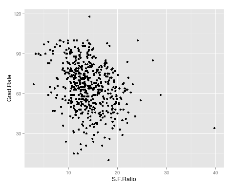
qplot(S.F.Ratio, Grad.Rate, data=trainingSet) As you can see, there appears to be a negative relationship between student faculty ratio and grad rate. In other words, as the ration of student to faculty increases there is a decrease in the graduation rate.
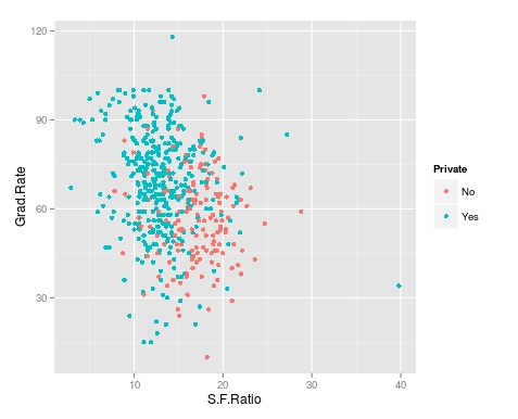
Next, we will color the plots on the graph based on whether they are a public or private university to get a better understanding of the data. Below is the code for this followed by the plot.
> qplot(S.F.Ratio, Grad.Rate, colour = Private, data=trainingSet) It appears that private colleges usually have lower student to faculty ratios and also higher graduation rates than public colleges
Add Regression Line
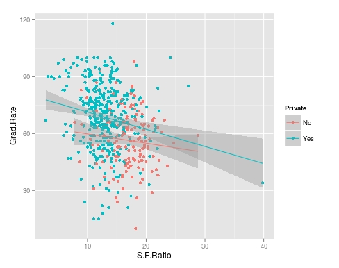
We will now plot the same data but will add a regression line. This will provide us with a visual of the slope. Below is the code followed by the plot.
> collegeplot<-qplot(S.F.Ratio, Grad.Rate, colour = Private, data=trainingSet) > collegeplot+geom_smooth(method = ‘lm’,formula=y~x) Most of this code should be familiar to you. We saved the plot as the variable ‘collegeplot’. In the second line of code, we add specific coding for ‘ggplot2’ to add the regression line. ‘lm’ means linear model and formula is for creating the regression.
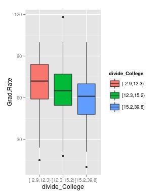
Cutting the Data
We will now divide the data based on the student-faculty ratio into three equal size groups to look for additional trends. To do this you need the “Hmisc” packaged. Below is the code followed by the table
Lastly, we will make a box plot with our three equal size groups based on student-faculty ratio. Below is the code followed by the box plot
CollegeBP<-qplot(divide_College, Grad.Rate, data=trainingSet, fill=divide_College, geom=c(“boxplot”)) > CollegeBP As you can see, the negative relationship continues even when student-faculty is divided into three equally size groups. However, our information about private and public college is missing. To fix this we need to make a table as shown in the code below.
This table tells you how many public and private colleges there based on the division of the student-faculty ratio into three groups. We can also get proportions by using the following
In this post, we found that there is a negative relationship between student-faculty ratio and graduation rate. We also found that private colleges have a lower student-faculty ratio and a higher graduation rate than public colleges. In other words, the status of a university as public or private moderates the relationship between student-faculty ratio and graduation rate.
You can probably tell by now that R can be a lot of fun with some basic knowledge of coding.
One of the strongest points of R in the opinion of many are the various features for creating graphs and other visualizations of data. In this post, we begin to look at using the various visualization features of R. Specifically, we are going to do the following
Using data in R to display graph
Add text to a graph
Manipulate the appearance of data in a graph
Using Plots
The ‘plot’ function is one of the basic options for graphing data. We are going to go through an example using the ‘islands’ data that comes with the R software. The ‘islands’ software includes lots of data, in particular, it contains data on the lass mass of different islands. We want to plot the land mass of the seven largest islands. Below is the code for doing this.
In the variable ‘islandgraph’ We used the ‘head’ and the ‘sort’ function. The sort function told R to sort the ‘island’ data by decreasing value ( this is why we have the decreasing argument equaling TRUE). After sorting the data, the ‘head’ function tells R to only take the first 7 values of ‘island’ (see the 7 in the code) after they are sorted by decreasing order.
Next, we use the plot function to plot are information in the ‘islandgraph’ variable. We also give the graph a title using the ‘main’ argument followed by the title. Following the title, we label the y-axis using the ‘ylab’ argument and putting in quotes “Square Miles”.
The last step is to add text to the information inside the graph for clarity. Using the ‘text’ function, we tell R to add text to the ‘islandgraph’ variable using the names from the ‘islandgraph’ data which uses the code ‘label=names(islandgraph)’. Remember the ‘islandgraph’ data is the first 7 islands from the ‘islands’ dataset.
After telling R to use the names from the islandgraph dataset we then tell it to place the label a little of center for readability reasons with the code ‘adj = c(0.5,1).
Below is what the graph should look like.
Changing Point Color and Shape in a Graph
For visual purposes, it may be beneficial to manipulate the color and appearance of several data points in a graph. To do this, we are going to use the ‘faithful’ dataset in R. The ‘faithful’ dataset indicates the length of eruption time and how long people had to wait for the eruption. The first thing we want to do is plot the data using the “plot” function.
As you see the data, there are two clear clusters. One contains data from 1.5-3 and the second cluster contains data from 3.5-5. To help people to see this distinction we are going to change the color and shape of the data points in the 1.5-3 range. Below is the code for this.
In this variable, we use the ‘with’ function. This allows us to access columns in the dataframe without having to use the $ sign constantly. We are telling R to look at the ‘faithful’ dataframe and only take the information from faithful that has eruptions that are less than 3. All of this is indicated in the first line of code above.
Next, we plot ‘faithful’ again
Last, we add the points from are ‘eruption_time’ variable and we tell R to color these points blue and to use a different point shape by using the ‘pch = 24’ argument
The results are below
Conclusion
In this post, we learned the following
How to make a graph
How to add a title and label the y-axis
How to change the color and shape of the data points in a graph