In this post, we will explore multidimensional scaling (MDS) in R. The main benefit of MDS is that it allows you to plot multivariate data into two dimensions. This allows you to create visuals of complex models. In addition, the plotting of MDS allows you to see relationships among examples in a dataset based on how far or close they are to each other.
We will use the “College” dataset from the “ISLR” package to create an MDS of the colleges that are in the data set. Below is some initial code.
After using the “str” function we know that we need to remove the variable “Private” because it is a factor and type of MDS we are doing can only accommodate numerical variables. After removing this variable we will then make a matrix using the “as.matrix” function. Once the matrix is ready we can use the “cmdscale” function to create the actual two-dimensional MDS. Another point to mention is that for the sake of simplicity, we are only going to use the first ten colleges in the dataset. The reason being that using all 722 will m ake it hard to understand the plots we will make. Below is the code.
We can now make our initial plot. The xlim and ylim arguments had to be played with a little for the plot to display properly. In addition, the “text” function was used to provide additional information such as the names of the colleges.
From the plot, you can see that even with only ten names it is messy. The colleges are mostly clumped together which makes it difficult to interpret. We can plot this with a four quadrant graph using “ggplot2”. First, we need to convert the matrix that we create to a dataframe.
collegemdsdf<-as.data.frame(collegemds)
We are now ready to use “ggplot” to create the four quadrant plot.
We set the horizontal and vertical line at the x and y-intercept respectively. By doing this it is much easier to understand and interpret the graph. Agnes Scott College is way off to the left while Alaska Pacific University, Abilene Christian College, and even Alderson-Broaddus College are clump together. The rest of the colleges are straddling below the x-axis.
Conclusion
In this example, we took several variables and condense them to two dimensions. This is the primary benefit of MDS. It allows you to visualize was cannot be visualized normally. The visualizing allows you to see the structure of the data from which you can draw inferences.
Topic models is a tool that can group text by their main themes. It involves the use of probability based on word frequencies. The algorithm that does this is called the Latent Dirichlet Allocation algorithm.
IN this post, we will use some text mining tools to analyze religious/philosophical text the five texts we will look at are The King James Bible The Quran The Book Of Mormon The Gospel of Buddha Meditations, by Marcus Aurelius
Once you unzip it you will need to rename each file appropriately.
The next few paragraphs are almost verbatim from the post text mining in R. This is because the data preparation is essentially the same. Small changes were made but original material is found in the analysis section of this post.
We will now begin the actual analysis. The package we need or “tm” and “topicmodels” Below is some initial code.
library(tm);library(topicmodels)
Data Preparation
We need to do three things for each text file
Paste it
convert it
write a table
Below is the code for pasting the text into R. Keep in mind that your code will be slightly different as the location of the file on your computer will be different. The “what” argument tells are what to take from the file and the “Collapse” argument deals with whitespace
Now we need to convert the new objects we created to ASCII text. This removes a lot of “funny” characters from the objects. For this, we use the “iconv” function. Below is the code.
The last step of the preparation is the creation of tables. What you are doing is you are taking the objects you have already created and are moving them to their own folder. The text files need to be alone in order to conduct the analysis. Below is the code.
write.table(bible,"/home/darrin/Documents/R working directory/textminingegw/mine/bible.txt")write.table(meditations,"/home/darrin/Documents/R working directory/textminingegw/mine/meditations.txt")write.table(buddha,"/home/darrin/Documents/R working directory/textminingegw/mine/buddha.txt")write.table(mormon,"/home/darrin/Documents/R working directory/textminingegw/mine/mormon.txt")write.table(quran,"/home/darrin/Documents/R working directory/textminingegw/mine/quran.txt")
Corpus Development
We are now ready to create the corpus. This is the object we use to clean the text together rather than individually as before. First, we need to make the corpus object, below is the code. Notice how it contains the directory where are tables are
docs<-Corpus(DirSource("/home/darrin/Documents/R working directory/textminingegw/mine"))
There are many different ways to prepare the corpus. For our example, we will do the following…
lower case all letters-This avoids the same word be counted separately (ie sheep and Sheep)
Remove numbers
Remove punctuation-Simplifies the document
Remove whitespace-Simplifies the document
Remove stopwords-Words that have a function but not a meaning (ie to, the, this, etc)
We now need to create the matrix. The document matrix is what r will actually analyze. We will then remove sparse terms. Sparse terms are terms that do not occur are a certain percentage in the matrix. For our purposes, we will set the sparsity to .60. This means that a word must appear in 3 of the 5 books of our analysis. Below is the code. The ‘dim’ function will allow you to see how the number of terms is reduced drastically. This is done without losing a great deal of data will speeding up computational time.
dtm<-DocumentTermMatrix(docs)dim(dtm)
## [1] 5 24368
dtm<-removeSparseTerms(dtm,0.6)dim(dtm)
## [1] 5 5265
Analysis
We will now create our topics or themes. If there is no a priori information on how many topics to make it os up to you to decide how many. We will create three topics. The “LDA” function is used and the argument “k” is set to three indicating we want three topics. Below is the code
set.seed(123)lda3<-LDA(dtm,k=3)
We can see which topic each book was assigned to using the “topics” function. Below is the code.
According to the results. The book of Mormon and the Bible were so unique that they each had their own topic (1 and 3). The other three text (Buddha, Meditations, and the Book of Mormon) were all placed in topic 2. It’s surprising that the Bible and the Book of Mormon were in separate topics since they are both Christian text. It is also surprising the Book by Buddha, Meditations, and the Quran are all under the same topic as it seems that these texts have nothing in common.
We can also use the “terms” function to see what the most common words are for each topic. The first argument in the function is the model name followed by the number of words you want to see. We will look at 10 words per topic.
Interpreting these results takes qualitative skills and is subjective. They all seem to be talking about the same thing. Topic 3 (Bible) seems to focus on Israel and Lord while topic 1 (Mormon) is about God and people. Topic 2 (Buddha, Meditations, and Quran) speak of god as well but the emphasis has moved to truth and the word one.
Conclusion
This post provided insight into developing topic models using R. The results of a topic model analysis is highly subjective and will often require strong domain knowledge. Furthermore, the number of topics is highly flexible as well and in the example in this post we could have had different numbers of topics for comparative purposes.
Text mining is descriptive analysis tool that is applied to unstructured textual data. By unstructured, it is meant data that is not stored in relational databases. The majority of data on the Internet and the business world, in general, is of an unstructured nature. As such, the use of text mining tools has grown in importance over the past two decades.
In this post, we will use some text mining tools to analyze religious/philosophical text the five texts we will look at are
The King James Bible
The Quran
The Book Of Mormon
The Gospel of Buddha
Meditations, by Marcus Aurelius
The link for access to these five text files is as follows
Once you unzip it you will need to rename each file appropriately.
The actual process of text mining is rather simple and does not involve a great deal of complex coding compared to other machine learning applications. Primarily you need to do the follow Prep the data by first scanning it into r, converting it to ASCII format, and creating the write table for each text Create a corpus that is then cleaned of unnecessary characters Conduct the actual descriptive analysis
We will now begin the actual analysis. The package we need or “tm” for text mining, “wordcloud”, and “RColorBrewer” for visuals. Below is some initial code.
Below is the code for pasting the text into R. Keep in mind that your code will be slightly different as the location of the file on your computer will be different. The “what” argument tells are what to take from the file and the “Collapse” argument deals with whitespace
Now we need to convert the new objects we created to ASCII text. This removes a lot of “funny” characters from the objects. For this, we use the “iconv” function. Below is the code.
The last step of the preparation is the creation of tables. Primarily you are taken the objects you have already created and moved them to their own folder. The text files need to be alone in order to conduct the analysis. Below is the code.
write.table(bible,"/home/darrin/Documents/R working directory/textminingegw/mine/bible.txt")write.table(meditations,"/home/darrin/Documents/R working directory/textminingegw/mine/meditations.txt")write.table(buddha,"/home/darrin/Documents/R working directory/textminingegw/mine/buddha.txt")write.table(mormon,"/home/darrin/Documents/R working directory/textminingegw/mine/mormon.txt")write.table(quran,"/home/darrin/Documents/R working directory/textminingegw/mine/quran.txt")
For fun, you can see a snippet of each object by simply typing its name into r as shown below.
bible
##[1] "x 1 The Project Gutenberg EBook of The King James Bible This eBook is for the use of anyone anywhere at no cost and with almost no restrictions whatsoever. You may copy it, give it away or re-use it under the terms of the Project Gutenberg License included with this eBook or online at www.gutenberg.org Title: The King James Bible Release Date: March 2, 2011 [EBook #10] [This King James Bible was orginally posted by Project Gutenberg in late 1989] Language: English *** START OF THIS PROJECT
Corpus Creation
We are now ready to create the corpus. This is the object we use to clean the text together rather than individually as before. First, we need to make the corpus object, below is the code. Notice how it contains the directory where are tables are
docs<-Corpus(DirSource("/home/darrin/Documents/R working directory/textminingegw/mine"))
There are many different ways to prepare the corpus. For our example, we will do the following…
lower case all letters-This avoids the same word be counted separately (ie sheep and Sheep)
Remove numbers
Remove punctuation-Simplifies the document Remove whitespace-Simplifies the document
Remove stopwords-Words that have a function but not a meaning (ie to, the, this, etc)
We now need to create the matrix. The document matrix is what r will actually analyze. We will then remove sparse terms. Sparse terms are terms that do not occur are a certain percentage in the matrix. For our purposes, we will set the sparsity to .60. This means that a word must appear in 3 of the 5 books of our analysis. Below is the code. The ‘dim’ function will allow you to see how the number of terms is reduced drastically. This is done without losing a great deal of data will speeding up computational time.
dtm<-DocumentTermMatrix(docs)dim(dtm)
## [1] 5 24368
dtm<-removeSparseTerms(dtm,0.6)dim(dtm)
## [1] 5 5265
Analysis
We now can explore the text. First, we need to make a matrix that has the sum of the columns od the document term matrix. Then we need to change the order of the matrix to have the most frequent terms first. Below is the code for this.
freq<-colSums(as.matrix(dtm))ord<-order(-freq)#changes the order to descending
We can now make a simple bar plot to see what the most common words are. Below is the code
barplot(freq[head(ord)])
As expected with religious text. The most common terms are religious terms. You can also determine what words appeared least often with the code below.
Notice how each word appeared 3 times. This may mean that the 3 terms appear once in three of the five books. Remember we set the sparsity to .60 or 3/5.
Another analysis is to determine how many words appear a certain number of times. For example, how many words appear 200 times or 300. Below is the code.
head(table(freq))
## freq
##   3   4   5   6   7   8
## 117 230 172 192 191 187
Using the “head” function and the “table” function gives us the six most common values of word frequencies. Three words appear 117 times, four appear 230 times, etc. Remember the “head” gives the first few values regardless of their amount
The “findFreqTerms” function allows you to set a cutoff point of how frequent a word needs to be. For example, if we want to know how many words appeared 3000 times we would use the following code.
The “findAssocs” function finds the correlation between two words in the text. This provides insight into how frequently these words appear together. For our example, we will see which words are associated with war, which is a common subject in many religious texts. We will set the correlation high to keep the list short for the blog post. Below is the code
The interpretation of the results can take many forms. It makes sense for ‘arrows’ and ‘captives’ to be associated with ‘war’ but ‘yield’ seems confusing. We also do not know the sample size of the associations.
Our last technique is the development of a word cloud. This allows you to see word frequency based on where the word is located in the cloud as well as its size. For our example, we will set it so that a word must appear at least 1000 times in the corpus with more common words in the middle. Below is the code.
This post provided an introduction to text mining in R. There are many more complex features that are available for the more serious user of R than what is described here
In this post, we will look at recommendation engines using binary information. For a binary recommendation engine, it requires that the data rates the product as good/bad or some other system in which only two responses are possible. The “recommendarlab” package is needed for this analysis and we will use the ratings of movies from grouplens.org for this post.
If you follow along you want to download the “small dataset” and use the “ratings.csv” and the “movies.csv”. We will then merge these two datasets based on the variable “movieId” the url is below is the initial code
library(recommenderlab)ratings<-read.csv("~/Downloads/ml-latest-small/ratings.csv")#load ratings datamovies<-read.csv("~/Downloads/ml-latest-small/movies.csv")#load movies datamovieRatings<-merge(ratings, movies, by='movieId')#merge movies and ratings data
We now need to convert are “movieRatings” data frame to a matrix that the “recommendarlab” can use. After doing this we need to indicate that we are doing a binary engine by setting the minimum rating to 2.5. What this means is that anything above 2.5 is in one category and anything below 2.5 is in a different category. We use the “binarize” function to do this. Below is the code
We need to use a subset of our data. We need each row to have a certain minimum number of ratings. For this analysis, we need at least ten ratings per row. Below is the code for this.
## 1817 x 671 rating matrix of class 'binaryRatingMatrix' with 68643 ratings.
Next, we need to setup the evaluation scheme. We use the function and plug in the data, method of evaluation, number of folds, and the given number of ratings. The code is as follows.
We now make a list that holds all the models we want to run. We will run four models “popular”, “random”, “ubcf”, and “ibcf”. We will then use the “evaluate” function to see how accurate are models are for 5,10,15, and 20 items.
The results are pretty bad for all models. The TPR (true positive rate) is always below .4. We can make a visual of the results by creating a ROC using the TPR/FPR as well as precision/recall.
In this post, we will look at how to make a recommendation engine. We will use data that makes recommendations about movies. We will use the “recommenderlab” package to build several different engines. The data comes from
At this link, you need to download the “ml-latest.zip”. From there, we will use the “ratings” and “movies” files in this post. Ratings provide the ratings of the movies while movies provide the names of the movies. Before going further it is important to know that the “recommenderlab” has five different techniques for developing recommendation engines (IBCF, UBCF, POPULAR, RANDOM, & SVD). We will use all of them for comparative purposes Below is the code for getting started.
We now need to merge the two datasets so that they become one. This way the titles and ratings are in one place. We will then coerce our “movieRatings” dataframe into a “realRatingMatrix” in order to continue our analysis. Below is the code
movieRatings<-merge(ratings, movies, by='movieId')#merge two filesmovieRatings<-as(movieRatings,"realRatingMatrix")#coerce to realRatingMatrix
We will now create two histograms of the ratings. The first is raw data and the second will be normalized data. The function “getRatings” is used in combination with the “hist” function to make the histogram. The normalized data includes the “normalize” function. Below is the code.
We are now ready to create the evaluation scheme for our analysis. In this object we need to set the data name (movieRatings), the method we want to use (cross-validation), the amount of data we want to use for the training set (80%), how many ratings the algorithm is given during the test set (1) with the rest being used to compute the error. We also need to tell R what a good rating is (4 or higher) and the number of folds for the cross-validation (10). Below is the code for all of this.
Below is the code for developing our models. To do this we need to use the “Recommender” function and the “getData” function to get the dataset. Remember we are using all six modeling techniques
The models have been created. We can now make our predictions using the “predict” function in addition to the “getData” function. We also need to set the argument “type” to “ratings”. Below is the code.
We can now look at the accuracy of the models. We will do this in two steps. First, we will look at the error rates. After completing this, we will do a more detailed analysis of the stronger models. Below is the code for the first step
ubcf_error<-calcPredictionAccuracy(ubcf_pred,getData(eSetup,"unknown"))#calculate erroribcf_error<-calcPredictionAccuracy(ibcf_pred,getData(eSetup,"unknown"))svd_error<-calcPredictionAccuracy(svd_pred,getData(eSetup,"unknown"))pop_error<-calcPredictionAccuracy(pop_pred,getData(eSetup,"unknown"))rand_error<-calcPredictionAccuracy(rand_pred,getData(eSetup,"unknown"))error<-rbind(ubcf_error,ibcf_error,svd_error,pop_error,rand_error)#combine objects into one data framerownames(error)<-c("UBCF","IBCF","SVD","POP","RAND")#give names to rowserror
The results indicate that the “RAND” and “IBCF” models are clearly worse than the remaining three. We will now move to the second step and take a closer look at the “UBCF”, “SVD”, and “POP” models. We will do this by making a list and using the “evaluate” function to get other model evaluation metrics. We will make a list called “algorithms” and store the three strongest models. Then we will make an objectcalled “evlist” in this object we will use the “evaluate” function as well as called the evaluation scheme “esetup”, the list (“algorithms”) as well as the number of movies to assess (5,10,15,20)
Well, the numbers indicate that all the models are terrible. All metrics are scored rather poorly. True positives, false positives, false negatives, true negatives, precision, recall, true positive rate, and false positive rate are low for all models. Remember that these values are averages of the cross-validation. As such, for the “POPULAR” model when looking at the top five movies on average, the number of true positives was .3.
Even though the numbers are terrible the “POPULAR” model always performed the best. We can even view the ROC curve with the code below
plot(evlist,legend="topleft",annotate=T)
We can now determine individual recommendations. We first need to build a model using the POPULAR algorithm. Below is the code.
## 5 x 671 rating matrix of class 'realRatingMatrix' with 2873 ratings.
movieresult<-as(rating,'matrix')[1:5,1:3]colnames(movieresult)<-c("Toy Story","Jumanji","Grumpier Old Men")movieresult
##   Toy Story  Jumanji Grumpier Old Men
## 1  2.859941 3.822666         3.724566
## 2  2.389340 3.352066         3.253965
## 3  2.148488 3.111213         3.013113
## 4  1.372087 2.334812         2.236711
## 5  2.255328 3.218054         3.119953
This is what the model thinks the person would rate the movie. It is the difference between this number and the actual one that the error is calculated. In addition, if someone did not rate a movie you would see an NA in that spot
Conclusion
This was a lot of work. However, with additional work, you can have your own recommendation system based on data that was collected.
Recommendations engines are used to make predictions about what future users would like based on prior users suggestions. Whenever you provide numerical feedback on a product or services this information can be used to provide recommendations in the future.
This post will look at various ways in which recommendation engines derive their conclusions.
Ways of Recommending
There are two common ways to develop a recommendation engine in a machine learning context. These two ways are collaborative filtering and content-based. Content-based recommendations rely solely on the data provided by the user. A user develops a profile through their activity and the engine recommends products or services. The only problem is if there is little data on user poor recommendations are made.
Collaborative filtering is crowd-based recommendations. What this means the data of many is used to recommend to one. This bypasses the concern with a lack of data that can happen with content-based recommendations.
There are four common ways to develop collaborative filters and they are as follows
User-based collaborative filtering
Item-baed collaborative filtering
Singular value decomposition and Principal component analysis
User-based Collaborative Filtering (UBCF)
UBCF uses k-nearest neighbor or some similarity measurement such as Pearson Correlation to predict the missing rating for a user. Once the number of neighbors is determined the algorithm calculates the average of the neighbors to predict the information for the user. The predicted value can be used to determine if a user will like a particular product or service
The predicted value can be used to determine if a user will like a particular product or service. Low values are not recommended while high values may be. A major weakness of UBCF is calculating the similarities of users requires keeping all the data in memory which is a computational challenge.
Item-based Collaborative Filtering (IBCF)
IBCF uses the similarity between items to make recomeendations. This is calculated with the same measures as before (Knn, Pearson correlation, etc.). After finding the most similar items, The algorithm will take the average from the individual user of the other items to predict recommendation the user would make for the unknown item.
In order to assure accuracy, it is necessary to have a huge number of items that can have the similarities calculated. This leads to the same computational problems mentioned earlier.
Singular Value Decomposition and Principal Component Analysis (SVD, PCA)
When the dataset is too big for the first two options. SVD or PCA could be an appropriate choice. What each of these two methods does in a simple way is reduce the dimensionality by making latent variables. Doing this reduces the computational effort as well as reduce noise in the data.
With SVD, we can reduce the data to a handful of factors. The remaining factors can be used to reproduce the original values which can then be used to predict missing values.
For PCA, items are combined in components and like items that load on the same component can be used to make predictions for an unknown data point for a user.
Conclusion
Recommendation engines play a critical part in generating sales for many companies. This post provided an insight into how they are created. Understanding this can allow you to develop recommendation engines based on data.
One of the major problems with hierarchical and k-means clustering is that they cannot handle nominal data. The reality is that most data is mixed or a combination of both interval/ratio data and nominal/ordinal data.
One of many ways to deal with this problem is by using the Gower coefficient. This coefficient compares the pairwise cases in the data set and calculates a dissimilarity between. By dissimilar we mean the weighted mean of the variables in that row.
Once the dissimilarity calculations are completed using the gower coefficient (there are naturally other choices), you can then use regular kmeans clustering (there are also other choices) to find the traits of the various clusters. In this post, we will use the “MedExp” dataset from the “Ecdat” package. Our goal will be to cluster the mixed data into four clusters. Below is some initial code.
You can clearly see that our data is mixed with both numerical and factor variables. Therefore, the first thing we must do is calculate the gower coefficient for the dataset. This is done with the “daisy” function from the “cluster” package.
disMat<-daisy(MedExp,metric="gower")
Now we can use the “kmeans” to make are clusters. This is possible because all the factor variables have been converted to a numerical value. We will set the number of clusters to 4. Below is the code.
The groups seem reasonably balanced. We now need to add the results of the kmeans to the original dataset. Below is the code
MedExp$cluster<-mixedClusters$cluster
We now can built a descriptive table that will give us the proportions of each variable in each cluster. To do this we need to use the “compareGroups” function. We will then take the output of the “compareGroups” function and use it in the “createTable” function to get are actual descriptive stats.
The table speaks for itself. Results that utilize factor variables have proportions to them. For example, in cluster 1, 1289 people or 65.8% responded “no” that the have an individual deductible plan (idp). Numerical variables have the mean with the standard deviation in parentheses. For example, in cluster 1 the average family size was 1 with a standard deviation of 1.05 (lfam).
Conclusion
Mixed data can be partition into clusters with the help of the gower or another coefficient. In addition, kmeans is not the only way to cluster the data. There are other choices such as the partitioning around medoids. The example provided here simply serves as a basic introduction to this.
Hierarchical clustering is a form of unsupervised learning. What this means is that the data points lack any form of label and the purpose of the analysis is to generate labels for our data points. IN other words, we have no Y values in our data.
Hierarchical clustering is an agglomerative technique. This means that each data point starts as their own individual clusters and are merged over iterations. This is great for small datasets but is difficult to scale. In addition, you need to set the linkage which is used to place observations in different clusters. There are several choices (ward, complete, single, etc.) and the best choice depends on context.
In this post, we will make a hierarchical clustering analysis of the “MedExp” data from the “Ecdat” package. We are trying to identify distinct subgroups in the sample. The actual hierarchical cluster creates what is a called a dendrogram. Below is some initial code.
Currently, for the purposes of this post. The dataset is too big. IF we try to do the analysis with over 5500 observations it will take a long time. Therefore, we will only use the first 1000 observations. In addition, We need to remove factor variables as hierarchical clustering cannot analyze factor variables. Below is the code.
We now need to scale are data. This is important because different scales will cause different variables to have more or less influence on the results. Below is the code
We now need to determine how many clusters to create. There is no rule on this but we can use statistical analysis to help us. The “NbClust” package will conduct several different analysis to provide a suggested number of clusters to create. You have to set the distance, min/max number of clusters, the method, and the index. The graphs can be understood by looking for the bend or elbow in them. At this point is the best number of clusters.
## *** : The Hubert index is a graphical method of determining the number of clusters.
##                 In the plot of Hubert index, we seek a significant knee that corresponds to a
##                 significant increase of the value of the measure i.e the significant peak in Hubert
##                 index second differences plot.
##
## *** : The D index is a graphical method of determining the number of clusters.
##                 In the plot of D index, we seek a significant knee (the significant peak in Dindex
##                 second differences plot) that corresponds to a significant increase of the value of
##                 the measure.
##
## *******************************************************************
## * Among all indices:
## * 7 proposed 2 as the best number of clusters
## * 9 proposed 3 as the best number of clusters
## * 6 proposed 6 as the best number of clusters
## * 1 proposed 8 as the best number of clusters
##
##                    ***** Conclusion *****
##
## * According to the majority rule, the best number of clusters is  3
##
##
## *******************************************************************
Simple majority indicates that three clusters is most appropriate. However, four clusters are probably just as good. Every time you do the analysis you will get slightly different results unless you set the seed.
To make our actual clusters we need to calculate the distances between clusters using the “dist” function while also specifying the way to calculate it. We will calculate distance using the “Euclidean” method. Then we will take the distance’s information and make the actual clustering using the ‘hclust’ function. Below is the code.
We can now plot the results. We will plot “hiclust” and set hang to -1 so this will place the observations at the bottom of the plot. Next, we use the “cutree” function to identify 4 clusters and store this in the “comp” variable. Lastly, we use the “ColorDendrogram” function to highlight are actual clusters.
Cluster 1 is the most educated (‘educdec’). Cluster 2 stands out as having higher medical cost (‘med’), chronic disease (‘ndisease’) and age. Cluster 3 had the lowest annual incentive payment (‘lpi’). Cluster 4 had the highest coinsurance rate (‘lc’). You can make boxplots of each of the stats above. Below is just an example of age by cluster.
Hierarchical clustering is one way in which to provide labels for data that does not have labels. The main challenge is determining how many clusters to create. However, this can be dealt with through using recommendations that come from various functions in R.
Deep learning is a complex machine learning concept in which new features are created new features from the variables that were inputted. These new features are used for classifying labeled data. This all done mostly with artificial neural networks that are multiple layers deep and can involve regularization.
If understanding is not important but you are in search of the most accurate classification possible deep learning is a useful tool. It is nearly impossible to explain to the typical stakeholder and is best for just getting the job done.
One of the most accessible packages for using deep learning is the “h2o” package.This package allows you to access the H2O website which will analyze your data and send it back to you. This allows a researcher to do analytics on a much larger scale than their own computer can handle. In this post, we will use deep learning to predict the gender of the head of household in the “VietnamH” dataset from the “Ecdat” package. Below is some initial code.
We need to remove the “commune” variable “lnexp12m” and the “lntotal” variable. The “commune” variable should be removed because it doesn’t provide much information. The “lntotal” variable should be removed because it is the total expenditures that the family spends. This is represented by other variables such as food “lnrlfood” which “lntotal” highly correlates with. the “lnexp12m” should be removed because it has a perfect correlation with “lnmed”. Below is the code
We now need to save our modified dataset as a csv file that we can send to h2o. The code is as follows.
write.csv(VietNamH, file="viet.csv",row.names=F)
Connect to H2O
Now we can connect to H2o and start what is called an instance.
localH2O<-h2o.init()
##  Connection successful!
##
## R is connected to the H2O cluster:
##     H2O cluster uptime:         50 minutes 18 seconds
##     H2O cluster version:        3.10.4.6
##     H2O cluster version age:    27 days
##     H2O cluster name:           H2O_started_from_R_darrin_hsl318
##     H2O cluster total nodes:    1
##     H2O cluster total memory:   3.44 GB
##     H2O cluster total cores:    4
##     H2O cluster allowed cores:  2
##     H2O cluster healthy:        TRUE
##     H2O Connection ip:          localhost
##     H2O Connection port:        54321
##     H2O Connection proxy:       NA
##     H2O Internal Security:      FALSE
##     R Version:                  R version 3.4.0 (2017-04-21)
The output indicates that we are connected. The next step is where it really gets complicated. We need to upload our data to h2o as an h2o dataframe, which is different from a regular data frame. We also need to indicate the location of the csv file on your computer that needs to be converted. All of this is done in the code below.
viet.hex<-h2o.uploadFile(path="/home/darrin/Documents/R working directory/blog/blog/viet.csv",destination_frame="viet.hex")
In the code above we create an object called “viet.hex”. This object uses the “h2o.uploadFile” function to send our csv to h2o. We can check if everything worked by using the “class” function and the “str” function on “viet.hex”.
The “summary” function also provides insight into the data.
summary(viet.hex)
##  sex          age             educyr           farm      urban
##  male  :4375  Min.   :16.00   Min.   : 0.000   yes:3438  no :4269
##  female:1624  1st Qu.:37.00   1st Qu.: 3.982   no :2561  yes:1730
##               Median :46.00   Median : 6.996
##               Mean   :48.01   Mean   : 7.094
##               3rd Qu.:58.00   3rd Qu.: 9.988
##               Max.   :95.00   Max.   :22.000
##  hhsize           lnmed            lnrlfood
##  Min.   : 1.000   Min.   : 0.000   Min.   : 6.356
##  1st Qu.: 4.000   1st Qu.: 4.166   1st Qu.: 8.372
##  Median : 5.000   Median : 5.959   Median : 8.689
##  Mean   : 4.752   Mean   : 5.266   Mean   : 8.680
##  3rd Qu.: 6.000   3rd Qu.: 7.171   3rd Qu.: 9.001
##  Max.   :19.000   Max.   :12.363   Max.   :11.384
Create Training and Testing Sets
We now need to create our train and test sets. We need to use slightly different syntax to do this with h2o. The code below is how it is done to create a 70/30 split in the data.
x = 2:8 is all the independent variables in the dataframe and y=1 is the first variable “sex”
We set the training and validation frame to “train” and “test” and set the seed.
Finally, we indicated that we want to know the variable importance.
We can check the performance of the model with the code below.
vietdlmodel
## Model Details:
## training
## Confusion Matrix (vertical: actual; across: predicted) for F1-optimal threshold:
##        female male    Error       Rate
## female    435  711 0.620419  =711/1146
## male      162 2896 0.052976  =162/3058
## Totals    597 3607 0.207659  =873/4204

## testing
## Confusion Matrix (vertical: actual; across: predicted) for F1-optimal threshold:
##        female male    Error       Rate
## female    151  327 0.684100   =327/478
## male       60 1257 0.045558   =60/1317
## Totals    211 1584 0.215599  =387/1795
There is a lot of output here. For simplicity, we will focus on the confusion matrices for the training and testing sets.The error rate for the training set is 19.8% and for the testing set, it is 21.2%. Below we can see which variable were most useful
The numbers speak for themselves. “Urban” and “farm” are both the most important variables for predicting sex. Below is the code for obtaining the predicted results and placing them into a dataframe. This is useful if you need to send in final results to a data science competition such as those found at kaggle.
##   predict     female      male
## 1    male 0.06045560 0.9395444
## 2    male 0.10957121 0.8904288
## 3    male 0.27459108 0.7254089
## 4    male 0.14721353 0.8527865
## 5    male 0.05493486 0.9450651
## 6    male 0.10598351 0.8940165
Conclusion
This was a complicated experience. However, we learned how to upload and download results from h2.
In this blog, we have already discussed and what gradient boosting is. However, for a brief recap, gradient boosting improves model performance by first developing an initial model called the base learner using whatever algorithm of your choice (linear, tree, etc.).
What follows next is that gradient boosting looks at the error in the first model and develops a second model using what is called the loss function. The loss function calculates the difference between the current accuracy and the desired prediction whether it’s accuracy for classification or error in regression. This process is repeated with the creation of additional models until a certain level of accuracy or reduction in error is attained.
This post what provide an example of the use of gradient boosting in random forest classification. Specifically, we will try to predict a person’s labor participation based on several independent variables.
We need to transform the ‘age’ variable by multiplying by ten so that the ages are realistic. In addition, we need to convert “lnnlinc” from the log of salary to regular salary. Below is the code to transform these two variables.
Participation$age<-10*Participation$age#normal ageParticipation$lnnlinc<-exp(Participation$lnnlinc)#actual income not log
We now need to create our grid and control. The grid allows us to create several different models with various parameter settings. This is important in determining what is the most appropriate model which is always determined by comparing. We are using random forest so we need to set the number of trees we desire, the depth of the trees, the shrinkage which controls the influence of each tree, and the minimum number of observations in a node. The control will allow us to set the cross-validation. Below is the code for the creation of the grid and control.
Gradient boosting provides us with the recommended parameters for our training model as shown above as well as the accuracy and kappa of each model. We also need to recode the dependent variable as 0 and 1 for the ‘gbm’ function.
You can see a summary of the most important variables for prediction as well as a plot by using the “summary” function.
summary(gbm.lfp)
##             var   rel.inf
## lnnlinc lnnlinc 28.680447
## age         age 27.451474
## foreign foreign 23.307932
## nyc         nyc 18.375856
## educ       educ  2.184291
## noc         noc  0.000000
Salary (lnnlinc), age and foreigner status are the most important predictors followed by the number of younger children (nyc) and last education. The number of older children (noc) has no effect. We can now test our model on the test set.
Gradient boosting is a machine learning tool for “boosting” or improving model performance. How this works is that you first develop an initial model called the base learner using whatever algorithm of your choice (linear, tree, etc.).
Gradient boosting looks at the error and develops a second model using what is called da loss function. The loss function is the difference between the current accuracy and the desired prediction whether it’s accuracy for classification or error in regression. This process of making additional models based only on the misclassified ones continues until the level of accuracy is reached.
Gradient boosting is also stochastic. This means that it randomly draws from the sample as it iterates over the data. This helps to improve accuracy and or reduce error.
In this post, we will use gradient boosting for regression trees. In particular, we will use the “Sacramento” dataset from the “caret” package. Our goal is to predict a house’s price based on the available variables. Below is some initial code
Already there are some actions that need to be made. We need to remove the variables “city” and “zip” because they both have a large number of factors. Next, we need to remove “latitude” and “longitude” because these values are hard to interpret in a housing price model. Let’s run the correlations before removing this information
There also appears to be a high correlation between “sqft” and beds and bathrooms. As such, we will remove “sqft” from the model. Below is the code for the revised variables remaining for the model.
We need to create a grid in order to develop the many different potential models available. We have to tune three different parameters for gradient boosting, These three parameters are number of trees, interaction depth, and shrinkage. Number of trees is how many trees gradient boosting g will make, interaction depth is the number of splits, shrinkage controls the contribution of each tree and stump to the final model. We also have to determine the type of cross-validation using the “trainControl”” function. Below is the code for the grid.
The printout shows you the values for each potential model. At the bottom of the printout are the recommended parameters for our model. We take the values at the bottom to create our model for the test data.
The actual value for the mean squared error is relative and means nothing by its self. The plot, however, looks good and indicates that our model may be doing well. The mean squared error is only useful when comparing one model to another it does not mean much by its self.
This post will cover the use of random forest for classification. Random forest involves the use of many decision trees in the development of a classification or regression tree. The results of each individual tree are added together and the mean is used in the final classification of an example. The use of an ensemble helps in dealing with the bias-variance tradeoff.
In the example of random forest classification, we will use the “Participation” dataset from the “ecdat” package. We want to classify people by their labor participation based on the other variables available in the dataset. Below is some initial code
For the data preparation, we need to multiple age by ten as the current values imply small children. Furthermore, we need to change the “lnnlinc” variable from the log of salary to just the regular salary. After completing these two steps, we need to split our data into training and testing sets. Below is the code
Participation$age<-10*Participation$age#normal ageParticipation$lnnlinc<-exp(Participation$lnnlinc)#actual income not log#split dataset.seed(502)ind=sample(2,nrow(Participation),replace=T,prob=c(.7,.3))train<-Participation[ind==1,]test<-Participation[ind==2,]
We will now create our classification model using random forest.
##
## Call:
##  randomForest(formula = lfp ~ ., data = train)
##                Type of random forest: classification
##                      Number of trees: 500
## No. of variables tried at each split: 2
##
##         OOB estimate of  error rate: 32.39%
## Confusion matrix:
##      no yes class.error
## no  248  93   0.2727273
## yes 113 182   0.3830508
The output is mostly self-explanatory. It includes the number of trees, number of variables at each split, error rate, and the confusion matrix. In general, are error rate is poor and we are having a hard time distinguishing between those who work and do not work based on the variables in the dataset. However, this is based on having all 500 trees in the analysis. Having this many trees is probably not necessary but we need to confirm this.
We can also plot the error by tree using the “plot” function as shown below.
plot(rf.lfp)
It looks as though error lowest with around 400 trees. We can confirm this using the “which.min” function and call information from “err.rate” in our model.
which.min(rf.lfp$err.rate[,1])
## [1] 242
We need 395 trees in order to reduce the error rate to its most optimal level. We will now create a new model that contains 395 trees in it.
##
## Call:
##  randomForest(formula = lfp ~ ., data = train, ntree = 395)
##                Type of random forest: classification
##                      Number of trees: 395
## No. of variables tried at each split: 2
##
##         OOB estimate of  error rate: 31.92%
## Confusion matrix:
##      no yes class.error
## no  252  89   0.2609971
## yes 114 181   0.3864407
The results are mostly the same. There is a small decline in error but not much to get excited about. We will now run our model on the test set.
Still disappointing, there is one last chart we should examine and that is the importance of each variable plot. It shows which variables are most useful in the prediction process. Below is the code.
varImpPlot(rf.lfp2)
This plot clearly indicates that salary (“lnnlinc”), age, and education are the strongest features for classifying by labor activity. However, the overall model is probably not useful.
Conclusion
This post explained and demonstrated how to conduct a random forest analysis. This form of analysis is powerful in dealing with large datasets with nonlinear relationships among the variables.
Random forest involves the process of creating multiple decision trees and the combing of their results. How this is done is through r using 2/3 of the data set to develop decision tree. This is done dozens, hundreds, or more times. Every tree made is created with a slightly different sample. The results of all these trees are then averaged together. This process of sampling is called bootstrap aggregation or bagging for short.
While the random forest algorithm is developing different samples it also randomly selects which variables to be used in each tree that is developed. By randomizing the sample and the features used in the tree, random forest is able to reduce both bias and variance in a model. In addition, random forest is robust against outliers and collinearity. Lastly, keep in mind that random forest can be used for regression and classification trees
In our example, we will use the “Participation” dataset from the “Ecdat” package. We will create a random forest regression tree to predict income of people. Below is some initial code
We now need to prepare the data. We need to transform the lnnlinc from a log of salary to the actual salary. In addition, we need to multiply “age” by ten as 3.4 & 4.5 do not make any sense. Below is the code
Participation$age<-10*Participation$age#normal ageParticipation$lnnlinc<-exp(Participation$lnnlinc)#actual income not log
##
## Call:
##  randomForest(formula = lnnlinc ~ ., data = train)
##                Type of random forest: regression
##                      Number of trees: 500
## No. of variables tried at each split: 2
##
##           Mean of squared residuals: 529284177
##                     % Var explained: 13.74
As you can see from calling “rf.pros” the variance explained is low at around 14%. The output also tells us how many trees were created. You have to be careful with making too many trees as this leads to overfitting. We can determine how many trees are optimal by looking at a plot and then using the “which.min”. Below is a plot of the number of trees by the mean squared error.
plot(rf.pros)
As you can see, as there are more trees there us less error to a certain point. It looks as though about 50 trees is enough. To confirm this guess, we used the “which.min” function. Below is the code
which.min(rf.pros$mse)
## [1] 45
We need 45 trees to have the lowest error. We will now rerun the model and add an argument called “ntrees” to indicating the number of trees we want to generate.
##
## Call:
##  randomForest(formula = lnnlinc ~ ., data = train, ntree = 45)
##                Type of random forest: regression
##                      Number of trees: 45
## No. of variables tried at each split: 2
##
##           Mean of squared residuals: 520705601
##                     % Var explained: 15.13
This model is still not great. We explain a little bit more of the variance and the error decreased slightly. We can now see which of the features in our model are the most useful by using the “varImpPlot” function. Below is the code.
varImpPlot(rf.pros.45)
The higher the IncNodePurity the more important the variable. AS you can see, education is most important followed by age and then the number of older children. The raw scores for each variable can be examined using the “importance” function. Below is the code.
Remember that the mean squared error calculated here is only useful in comparison to other models. Random forest provides a way in which to remove the weaknesses of one decision tree by averaging the results of many. This form of ensemble learning is one of the more powerful algorithms in machine learning.
Classification trees are similar to regression trees except that the determinant of success is not the residual sum of squares but rather the error rate. The strange thing about classification trees is that you can you can continue to gain information in splitting the tree without necessarily improving the misclassification rate. This is done through calculating a measure of error called the Gini coefficient
Gini coefficient is calculated using the values of the accuracy and error in an equation. For example, if we have a model that is 80% accurate with a 20% error rate the Gini coefficient is calculated as follows for a single node
n0gini<-1-(((8/10)^2)-((2/10)^2))n0gini
## [1] 0.4
Now if we split this into two nodes notice the change in the Gini coefficient
The lower the Gini coefficient the better as it measures purity. IN the example, there is no improvement in the accuracy yet there is an improvement in the Gini coefficient. Therefore, classification is about purity and not the residual sum of squares.
In this post, we will make a classification tree to predict if someone is participating in the labor market. We will do this using the “Participation” dataset from the “Ecdat” package. Below is some initial code to get started.
The ‘age’ feature needs to be transformed. Since it is doubtful that the survey was conducted among 4 and 5-year-olds. We need to multiply this variable by ten. In addition, the “lnnlinc” feature is the log of income and we want the actual income so we will exponentiate this information. Below is the code for these two steps.
Participation$age<-10*Participation$age#normal ageParticipation$lnnlinc<-exp(Participation$lnnlinc)#actual income not log
We will now create our training and testing datasets with the code below.
In the text above, the first split is made on the feature “foreign” which is a yes or no possibility. 471 were not foreigners will 165 were foreigners. The accuracy here is not great at 61% for those not classified as foreigners and 31% for those classified as foreigners. For the 165 that are classified as foreigners, the next split is by their income, etc. This is hard to understand. Below is an actual diagram of the text above.
plot(as.party(tree.pros))
We now need to determining if pruning the tree is beneficial. We do this by looking at the cost complexity. Below is the code.
The “rel error” indicates that our model is bad no matter how any splits. Even with 9 splits we have an error rate of 60%. Below is a plot of the table above
plotcp(tree.pros)
Based on the table, we will try to prune the tree to 5 splits. The plot above provides a visual as it has the lowest error. The table indicates that a tree of five splits (row number 4) has the lowest cross-validation error (xstd). Below is the code for pruning the tree followed by a plot of the modified tree.
IF you compare the two trees we have developed. One of the main differences is that the pruned.tree is missing the “noc” (number of older children) variable. There are also fewer splits on the income variable (lnnlinc). We can no use the pruned tree with the test data set.
##
## party.pros.test no yes
##             no  90  41
##             yes 40  65
Now for the accuracy
(90+65)/(90+41+40+65)
## [1] 0.6567797
This is surprisingly high compared to the results for the training set but 65% is not great, However, this is fine for a demonstration.
Conclusion
Classification trees are one of many useful tools available for data analysis. When developing classification trees one of the key ideas to keep in mind is the aspect of prunning as this affects the complexity of the model.
In this post, we will look at support vector machines for numeric prediction. SVM is used for both classification and numeric prediction. The advantage of SVM for numeric prediction is that SVM will automatically create higher dimensions of the features and summarizes this in the output. In other words, unlike in regression where you have to decide for yourself how to modify your features, SVM does this automatically using different kernels.
Different kernels transform the features in different ways. And the cost function determines the penalty for an example being on the wrong side of the margin developed by the kernel. Remember that SVM draws lines and separators to divide the examples. Examples on the wrong side are penalized as determined by the researcher.
Just like with regression, generally, the model with the least amount of error may be the best model. As such, the purpose of this post is to use SVM to predict income in the “Mroz” dataset from the “Ecdat” package. We will use several different kernels that will transformation the features different ways and calculate the mean-squared error to determine the most appropriate model. Below is some initial code.
We need to place the factor variables next to each other as it helps in having to remove them when we need to scale the data. We must scale the data because SVM is based on distance when making calculations. If there are different scales the larger scale will have more influence on the results. Below is the code
mroz.scale<-Mroz[,c(17,1,2,3,4,5,6,7,8,9,10,11,12,13,14,15,16,18)]mroz.scale<-as.data.frame(scale(mroz.scale[,c(-1,-2)]))#remove factor variables for scalingmroz.scale$city<-Mroz$city# add factor variable back into the datasetmroz.scale$work<-Mroz$work# add factor variable back into the dataset#mroz.cor<-cor(mroz.scale[,-17:-18])#corrplot(mroz.cor,method='number', col='black')
Below is the code for creating the train and test datasets.
Our first kernel is the linear kernel. Below is the code. We use the “tune.svm” function from the “e1071” package. We set the kernel to “linear” and we pick our own values for the cost function. The numbers for the cost function can be whatever you want. Also, keep in mind that r will produce six different models because we have six different values in the “cost” argument.
The process we are using to develop the models is as follows
Set the seed
Develop the initial model by setting the formula, dataset, kernel, cost function, and other needed information.
Select the best model for the test set
Predict with the best model
Plot the predicted and actual results
Calculate the mean squared error
The first time we will go through this process step-by-step. However, all future models will just have the code followed by an interpretation.
Now we will create a plot so we can see how well our model predicts. In addition, we will calculate the mean squared error to have an actual number of our model’s performance
The model looks good in the plot. However, we cannot tell if the error number is decent until it is compared to other models
Polynomial Kernel
The next kernel we will use is the polynomial one. The kernel requires two parameters the degree of the polynomial (3,4,5, etc) as well as the kernel coefficient. Below is the code
The sigmoid performed much worst then the other models based on the metric of error. You can further see the problems with this model in the plot above.
Conclusion
The final results are as follows
Linear kernel .21
Polynomial kernel .24
Radial kernel .31
Sigmoid kernel .80
Which model to select depends on the goals of the study. However, it definitely looks as though you would be picking from among the first three models. The power of SVM is the ability to use different kernels to uncover different results without having to really modify the features yourself.
In this post, we will take a look at regression trees. Regression trees use a concept called recursive partitioning. Recursive partitioning involves splitting features in a way that reduces the error the most.
The splitting is also greedy which means that the algorithm will partition the data at one point without considering how it will affect future partitions. Ignoring how a current split affects the future splits can lead to unnecessary branches with high variance and low bias.
One of the main strengths of regression trees is their ability to deal with nonlinear relationships. However, predictive performance can be hurt when a particular example is assigned the mean of a node. This forced assignment is a loss of data such as turning continuous variables into categorical variables.
in this post, we will use the “participation” dataset from the “ecdat” package to predict income based on the other variables in the dataset. Below is some initial code.
There are several things we need to do to make the results easier to interpret. The “age” variable needs to be multiplied by ten as it currently shows such results as 4.5, 3, etc. Common sense indicates that a four-year-old and a three-year-old is not earning an income.
In addition, we need to convert or income variable (lnnlinc) from the log of income to regular income. This will also help to understand the results. Below is the code.
Participation$age<-10*Participation$age#normal ageParticipation$lnnlinc<-exp(Participation$lnnlinc)#actual income not log
The next step is to create our training and testing data sets. Below is the code.
I will not interpret all of this but here is a brief description use numbers 2,4, and 8. If the person has less than 11.5 years of education (473 qualify) If the person has less than 9.5 years of education (335 of the 473 qualify) If the person is a foreigner (129 of the 335 qualify) than their average salary is 36,016.12 dollars.
Perhaps now you can see how some data is lost. The average salary for people in this node is 36,016.12 dollars but probably nobody earns exactly this amount
If what I said does not make sense. Here is an actual plot of the current regression tree.
plot(as.party(reg.tree))
The little boxes at the bottom are boxplots of that node.
Tree modification
We now will make modifications to the tree. We will begin by examining the cptable. Below is the code
The cptable shares a lot of information. First, cp stands for cost complexity and this is the column furthest to the left. This number decreases as the tree becomes more complex. “nsplit” indicates the number of splits in the tree. “rel error” as another term for the residual sum of squares or RSS error. The ‘xerror’ and ‘xstd’ are the cross-validated average error and standard deviation of the error respectively.
One thing we can see from the cptable is that 9 splits has the lowest error but 2 splits have the lowest cross-validated error. Below we will look at a printout of the current table.
We will now make a plot of the complexity parameter to determine at what point to prune the tree. Pruning helps in removing unnecessary splits that do not improve the model much. Below is the code. The information in the plot is a visual of the “cptable”
plotcp(reg.tree)
It appears that a tree of size 2 is the best but this is boring. The next lowest dip is a tree of size 8. Therefore, we will prune our tree to have a size of 8 or eight splits. First, we need to create an object that contains how many splits we want. Then we use the “prune” function to make the actually modified tree.
The number we calculated is the mean squared error. This number must be compared to models that are developed differently in order to assess the current model. By its self it means nothing.
Conclusion
This post exposed you to regression trees. This type of tree can be used to m ake numeric predictions in nonlinear data. However, with the classification comes a loss of data as the uniqueness of each example is lost when placed in a node.
K-nearest neighbor is one of many nonlinear algorithms that can be used in machine learning. By non-linear I mean that a linear combination of the features or variables is not needed in order to develop decision boundaries. This allows for the analysis of data that naturally does not meet the assumptions of linearity.
KNN is also known as a “lazy learner”. This means that there are known coefficients or parameter estimates. When doing regression we always had coefficient outputs regardless of the type of regression (ridge, lasso, elastic net, etc.). What KNN does instead is used K nearest neighbors to give a label to an unlabeled example. Our job when using KNN is to determine the number of K neighbors to use that is most accurate based on the different criteria for assessing the models.
In this post, we will develop a KNN model using the “Mroz” dataset from the “Ecdat” package. Our goal is to predict if someone lives in the city based on the other predictor variables. Below is some initial code.
We need to remove the factor variable “work” as KNN cannot use factor variables. After this, we will use the “melt” function from the “reshape2” package to look at the variables when divided by whether the example was from the city or not.
From the plots, it appears there are no differences in how the variable act whether someone is from the city or not. This may be a flag that classification may not work.
We now need to scale our data otherwise the results will be inaccurate. Scaling might also help our box-plots because everything will be on the same scale rather than spread all over the place. To do this we will have to temporarily remove our outcome variable from the data set because it’s a factor and then reinsert it into the data set. Below is the code.
Before creating a model we need to create a grid. We do not know the value of k yet so we have to run multiple models with different values of k in order to determine this for our model. As such we need to create a ‘grid’ using the ‘expand.grid’ function. We will also use cross-validation to get a better estimate of k as well using the “trainControl” function. The code is below.
## k-Nearest Neighbors
##
## 540 samples
##  16 predictors
##   2 classes: 'no', 'yes'
##
## No pre-processing
## Resampling: Cross-Validated (10 fold)
## Summary of sample sizes: 487, 486, 486, 486, 486, 486, ...
## Resampling results across tuning parameters:
##
##   k   Accuracy   Kappa
##    2  0.6000095  0.1213920
##    3  0.6368757  0.1542968
##    4  0.6424325  0.1546494
##    5  0.6386252  0.1275248
##    6  0.6329998  0.1164253
##    7  0.6589619  0.1616377
##    8  0.6663344  0.1774391
##    9  0.6663681  0.1733197
##   10  0.6609510  0.1566064
##   11  0.6664018  0.1575868
##   12  0.6682199  0.1669053
##   13  0.6572111  0.1397222
##   14  0.6719586  0.1694953
##   15  0.6571425  0.1263937
##   16  0.6664367  0.1551023
##   17  0.6719573  0.1588789
##   18  0.6608811  0.1260452
##   19  0.6590979  0.1165734
##   20  0.6609510  0.1219624
##
## Accuracy was used to select the optimal model using  the largest value.
## The final value used for the model was k = 14.
R recommends that k = 16. This is based on a combination of accuracy and the kappa statistic. The kappa statistic is a measurement of the accuracy of a model while taking into account chance. We don’t have a model in the sense that we do not use the ~ sign like we do with regression. Instead, we have a train and a test set a factor variable and a number for k. This will make more sense when you see the code. Finally, we will use this information on our test dataset. We will then look at the table and the accuracy of the model.
knn.test<-knn(train[,-17],test[,-17],train[,17],k=16)#-17 removes the dependent variable 'citytable(knn.test,test$city)
##
## knn.test  no yes
##      no   19   8
##      yes  61 125
prob.agree<-(15+129)/213prob.agree
## [1] 0.6760563
Accuracy is 67% which is consistent with what we found when determining the k. We can also calculate the kappa. This done by calculating the probability and then do some subtraction and division. We already know the accuracy as we stored it in the variable “prob.agree” we now need the probability that this is by chance. Lastly, we calculate the kappa.
The example we just did was with unweighted k neighbors. There are times when weighted neighbors can improve accuracy. We will look at three different weighing methods. “Rectangular” is unweighted and is the one that we used. The other two are “triangular” and “epanechnikov”. How these calculate the weights is beyond the scope of this post. In the code below the argument “distance” can be set to 1 for Euclidean and 2 for absolute distance.
##
## Call:
## train.kknn(formula = city ~ ., data = train, kmax = 25, distance = 2,     kernel = c("rectangular", "triangular", "epanechnikov"))
##
## Type of response variable: nominal
## Minimal misclassification: 0.3277778
## Best kernel: rectangular
## Best k: 14
If you look at the plot you can see which value of k is the best by looking at the point that is the lowest on the graph which is right before 15. Looking at the legend it indicates that the point is the “rectangular” estimate which is the same as unweighted. This means that the best classification is unweighted with a k of 14. Although it recommends a different value for k our misclassification was about the same.
Conclusion
In this post, we explored both weighted and unweighted KNN. This algorithm allows you to deal with data that does not meet the assumptions of regression by ignoring the need for parameters. However, because there are no numbers really attached to the results beyond accuracy it can be difficult to explain what is happening in the model to people. As such, perhaps the biggest drawback is communicating results when using KNN.
Elastic net is a combination of ridge and lasso regression. What is most unusual about elastic net is that it has two tuning parameters (alpha and lambda) while lasso and ridge regression only has 1.
In this post, we will go through an example of the use of elastic net using the “VietnamI” dataset from the “Ecdat” package. Our goal is to predict how many days a person is ill based on the other variables in the dataset. Below is some initial code for our analysis
We need to check the correlations among the variables. We need to exclude the “sex” variable as it is categorical. The code is below.
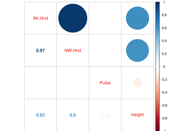
p.cor<-cor(VietNamI[,-4])corrplot.mixed(p.cor)
No major problems with correlations. Next, we set up our training and testing datasets. We need to remove the variable “commune” because it adds no value to our results. In addition, to reduce the computational time we will only use the first 1000 rows from the data set.
We need to create a grid that will allow us to investigate different models with different combinations of alpha and lambda. This is done using the “expand.grid” function. In combination with the “seq” function below is the code
We also need to set the resampling method, which allows us to assess the validity of our model. This is done using the “trainControl” function” from the “caret” package. In the code below “LOOCV” stands for “leave one out cross-validation”.
control<-trainControl(method="LOOCV")
We are no ready to develop our model. The code is mostly self-explanatory. This initial model will help us to determine the appropriate values for the alpha and lambda parameters
## glmnet
##
## 694 samples
##  10 predictors
##
## No pre-processing
## Resampling: Leave-One-Out Cross-Validation
## Summary of sample sizes: 693, 693, 693, 693, 693, 693, ...
## Resampling results across tuning parameters:
##
##   alpha  lambda  RMSE      Rsquared
##   0.0    0.0     5.229759  0.2968354
##   0.0    0.1     5.229759  0.2968354
##   0.0    0.2     5.229759  0.2968354
##   0.5    0.0     5.243919  0.2954226
##   0.5    0.1     5.225067  0.2985989
##   0.5    0.2     5.200415  0.3038821
##   1.0    0.0     5.244020  0.2954519
##   1.0    0.1     5.203973  0.3033173
##   1.0    0.2     5.182120  0.3083819
##
## RMSE was used to select the optimal model using  the smallest value.
## The final values used for the model were alpha = 1 and lambda = 0.2.
The output list all the possible alpha and lambda values that we set in the “grid” variable. It even tells us which combination was the best. For our purposes, the alpha will be .5 and the lambda .2. The r-square is also included.
We will set our model and run it on the test set. We have to convert the “sex” variable to a dummy variable for the “glmnet” function. We next have to make matrices for the predictor variables and a for our outcome variable “illdays”
train$sex<-model.matrix(~sex-1, data=train)#convert to dummy variable test$sex<-model.matrix(~sex-1, data=test)predictor_variables<-as.matrix(train[,-9])days_ill<-as.matrix(train$illdays)enet<-glmnet(predictor_variables,days_ill,family="gaussian",alpha=0.5,lambda=.2)
We can now look at specific coefficient by using the “coef” function.
## 12 x 1 sparse Matrix of class "dgCMatrix"
##                         s0
## (Intercept)   -1.304263895
## pharvis        0.532353361
## lnhhexp       -0.064754000
## age            0.760864404
## sex.sexfemale  0.029612290
## sex.sexmale   -0.002617404
## married        0.318639271
## educ           .
## illness        3.103047473
## injury         .
## actdays        0.314851347
## insurance      .
You can see for yourself that several variables were removed from the model. Medical expenses (lnhhexp), sex, education, injury, and insurance do not play a role in the number of days ill for an individual in Vietnam.
With our model developed. We now can test it using the predict function. However, we first need to convert our test dataframe into a matrix and remove the outcome variable from it
This does not look good. Let’s check the mean squared error
enet.resid<-enet.y-test$illdaysmean(enet.resid^2)
## [1] 20.18134
We will now do a cross-validation of our model. We need to set the seed and then use the “cv.glmnet” to develop the cross-validated model. We can see the model by plotting it.
You can see that as the number of features are reduce (see the numbers on the top of the plot) the MSE increases (y-axis). In addition, as the lambda increases, there is also an increase in the error but only when the number of variables is reduced as well.
The dotted vertical lines in the plot represent the minimum MSE for a set lambda (on the left) and the one standard error from the minimum (on the right). You can extract these two lambda values using the code below.
enet.cv$lambda.min
## [1] 0.3082347
enet.cv$lambda.1se
## [1] 2.874607
We can see the coefficients for a lambda that is one standard error away by using the code below. This will give us an alternative idea for what to set the model parameters to when we want to predict.
coef(enet.cv,s="lambda.1se")
## 12 x 1 sparse Matrix of class "dgCMatrix"
##                      1
## (Intercept)   2.34116947
## pharvis       0.003710399
## lnhhexp       .
## age           .
## sex.sexfemale .
## sex.sexmale   .
## married       .
## educ          .
## illness       1.817479480
## injury        .
## actdays       .
## insurance     .
Using the one standard error lambda we lose most of our features. We can now see if the model improves by rerunning it with this information.
In this post, we will conduct an analysis using the lasso regression. Remember lasso regression will actually eliminate variables by reducing them to zero through how the shrinkage penalty can be applied.
We will use the dataset “nlschools” from the “MASS” packages to conduct our analysis. We want to see if we can predict language test scores “lang” with the other available variables. Below is some initial code to begin the analysis
We need to remove the “class” variable as it is used as an identifier and provides no useful data. After this, we can check the correlations among the variables. Below is the code for this.
Remember that the ‘glmnet’ function does not like factor variables. So we need to convert our “COMB” variable to a dummy variable. In addition, “glmnet” function does not like data frames so we need to make two data frames. The first will include all the predictor variables and the second we include only the outcome variable. Below is the code
train$COMB<-model.matrix(~COMB-1, data=train)#convert to dummy variable test$COMB<-model.matrix(~COMB-1, data=test)predictor_variables<-as.matrix(train[,2:4])language_score<-as.matrix(train$lang)
We can now run our model. We place both matrices inside the “glmnet” function. The family is set to “gaussian” because our outcome variable is continuous. The “alpha” is set to 1 as this indicates that we are using lasso regression.
Now we need to look at the results using the “print” function. This function prints a lot of information as explained below.
Df = number of variables including in the model (this is always the same number in a ridge model)
%Dev = Percent of deviance explained. The higher the better
Lambda = The lambda used to obtain the %Dev
When you use the “print” function for a lasso model it will print up to 100 different models. Fewer models are possible if the percent of deviance stops improving. 100 is the default stopping point. In the code below we will use the “print” function but, I only printed the first 5 and last 5 models in order to reduce the size of the printout. Fortunately, it only took 60 models to converge.
The results from the “print” function will allow us to set the lambda for the “test” dataset. Based on the results we can set the lambda at 0.02 because this explains the highest amount of deviance at .39.
The plot below shows us lambda on the x-axis and the coefficients of the predictor variables on the y-axis. The numbers next to the coefficient lines refers to the actual coefficient of a particular variable as it changes from using different lambda values. Each number corresponds to a variable going from left to right in a dataframe/matrix using the “View” function. For example, 1 in the plot refers to “IQ” 2 refers to “GS” etc.
plot(lasso,xvar="lambda",label=T)
As you can see, as lambda increase the coefficient decrease in value. This is how regularized regression works. However, unlike ridge regression which never reduces a coefficient to zero, lasso regression does reduce a coefficient to zero. For example, coefficient 3 (SES variable) and coefficient 2 (GS variable) are reduced to zero when lambda is near 1.
You can also look at the coefficient values at a specific lambda values. The values are unstandardized and are used to determine the final model selection. In the code below the lambda is set to .02 and we use the “coef” function to do see the results
lasso.coef<-coef(lasso,s=.02,exact=T)lasso.coef
## 4 x 1 sparse Matrix of class "dgCMatrix"
##                       1
## (Intercept)  9.35736325
## IQ           2.34973922
## GS          -0.02766978
## SES          0.16150542
Results indicate that for a 1 unit increase in IQ there is a 2.41 point increase in language score. When GS (class size) goes up 1 unit there is a .03 point decrease in language score. Finally, when SES (socioeconomic status) increase 1 unit language score improves .13 point.
The second plot shows us the deviance explained on the x-axis. On the y-axis is the coefficients of the predictor variables. Below is the code
plot(lasso,xvar='dev',label=T)
If you look carefully, you can see that the two plots are completely opposite to each other. increasing lambda cause a decrease in the coefficients. Furthermore, increasing the fraction of deviance explained leads to an increase in the coefficient. You may remember seeing this when we used the “print”” function. As lambda became smaller there was an increase in the deviance explained.
Now, we will assess our model using the test data. We need to convert the test dataset to a matrix. Then we will use the “predict”” function while setting our lambda to .02. Lastly, we will plot the results. Below is the code.
The visual looks promising. The last thing we need to do is calculated the mean squared error. By its self this number does not mean much. However, it provides a benchmark for comparing our current model with any other models that we may develop. Below is the code
lasso.resid<-lasso.y-test$langmean(lasso.resid^2)
## [1] 46.74314
Knowing this number, we can, if we wanted, develop other models using other methods of analysis to try to reduce it. Generally, the lower the error the better while keeping in mind the complexity of the model.
In this post, we will conduct an analysis using ridge regression. Ridge regression is a type of regularized regression. By applying a shrinkage penalty, we are able to reduce the coefficients of many variables almost to zero while still retaining them in the model. This allows us to develop models that have many more variables in them compared to models using the best subset or stepwise regression.
In the example used in this post, we will use the “SAheart” dataset from the “ElemStatLearn” package. We want to predict systolic blood pressure (sbp) using all of the other variables available as predictors. Below is some initial code that we need to begin.
A look at the object using the “str” function indicates that one variable “famhist” is a factor variable. The “glmnet” function that does the ridge regression analysis cannot handle factors so we need to convert this to a dummy variable. However, there are two things we need to do before this. First, we need to check the correlations to make sure there are no major issues with multicollinearity Second, we need to create our training and testing data sets. Below is the code for the correlation plot.
p.cor<-cor(SAheart[,-5])corrplot.mixed(p.cor)
First we created a variable called “p.cor” the -5 in brackets means we removed the 5th column from the “SAheart” data set which is the factor variable “Famhist”. The correlation plot indicates that there is one strong relationship between adiposity and obesity. However, one common cut-off for collinearity is 0.8 and this value is 0.72 which is not a problem.
We will now create are training and testing sets and convert “famhist” to a dummy variable.
ind<-sample(2,nrow(SAheart),replace=T,prob=c(0.7,0.3))train<-SAheart[ind==1,]test<-SAheart[ind==2,]train$famhist<-model.matrix(~famhist-1, data=train)#convert to dummy variable test$famhist<-model.matrix(~famhist-1, data=test)
We are still not done preparing our data yet. “glmnet” cannot use data frames, instead, it can only use matrices. Therefore, we now need to convert our data frames to matrices. We have to create two matrices, one with all of the predictor variables and a second with the outcome variable of blood pressure. Below is the code
We are now ready to create our model. We use the “glmnet” function and insert our two matrices. The family is set to Gaussian because “blood pressure” is a continuous variable. Alpha is set to 0 as this indicates ridge regression. Below is the code
Now we need to look at the results using the “print” function. This function prints a lot of information as explained below.
Df = number of variables including in the model (this is always the same number in a ridge model)
%Dev = Percent of deviance explained. The higher the better
Lambda = The lambda used to attain the %Dev
When you use the “print” function for a ridge model it will print up to 100 different models. Fewer models are possible if the percent of deviance stops improving. 100 is the default stopping point. In the code below we have the “print” function. However, I have only printed the first 5 and last 5 models in order to save space.
The results from the “print” function are useful in setting the lambda for the “test” dataset. Based on the results we can set the lambda at 0.83 because this explains the highest amount of deviance at .20.
The plot below shows us lambda on the x-axis and the coefficients of the predictor variables on the y-axis. The numbers refer to the actual coefficient of a particular variable. Inside the plot, each number corresponds to a variable going from left to right in a data-frame/matrix using the “View” function. For example, 1 in the plot refers to “tobacco” 2 refers to “ldl” etc. Across the top of the plot is the number of variables used in the model. Remember this number never changes when doing ridge regression.
plot(ridge,xvar="lambda",label=T)
As you can see, as lambda increase the coefficient decrease in value. This is how ridge regression works yet no coefficient ever goes to absolute 0.
You can also look at the coefficient values at a specific lambda value. The values are unstandardized but they provide a useful insight when determining final model selection. In the code below the lambda is set to .83 and we use the “coef” function to do this
The second plot shows us the deviance explained on the x-axis and the coefficients of the predictor variables on the y-axis. Below is the code
plot(ridge,xvar='dev',label=T)
The two plots are completely opposite to each other. Increasing lambda cause a decrease in the coefficients while increasing the fraction of deviance explained leads to an increase in the coefficient. You can also see this when we used the “print” function. As lambda became smaller there was an increase in the deviance explained.
We now can begin testing our model on the test data set. We need to convert the test dataset to a matrix and then we will use the predict function while setting our lambda to .83 (remember a lambda of .83 explained the most of the deviance). Lastly, we will plot the results. Below is the code.
The last thing we need to do is calculated the mean squared error. By it’s self this number is useless. However, it provides a benchmark for comparing the current model with any other models you may develop. Below is the code
ridge.resid<-ridge.y-test$sbpmean(ridge.resid^2)
## [1] 372.4431
Knowing this number, we can develop other models using other methods of analysis to try to reduce it as much as possible.
Performing a data analysis in the realm of data science is a difficult task due to the huge number of decisions that need to be made. For some people, plotting the course to conduct an analysis is easy. However, for most of us, beginning a project leads to a sense of paralysis as we struggle to determine what to do.
In light of this challenge, there are at least 5 core task that you need to consider when preparing to analyze data. These five tasks are
Developing your question(s)
Data exploration
Developing a statistical model
Interpreting the results
Sharing the results
Developing Your Question(s)
You really cannot analyze data until you first determine what it is you want to know. It is tempting to just jump in and start looking for interesting stuff but you will not know if something you find is interesting unless it helps to answer your question(s).
There are several types of research questions. The point is you need to ask them in order to answer them.
Data Exploration
Data exploration allows you to determine if you can answer your questions with the data you have. In data science, the data is normally already collected by the time you are called upon to analyze it. As such, what you want to find may not be possible.
In addition, exploration of the data allows you to determine if there are any problems with the data set such as missing data, strange variables, and if necessary to develop a data dictionary so you know the characteristics of the variables.
Data exploration allows you to determine what kind of data wrangling needs to be done. This involves the preparation of the data for a more formal analysis when you develop your statistical models. This process takes up the majority of a data scientist time and is not easy at all. Mastery of this in many ways means being a master of data science
Develop a Statistical Model
Your research questions and the data exploration process helps you to determine what kind of model to develop. The factors that can affect this is whether your data is supervised or unsupervised and whether you want to classify or predict numerical values.
This is probably the funniest part of data analysis and is much easier than having to wrangle with the data. Your goal is to determine if the model helps to answer your question(s)
Interpreting the Results
Once a model is developed it is time to explain what it means. Sometimes you can make a really cool model that nobody (including yourself) can explain. This is especially true of “black box” methods such as support vector machines and artificial neural networks. Models need to normally be explainable to non-technical stakeholders.
With interpretation, you are trying to determine “what does this answer mean to the stakeholders?” For example, if you find that people who smoke are 5 times more likely to die before the age of 50 what are the implications of this? How can the stakeholders use this information to achieve their own goals? In other words, why should they care about what you found out?
Communication of Results
Now is the time to actually share the answer(s) to your question(s). How this is done varies but it can be written, verbal or both. Whatever the mode of communication it is necessary to consider the following
The audience or stakeholders
The actual answers to the questions
The benefits of knowing this
You must remember the stakeholders because this affects how you communicate. How you speak to business professionals would be different from academics. Next, you must share the answers to the questions. This can be done with charts, figures, illustrations etc. Data visualization is an expertise of its own. Lastly, you explain how this information is useful in a practical way.
Conclusion
The process shared here is one way to approach the analysis of data. Think of this as a framework from which to develop your own method of analysis.
In this post, we will look at linear discriminant analysis (LDA) and quadratic discriminant analysis (QDA). Discriminant analysis is used when the dependent variable is categorical. Another commonly used option is logistic regression but there are differences between logistic regression and discriminant analysis. Both LDA and QDA are used in situations in which there is a clear separation between the classes you want to predict. If the categories are fuzzier logistic regression is often the better choice.
For our example, we will use the “Mathlevel” dataset found in the “Ecdat” package. Our goal will be to predict the sex of a respondent based on SAT math score, major, foreign language proficiency, as well as the number of math, physic, and chemistry classes a respondent took. Below is some initial code to start our analysis.
library(MASS);library(Ecdat)
data("Mathlevel")
The first thing we need to do is clean up the data set. We have to remove any missing data in order to run our model. We will create a dataset called “math” that has the “Mathlevel” dataset but with the “NA”s removed use the “na.omit” function. After this, we need to set our seed for the purpose of reproducibility using the “set.seed” function. Lastly, we will split the data using the “sample” function using a 70/30 split. The training dataset will be called “math.train” and the testing dataset will be called “math.test”. Below is the code
Now we will make our model and it is called “lda.math” and it will include all available variables in the “math.train” dataset. Next, we will check the results by calling the model. Finally, we will examine the plot to see how our model is doing. Below is the code.
Calling “lda.math” gives us the details of our model. It starts be indicating the prior probabilities of someone being male or female. Next is the means for each variable by sex. The last part is the coefficients of the linear discriminants. Each of these values is used to determine the probability that a particular example is male or female. This is similar to a regression equation.
The plot provides us with densities of the discriminant scores for males and then for females. The output indicates a problem. There is a great deal of overlap between male and females in the model. What this indicates is that there is a lot of misclassification going on as the two groups are not clearly separated. Furthermore, this means that logistic regression is probably a better choice for distinguishing between male and females. However, since this is for demonstrating purposes we will not worry about this.
We will now use the “predict” function on the training set data to see how well our model classifies the respondents by gender. We will then compare the prediction of the model with the actual classification. Below is the code.
As you can see, we have a lot of misclassification happening. A large amount of false negatives which is a lot of males being classified as female. The overall accuracy is only 59% which is not much better than chance.
We will now conduct the same analysis on the test data set. Below is the code.
As you can see the results are similar. To put it simply, our model is terrible. The main reason is that there is little distinction between males and females as shown in the plot. However, we can see if perhaps a quadratic discriminant analysis will do better
QDA allows for each class in the dependent variable to have its own covariance rather than a shared covariance as in LDA. This allows for quadratic terms in the development of the model. To complete a QDA we need to use the “qda” function from the “MASS” package. Below is the code for the training data set.
Still disappointing. However, in this post, we reviewed linear discriminant analysis as well as learned about the use of quadratic linear discriminant analysis. Both of these statistical tools are used for predicting categorical dependent variables. LDA assumes shared covariance in the dependent variable categories will QDA allows for each category in the dependent variable to have its own variance.
In this post, we are going to continue our analysis of the logistic regression model from the post on logistic regression in R. We need to rerun all of the code from the last post to be ready to continue. As such the code form the last post is all below
We will now do a K-fold cross validation in order to further see how our model is doing. We cannot use the factor variable “Sex” with the K-fold code so we need to create a dummy variable. First, we create a variable called “y” that has 123 spaces, which is the same size as the “train” dataset. Second, we fill “y” with 1 in every example that is coded “male” in the “Sex” variable.
In addition, we also need to create a new dataset and remove some variables from our prior analysis otherwise we will confuse the functions that we are going to use. We will remove “predict”, “Sex”, and “probs”
## Morgan-Tatar search since family is non-gaussian.
## CV(K = 10, REP = 1)
## BICq equivalent for q in (6.66133814775094e-16, 0.0328567092272112)
## Best Model:
## Estimate Std. Error z value Pr(>|z|)
## (Intercept) -45.2329733 7.80146036 -5.798014 6.710501e-09
## Height 0.2615027 0.04534919 5.766425 8.097067e-09
The results confirm what we alreaedy knew that only the “Height” variable is valuable in predicting Sex. We will now create our new model using only the recommendation of the kfold validation analysis. Then we check the new model against the train dataset and with the test dataset. The code below is a repeat of prior code but based on the cross-validation
The results are consistent for both the train and test dataset. We are now going to create the ROC curve. This will provide a visual and the AUC number to further help us to assess our model. However, a model is only good when it is compared to another model. Therefore, we will create a really bad model in order to compare it to the original model, and the cross validated model. We will first make a bad model and store the probabilities in the “test” dataset. The bad model will use “age” to predict “Sex” which doesn’t make any sense at all. Below is the code followed by the ROC curve of the bad model.
The more of a diagonal the line is the worst it is. As we can see the bad model is really bad.
What we just did with the bad model we will now repeat for the full model and the cross-validated model. As before, we need to store the prediction in a way that the ROCR package can use them. We will create a variable called “pred.full” to begin the process of graphing the original full model from the last blog post. Then we will use the “prediction” function. Next, we will create the “perf.full” variable to store the performance of the model. Notice, the arguments ‘tpr’ and ‘fpr’ for true positive rate and false positive rate. Lastly, we plot the results
The higher the AUC the better. As such, the full model with all variables is superior to the cross-validated or bad model. This is despite the fact that there are many high correlations in the full model as well. Another point to consider is that the cross-validated model is simpler so this may be a reason to pick it over the full model. As such, the statistics provide support for choosing a model but they do not trump the ability of the research to pick based on factors beyond just numbers.
In this post, we will conduct a logistic regression analysis. Logistic regression is used when you want to predict a categorical dependent variable using continuous or categorical dependent variables. In our example, we want to predict Sex (male or female) when using several continuous variables from the “survey” dataset in the “MASS” package.
data(survey)
?MASS::survey#explains the variables in the study
The first thing we need to do is remove the independent factor variables from our dataset. The reason for this is that the function that we will use for the cross-validation does not accept factors. We will first use the “str” function to identify factor variables and then remove them from the dataset. We also need to remove in examples that are missing data so we use the “na.omit” function for this. Below is the code
We have an extreme correlation between “We.Hnd” and “NW.Hnd” this makes sense because people’s hands are normally the same size. Since this blog post is a demonstration of logistic regression we will not worry about this too much.
We now need to divide our dataset into a train and a test set. We set the seed for. First, we need to make a variable that we call “ind” that is randomly assigned 70% of the number of rows of survey 1 and 30% 2. We then subset the “train” dataset by taking all rows that are 1’s based on the “ind” variable and we create the “test” dataset for all the rows that line up with 2 in the “ind” variable. This means our data split is 70% train and 30% test. Below is the code
We now make our model. We use the “glm” function for logistic regression. We set the family argument to “binomial”. Next, we look at the results as well as the odds ratios.
fit<-glm(Sex~.,family=binomial,train)summary(fit)
##
## Call:
## glm(formula = Sex ~ ., family = binomial, data = train)
##
## Deviance Residuals:
## Min 1Q Median 3Q Max
## -1.9875 -0.5466 -0.1395 0.3834 3.4443
##
## Coefficients:
## Estimate Std. Error z value Pr(>|z|)
## (Intercept) -46.42175 8.74961 -5.306 1.12e-07 ***
## Wr.Hnd -0.43499 0.66357 -0.656 0.512
## NW.Hnd 1.05633 0.70034 1.508 0.131
## Pulse -0.02406 0.02356 -1.021 0.307
## Height 0.21062 0.05208 4.044 5.26e-05 ***
## Age 0.00894 0.05368 0.167 0.868
## ---
## Signif. codes: 0 '***' 0.001 '**' 0.01 '*' 0.05 '.' 0.1 ' ' 1
##
## (Dispersion parameter for binomial family taken to be 1)
##
## Null deviance: 169.14 on 122 degrees of freedom
## Residual deviance: 81.15 on 117 degrees of freedom
## AIC: 93.15
##
## Number of Fisher Scoring iterations: 6
The results indicate that only height is useful in predicting if someone is a male or female. The second piece of code shares the odds ratios. The odds ratio tell how a one unit increase in the independent variable leads to an increase in the odds of being male in our model. For example, for every one unit increase in height there is a 1.23 increase in the odds of a particular example being male.
We now need to see how well our model does on the train and test dataset. We first capture the probabilities and save them to the train dataset as “probs”. Next we create a “predict” variable and place the string “Female” in the same number of rows as are in the “train” dataset. Then we rewrite the “predict” variable by changing any example that has a probability above 0.5 as “Male”. Then we make a table of our results to see the number correct, false positives/negatives. Lastly, we calculate the accuracy rate. Below is the code.
Despite the weaknesses of the model with so many insignificant variables it is surprisingly accurate at 88.6%. Let’s see how well we do on the “test” dataset.
As you can see, we do even better on the test set with an accuracy of 93.4%. Our model is looking pretty good and height is an excellent predictor of sex which makes complete sense. However, in the next post we will use cross-validation and the ROC plot to further assess the quality of it.
In this post, we will take a look at best subset regression. Best subset regression fits a model for all possible feature or variable combinations and the decision for the most appropriate model is made by the analyst based on judgment or some statistical criteria.
Best subset regression is an alternative to both Forward and Backward stepwise regression. Forward stepwise selection adds one variable at a time based on the lowest residual sum of squares until no more variables continue to lower the residual sum of squares. Backward stepwise regression starts with all variables in the model and removes variables one at a time. The concern with stepwise methods is they can produce biased regression coefficients, conflicting models, and inaccurate confidence intervals.
Best subset regression bypasses these weaknesses of stepwise models by creating all models possible and then allowing you to assess which variables should be included in your final model. The one drawback to best subset is that a large number of variables means a large number of potential models, which can make it difficult to make a decision among several choices.
In this post, we will use the “Fair” dataset from the “Ecdat” package to predict marital satisfaction based on age, Sex, the presence of children, years married, religiosity, education, occupation, and the number of affairs in the past year. Below is some initial code.
The initial results are already interesting even though the r-square is low. When couples have children the have less marital satisfaction than couples without children when controlling for the other factors and this is the strongest regression weight. In addition, the more education a person has there is an increase in marital satisfaction. Lastly, as the number of affairs increases there is also a decrease in marital satisfaction. Keep in mind that the “rate” variable goes from 1 to 5 with one meaning a terrible marriage to five being a great one. The mean marital satisfaction was 3.52 when controlling for the other variables.
We will now create our subset models. Below is the code.
In the code above we create the sub models using the “regsubsets” function from the “leaps” package and saved it in the variable called “sub.fit”. We then saved the summary of “sub.fit” in the variable “best.summary”. We will use the “best.summary” “sub.fit variables several times to determine which model to use.
There are many different ways to assess the model. We will use the following statistical methods that come with the results from the “regsubset” function.
Mallow’ Cp
Bayesian Information Criteria
We will make two charts for each of the criteria above. The plot to the left will explain how many features to include in the model. The plot to the right will tell you which variables to include. It is important to note that for both of these methods, the lower the score the better the model. Below is the code for Mallow’s Cp.
The plot on the left suggests that a four feature model is the most appropriate. However, this chart does not tell me which four features. The chart on the right is read in reverse order. The high numbers are at the bottom and the low numbers are at the top when looking at the y-axis. Knowing this, we can conclude that the most appropriate variables to include in the model are age, children presence, education, and number of affairs. Below are the results using the Bayesian Information Criterion
These results indicate that a three feature model is appropriate. The variables or features are years married, education, and number of affairs. Presence of children was not considered beneficial. Since our original model and Mallow’s Cp indicated that presence of children was significant we will include it for now.
Below is the code for the model based on the subset regression.
##
## Call:
## lm(formula = rate ~ age + child + education + nbaffairs, data = Fair)
##
## Residuals:
## Min 1Q Median 3Q Max
## -3.2172 -0.7256 0.1675 0.7856 2.2713
##
## Coefficients:
## Estimate Std. Error t value Pr(>|t|)
## (Intercept) 3.861154 0.307280 12.566 < 2e-16 ***
## age -0.017440 0.005057 -3.449 0.000603 ***
## childyes -0.261398 0.103155 -2.534 0.011531 *
## education 0.058637 0.017697 3.313 0.000978 ***
## nbaffairs -0.084973 0.012830 -6.623 7.87e-11 ***
## ---
## Signif. codes: 0 '***' 0.001 '**' 0.01 '*' 0.05 '.' 0.1 ' ' 1
##
## Residual standard error: 1.029 on 596 degrees of freedom
## Multiple R-squared: 0.1352, Adjusted R-squared: 0.1294
## F-statistic: 23.29 on 4 and 596 DF, p-value: < 2.2e-16
The results look ok. The older a person is the less satisfied they are with their marriage. If children are present the marriage is less satisfying. The more educated the more satisfied they are. Lastly, the higher the number of affairs indicate less marital satisfaction. However, before we get excited we need to check for collinearity and homoscedasticity. Below is the code
vif(fit2)
## age child education nbaffairs
## 1.249430 1.228733 1.023722 1.014338
No issues with collinearity.For vif values above 5 or 10 indicate a problem. Let’s check for homoscedasticity
par(mfrow=c(2,2))plot(fit2)
The normal qqplot and residuals vs leverage plot can be used for locating outliers. The residual vs fitted and the scale-location plot do not look good as there appears to be a pattern in the dispersion which indicates homoscedasticity. To confirm this we will use Breusch-Pagan test from the “lmtest” package. Below is the code
bptest(fit2)
##
## studentized Breusch-Pagan test
##
## data: fit2
## BP = 16.238, df = 4, p-value = 0.002716
There you have it. Our model violates the assumption of homoscedasticity. However, this model was developed for demonstration purpose to provide an example of subset regression.
Collecting and preparing data for analysis is the primary job of a data scientist. This experience is called data wrangling. In this post, we will look at an example of data wrangling using a simple artificial data set. You can create the table below in r or excel. If you created it in excel just save it as a csv and load it into r. Below is the initial code
## # A tibble: 10 × 2
## weight location
##
## 1 3.2 Europe
## 2 4.2kg europee
## 3 1.3 kg U.S.
## 4 7200 grams USA
## 5 42 United States
## 6 2.3 europee
## 7 2.1kg Europe
## 8 3.1kg USA
## 9 2700 grams U.S.
## 10 24 United States
This a small dataset with the columns of “weight” and “location”. Here are some of the problems
Weights are in different units
Weights are written in different ways
Location is not consistent
In order to have any success with data wrangling, you need to state specifically what it is you want to do. Here are our goals for this project
Convert the “Weight variable” to a numerical variable instead of character
Remove the text and have only numbers in the “weight variable”
Change weights in grams to kilograms
Convert the “location” variable to a factor variable instead of character
Have consistent spelling for Europe and United States in the “location” variable
We will begin with the “weight” variable. We want to convert it to a numerical variable and remove any non-numerical text. Below is the code for this
We use the function “as.numeric” this makes whatever results inside it to be a numerical variable
Inside “as.numeric” we used the “gsub” function which allows us to substitute one value for another.
Inside “gsub” we used the argument pattern and set it to “[[alpha:]]” and “” this told r to look for any lower or uppercase letters and replace with nothing or remove it. This all pertains to the “weight” variable in the apple dataframe.
We now need to convert the weights into grams to kilograms so that everything is the same unit. Below is the code
We used the grep function to search are the “weight” variable in the apple data frame for input that is a digit and is 4 digits in length this is what the “[[:digit:]]{4}” argument means. We do not change any values yet we just store them in “gram.error”
Once this information is stored in “gram.error” we use it as a subset for the “corrected.weight” variable.
We tell r to save into the “corrected.weight” variable any value that is changeable according to the criteria set in “gram.error” and to divide it by 1000. Dividing it by 1000 converts the value from grams to kilograms.
We have completed the transformation of the “weight” and will move to dealing with the problems with the “location” variable in the “apple” dataframe. To do this we will first deal with the issues related to the values that relate to Europe and then we will deal with values related to the United States. Below is the code.
The code is a little complicated to explain but in short We used the “agrep” function to tell r to search the “location” to look for values similar to our term “europe”. The other arguments provide some exceptions that r should change because the exceptions are close to the term europe. This process is repeated for the term “us”. We then store are the location variable from the “apple” dataframe in a new variable called “corrected.location” We then apply the two objects we made called “europe” and “america” to the “corrected.location” variable. Next, we have to make some code to deal with “United States” and apply this using the “gsub” function.
We are almost done, now we combine are two variables “corrected.weight” and “corrected.location” into a new data.frame. The code is below
## weight location
## 1 3.2 europe
## 2 4.2 europe
## 3 1.3 US
## 4 7.2 US
## 5 42.0 US
## 6 2.3 europe
## 7 2.1 europe
## 8 3.1 US
## 9 2.7 US
## 10 24.0 US
If you use the “str” function on the “cleaned.apple” dataframe you will see that “location” was automatically converted to a factor.
This looks much better especially if you compare it to the original dataframe that is printed at the top of this post.
This post will demonstrate the use of principal component analysis (PCA). PCA is useful for several reasons. One it allows you place your examples into groups similar to linear discriminant analysis but you do not need to know beforehand what the groups are. Second, PCA is used for the purpose of dimension reduction. For example, if you have 50 variables PCA can allow you to reduce this while retaining a certain threshold of variance. If you are working with a large dataset this can greatly reduce the computational time and general complexity of your models.
Keep in mind that there really is not a dependent variable as this is unsupervised learning. What you are trying to see is how different examples can
be mapped in space based on whatever independent variables are used. For our example, we will use the “Carseats” dataset from the “ISLR”. Our goal is to understand the relationship among the variables when examining the shelve location of the car seat. Below is the initial code to begin the analysis
library(ggplot2)library(ISLR)data("Carseats")
We first need to rearrange the data and remove the variables we are not going to use in the analysis. Below is the code.
Here is what we did 1. We made a copy of the “Carseats” data called “Careseats1” 2. We rearranged the order of the variables so that the factor variables are at the end. This will make sense later 3.We removed the “Urban” and “US” variables from the table as they will not be a part of our analysis
We will now do the PCA. We need to scale and center our data otherwise the larger numbers will have a much stronger influence on the results than smaller numbers. Fortunately, the “prcomp” function has a “scale” and a “center” argument. We will also use only the first 7 columns for the analysis as “sheveLoc” is not useful for this analysis. If we hadn’t moved “shelveLoc” to the end of the dataframe it would cause some headache. Below is the code.
The summary of “Carseats.pca” Tells us how much of the variance each component explains. Keep in mind that the number of components is equal to the number of variables. The “proportion of variance” tells us the contribution each component makes and the “cumulative proportion”.
If your goal is dimension reduction than the number of components to keep depends on the threshold you set. For example, if you need around 90% of the variance you would keep the first 5 components. If you need 95% or more of the variance you would keep the first six. To actually use the components you would take the “Carseats.pca$x” data and move it to your data frame.
Keep in mind that the actual components have no conceptual meaning but is a numerical representation of a combination of several variables that were reduced using PCA to fewer variables such as going from 7 variables to 5 variables.
This means that PCA is great for reducing variables for prediction purpose but is much harder for explanatory studies unless you can explain what the new components represent.
For our purposes, we will keep 5 components. This means that we have reduced our dimensions from 7 to 5 while still keeping almost 90% of the variance. Graphing our results is tricky because we have 5 dimensions but the human mind can only conceptualize 3 at the best and normally 2. As such we will plot the first two components and label them by shelf location using ggplot2. Below is the code
From the plot, you can see there is little separation when using the first two components of the PCA analysis. This makes sense as we can only graph to components so we are missing a lot of the variance. However, for demonstration purposes the analysis is complete.
In this post we will look at an example of linear discriminant analysis (LDA). LDA is used to develop a statistical model that classifies examples in a dataset. In the example in this post, we will use the “Star” dataset from the “Ecdat” package. What we will do is try to predict the type of class the students learned in (regular, small, regular with aide) using their math scores, reading scores, and the teaching experience of the teacher. Below is the initial code
library(Ecdat)
library(MASS)
data(Star)
We first need to examine the data by using the “str” function
The data mostly looks good. The results of the “prop.table” function will help us when we develop are training and testing datasets. The only problem is with the “totexpk” variable. IT is not anywhere near to be normally distributed. TO deal with this we will use the square root for teaching experience. Below is the code
None of the correlations are too bad. We can now develop our model using linear discriminant analysis. First, we need to scale are scores because the test scores and the teaching experience are measured differently. Then, we need to divide our data into a train and test set as this will allow us to determine the accuracy of the model. Below is the code.
Now we develop our model. In the code before the “prior” argument indicates what we expect the probabilities to be. In our data the distribution of the the three class types is about the same which means that the apriori probability is 1/3 for each class type.
The printout is mostly readable. At the top is the actual code used to develop the model followed by the probabilities of each group. The next section shares the means of the groups. The coefficients of linear discriminants are the values used to classify each example. The coefficients are similar to regression coefficients. The computer places each example in both equations and probabilities are calculated. Whichever class has the highest probability is the winner. In addition, the higher the coefficient the more weight it has. For example, “tmathssk” is the most influential on LD1 with a coefficient of 0.89.
The proportion of trace is similar to principal component analysis
Now we will take the trained model and see how it does with the test set. We create a new model called “predict.lda” and use are “train.lda” model and the test data called “test.star”
predict.lda<-predict(train.lda,newdata=test.star)
We can use the “table” function to see how well are model has done. We can do this because we actually know what class our data is beforehand because we divided the dataset. What we need to do is compare this to what our model predicted. Therefore, we compare the “classk” variable of our “test.star” dataset with the “class” predicted by the “predict.lda” model.
The results are pretty bad. For example, in the first row called “regular” we have 155 examples that were classified as “regular” and predicted as “regular” by the model. In rhe next column, 182 examples that were classified as “regular” but predicted as “small.class”, etc. To find out how well are model did you add together the examples across the diagonal from left to right and divide by the total number of examples. Below is the code
(155+198+269)/1748
## [1] 0.3558352
Only 36% accurate, terrible but ok for a demonstration of linear discriminant analysis. Since we only have two-functions or two-dimensions we can plot our model. Below I provide a visual of the first 50 examples classified by the predict.lda model.
The first function, which is the vertical line, doesn’t seem to discriminant anything as it off to the side and not separating any of the data. However, the second function, which is the horizontal one, does a good of dividing the “regular.with.aide” from the “small.class”. Yet, there are problems with distinguishing the class “regular” from either of the other two groups. In order improve our model we need additional independent variables to help to distinguish the groups in the dependent variable.
In this post, we will learn how to create a generalized additive model (GAM). GAMs are non-parametric generalized linear models. This means that linear predictor of the model uses smooth functions on the predictor variables. As such, you do not need to specify the functional relationship between the response and continuous variables. This allows you to explore the data for potential relationships that can be more rigorously tested with other statistical models
In our example, we will use the “Auto” dataset from the “ISLR” package and use the variables “mpg”,“displacement”,“horsepower”, and “weight” to predict “acceleration”. We will also use the “mgcv” package. Below is some initial code to begin the analysis
library(mgcv)
library(ISLR)data(Auto)
We will now make the model we want to understand the response of “acceleration” to the explanatory variables of “mpg”,“displacement”,“horsepower”, and “weight”. After setting the model we will examine the summary. Below is the code
All of the explanatory variables are significant and the adjust r-squared is .73 which is excellent. edf stands for “effective degrees of freedom”. This modified version of the degree of freedoms is due to the smoothing process in the model. GCV stands for generalized cross-validation and this number is useful when comparing models. The model with the lowest number is the better model.
We can also examine the model visually by using the “plot” function. This will allow us to examine if the curvature fitted by the smoothing process was useful or not for each variable. Below is the code.
plot(model1)
We can also look at a 3d graph that includes the linear predictor as well as the two strongest predictors. This is done with the “vis.gam” function. Below is the code
vis.gam(model1)
If multiple models are developed. You can compare the GCV values to determine which model is the best. In addition, another way to compare models is with the “AIC” function. In the code below, we will create an additional model that includes “year” compare the GCV scores and calculate the AIC. Below is the code.
As you can see, the second model has a higher GCV score when compared to the first model. This indicates that the first model is a better choice. This makes sense because in the second model the variable “year” is not significant. To confirm this we will calculate the AIC scores using the AIC function.
Again, you can see that model1 s better due to its fewer degrees of freedom and slightly lower AIC score.
Conclusion
Using GAMs is most common for exploring potential relationships in your data. This is stated because they are difficult to interpret and to try and summarize. Therefore, it is normally better to develop a generalized linear model over a GAM due to the difficulty in understanding what the data is trying to tell you when using GAMs.
Proportions are a fraction or “portion” of a total amount. For example, if there are ten men and ten women in a room the proportion of men in the room is 50% (5 / 10). There are times when doing an analysis that you want to evaluate proportions in our data rather than individual measurements of mean, correlation, standard deviation etc.
In this post we will learn how to do a test of proportions using R. We will use the dataset “Default” which is found in the “ISLR” package. We will compare the proportion of those who are students in the dataset to a theoretical value. We will calculate the results using the z-test and the binomial exact test. Below is some initial code to get started.
library(ISLR)data("Default")
We first need to determine the actual number of students that are in the sample. This is calculated below using the “table” function.
table(Default$student)
##
## No Yes
## 7056 2944
We have 2944 students in the sample and 7056 people who are not students. We now need to determine how many people are in the sample. If we sum the results from the table below is the code.
sum(table(Default$student))
## [1] 10000
There are 10000 people in the sample. To determine the proportion of students we take the number 2944 / 10000 which equals 29.44 or 29.44%. Below is the code to calculate this
The proportion test compares a particular value with a theoretical value. For our example, the particular value we have is 29.44% of the people were students. We want to compare this value with a theoretical value of 50%. Before we do so it is better to state specificallt what are hypotheses are. NULL = The value of 29.44% of the sample being students is the same as 50% found in the population ALTERNATIVE = The value of 29.44% of the sample being students is NOT the same as 50% found in the population.
##
## 1-sample proportions test without continuity correction
##
## data: 2944 out of 10000, null probability 0.5
## X-squared = 1690.9, df = 1, p-value < 2.2e-16
## alternative hypothesis: true p is not equal to 0.5
## 95 percent confidence interval:
## 0.2855473 0.3034106
## sample estimates:
## p
## 0.2944
Here is what the code means. 1. prop.test is the function used 2. The first value of 2944 is the total number of students in the sample 3. n = is the sample size 4. p= 0.5 is the theoretical proportion 5. alternative =“two.sided” means we want a two-tail test 6. correct = FALSE means we do not want a correction applied to the z-test. This is useful for small sample sizes but not for our sample of 10000
The p-value is essentially zero. This means that we reject the null hypothesis and conclude that the proportion of students in our sample is different from a theortical proportion of 50% in the population.
Below is the same analysis using the binomial exact test.
binom.test(2944, n=10000, p=0.5)
##
## Exact binomial test
##
## data: 2944 and 10000
## number of successes = 2944, number of trials = 10000, p-value <
## 2.2e-16
## alternative hypothesis: true probability of success is not equal to 0.5
## 95 percent confidence interval:
## 0.2854779 0.3034419
## sample estimates:
## probability of success
## 0.2944
The results are the same. Whether to use the “prop.test”” or “binom.test” is a major argument among statisticians. The purpose here was to provide an example of the use of both
This post will explore an example of testing if a dataset fits a specific theoretical distribution. This is a very important aspect of statistical modeling as it allows to understand the normality of the data and the appropriate steps needed to take to prepare for analysis.
In our example, we will use the “Auto” dataset from the “ISLR” package. We will check if the horsepower of the cars in the dataset is normally distributed or not. Below is some initial code to begin the process.
library(ISLR)library(nortest)library(fBasics)
data("Auto")
Determining if a dataset is normally distributed is simple in R. This is normally done visually through making a Quantile-Quantile plot (Q-Q plot). It involves using two functions the “qnorm” and the “qqline”. Below is the code for the Q-Q plot
qqnorm(Auto$horsepower)
We now need to add the Q-Q line to see how are distribution lines up with the theoretical normal one. Below is the code. Note that we have to repeat the code above in order to get the completed plot.
The “qqline” function needs the data you want to test as well as the distribution and probability. The distribution we wanted is normal and is indicated by the argument “qnorm”. The probs argument means probability. The default values are .25 and .75. The resulting graph indicates that the distribution of “horsepower”, in the “Auto” dataset is not normally distributed. That are particular problems with the lower and upper values.
We can confirm our suspicion by running a statistical test. The Anderson-Darling test from the “nortest” package will allow us to test whether our data is normally distributed or not. The code is below
ad.test(Auto$horsepower)
## Anderson-Darling normality test
##
## data: Auto$horsepower
## A = 12.675, p-value < 2.2e-16
From the results, we can conclude that the data is not normally distributed. This could mean that we may need to use non-parametric tools for statistical analysis.
We can further explore our distribution in terms of its skew and kurtosis. Skew measures how far to the left or right the data leans and kurtosis measures how peaked or flat the data is. This is done with the “fBasics” package and the functions “skewness” and “kurtosis”.
First we will deal with skewness. Below is the code for calculating skewness.
We now need to determine if this value of skewness is significantly different from zero. This is done with a simple t-test. We must calculate the t-value before calculating the probability. The standard error of the skew is defined as the square root of six divided by the total number of samples. The code is below
Now we take the standard error of Horsepower and plug this into the “pt” function (t probability) with the degrees of freedom (sample size – 1 = 391) we also put in the number 1 and subtract all of this information. Below is the code
1-pt(stdErrorHorsepower,391)
## [1] 0
## attr(,"method")
## [1] "moment"
The value zero means that we reject the null hypothesis that the skew is not significantly different form zero and conclude that the skew is different form zero. However, the value of the skew was only 1.1 which is not that non-normal.
We will now repeat this process for the kurtosis. The only difference is that instead of taking the square root divided by six we divided by 24 in the example below.
Again the pvalue is essentially zero, which means that the kurtosis is significantly different from zero. With a value of 2.64 this is not that bad. However, when both skew and kurtosis are non-normally it explains why our overall distributions was not normal either.
Conclusion
This post provided insights into assessing the normality of a dataset. Visually inspection can take place using Q-Q plots. Statistical inspection can be done through hypothesis testing along with checking skew and kurtosis.
In this post, we will use probability distributions and ggplot2 in R to solve a hypothetical example. This provides a practical example of the use of R in everyday life through the integration of several statistical and coding skills. Below is the scenario.
At a busing company the average number of stops for a bus is 81 with a standard deviation of 7.9. The data is normally distributed. Knowing this complete the following.
Calculate the interval value to use using the 68-95-99.7 rule
Calculate the density curve
Graph the normal curve
Evaluate the probability of a bus having less then 65 stops
Evaluate the probability of a bus having more than 93 stops
Calculate the Interval Value
Our first step is to calculate the interval value. This is the range in which 99.7% of the values falls within. Doing this requires knowing the mean and the standard deviation and subtracting/adding the standard deviation as it is multiplied by three from the mean. Below is the code for this.
The values above mean that we can set are interval between 55 and 110 with 100 buses in the data. Below is the code to set the interval.
interval<-seq(55,110, length=100)#length here represents
100 fictitious buses
Density Curve
The next step is to calculate the density curve. This is done with our knowledge of the interval, mean, and standard deviation. We also need to use the “dnorm” function. Below is the code for this.
densityCurve<-dnorm(interval,mean=81,sd=7.9)
We will now plot the normal curve of our data using ggplot. Before we need to put our “interval” and “densityCurve” variables in a dataframe. We will call the dataframe “normal” and then we will create the plot. Below is the code.
library(ggplot2)normal<-data.frame(interval, densityCurve)ggplot(normal, aes(interval, densityCurve))+geom_line()+ggtitle("Number of Stops for Buses")
Probability Calculation
We now want to determine what is the provability of a bus having less than 65 stops. To do this we use the “pnorm” function in R and include the value 65, along with the mean, standard deviation, and tell R we want the lower tail only. Below is the code for completing this.
pnorm(65,mean=81,sd=7.9,lower.tail=TRUE)
## [1] 0.02141744
As you can see, at 2% it would be unusually to. We can also plot this using ggplot. First, we need to set a different density curve using the “pnorm” function. Combine this with our “interval” variable in a dataframe and then use this information to make a plot in ggplot2. Below is the code.
CumulativeProb<-pnorm(interval, mean=81,sd=7.9,lower.tail=TRUE)pnormal<-data.frame(interval, CumulativeProb)ggplot(pnormal, aes(interval, CumulativeProb))+geom_line()+ggtitle("Cumulative Density of Stops for Buses")
Second Probability Problem
We will now calculate the probability of a bus have 93 or more stops. To make it more interesting we will create a plot that shades the area under the curve for 93 or more stops. The code is a little to complex to explain so just enjoy the visual.
pnorm(93,mean=81,sd=7.9,lower.tail=FALSE)
## [1] 0.06438284
x<-intervalytop<-dnorm(93,81,7.9)MyDF<-data.frame(x=x,y=densityCurve)p<-ggplot(MyDF,aes(x,y))+geom_line()+scale_x_continuous(limits=c(50, 110))
+ggtitle("Probabilty of 93 Stops or More is 6.4%")shade<-rbind(c(93,0), subset(MyDF, x>93), c(MyDF[nrow(MyDF), "X"], 0))p+geom_segment(aes(x=93,y=0,xend=93,yend=ytop))+geom_polygon(data=shade, aes(x, y))
Conclusion
A lot of work was done but all in a practical manner. Looking at realistic problem. We were able to calculate several different probabilities and graph them accordingly.
It seems as though there are no limits to what can be done with ggplot2. Another example of this is the use of maps in presenting data. If you are trying to share information that depends on location then this is an important feature to understand.
This post will provide some basic explanation for understanding how to use maps with ggplot2.
The Maps Package
One of several packages available for using maps with ggplot2 is the “maps” package. This package contains a limited number of maps along with several databases that contain information that can be used to create data-filled maps.
The “maps” package cooperates with ggplot2 through the use of the “borders” function and plotting the plot using lattitude and longitude for the “aes” function. After you have installed the “maps” package you can run the example code below.
In the code above we told R to use the data from “us.cities” which comes with the “maps” package. We then told R to graph the latitude and longitude and to do this by placing a point for each city. Lastly, the “borders” function was use to place this information on the state map of the US.
There are several points way off of the map. These represents datapoints for cities in Alaska and Hawaii.
Below is an example that is limited to one state in America. To do this we first must subset the data to only include one state.
In the example above, we took all of the cities in Thailand and saved them into the variable “Thai_cities”. We then made a plot of Thailand but we played with the color and fill features. Lastly, we plotted the population be location and we indicated that the size of the data point should depend on the size. In this example, all the data points were the same size which means that all the cities in Thailand in the dataset are about the same size.
We can also add text to maps. In the example below, we will use a subset of the data from Thailand and add the names of cities to the map.
In this plot there is a messy part in the middle where Bangkok is a long with several other large cities. However, you can see the flexiability in the plot by adding the “geom_text” function which has been discussed previously. In the “geom_text” function we added some aesthetics as well add the “name” of the city.
Conclusion
In this post, we look at some of the basic was of using maps with ggplot2. There are many more ways and features that can be explored in future post.
This post will provide explanation on how to customize the axis and title of a plot that utilizes ggplot2. We will use the “Computer” dataset from the “Ecdat” package looking specifically at the difference in price of computers based on the inclusion of a cd-rom. Below is some code needed to be prepared for the examples along with a printout of our initial boxplot.
In the example below, we change the color of the tick marks to purple and we bold them. This all involves the use of the “axis.text” argument in the “theme” function.
In the example below, the y label “price” is rotated 90 degrees to be in line with text. This is accomplished using the “axis.title.y” argument along with additional code.
It is also possible to modify the plot background axis as well. In the example below, we change the background color to blue, the color of the lines to green, and yellow.
This is not an attractive plot but it does provide an example of the various options available in ggplot2
All of the tricks we have discussed so far can also apply when faceting data. Below we make a scatterplot using the same background as before but comparing trend and price.
Right now the plots are too close to each other. We can account for this by modifying the panel margins.
theScatter1+theme(panel.margin=unit(2,"cm"))
Conclusion
These examples provide further evidence of the endless variety that is available when using ggplot2. Whatever are your purposes, it is highly probably that ggplot2 has some sort of a data visualization answer.
This post will provide information on fine tuning the legend of a graph using ggplot2. We will be using the “Wage” dataset from the “ISLR” package. Below is some initial code that is needed to complete the examples. The initial plot is saved as a variable to save time and avoid repeating the same code.
The default ggplot has a grey background with grey text. By adding the “theme_bw” function to a plot you can create a plot that has a white background with black text. The code is below.
myBoxplot+theme_bw()
If you desire, you can also add a rectangle around the legend with the “legend.baclground” argument You can even specify the color of the rectangle as shown below.
It is also possible to add a highlighting color to the keys in the legend. In the code below we highlight the keys with the color red using the “legend.key” argument
The code below provides an example of how to change the size of a plot.
myBoxplot+theme(legend.margin=unit(2, "cm"))
This example demonstrate how to modify the text in a legend. This requires the use of the “legend.text”, along with several other arguments and functions. The code below does the following.
Lastly, you can even move the legend around the plot. The first example moves the legend to the top of the plot using “legend.position” argument. The second example moves the legend based on numerical input. The first number moves the plot from left to right or from 0 being left to 1 being all the way to the right. The second number moves the text from bottom to top with 0 being the bottom and 1 being the top.
myBoxplot+theme(legend.position="top")
myBoxplot+theme(legend.position=c(.6,.7))
Conclusion
The examples provided here show how much control over plots is possible when using ggplot2. In many ways this is just an introduction into the nuance controlled that is available
In this post, we will look at how to manipulate the labels and positioning of the data when using ggplot2. We will use the “Wage” data from the “ISLR” package. Below is initial code needed to begin.
library(ggplot2);library(ISLR)data("Wage")
Manipulating Labels
Our first example involves adding labels for the x, y-axis as well as a title. To do this we will create a histogram of the wage variable and save it as a variable in R. By saving the histogram as a variable it saves time as we do not have to recreate all of the code but only add the additional information. After creating the histogram and saving it to a variable we will add the code for creating the labels. Below is the code
myHistogram<-ggplot(Wage, aes(wage, fill=..count..))+geom_histogram()myHistogram+labs(title="This is My Histogram", x="Salary as a Wage", y="Number")
By using the “labs” function you can add a title and information for the x and y-axis. If your title is really long you can use the code “” to break the information into separate lines as shown below.
myHistogram+labs(title="This is the Longest Title for a Histogram \n that I have ever Seen in My Entire Life", x="Salary as a Wage", y="Number")
Discrete Axis Scale
We will now turn our attention to working with discrete scales. Discrete scales deal with categorical data such as box plots and bar charts. First, we will store a boxplot of the wages subsetted by the level of education in a variable and we will display it.
Now, by using the “scale_x_discrete” function along with the “limits” argument we are able to change the order of the groups as shown below
myBoxplot+scale_x_discrete(limits=c("5. Advanced Degree","2. HS Grad","1. < HS Grad","4. College Grad","3. Some College"))
Continuous Scale
The most common modification to a continuous scale is to modify the range. In the code below, we change the default range of “myBoxplot” to something that is larger.
myBoxplot+scale_y_continuous(limits=c(0,400))
Conclusion
This post provided some basic insights into modifying plots using ggplot2.
This post will explain several types of visuals that can be developed in using ggplot2. In particular, we are going to make three specific types of charts and they are…
Pie chart
Bullseye chart
Coxcomb diagram
To complete this task, we will use the “Wage” dataset from the “ISLR” package. We will use the “education” variable which has five factors in it. Below is the initial code to get started.
library(ggplot2);library(ISLR)data("Wage")
Pie Chart
In order to make a pie chart, we first need to make a bar chart and add several pieces of code to change it into a pie chart. Below is the code for making a regular bar plot.
We will now modify two parts of the code. First, we do not want separate bars. Instead, we want one bar. The reason being is that we only want one pie chart so before that we need one bar. Therefore, for the x value in the “aes” function, we will use the argument “factor(1)” which tells R to force the data as one factor on the chart thus making one bar. We also need to add the “width=1” inside the “geom_bar” function. This helps with spacing. Below is the code for this
To make the pie chart, we need to add the “coord_polar” function to the code which adjusts the mapping. We will include the argument “theta=y” which tells R that the size of the pie a factor gets depends on the number of people in that factor. Below is the code for the pie chart.
A bullseye chart is a pie chart that shares the information in a concentric way. The coding is mostly the same except that you remove the “theta” argument from the “coord_polar” function. The thicker the circle the more respondents within it. Below is the code
The Coxcomb Diagram is similar to the pie chart but the data is not normalized to fit the entire area of the circle. To make this plot we have to modify the code to make the by removing the “factor(1)” argument and replacing it with the name of the variable and be reading the “coord_polor” function. Below is the code
These are just some of the many forms of visualizations available using ggplot2. Which to use depends on many factors from personal preference to the needs of the audience.
There are times when a researcher may want to add annotated information to a plot. Example of annotation includes text and or different lines to clarify information. In this post we will learn how to add lines and text to a plot. For the lines, we are speaking of lines that are added mainly and not through some sort of statistical transformation such as through regression or smoothing.
In order to do this we will use the “Caschool” data set from the “Ecdata” package and will make several histograms that will display test scores. Below is initial coding information that is needed.
library(ggplot2);library(Ecdat)
data("Caschool")
There are three lines that can be added manually using ggplot2. They are…
geom_vline = vertical line
geom_hline = horizontal line
geom_abline = slope/intercept line
In the code below, we are going to make a histogram of the test scores in the “Caschool” dataset. We are also going to add a vertical yellow line that is set at where the median is. Below is the code
By adding aesthetic information to the “geom_vline” function we add the line depicting the median. We will now use the same code but add a horizontal line. Below is the code.
The horizontal line we added was at the arbitrary point of 15 on the y axis. We could have set it anywhere we wanted by specifying a value for the y-intercept.
In the next histogram we are going to add text to the graph. Text provides further explanation about what is happening in the plot. We are going to use the same code as before but we are going to provide additional information about the yellow median line. We are going to explain that the yellow is the median and we will provide the value of the median.
Must of the code above is review but we did add the “geom_text” function. Here is what’s happening. Inside the function we need to add aesthetic information. We indicate that the label =“median” should be placed at the median for the test scores for the x value and at the arbitrary point of 30 for the y-intercept. We also offset the the placement by using the hjust argument.
For the second label we calculate the actual median and have it rounded and have the digits removed. This result is also offset slightly. Lastly, for both text we set the text size to 9 to make it easier to read.
Are next example involves annotating. Using ggplot2 we can actually highlight a specific area of the histogram. In the example below we highlight the middle quartile.
The information inside the “annotate” function includes the “rect” argument which indicates that the added information is numerical. Next, we indicate that we want the xmin value to be the 25% quartile and the xmax to be the 75% quartile. We also indicate the values for the y axis as well as some transparency with the “alpha” argument as well as the color of the annotated area, which is red.
Are final example involves the use of facets. We are going to split the data by school district type and show how you can add lines to another while not adding lines to a different plot. The second plot will include a line based on median while the first plot will not.
In this post, we will look at how ggplot2 is able to create variables for the purpose of providing aesthetic information for a histogram. Specifically, we will look at how ggplot2 calculates the bin sizes and then assigns colors to each bin depending on the count or density of that particular bin.
To do this we will use dataset called “Star” from the “Edat” package. From the dataset, we will look at total math score and make several different histograms. Below is the initial code you need to begin.
library(ggplot2);library(Ecdat)
data(Star)
We will now create our initial histogram. What is new in the code below is the “..count..” for the “fill” argument. This information tells are to fill the bins based on their count or the number of data points that fall in this bin. By doing this, we get a gradation of colors with darker colors indicating more data points and lighter colors indicating fewer data points. The code is as follows.
As you can see, we have a nice histogram that uses color to indicate how common data in a specific bin is. We can also make a histogram that has a line that indicates the density of the data using the kernel function. This is similar to adding a LOESS line on a plot. The code is below.
The code is mostly the same but we moved the “fill” argument inside “geom_histogram” function and added a second “aes” function. We also included a y argument inside the second “aes” function. Instead of using the “..count..” information we used “..density..” as this is needed to create the line. Lastly, we added the “geom_density” function.
The chart below uses the “alpha” argument to add transparency to the histogram. This allows us to communicate additional information. In the histogram below we can see visual information about gender and the how common a particular gender and bin are in the data.
What we have learned in this post is some of the basic features of ggplot2 for creating various histograms. Through the use of colors, a researcher is able to display useful information in an interesting way.
In this post, we will look at how to add a regression line to a plot using the “ggplot2” package. This is mostly a review of what we learned in the post on adding a LOESS line to a plot. The main difference is that a regression line is a straight line that represents the relationship between the x and y variable while a LOESS line is used mostly to identify trends in the data.
One new wrinkle we will add to this discussion is the use of faceting when developing plots. Faceting is the development of multiple plots simultaneously with each sharing different information about the data.
The data we will use is the “Housing” dataset from the “Ecdat” package. We will examine how lotsize affects housing price when also considering whether the house has central air conditioning or not. Below is the initial code in order to be prepared for analysis
library(ggplot2);library(Ecdat)
## Loading required package: Ecfun
##
## Attaching package: 'Ecdat'
##
## The following object is masked from 'package:datasets':
##
## Orange
data("Housing")
The first plot we will make is the basic plot of lotsize and price with the data being distinguished by having central air or not, without a regression line. The code is as follows
We will now experiment with a technique called faceting. Faceting allows you to split the data by various subgroups and display the result via plot simultaneously. For example, below is the code for splitting the data by central air for examining the relationship between lot size and price.
By adding the “facet_grid” function we can subset the data by the categorical variable “airco”.
In the code below we have three plots. The first two show the relationship between lotsize and price based on central air and the last plot shows the overall relationship.
By adding the argument “margins” and setting it to true we are able to add the third plot that shows the overall results.
So far all of are facetted plots have had the same statistical transformation of the use of a regression. However, we can actually mix the type of transformations that happen when facetting the results. This is shown below.
In the code we needed to use two functions of “stat_smooth” and indicate the information to transform inside the function. The plot to the left is a regression line with houses without central air and the plot to the right is a LOESS line with houses that have central air.
Conclusion
In this post, we explored the use of regression lines and advance faceting techniques. Communicating data with ggplot2 is one of many ways in which a data analyst can portray valuable information.