
The receiver operating characteristic curve (ROC curve) is a tool used in statistical research to assess the trade-off of detecting true positives and true negatives. The origins of this tool goes all the way back to WWII when engineers were trying to distinguish between true and false alarms. Now this technique is used in machine learning

This post will explain the ROC curve and provide an example using R.
Below is a diagram of a ROC curve

On the X axis, we have the false positive rate. As you move to the right the false positive rate increases which is bad. We want to be as close to zero as possible.
On the y-axis, we have the true positive rate. Unlike the x-axis, we want the true positive rate to be as close to 100 as possible. In general, we want a low value on the x-axis and a high value on the y-axis.
In the diagram above, the diagonal line called “Test without diagnostic benefit” represents a model that cannot tell the difference between true and false positives. Therefore, it is not useful for our purpose.
The L-shaped curve call “Good diagnostic test” is an example of an excellent model. This is because all the true positives are detected.
Lastly, the curved-line called “Medium diagnostic test” represents an actual model. This model is a balance between the perfect L-shaped model and the useless straight-line model. The curved-line model is able to moderately distinguish between false and true positives.
Area Under the ROC Curve
The area under a ROC curve is literally called the “Area Under the Curve” (AUC). This area is calculated with a standardized value ranging from 0 – 1. The closer to 1 the better the model
We will now look at an analysis of a model using the ROC curve and AUC. This is based on the results of a post using the KNN algorithm for nearest neighbor classification. Below is the code
predCollege <- ifelse(College_test_pred=="Yes", 1, 0)
realCollege <- ifelse(College_test_labels=="Yes", 1, 0)
pr <- prediction(predCollege, realCollege)
collegeResults <- performance(pr, "tpr", "fpr")
plot(collegeResults, main="ROC Curve for KNN Model", col="dark green", lwd=5)
abline(a=0,b=1, lwd=1, lty=2)
aucOfModel<-performance(pr, measure="auc")
unlist(aucOfModel@y.values)
- The first two variables (predCollege & realCollege) is just for converting the values of the prediction of the model and the actual results to numeric variables
- The “pr” variable is for storing the actual values to be used for the ROC curve. The “prediction” function comes from the “ROCR” package
- With the information of the “pr” variable we can now analyze the true and false positives, which are stored in the “collegeResults” variable. The “performance” function also comes from the “ROCR” package.
- The next two lines of code are for the plot the ROC curve. You can see the results below
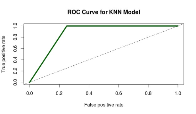
6. The curve looks pretty good. To confirm this we use the last two lines of code to calculate the actually AUC. The actual AUC is 0.88 which is excellent. In other words, the model developed does an excellent job of discerning between true and false positives.
Conclusion
The ROC curve provides one of many ways in which to assess the appropriateness of a model. As such, it is yet another tool available for a person who is trying to test models.
Pingback: Receiver Operating Characteristic Curve | Educa...
Pingback: Improving the Performance of Machine Learning Model | educational research techniques