As with all the features in Moodle, there are many different ways to mark an assignment. In this post we will explain several different approaches that can be taken to marking an assignment in Moodle. For information on setting up an assignment see the post on how to do this.
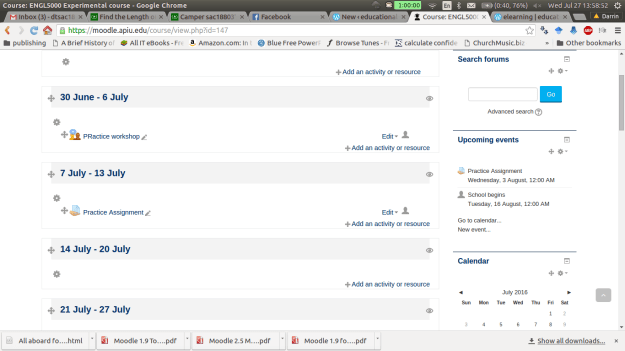
Below is a screen shot of a demo class for this post. To beginning marking an assignment, you need to click on the assignment while in the role of a teacher.
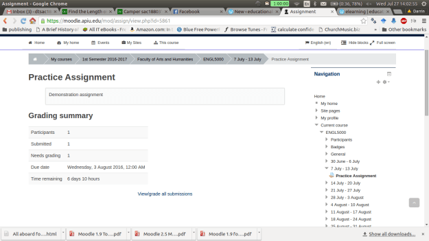
After clicking on the assignment you will see a
summary page that indicates the number of students
how many assignments have been submitted
the number of assignments that need to be graded
the due date
how much time before the assignment is late.
Underneath all this information is a link for viewing submissions and you need to click on this. Below is a visual of this.
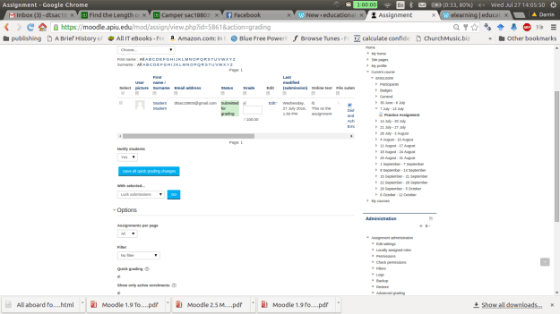
On the next page there is a lot of information. For “grading action” we don’t want to change this option for now. The next section has the names of the students who have submitted the assignment. The “grade” box allows you to submit a numerical grade for the assignment. The “online text” box is only available if you want the students to type a response into Moodle. The “file submission” link allows you to download any attachments the students uploaded. If any comments have been made by the student or someone else you can see those in the “comments” section. The “feedback comments” allows you to inform the student privately how they did on the assignment.
The other options are self-explanatory. Please note that this example uses the quick grading option which is useful if you are the only one marking assignments in the class. Below is a visual of this page.
Once you put in a score and at feedback (feedback is optional). You must click on “save all quick grading changes”. The student now has a grade with feedback on the assignment. As the teacher, you can view the students overall grade by going to the “grading action” drop down menu and clicking on “View gradebook” You will see the following.
You can also change grades here by clicking on the assignment. This will take you “grading summary page” which is the second screenshot in this post. If you click on the pencil you can override an existing grade as shown in the screen below. It will take you to the following screen.
Click on override and you can change the grade or feedback. Click on exclude and the assignment will not be a part of the final grade.
Conclusion
In this post we explored some of the options for grading assignments in Moodle. This is not an inherently technical task but you should be aware of the different ways that it can be done to avoiding becoming confused when trying to use Moodle.
Market basket analysis a machine learning approach that attempts to find relationships among a group of items in a data set. For example, a famous use of this method was when retailers discovered an association between beer and diapers.
Upon closer examination, the retailers found that when men came to purchase diapers for their babies they would often buy beer in the same trip. With this knowledge, the retailers placed beer and diapers next to each other in the store and this further increased sales.
In addition, many of the recommendation systems we experience when shopping online use market basket analysis results to suggest additional products to us. As such, market basket analysis is an intimate part of our lives with us even knowing.
In this post, we will look at some of the details of market basket analysis such as association rules, apriori, and the role of support and confidence.
Association Rules
The heart of market basket analysis are association rules. Association rules explain patterns of relationship among items. Below is an example
{rice, seaweed} -> {soy sauce}
Everything in curly braces { } is an itemset, which is some form of data that occurs often in the dataset based on criteria. Rice and seaweed are our itemset on the left and soy sauce is our itemset on the right. The arrow -> indicates what comes first as we read from left to right. If we put this association rule in simple English it would say “if someone buys rice and seaweed then they will buy soy sauce”.
The practical application of this rule is to place rice, seaweed and soy sauce near each other in order to reinforce this rule when people come to shop.
The Algorithm
Market basket analysis uses an apriori algorithm. This algorithm is useful for unsupervised learning that does not require any training and thus no predictions. The Apriori algorithm is especially useful with large datasets but it employs simple procedures to find useful relationships among the items.
The shortcut that this algorithm uses is the “apriori property” which states that all suggsets of a frequent itemset must also be frequent. What this means in simple English is that the items in an itemset need to be common in the overall dataset. This simple rule saves a tremendous amount of computational time.
Support and Confidence
Two key pieces of information that can further refine the work of the Apriori algorithm is support and confidence. Support is a measure of the frequency of an itemset ranging from 0 (no support) to 1 (highest support). High support indicates the importance of the itemset in the data and contributes to the itemset being used to generate association rule(s).
Returning to our rice, seaweed, and soy sauce example. We can say that the support for soy sauce is 0.4. This means that soy sauce appears in 40% of the purchases in the dataset which is pretty high.
Confidence is a measure of the accuracy of an association rule which is measured from 0 to 1. The higher the confidence the more accurate the association rule. If we say that our rice, seaweed, and soy sauce rule has a confidence of 0.8 we are saying that when rice and seaweed are purchased together, 80% of the time soy sauce is purchased as well.
Support and confidence can be used to influence the apriori algorithm by setting cutoff values to be searched for. For example, if we set a minimum support of 0.5 and a confidence of 0.65 we are telling the computer to only report to us association rules that are above these cutoff points. This helps to remove useless rules that are obvious or useless.
Conclusion
Market basket analysis is a useful tool for mining information from large datasets. The rules are easy to understanding. In addition, market basket analysis can be used in many fields beyond shopping and can include relationships within DNA, and other forms of human behavior. As such, care must be made so that unsound conclusions are not drawn from random patterns in the data
In this post, we are going to take a closer look at setting up the gradebook in Moodle. In particular we are going to learn how to setup categories and graded items in. For many, the gradebook in Moodle is very confusing and hard to understand. However, with some basic explanation the gradebook can become understandable and actually highly valuable.
Finding the Setup Page
After logging into Moodle and selecting a course in which you are the teacher, you need to do the following.
Go to the administration block and click on “grades”
Next click on the “setup” tab. You should see the following
The folder “ENGL 5000 Experimental course” is the name of the class that I am using. Your folder should have the name of your class in this place. When you create categories and grade items they should all be inside this folder.
Making Categories
It makes sense to create categories first so that we have a place to put various graded items. How you setup the categories is up to you. One thing to keep in mind is that you can create sub-categories, sub-sub categories, etc. This can get really confusing so it is suggested that you only make main categories for simplicity sake unless there is a compelling reason not to do this. In this example, we will create 4 main categories and they are
Classwork (35% of grade)
Quizzes (20% of grade)
Tests (20% of grade)
Final (25% of grade)
To make a category click on “Add category” and you will see the following.
Give the category the name “Classwork”
Aggregation is confusing for people who are not familiar with statistics. There are different ways in which grades can be calculated in a category below is the explanation of 2 that are most commonly used.
Mean of grades-This aggregation calculate the mean of the graded items. All items have the same weight
Simple weighted mean-For this aggregation, the more points an item is worth the more influence it has in the calculation of the grade for the category.
Set your aggregation to “mean of grades
Click on “category total”
The grade type should be set to “value” this means that it is worth points.
The maximum grade should be set to 35. Remember our classwork category is worth 35% so we want the category to be worth 35 points and the entire class to be worth 100 points. Moodle is able to standardized the data so that everything fits accordingly.
Click on “save changes”
Repeat what we did for the “classwork” category for each of the other categories in the example. Below are screenshots of the categories
QUIZZES Category
TEST CATEGORY
FINAL CATEGORY
If everything went well you should see the following on the setup page.
Notice how the class is now worth 100 points. You can make your categories worth whatever you want. However, it becomes difficult to interpret the scores when you do anything. As educators, we are already use to a 100 point system so you may as well use that in Moodle as well even though you have the flexibility to make it whatever you want.
There is one more step we need to take in order to make sure the gradebook calculates grades correctly. You may have noticed that each of our categories are worth a different number of points. Therefore, we must tell Moodle to weigh these categories differently. Otherwise the results of each category will have the same weight on the overall grade. To fix this problem do the following.
Find the folder that has the name of your course (for me this is ENGL 5000 Experimental course)
To the right of the folder there is a link called “edit” click on this.
Click “edit settings”
You do not need to give this category a name so leave that blank.
For aggregation, change it to “simple weighted mean”
Click “save changes”
You should see the following
Notice in the course total that it now says “simple weighted mean of grades”.
For adding graded items, you do the following
Click on “add graded item”
Give it a name (I will call mines quiz 1)
Determine how many points it is worth (for me 10 points)
Scroll to the bottom and you will see a drop down tab called “grade category”
Pick the category you want the graded item to be in.
Below is an example of a quiz I put in the quiz category. This is what the setup page should look like if this is down correctly
As you can see, quiz 1 is worth ten points. You may wonder how quiz 1 can be worth 10 points when the entire category is only worth 20. Remember, Moodle use statistics to condense the score of the quiz to fit within the 20 points of the category.
Conclusion
This post exposed you to the basics of setting up categories and graded items in Moodle. The main problem with the gradebook is the flexibility it provides. With some sort of a predefined criteria it is easy to get confused in using it. However, with the information provided here, you now have a foundation for using the Moodle gradebook.
In this post, we will use support vector machine analysis to look at some data available on kaggle. In particular, we will predict what number a person wrote by analyzing the pixels that were used to make the number. The file for this example is available at https://www.kaggle.com/c/digit-recognizer/data
To do this analysis you will need to use the ‘kernlab’ package. While playing with this dataset I noticed a major problem, doing the analysis with the full data set of 42000 examples took forever. To alleviate this problem. We are going to practice with a training set of 7000 examples and a test set of 3000. Below is the code for the first few sets. Remember that the dataset was downloaded separately
#load packageslibrary(kernlab)digitTrain<-read.csv(file="digitTrain.csv",head=TRUE,sep=",")#split data digitRedux<-digitTrain[1:7000,]digitReduxTest<-digitTrain[7001:10000,]#explore datastr(digitRedux)
From the “str” function you can tell we have a lot of variables (785). This is what slowed the analysis down so much when I tried to run the full 42000 examples in the original dataset.
SVM need a factor variable as the predictor if possible. We are trying to predict the “label” variable so we are going to change this to a factor variable because that is what it really is. Below is the code
#convert label variable to factordigitRedux$label<-as.factor(digitRedux$label)digitReduxTest$label<-as.factor(digitReduxTest$label)
Before we continue with the analysis we need to scale are variables. This makes all variables to be within the same given range which helps to equalize the influence of them. However, we do not want to change our “label” variable as this is the predictor variable and scaling it would make the results hard to understand. Therefore, we are going to temporarily remove the “label” variable from both of our data sets and save them in a temporary data frame. The code is below.
#temporary dataframe for the label resultskeep<-as.data.frame(digitRedux$label)keeptest<-as.data.frame(digitReduxTest$label)#null label variable in both datasetsdigitRedux$label<-NAdigitReduxTest$label<-NA
Next, we scale the remaining variable and reinsert the label variables for each data set as show in our code below.
digitRedux<-as.data.frame(scale(digitRedux))digitRedux[is.na(digitRedux)]<-0#replace NA with 0digitReduxTest<-as.data.frame(scale(digitReduxTest))digitReduxTest[is.na(digitReduxTest)]<-0#add back labeldigitRedux$label<-keep$`digitRedux$label`digitReduxTest$label<-keeptest$`digitReduxTest$label`
Now we make our model using the “ksvm” function in the “kernlab” package. We set the kernel to “vanilladot” which is a linear kernel. We will also print the results. However, the results do not make any sense on their own and the model can only be assessed through other means. Below is the code. If you get a warning message about scaling do not worry about this as we scaled the data ourselves.
#make the modelnumber_classify<-ksvm(label~., data=digitRedux,
kernel="vanilladot")
#look at the resultsnumber_classify
## Support Vector Machine object of class "ksvm"
##
## SV type: C-svc  (classification)
##  parameter : cost C = 1
##
## Linear (vanilla) kernel function.
##
## Number of Support Vectors : 2218
##
## Objective Function Value : -0.0623 -0.207 -0.1771 -0.0893 -0.3207 -0.4304 -0.0764 -0.2719 -0.2125 -0.3575 -0.2776 -0.1618 -0.3408 -0.1108 -0.2766 -1.0657 -0.3201 -1.0509 -0.2679 -0.4565 -0.2846 -0.4274 -0.8681 -0.3253 -0.1571 -2.1586 -0.1488 -0.2464 -2.9248 -0.5689 -0.2753 -0.2939 -0.4997 -0.2429 -2.336 -0.8108 -0.1701 -2.4031 -0.5086 -0.0794 -0.2749 -0.1162 -0.3249 -5.0495 -0.8051
## Training error : 0
We now need to use the “predict” function so that we can determine the accuracy of our model. Remember that for predicting, we use the answers in the test data and compare them to what our model would guess based on what it knows.
The table allows you to see how many were classified correctly and how they were misclassified. The prop.table allows you to see an overall percentage. This particular model was highly accurate at 91%. It would be difficult to improve further. Below is code for a model that is using a different kernel with results that are barely better. However, if you ever enter a data science competition any improve ususally helps even if it is not practical for everyday use.
From this demonstration we can see the power of support vector machines with numerical data. This type of analysis can be used for things beyond the conventional analysis and can be used to predict things such as hand written numbers. As such, SVM is yet another tool available for the data scientist.
In this post, we will explore how to setup an assignment in Moodle. As with most features in Moodle, how to setup assignments comes with an endless array of options and ways that can become exceedingly confusing for people. As such, we will not look at all of the options but rather try to look at the basic steps need to complete this process.
Once you are logged in to Moodle and your course as a teacher you need to turn on editing in order to see the options for adding resources and activities. Once editing is on you need to click on the link that says “add an activity or resource.” After clicking on this link you should see the following.
2.Select the “Assignment” button and click “add” and you should then see the following
3. You need to type a name for the assignment in the “assignment name” box as well as a brief description of the assignment in the “description” box. These are required.
If you look closely at the many different options you will see little question marks in many places. Clicking on these will give you a brief explanation of what the feature does. This is important to know as there are too many features to explain them all clearly.
Explanation of the Various Sections
Additional Files. This section allows you to upload files the students may need to complete the assignment. It is shown in the picture above.
Availability and Submission Types. Availability allows you to setup time frame in which the assignment can be completed. The submission type allows you to determine how the students can submit the assignments. Below is a visual of these two sections.
Feedback Type and Submission Settings. The feedback type is how you can communicate with students about their grade for the assignment. Submission settings allows you to use one of several options for allowing students to turn in their work through Moodle. Below is a picture of what these sections look like.
Group Submission and Notifications. Group submission is useful when a team of students submit something together. Notification settings provide options for how Moodle communicates with teachers and students when assignment are submitted and marked. Both of these settings are shown below.
Grade Settings. Grade settings provides options for how papers are marked. Again, further details, you need to click on the question marks for additional information. Below is a screenshot of the grade options.
The final section is common module sections. These can mostly be ignored unless you are working with students in groups. After determining your settings you need to click either “save and return to course” or “save and display”.
Conclusion
There really is no simple way to explain when to use the various features available when using assignments. What to use depends on such factors as the needs of the students, the learning environment, the goals and objectives of the course, etc. As such, for you as a teacher the best advice to be given is to look at the context in which you are teaching and try to find the right combinations of options to use for that particular assignment.
Support vector machines (SVM) is another one of those mysterious black box methods in machine learning. This post will try to explain in simple terms what SVM are and their strengths and weaknesses.
Definition
SVM is a combination of nearest neighbor and linear regression. For the nearest neighbor, SVM uses the traits of an identified example to classify an unidentified one. For regression, a line is drawn that divides the various groups.It is preferred that the line is straight but this is not always the case
This combination of using the nearest neighbor along with the development of a line leads to the development of a hyperplane. The hyperplane is drawn in a place that creates the greatest amount of distance among the various groups identified.
The examples in each group that are closest to the hyperplane are the support vectors. They support the vectors by providing the boundaries for the various groups.
If for whatever reason a line cannot be straight because the boundaries are not nice and night. R will still draw a straight line but make accommodations through the use of a slack variable, which allows for error and or for examples to be in the wrong group.
Another trick used in SVM analysis is the kernel trick. A kernel will add a new dimension or feature to the analysis by combining features that were measured in the data. For example, latitude and longitude might be combined mathematically to make altitude. This new feature is now used to develop the hyperplane for the data.
There are several different types of kernel tricks that achieve their goal using various mathematics. There is no rule for which one to use and playing different choices is the only strategy currently.
Pros and Cons
The pros of SVM is their flexibility of use as they can be used to predict numbers or classify. SVM are also able to deal with nosy data and are easier to use than artificial neural networks. Lastly, SVM are often able to resist overfitting and are usually highly accurate.
Cons of SVM include they are still complex as they are a member of black box machine learning methods even if they are simpler than artificial neural networks. The lack of criteria for kernel selection makes it difficult to determine which model is the best.
Conclusion
SVM provide yet another approach to analyzing data in a machine learning context. Success with this approach depends on determining specifically what the goals of a project are.
Rubrics are a systematic way of grading assignments. They can be holistic or analytical in nature.
A holistic rubric looks at the overall assignment and provides one over-arching criterion with various levels of performance. For example, a paper can be jduge on overall writing by making the categories of excellent, good, average, and poor. Each of these ratings comes with a brief paragraph that describes the level of performance. This is a way to provide some feedback with having to spend a large amount of time marking.
An analytical rubric breaks the assignment done into components and provides a rating for each component. For a research paper a teacher might include the components of grammar, formatting, word count, etc. and each of these components would have a score attached to it.
In this post, we are going to develop an analytical rubric for an assignment in Moodle. The only activity that allows for rubrics is “assignments” so we will make a rubric for this activity.
Making a Rubric
After logging into Moodle, in your course, click “turn editing on”
Next, in one of the sections of the course click “add activity”
Select “assignment”
The setting page for the assignment appears. There is a lot of information here but focus on the following
Give your assignment a name (THIS IS REQUIRED BY MOODLE)
Give your assignment a description (THIS IS REQUIRED BY MOODLE)
Below is a picture of step 4
5. Scroll down to the “grades” tab
6. Set maximum number of points to “30”
7. Change the grading method to “rubric” and leave the rest of the settings the same
Below is a picture of steps 5-7
8. Click “save and display” and you will see the following.
9. Click on “define new grading form from scratch” The other option only works if there are existing rubrics.
10. In the next screen, you need to complete the following
Give the rubric a name
Create three criterion by clicking on “add criterion” two times
Add one levels to each criterion by clicking on “add level”. You should have four levels for each criterion
Below is a picture of the rubric I developed
As you can see, rubric is highly flexible. Each level can be worth a different number of points ad you can have a different number of levels for each criterion. The only rule is to make sure that the total points for the rubric are the same as those you set in the points option in assignment settings.
11. Once finished, click”save rubric and make it ready” You should see the following
We can now use our rubric and I will demonstrate this with an example student. You may not be able to follow along if your course does not have any students.
I click on “view/grade all submissions”
Next, I see the assignment and the students in the class. To grade the student I click on “edit” and select “grade”. Below is a picture
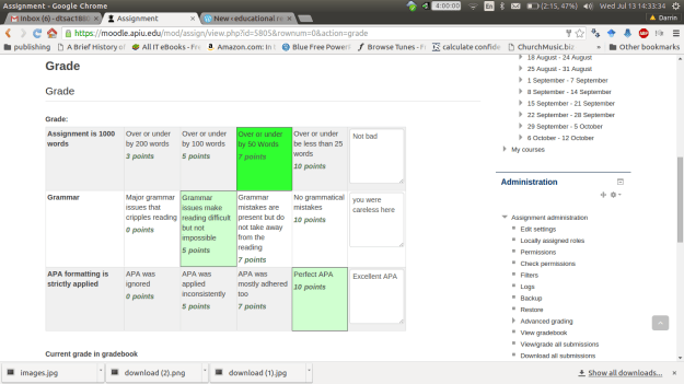
3. I can now pick the score I want to give. Provide comments for each criteria and provide overall comments in the “Feedback” section. Below are pictures of the rubric and feedback.
4. Now, I click “save changes” On the next screen I click “continue”You should now see the grade page again with the score and feedback you provided. Below is a visual of this
Conclusion
This post provided step-by-step instruction on using rubrics in Moodle. Rubrics provide quick feedback to a student in terms of there performance on specific action-based task.
In this post, we are going make an artificial neural network (ANN) by analyzing some data about computers. Specifically, we are going to make an ANN to predict the price of computers.
We will be using the “ecdat” package and the data set “Computers” from this package. In addition, we are going to use the “neuralnet” package to conduct the ANN analysis. Below is the code for the packages and dataset we are using
library(Ecdat);library(neuralnet)
#load data setdata("Computers")
Explore the Data
The first step is always data exploration. We will first look at nature of the data using the “str” function and then used the “summary” function. Below is the code.
## $price
##    Min. 1st Qu.  Median    Mean 3rd Qu.    Max.
##     949    1794    2144    2220    2595    5399
##
## $speed
##    Min. 1st Qu.  Median    Mean 3rd Qu.    Max.
##   25.00   33.00   50.00   52.01   66.00  100.00
##
## $hd
##    Min. 1st Qu.  Median    Mean 3rd Qu.    Max.
##    80.0   214.0   340.0   416.6   528.0  2100.0
##
## $ram
##    Min. 1st Qu.  Median    Mean 3rd Qu.    Max.
##   2.000   4.000   8.000   8.287   8.000  32.000
##
## $screen
##    Min. 1st Qu.  Median    Mean 3rd Qu.    Max.
##   14.00   14.00   14.00   14.61   15.00   17.00
##
## $cd
##   no  yes
## 3351 2908
##
## $multi
##   no  yes
## 5386  873
##
## $premium
##   no  yes
##  612 5647
##
## $ads
##    Min. 1st Qu.  Median    Mean 3rd Qu.    Max.
##    39.0   162.5   246.0   221.3   275.0   339.0
##
## $trend
##    Min. 1st Qu.  Median    Mean 3rd Qu.    Max.
##    1.00   10.00   16.00   15.93   21.50   35.00
ANN is primarily for numerical data and not categorical or factors. As such, we will remove the factor variables cd, multi, and premium from further analysis. Below are is the code and histograms of the remaining variables.
Looking at the summary combined with the histograms indicates that we need to normalize our data as this is a requirement for ANN. We want all of the variables to have an equal influence initially. Below is the code for the function we will use to normalize are variables.
We now need to make a new dataframe that has only the variables we are going to use for the analysis. Then we will use our “normalize” function to scale and center the variables appropriately. Lastly, we will re-explore the data to make sure it is ok using the “str” “summary” and “hist” functions. Below is the code.
#make dataframe without factor variablesComputers_no_factors<-data.frame(Computers$price,Computers$speed,Computers$hd,
Computers$ram,Computers$screen,Computers$ad,
Computers$trend)#make a normalize dataframe of the dataComputers_norm<-as.data.frame(lapply(Computers_no_factors, normalize))#reexamine the normalized datalapply(Computers_norm, summary)
## $Computers.price
##    Min. 1st Qu.  Median    Mean 3rd Qu.    Max.
##  0.0000  0.1565  0.2213  0.2353  0.3049  0.8242
##
## $Computers.speed
##    Min. 1st Qu.  Median    Mean 3rd Qu.    Max.
##  0.0000  0.0800  0.2500  0.2701  0.4100  0.7500
##
## $Computers.hd
##    Min. 1st Qu.  Median    Mean 3rd Qu.    Max.
## 0.00000 0.06381 0.12380 0.16030 0.21330 0.96190
##
## $Computers.ram
##    Min. 1st Qu.  Median    Mean 3rd Qu.    Max.
##  0.0000  0.0625  0.1875  0.1965  0.1875  0.9375
##
## $Computers.screen
##    Min. 1st Qu.  Median    Mean 3rd Qu.    Max.
## 0.00000 0.00000 0.00000 0.03581 0.05882 0.17650
##
## $Computers.ad
##    Min. 1st Qu.  Median    Mean 3rd Qu.    Max.
##  0.0000  0.3643  0.6106  0.5378  0.6962  0.8850
##
## $Computers.trend
##    Min. 1st Qu.  Median    Mean 3rd Qu.    Max.
##  0.0000  0.2571  0.4286  0.4265  0.5857  0.9714
Everything looks good, so we will now split our data into a training and testing set and develop the ANN model that will predict computer price. Below is the code for this.
#split data into training and testingComputer_train<-Computers_norm[1:4694,]Computers_test<-Computers_norm[4695:6259,]#modelcomputer_model<-neuralnet(Computers.price~Computers.speed+Computers.hd+Computers.ram+Computers.screen+Computers.ad+Computers.trend, Computer_train)
Our initial model is a simple feedforward network with a single hidden node. You can visualize the model using the “plot” function as shown in the code below.
plot(computer_model)
We now need to evaluate our model’s performance. We will use the “compute” function to generate predictions. The predictions generated by the “compute” function will then be compared to the actual prices in the test data set using a Pearson correlation. Since we are not classifying we can’t measure accuracy with a confusion matrix but rather with correlation. Below is the code followed by the results
The correlation between the predict results and the actual results is 0.88 which is a strong relationship. This indicates that our model does an excellent job in predicting the price of a computer based on ram, screen size, speed, hard drive size, advertising, and trends.
Develop Refined Model
Just for fun, we are going to make a more complex model with three hidden nodes and see how the results change below is the code.
The correlation improves to 0.89. As such, the increased complexity did not yield much of an improvement in the overall correlation. Therefore, a single node model is more appropriate.
Conclusion
In this post, we explored an application of artificial neural networks. This black box method is useful for making powerful predictions in highly complex data.
Scales are used in Moodle to grade individual assignments. Once created, scales can be used for any assignment if desired.
The difference between scales and letter grades is that letter grades can be used for individual assignments and or for determining the overall grade of a course. Scales can only be used for assignments and the results of a using a scale are used to calculate the final grade of a course.
In this post, we will look at how to make a scale in Moodle
Creating a Scale
In a Moodle course in which you are the teacher click on “course settings” and then click on “grades”
Inside the grades window, click on “scales” you should see something similar to the following.
There are two categories of scales. The first is “custom scales” these are scales that you make as the teacher. The second category is “standard scales” these are made by your site administrator are came with Moodle upon installation.
3. Now, click on “add a new scale” to begin making your own scale. You should see a screen similar to the following.
This is mostly self-explanatory. You need to give the scale a name in the “name” section. The “standard scale” box should only be checked if you want the scale to available all over the Moodle site.
The “scale” section is a little trickier. In this section, we will put all of the levels of our scale. You put the lowest ranking comment first and go in increasing order. We are going to make a scale with three levels as shown below.
Poor, Okay, Excellent
You can copy the text above into the “scale” section
The description section can be left blank. This is useful for telling people or reminding yourself of the traits of the scale and its purpose. Once you provide all the necessary information click “save changes.” Below is a picture of the completed scale with all of the necessary information.
The scale we made is a three point scale. A mark of poor = 1, okay = 2, and excellent = 3. When using the scale, students will see the word of the scale while the gradebook would record the word and points for calculation.
4. Using the Scale
Whenever you make any kind of assignment in Moodle, all you have to do to use the scale is to change the option “grade type” and set it to “scale” as shown in the example below.
All other features can be left only. In a future post, we will look at greater detail how to created assignments.
Conclusion
This post provided explanation into creating scales in Moodle. Scales provide a way to give richer feedback than just giving points and or a letter grade. As such, a combination of points and scale grades can provide students with a multi-faceted feedback experience.
In machine learning, there are a set of analytical techniques know as black box methods. What is meant by black box methods is that the actual models developed are derived from complex mathematical processes that are difficult to understand and interpret. This difficulty in understanding them is what makes them mysterious.
One black method is artificial neural network (ANN). This method tries to imitate mathematically the behavior of neurons in the nervous system of humans. This post will attempt to explain ANN in simplistic terms.
The Human Mind and the Artificial One
We will begin by looking at how real neurons work before looking at ANN. In simple terms, as this is not a biology blog, neurons send and receive signals. They receive signals through their dendrites, process information in the soma, and the send signals through their axon terminal. Below is a picture of a neuron.
An ANN works in a highly similar manner. The x variables are the dendrites that are providing information to the cell body when they are summed. Different dendrites or x variables can have different weights (w). Next, the summation of the x variables is passed to an activation function before moving to the output or dependent variable y. Below is a picture of this process.
If you compare the two pictures they are similar yet different. ANN mimics the mind in a way that has fascinated people for over 50 years.
Activation Function (f)
The activation function purpose is to determine if there should be an activation. In the human body, activation takes place when the nerve cell sends the message to the next cell. This indicates that the message was strong enough to have it move forward.
The same concept applies in ANN. A signal will not be passed on unless it meets a minimum threshold. This threshold can vary depending on how the ANN is model.
ANN Design
The makeup of an ANNs can vary greatly. Some models have more than one output variable as shown below.
Two outputs
Other models have what are called hidden layers. These are variables that are both input and output variables. They could be seen as mediating variables. Below is a visual example.
Hidden layer is the two circles in the middle
How many layers to developed is left to the researcher. When models become really complex with several hidden layers and or outcome variables it is referred to as deep learning in the machine learning community.
Another complexity of ANN is the direction of information. Just as in the human body information can move forward and backward in an ANN. This provides for opportunities to model highly complex data and relationships.
Conclusion
ANN can be used for classifying virtually anything. They are a highly accurate model as well that is not bogged down by many assumptions. However, ANN’s are so hard to understand that it makes it difficult to use them despite their advantages. As such, this form of analysis can be beneficial if the user is able to explain the results.
Moodle is an open-source learning management system that is used by many different institutions within and outside of education. The challenge with Moodle is not a lack of features but rather how incredible flexible it is. What you can do with Moodle is only limited by your imagination. This problem is almost insurmountable for people who like rigid and fixed systems and options.
The overall flexible found in the Moodle system is also a part of the gradebook found within Moodle. A common complaint is that the gradebook is too complicated. In reality, the complexity of the gradebook is its flexibility that it possesses. Without clear goals and objectives going in, the gradebook is impossible to use.
In this post, we will begin to explore some of the features of the Moodle gradebook before moving to other features of this Learning Management System.
Types of Grades
There are three ways that grades can be recording in the gradebook in Moodle
Numerically (value)
As a letter (text)
As a scale (scale)
We will look briefly at each
Numeric Grade
The default option in Moodle is a numeric grading. This option involves giving points for the completion of an assignment. The default number of points is 100 but this can be changed as necessary. Below is a screenshot of an assignment that is using a numeric grade. Notice how the grade type is set to “value” and the maximum grade is set to 100 points.
Letter Grade
A letter grade is a letter, word or phrase that serves as a substitute for numerical grade. The letter acts like a number and the letter or word is converted into a number for calculating grades. Below is an example of letter grade system.
Below are directions for creating a letter grade system in Moodle 2.8
Log in to your Moodle system and pick a course it which you have teacher authorization.
Inside the course, click on “course administration” and then click on”grades”
Click on the “letters” tab. You can see the tab in the picture below.
4. There should be some default settings already visible. We want to changes these so we need to click on the “edit” link.
5. You should no see a new screen with the current grades along with their cutoff points. In this screen click on the “override site defaults” so we can set our own grade system.
6. We will now set our own sample grade system below are the details
Excellent 90%
Good 75%
Satisfactory 60%
Below is what this looks like in Moodle
After clicking on “save changes”, here is what the grade systems looks when it is complete
Whenever we want to see the final grades of a course. This scale will be used and will be displayed as the final grade. However, if we want to grade individual assignments with different grading systems we will need to make a scale. In a future post, we will look at how to create scales for grading.
Conclusion
Moodle offers a huge array of options in terms of learning and instruction. In addition, Moodle offers many different options in regards to grading that can by confusing. However, with clear goals it is possible to achieve what you want from this system.
In this post, we will look at an example of regression trees. Regression trees use decision tree-like approach to develop prediction models involving numerical data. In our example, we will be trying to predict how many kids a person has based on several independent variables in the “PSID” data set in the “Ecdat” package.
Let’s begin by loading the necessary packages and data set. The code is below
##      intnum        persnum            age           educatn
##  Min.   :   4   Min.   :  1.00   Min.   :30.00   Min.   : 0.00
##  1st Qu.:1905   1st Qu.:  2.00   1st Qu.:34.00   1st Qu.:12.00
##  Median :5464   Median :  4.00   Median :38.00   Median :12.00
##  Mean   :4598   Mean   : 59.21   Mean   :38.46   Mean   :16.38
##  3rd Qu.:6655   3rd Qu.:170.00   3rd Qu.:43.00   3rd Qu.:14.00
##  Max.   :9306   Max.   :205.00   Max.   :50.00   Max.   :99.00
##                                                  NA's   :1
##     earnings          hours           kids                 married
##  Min.   :     0   Min.   :   0   Min.   : 0.000   married      :3071
##  1st Qu.:    85   1st Qu.:  32   1st Qu.: 1.000   never married: 681
##  Median : 11000   Median :1517   Median : 2.000   widowed      :  90
##  Mean   : 14245   Mean   :1235   Mean   : 4.481   divorced     : 645
##  3rd Qu.: 22000   3rd Qu.:2000   3rd Qu.: 3.000   separated    : 317
##  Max.   :240000   Max.   :5160   Max.   :99.000   NA/DF        :   9
##                                                   no histories :  43
The variables “intnum” and “persnum” are for identification and are useless for our analysis. We will now explore our dataset with the following code.
hist(PSID$age)
hist(PSID$educatn)
hist(PSID$earnings)
hist(PSID$hours)
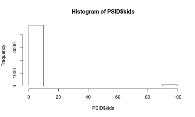
hist(PSID$kids)
table(PSID$married)
##
##       married never married       widowed      divorced     separated
##          3071           681            90           645           317
##         NA/DF  no histories
##             9            43
Almost all of the variables are non-normal. However, this is not a problem when using regression trees. There are some major problems with the “kids” and “educatn” variables. Each of these variables has values at 98 and 99. When the data for this survey was collected 98 meant the respondent did not know the answer and a 99 means they did not want to say. Since both of these variables are numerical we have to do something with them so they do not ruin our analysis.
We are going to recode all values equal to or greater than 98 as 3 for the “kids” variable. The number 3 means they have 3 kids. This number was picked because it was the most common response for the other respondents. For the “educatn” variable all values equal to or greater than 98 are recoded as 12, which means that they completed 12th grade. Again this was the most frequent response. Below is the code.
We will now make our model and also create a visual of it. Our goal is to predict the number of children a person has based on their age, education, earnings, hours worked, marital status. Below is the code
The first split on the tree is by income. On the left, we have those who make more than 20k and on the right those who make less than 20k. On the left the next split is by marriage, those who are never married or not applicable have on average 0.74 kids. Those who are married, widowed, divorced, separated, or have no history have on average 1.72.
The left side of the tree is much more complicated and I will not explain all of it. The after making less than 20k the next split is by marriage. Those who are married, widowed, divorced, separated, or no history with less than 13.5 years of education have 2.46 on average.
Make Prediction Model and Conduct Evaluation
Our next task is to make the prediction model. We will do this with the following code
PSID_pred<-predict(PSID_Model, PSID_test)
We will now evaluate the model. We will do this three different ways. The first involves looking at the summary statistics of the prediction model and the testing data. The numbers should be about the same. After that, we will calculate the correlation between the prediction model and the testing data. Lastly, we will use a technique called the mean absolute error. Below is the code for the summary statistics and correlation.
summary(PSID_pred)
##    Min. 1st Qu.  Median    Mean 3rd Qu.    Max.
##   0.735   2.041   2.463   2.226   2.463   2.699
summary(PSID_test$kids)
##    Min. 1st Qu.  Median    Mean 3rd Qu.    Max.
##   0.000   2.000   2.000   2.494   3.000  10.000
cor(PSID_pred, PSID_test$kids)
## [1] 0.308116
Looking at the summary stats our model has a hard time predicting extreme values because the max value of the two models are far apart. However, how often do people have ten kids? As such, this is not a major concern.
A look at the correlation finds that it is pretty low (0.30) this means that the two models have little in common and this means we need to make some changes. The mean absolute error is a measure of the difference between the predicted and actual values in a model. We need to make a function first before we analyze our model.
The results indicate that on average the difference between our model’s prediction of the number of kids and the actual number of kids was 1.13 on a scale of 0 – 10. That’s a lot of error. However, we need to compare this number to how well the mean does to give us a benchmark. The code is below.
Our model with a score of 1.13 is slightly better than using the mean which is 1.17. We will try to improve our model by switching from a regression tree to a model tree which uses a slightly different approach for prediction. In a model tree each node in the tree ends in a linear regression model. Below is the code.
It would take too much time to explain everything. You can read part of this model as follows earnings greater than 20754 use linear model 4earnings less than 20754 and less than 2272 and less than 12.5 years of education use linear model 1 earnings less than 20754 and less than 2272 and greater than 12.5 years of education use linear model 2 earnings less than 20754 and greater than 2272 linear model 3 The print out then shows each of the linear model. Lastly, we will evaluate our model tree with the following code
##    Min. 1st Qu.  Median    Mean 3rd Qu.    Max.
##  0.3654  2.0490  2.3400  2.3370  2.6860  4.4220
cor(PSIDM5_Pred, PSID_test$kids)
## [1] 0.3486492
MAE(PSID_test$kids, PSIDM5_Pred)
## [1] 1.088617
This model is slightly better. For example, it is better at predict extreme values at 4.4 compare to 2.69 for the regression tree model. The correlation is 0.34 which is better than 0.30 for the regression tree model. Lastly. the mean absolute error shows a slight improve to 1.08 compared to 1.13 in the regression tree model
Conclusion
This provide examples of the use of regression trees and model trees. Both of these models make prediction a key component of their analysis.