Normal distribution is an important term in statistics. When we say normal distribution, we are speaking of the traditional bell curve concept. Normal distribution is important because it is often an assumption of inferential statistics that the distribution of data points is normal. Therefore, one of the first things you do when analyzing data is to check for normality.
In this post, we will look at the following ways to assess normality.
- By graph
- By plots
- By test
Checking Normality by Graph
The easiest and crudest way to check for normality is visually through the use of histograms. You simply look at the histogram and determine how closely it resembles a bell.
To illustrate this we will use the ‘beaver2’ data that is already loaded into R. This dataset contains five variables “day”, “time”, “temp”, and “activ” for data about beavers. Day indicates what day it was, time indicates what time it was, temp is the temperature of the beavers, and activ is whether the beavers were active when their temperature was taking. We are going to examine the normality of the temperature of active and inactive. Below is the code
> library(lattice)
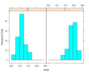
> histogram(~temp | factor(activ), data = beaver2)
- We loaded the ‘lattice’ package. (If you don’t have this package please download)>
- We used the histogram function and indicate the variable ‘temp’ then the union ( | ) followed by the factor variable ‘activ’ (0 = inactive, 1 = active)
- Next, we indicate the dataset we are using ‘beaver2’
- After pressing ‘enter’ you should see the following
As you look at the histograms, you can say that they are somewhat normal. The peaks of the data are a little high in both. Group 1 is more normal than Group 0. The problem with visual inspection is lack of accuracy in interpretation. This is partially solved by using QQ plots.
Checking Normality by Plots
QQplots are useful for comparing your data with a normally distributed theoretical dataset. The QQplot includes a line of a normal distribution and the data points for your data for comparison. The more closely your data follows the line the more normal it is. Below is the code for doing this with our beaver information.
> qqnorm(beaver2$temp[beaver2$activ==1], main = 'Active')
> qqline(beaver2$temp[beaver2$activ==1])
Here is what we did
- We used the ‘qqnorm’ function to make the plot
- Within the ‘qqnorm’ function we tell are to use ‘temp’ from the ‘beaver2’ dataset.
- From the ‘temp’ variable we subset the values that have a 1 in the ‘activ’ variable.
- We give the plot a title by adding ‘main = Active’
- Finally, we add the ‘qqline’ using most of the previous information.
- Below is how the plot should look
Going by sight again. The data still looks pretty good. However, one last test will determine conclusively if the dataset is normal or not.
Checking Normality by Test
The Shapiro-Wilks normality test determines the probability that the data is normally distributed. The lower the probability the less likely that the data is normally distributed. Below is the code and results for the Shapiro test.
> shapiro.test(beaver2$temp[beaver2$activ==1])

	Shapiro-Wilk normality test

data:  beaver2$temp[beaver2$activ == 1]
W = 0.98326, p-value = 0.5583
Here is what happened
- We use the ‘shapiro.test’ function for ‘temp’ of only the beavers who are active (activ = 1)
- R tells us the p-value is 0.55 or 55%
- This means that the probability of our data being normally distributed is 55% which means it is highly likely to be normal.
Conclusion
It is necessary to always test the normality of data before data analysis. The tips presented here provide some framework for accomplishing this.


Pingback: Examining Distributions In R | Education and Re...
I also find it informative and educational to overlay a density plot from a normal distribution with the same mean and standard deviation as the observed data. I know how to do this in base graphics and ggplot2 but have not worked with lattice enough to give the code here.
I should have added it. Maybe in a a future post. I also add density plots using ggplot2